-
Welcome to rpgcodex.net, a site dedicated to discussing computer based role-playing games in a free and open fashion. We're less strict than other forums, but please refer to the rules.
"This message is awaiting moderator approval": All new users must pass through our moderation queue before they will be able to post normally. Until your account has "passed" your posts will only be visible to yourself (and moderators) until they are approved. Give us a week to get around to approving / deleting / ignoring your mundane opinion on crap before hassling us about it. Once you have passed the moderation period (think of it as a test), you will be able to post normally, just like all the other retards.
You are using an out of date browser. It may not display this or other websites correctly.
You should upgrade or use an alternative browser.
You should upgrade or use an alternative browser.
D&DNext Art Thread
- Thread starter Mother Russia
- Start date
Syl
Cipher
- Joined
- Nov 3, 2011
- Messages
- 751
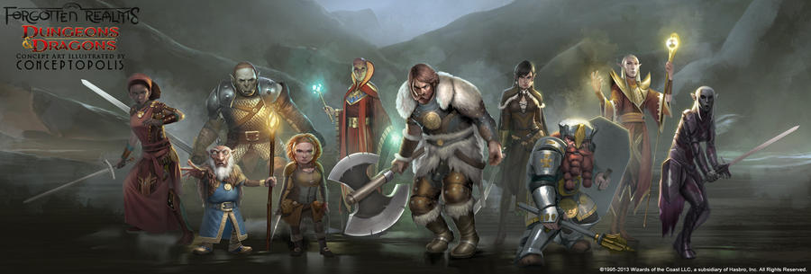
I'm sorry to break the oldschool mood but I just found all the official concept pieces on this page: http://conceptopolis.deviantart.com. Some of them have already been posted.
Characters:


Monsters:
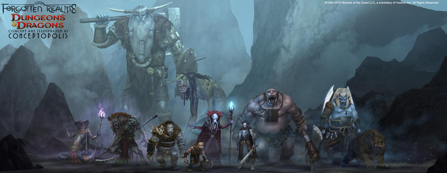


The halflings are still retarded and the weapons are slightly oversized, but good quality overall.
Characters:


Monsters:


The halflings are still retarded and the weapons are slightly oversized, but good quality overall.
What is Ganondorf doing in there.
catfood
AGAIN
That doesn't look very good to be honest. Which is weird since MTG artwork is usually a lot better than that, so it's not like Hasbro can't hire better artists or something.
The Dwarfs look like they are taken straight out of a shitty mmo.
Much like the game itself, the soul of D&D is gone just like the new artwork shows.
Alex
Arcane
Syl
God damn it, I had just eaten too!
About the older editions art, I won't deny 2e has a lot of very good art, but like Excidium, I like a lot about what came before.

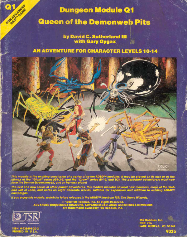
I really like how the monster in this cover appears. The purple skin tone, the shadows, the humanoid shape that doesn't seem quite right, all add up to a pretty cool effect. Speaking of shadows, I really like the use of color, lights and shadows in some of that older art:
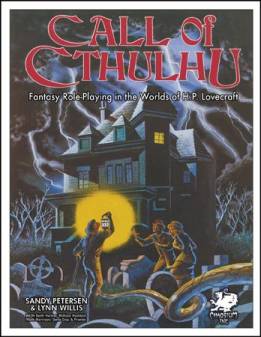
This cover from the 1st edition of CoC may be a bit amateurish, like all this art, but at the same time seems to set the game's theme so well...

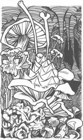
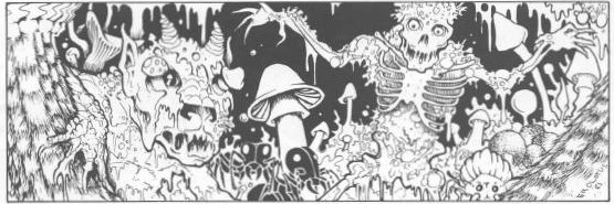
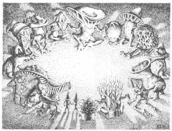
The use of lights in this scene looks almost as psychedelic as the scene itself. The presence of mushrooms here also seem to be a kind of recurring theme in a few of those older modules.


Another very interesting aspect of the early D&D art is that is sometimes is pretty... whimsy, I guess you could call it:


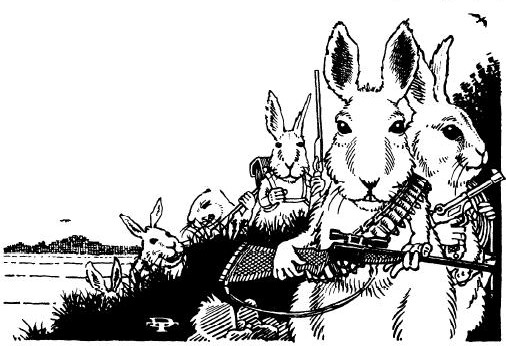
(note this one is from early Gamma World)
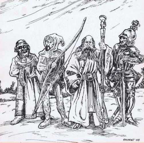
(and this one from Chivalry & Sorcery)
Finally, touching the subject of monsters, I can't help but think the older illustrations had a bit more... personality, maybe?


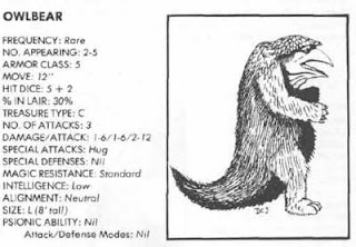

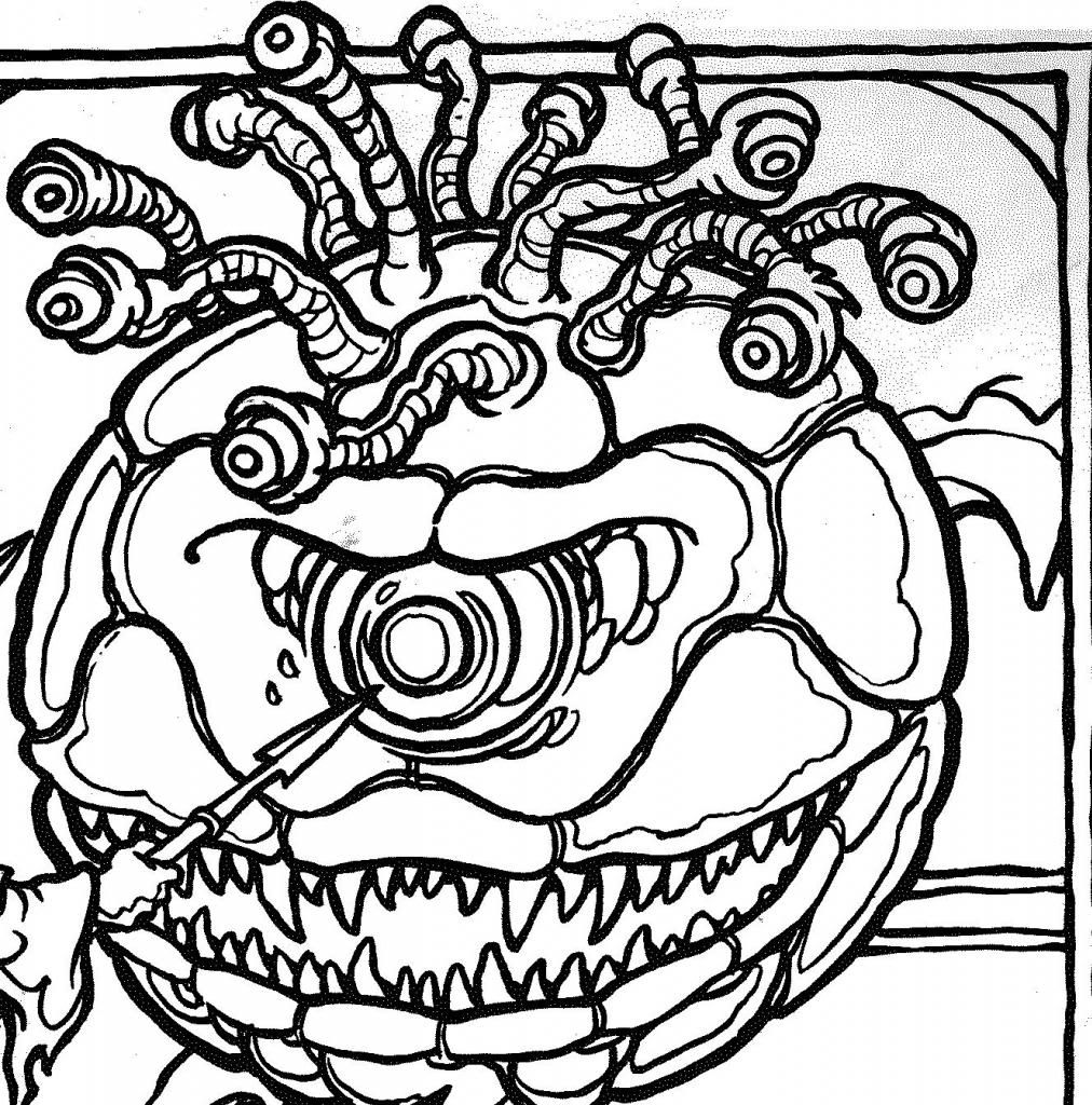
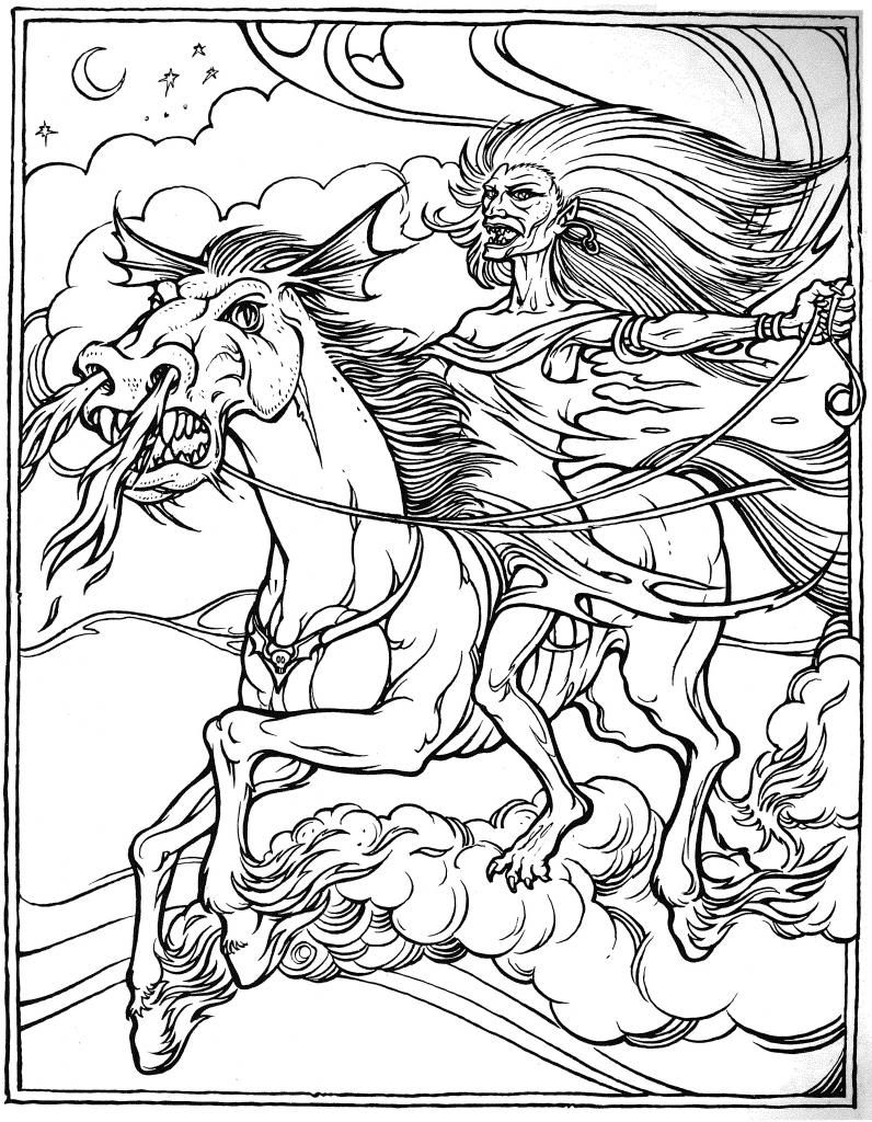
By the way, I really like that the osr is bringing some of thatold drawing style back in the RPG market. I thought that DCC RPG in particular was very well illustrated.
God damn it, I had just eaten too!
About the older editions art, I won't deny 2e has a lot of very good art, but like Excidium, I like a lot about what came before.

I really like how the monster in this cover appears. The purple skin tone, the shadows, the humanoid shape that doesn't seem quite right, all add up to a pretty cool effect. Speaking of shadows, I really like the use of color, lights and shadows in some of that older art:

This cover from the 1st edition of CoC may be a bit amateurish, like all this art, but at the same time seems to set the game's theme so well...

The use of lights in this scene looks almost as psychedelic as the scene itself. The presence of mushrooms here also seem to be a kind of recurring theme in a few of those older modules.


Another very interesting aspect of the early D&D art is that is sometimes is pretty... whimsy, I guess you could call it:


(note this one is from early Gamma World)
(and this one from Chivalry & Sorcery)
Finally, touching the subject of monsters, I can't help but think the older illustrations had a bit more... personality, maybe?


By the way, I really like that the osr is bringing some of thatold drawing style back in the RPG market. I thought that DCC RPG in particular was very well illustrated.
Oh gawd. Hidden Shrine of Tomoachan.


My only thoughts towards D&D Next art is: It could be worse.
Excidium
P. banal
Well, technically it doesn't have art yet. It's only concept stuff to settle the overall aesthetics of races and shit. The last update with halflings was already a step in the right direction.
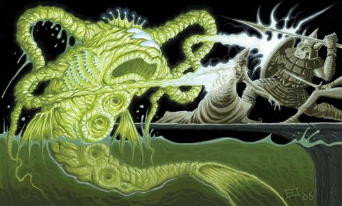
I'm also writing an angry letter to the editor about the fact that chinese wage slaves can't even spell "Kuo-toa" properly. Preposterous!
Vaarna_Aarne
Notorious Internet Vandal
One problem with that though would be that DnD is not realistic. Like, at all.I do wish D&D would go back to a more realistic looking art style.
Excidium
P. banal
So what? It's not because it's heroic fantasy that it needs to look retarded with spikes and sharp angles everywhere.One problem with that though would be that DnD is not realistic. Like, at all.I do wish D&D would go back to a more realistic looking art style.
Just don't hire Wayne Reynolds.
Vaarna_Aarne
Notorious Internet Vandal
Not heroic fantasy. Sky high fantasy. You'd look more silly trying to be gritty and realistic in the art style when any sufficiently high level Fighter is basically Kenshiro with a sharp implement instead of a fist (a Monk is just Kenshiro).So what? It's not because it's heroic fantasy that it needs to look retarded with spikes and sharp angles everywhere.One problem with that though would be that DnD is not realistic. Like, at all.I do wish D&D would go back to a more realistic looking art style.
Just don't hire Wayne Reynolds.
Excidium
P. banal
Not really. At the very least it wouldn't hurt my eyes.
Brzęczyszczykiewicz
Arcane
- Joined
- Oct 13, 2012
- Messages
- 1,205


3E had good art as well.

3E had good art as well.
Not so much 3E. The Forgotten Realms Campaign material, mostly the early stuff. That piece in particular is cool as all fuck. Straight out of Icewind Dale art
Szass Tam in his FR Campaign Setting rendition is the best Tam ever:
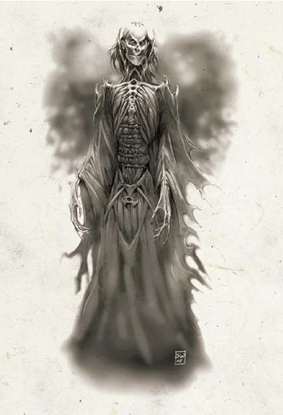
Also:
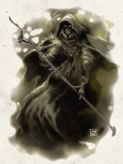
Anything Sweet does is fucking sweet.
Man, I'm jealous of his skills.
Man, I'm jealous of his skills.
Did someone say old school? I didn't see these posted, though my browser couldn't load every pic:


And some newer Erol Otus:
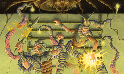


And some newer Erol Otus:


Don't get why people are complaining. That art is cool and actually some genuinely original fantasy art. We've been used to FIST-BIGGER-THAN-HEAD WoW art style for so long now I welcome any change. For every point where Pathfinder is great, its art style was the most shitty in any D&D iteration yet.
I don't want Pathfinder, but I don't want this either, God no.
I want a new Clyde Cadwell or Jeff Easley.
nikolokolus
Arcane
- Joined
- May 8, 2013
- Messages
- 4,090
If you want good looking art in modern PnP games, Goodman Games has nailed old-school aesthetics without being slavish to the past. Anything by Doug Kovacs is incline.Don't get why people are complaining. That art is cool and actually some genuinely original fantasy art. We've been used to FIST-BIGGER-THAN-HEAD WoW art style for so long now I welcome any change. For every point where Pathfinder is great, its art style was the most shitty in any D&D iteration yet.
I don't want Pathfinder, but I don't want this either, God no.
I want a new Clyde Cadwell or Jeff Easley.
The guy who work on DCC? DCC art definitely feels very oldschool, even hearkening back to Erol Otus.
Stuff like this is painfully underrated:


nikolokolus
Arcane
- Joined
- May 8, 2013
- Messages
- 4,090
Yeah, DCC RPG. The one on top is by Peter Mullen, Kovacs is on the bottom. Most of the guys in their stable have that Erol Otus/Trampier vibe.


![Glory to Codexia! [2012] Codex 2012](/forums/smiles/campaign_tags/campaign_slushfund2012.png)

![The Year of Incline [2014] Codex 2014](/forums/smiles/campaign_tags/campaign_incline2014.png)


