Great!
I wonder if it is actually DRM-free.
It seems to run fine without being logged in the client, from my experience.
Hopefully I can still run it after erasing the EPIC client, as I don't intend on becoming a customer of them any time soon.
Great!
Great!
I wonder if it is actually DRM-free.
It seems to run fine without being logged in the client, from my experience.
Hopefully I can still run it after erasing the EPIC client, as I don't intend on becoming a customer of them any time soon.
Wow, I was really excited to play this and I boot it up and it has... SNES graphics. This game was made in the 2010s. WHY DOES IT HAVE RETRO STYLE GRAPHICS!? FUCK. OFFFFFFF.
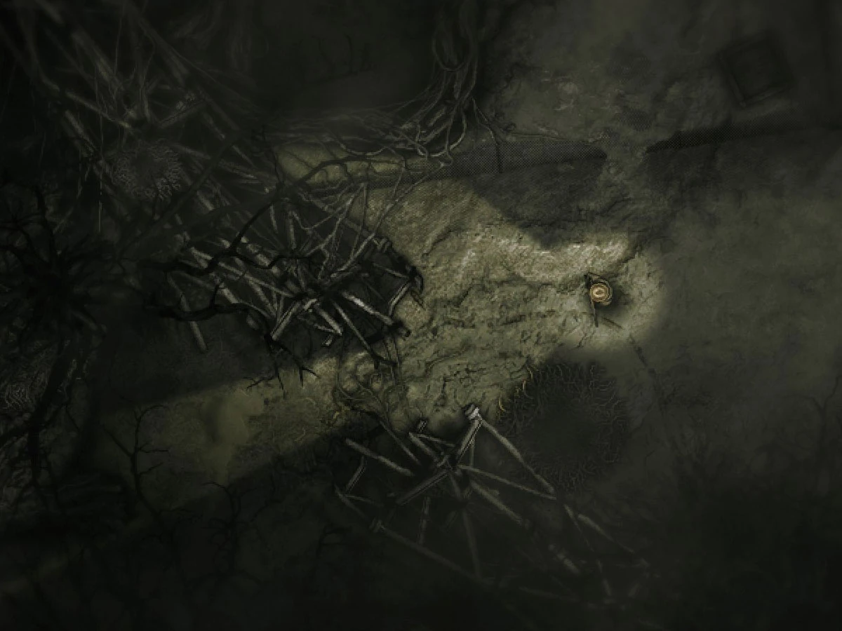


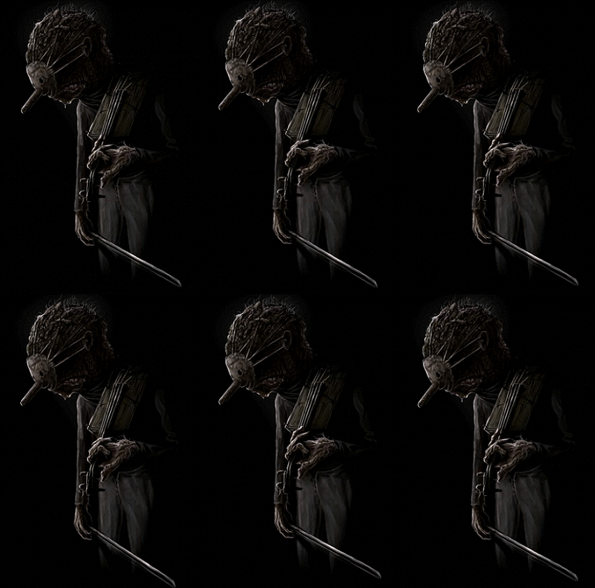
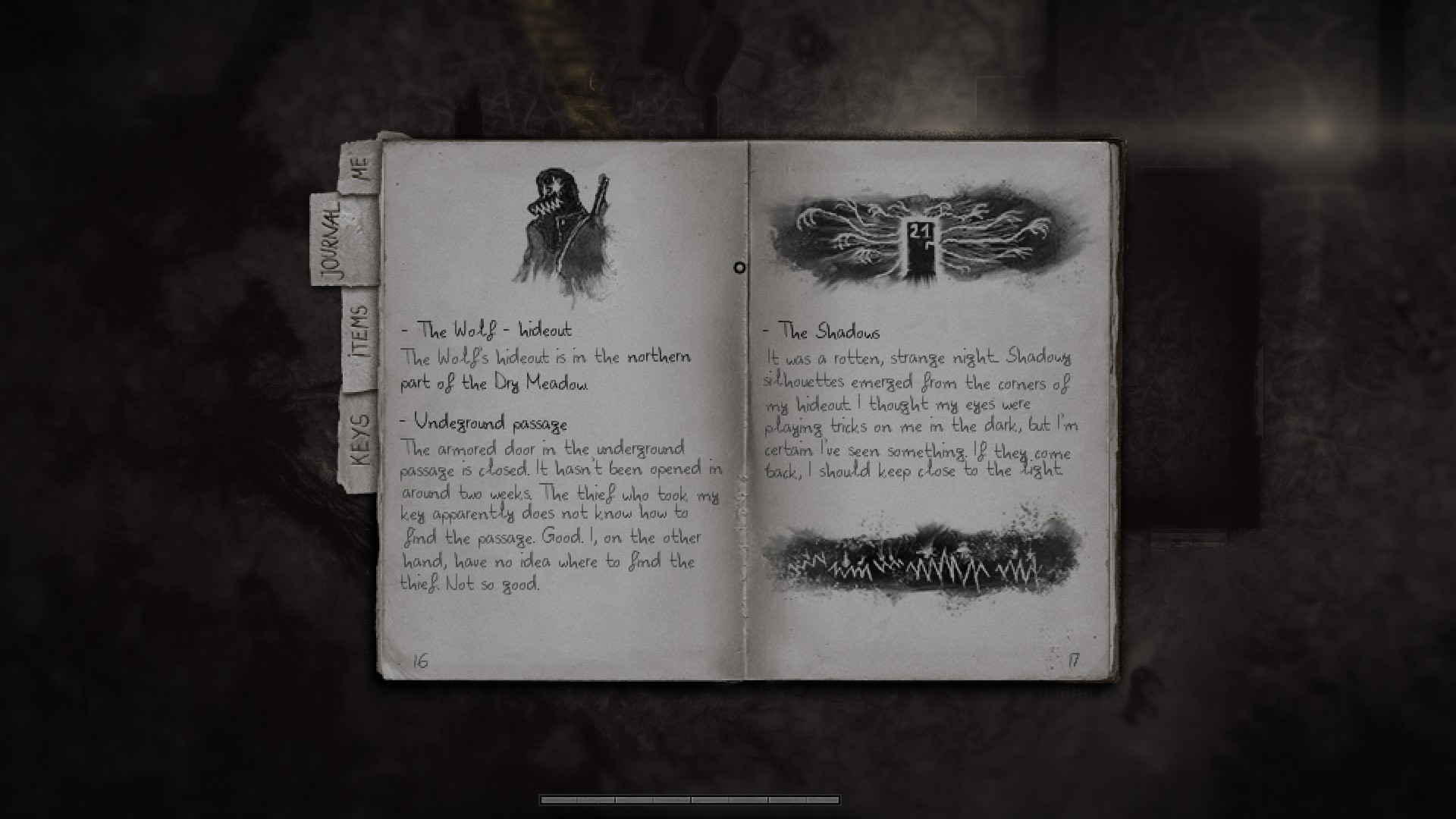

The game generally gets worse (more repetitive and tedious) over time. I would still play a bit of the first area before quitting. It's definitely not worth playing to completion, though.Is Darkwood worth getting into once you get past the beginning of the game?
There's no denying that the terrain looks pretty good, I agree there.Damn graphics whore degenerates. The irony is the game actually does look very nice w/ solid art direction and is probably one of the best-looking top-down 2D games ever made.
Darkwood is literally one of the top ten games of the decline era, and unique in that it is a completely genuine game with zero modern day decline present. Zero. The retardation I tell ya:


You're being a massive bitch right now, I can smell your menstruation from here. Instead of writing all this whining about a character that has 8.5/10 animation (well-above acceptable) and how you think it should be 10/10 that "draws your attention" cause you want to suck his pixelated dick off like Flamboyant Light Drifter, you should go play the game. It's not a problem at all. The visuals are great and your self-insert should never be drawing your attention perhaps the same way as a game that relies on character animation, this is man vs wild; it's everything else that you should be focusing on. You never even need to look at him in detail as his animations are pretty much never used as gameplay cues. But there's nothing even wrong with his anim quality anyway. We've gone from shitty snes graphics to only the MC is bad. What silly nonsense is next?
Seriously, games should be all about the main character IMO

Jesus, you even like a mediocre action platformer that was made by a woman. Most of the other action platformers on the system were notably better. Knew you were a bitch.
Seriously, games should be all about the main character IMO
OK you are FOR SURE a woman. That or a sissy.
Also RIP games with self-insert characters, such as many horror games, racing, FPS and RPGs.
You like Uncharted too, don't you bitch?PS > Amy Hennig has bigger nuts than you.
Excellent insight there. Participation award for you, faggot.
You like Uncharted too, don't you bitch?PS > Amy Hennig has bigger nuts than you.


Mating rituals of the autistic folk.I don't know what's going on in this thread
Mating rituals of the autistic folk.I don't know what's going on in this thread
If Dorkwank is so good why haven't I even bothered to pay one second of attention to the idea of it potentially being interesting to think about considering the idea of possibly playing it for at least five seconds or so?
I meant I haven't even bothered to pay one second of attention to the idea of it potentially being interesting to think about considering the idea of possibly playing it for at least five seconds or so. And what I really mean by this is that Ash's constant shilling of this game gave me negative interest. So, like, stop that, Ash! Oh wait he can't read this because he's a crybaby ignorebitch.If Dorkwank is so good why haven't I even bothered to pay one second of attention to the idea of it potentially being interesting to think about considering the idea of possibly playing it for at least five seconds or so?
I am not even sure what you wanted this sentence to mean but the only thing it says to me is that you're a fucking retard.
Also, I couldn't possibly come up with the dumber reason to dismiss this game as "I cannot get immersed in main character animations!". Holy shit, this is some next level decline.
I'm always serious, always sincere, and never a shitster. Calm your tits BlunderbraMorenatsu is a le ironic furry hipsterfaggot who never says anything completely serious and sincere.
Ackshully my gimmick is to make zero-effort poasts shitting up threads when people are acting retarded or talking about inane shit. Do you poast inanity? Better watch out for the big bad wolf uwuHis whole gimmick is pretending to be retarded, except he's not really pretending.
Wow, I was really excited to play this and I boot it up and it has... SNES graphics. This game was made in the 2010s. WHY DOES IT HAVE RETRO STYLE GRAPHICS!? FUCK. OFFFFFFF.
I know, right?
Darkwood gets showered with praise, yet the graphics are about as good as Grand Theft Auto #1.
I played it for about 10 minutes, and the sound was cool (features a creepy echo effect), but the top-down graphics are total shit.


