Putting the 'role' back in role-playing games since 2002.
Donate to Codex
Good Old Games
  • Welcome to rpgcodex.net, a site dedicated to discussing computer based role-playing games in a free and open fashion. We're less strict than other forums, but please refer to the rules.

    "This message is awaiting moderator approval": All new users must pass through our moderation queue before they will be able to post normally. Until your account has "passed" your posts will only be visible to yourself (and moderators) until they are approved. Give us a week to get around to approving / deleting / ignoring your mundane opinion on crap before hassling us about it. Once you have passed the moderation period (think of it as a test), you will be able to post normally, just like all the other retards.

Game News DoubleBear Reveals Dead State GUI

sgc_meltdown

Arcane
Joined
May 8, 2003
Messages
6,000
I'm right handed.

Just very nostalgic for fallout/IE placement of textbox, full disclosure

I also prefer my stealth meters to be in the centre and clicky stuff all together on the right, similar to rts games I guess?

visual textual information on left, most clicked action stuff killing buttons in the centre with meters, nitty gritty on the right
 

Burning Bridges

Enviado de meu SM-G3502T usando Tapatalk
Joined
Apr 21, 2006
Messages
27,571
Location
Tampon Bay
I am also right handed. For some reason I would want the mercs on the left and the text box on the right.
 
Joined
Mar 13, 2012
Messages
3,438
Location
Lost Hills bunker
General Maxson
Dunno. Looks like a xcom clone and I haven't even played the original. Plus I heard here most xcom clones suck. The chances are this will suck, too. At least compared to the original. Could be interesting but it's something I would look at when it's released.

For an improved Starflight remake on the other hand...

That is a mistake you should definitely correct. You can get the original from Steam, it's like a gog dosbox version, and works flawlessly. It's a great game.
 

sgc_meltdown

Arcane
Joined
May 8, 2003
Messages
6,000
I am also right handed. For some reason I would want the mercs on the left and the text box on the right.

Purely preference here as far as I can tell though I must say that my version has all the command buttons consolidated together, the original has the dialog in between the menu and map stuff

in other words info on the left business on the right
 

Morkar Left

Guest
That is a mistake you should definitely correct. You can get the original from Steam, it's like a gog dosbox version, and works flawlessly. It's a great game.

I don't know but it never really grapped my attention. Maybe it's because I think the setting is silly unrealistic, especially for a strategic game.
And I will not use Steam.

But anyways, I'm not gonna backup more than three games and Dead State is the game to go for me here.
 
Joined
May 18, 2009
Messages
513
The Fallout GUI fit the aesthetic feel of the game, this GUI clashes with the theme of Dead State.
You probably have not been following the game too closely, but where Fallout combined the 1950s retro-futurism with the nuclear apocalypse theme, Dead State combines (for better or worse) school-related motifs (school being the main base of operations in the game) with those of the zombie apocalypse. It's rather clear that it's precisely this combination that is intended to give DS a special aesthetic feel. You may or may not like the idea, but it does make the game stand out -- and in this light, the UI certainly does not clash with the aesthetic theme. On the contrary, the visibility of the desk and the placement of individual components would seem to re-inforce the idea; it actually slightly favours aesthetic ambiance over usability. I can see room for improvement in balancing the two (preserving the school theme while enhancing readability), but other than that, it's fine.
 

Burning Bridges

Enviado de meu SM-G3502T usando Tapatalk
Joined
Apr 21, 2006
Messages
27,571
Location
Tampon Bay
Sure. all these games are still 1-2 years out, so back the ones you like most and see what happens in the meantime.
 

Morkar Left

Guest
Is it confirmed that you will only have three guys in your party? On the original gui there would be space for another one.
 

Surf Solar

cannot into womynz
Joined
Jan 8, 2011
Messages
8,837
I like the direction the DS UI is going, but I too would prefer a bar on the bottom like in the mocked up interface the bros posted here.
Also - more personal preference, but the UI, especially the Character screen, looks too "clean" to me. Ofcourse you don't have to go overboard with the grittines, but some grunge sprinkles here and there, a stain of questionable liquid on a paper and such wouldn't hurt to add, IMO. Hell, even my workplace looks more worn and torn and I am not even living in a goddamn zombie apocalypse ridden world. ;)

Also, yeah there is a bit too much screen estate wasted on the char screen.

The actual graphics look really nice though!

:thumbsup:
 

sgc_meltdown

Arcane
Joined
May 8, 2003
Messages
6,000
empty space

recent trend in game uis

probably have to do with minimalism in favor of more gameworld feedback and immersion, i.e. rendering for the whole screen instead of the top 80%

you can't get away from that immersion thing these days

and yes I did not like AoD's new ui center pad, who cares if I'm not using the whole screen for the damn game, if you do that then the interface is actively blocking shit in the gameworld whereas for our example...it isn't. Fuck anyone who thinks it's ugly or clunky.
 
Joined
Mar 13, 2012
Messages
3,438
Location
Lost Hills bunker
That is a mistake you should definitely correct. You can get the original from Steam, it's like a gog dosbox version, and works flawlessly. It's a great game.

I don't know but it never really grapped my attention. Maybe it's because I think the setting is silly unrealistic, especially for a strategic game.
And I will not use Steam.

But anyways, I'm not gonna backup more than three games and Dead State is the game to go for me here.

The games, once downloaded, work independently from Steam.
 

sgc_meltdown

Arcane
Joined
May 8, 2003
Messages
6,000
7c5fa6fa.jpg

if you want to push things further I guess the perk section can be shrank down so the info box at the bottom center can fit in seamlessly and free up the entire right half, perhaps for a highly detailed spinning inventory item graphic or similar
 

mindx2

Codex Roaming East Coast Reporter
Patron
Joined
Feb 22, 2006
Messages
4,534
Location
Perusing his PC Museum shelves.
Codex 2012 PC RPG Website of the Year, 2015 Codex 2016 - The Age of Grimoire RPG Wokedex Serpent in the Staglands Divinity: Original Sin Project: Eternity Torment: Tides of Numenera Wasteland 2 Shadorwun: Hong Kong Divinity: Original Sin 2 BattleTech Pathfinder: Wrath I'm very into cock and ball torture I helped put crap in Monomyth
yeah, I was going to say move the end turn button to the right as the human eye drifts from the upper left to the lower right, there's a reason why that button is always placed there

here is my mod of phantasmal's already rad UI mockup

2ad028a5.jpg

I personally prefer the original version. Must be an issue with brain hemispheres.
Are you left handed?

I like this look a lot more. I don't want to have to look all over the screen to find the info I need. A nice clean look from left to right at the bottom with the noise meter in the center is the way to go. I also like the contrast in colors with this one. Double Bear's original one is just too scattered and the colors too bland/ washed out.
 
Joined
Apr 2, 2010
Messages
7,428
Location
Villainville
MCA
I like the notebook paper style of the UI but I agree, I don't want that MMO influenced clutterfuck all over the screen. All of them neatly packed in one edge is just neat.

Also, if a gunfight breaks out between you and other survivors out there, how the fuck will it work? There will be cars and debris around that you won't be able to use for cover, unless standing still behind one counts. Will there even be running and stamina management? Will we get to scavenge buildings tile by tile for the real deal or will we get an abstraction interface?

I have faith in Annie & Brian for delivering quality writing, narrative and whatnot but at this point, honestly I don't have much faith in their ability of delivering a solid Zombie game that's a game before everything else. I'm concerned that it will be a little more than a visual novel /adventure with management and some running around. A zombie mod for AoD. Their whole approach to the genre from a gaming context strikes me as seriously lacking (apart from stuff they have to settle with due to lack of resources).

Nonetheless, I will support the project. A world with a flawed and lacking zombie game with good writing and story is still a much better one than one without.
 

Kenneybounces

Novice
Joined
Aug 8, 2006
Messages
21
Whoa. Good work Brian & Annie. (what's with the A&B... B&A needs love too.)

I thought you guys went vapor a while back cause you were so silent.. it's great to see some screenies coming up. :) Keep at it!
 

EG

Nullified
Joined
Oct 12, 2011
Messages
4,264
Clearly, they stole their GUI from Rebuild 2. :troll:

Do they plan to dirtify them there purdy textures a bit?
 

Burning Bridges

Enviado de meu SM-G3502T usando Tapatalk
Joined
Apr 21, 2006
Messages
27,571
Location
Tampon Bay
Also, if a gunfight breaks out between you and other survivors out there, how the fuck will it work? There will be cars and debris around that you won't be able to use for cover, unless standing still behind one counts.

One of the biggest problems for sure. It would be great of they reconsider world / item interaction, cover etc, and not go AoD style.

But that will only work if they can extend the engine in that direction. Under the condition that they get substantial money, I'd really like them to extend their original idea of the engine. There's still only a handful of games coming and instead of medium complexity games (that will probably be made all the same), I'd really love every single one to pull all stops out and make a first rate game. Always under the condition that they feel comfortable they can finish them of course.

I would also like to hear more who's in the team. All I know is Annie and Brian, two first class writers for sure. If someone can provide more info, I would brofist.
 

sgc_meltdown

Arcane
Joined
May 8, 2003
Messages
6,000
"DoubleBear Reveals Dead State GUI, gets both interface screenshots denounced and reconstructed by rpgcodex, the site also repeating request for quality human on human combat on top of theoretical quality human on zombie combat. Preview took multiple hits to ass and leg, yelling as it fell.'


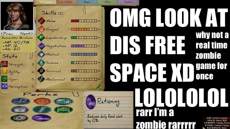
oh and here's an idea for the character screen/management gui: make it a repurposed fictional p&p character sheet from the gameworld

so you get a photograph stapled or paperclipped on where character art would be, printed titles, lines and boxes as you would, plus handwriting for specifics
 

Metro

Arcane
Beg Auditor
Joined
Aug 27, 2009
Messages
27,792
It's like in Fallout when if you shoot someone in the eyes with a gun for a critical hit they'll still come at you~
 

As an Amazon Associate, rpgcodex.net earns from qualifying purchases.
Back
Top Bottom