Putting the 'role' back in role-playing games since 2002.
Donate to Codex
Good Old Games
  • Welcome to rpgcodex.net, a site dedicated to discussing computer based role-playing games in a free and open fashion. We're less strict than other forums, but please refer to the rules.

    "This message is awaiting moderator approval": All new users must pass through our moderation queue before they will be able to post normally. Until your account has "passed" your posts will only be visible to yourself (and moderators) until they are approved. Give us a week to get around to approving / deleting / ignoring your mundane opinion on crap before hassling us about it. Once you have passed the moderation period (think of it as a test), you will be able to post normally, just like all the other retards.

Game News DoubleBear Reveals Dead State GUI

sgc_meltdown

Arcane
Joined
May 8, 2003
Messages
6,000
Wait, there are no cover mechanics in this game?

man, that's how you balance Perception in SPECIAL, make it so that it affects your chance of being interrupted by overwatch if firing from behind cover, stat based popamole checks hell yes

come at you~

does dungeon of dredmor have cover mechanics

what do you say to that huh
 

chewie

Educated
Joined
Aug 15, 2008
Messages
68
Location
Berlin, Germany
Cover mechanics are horrible anyway, unless you mean like in Silent Storm where it traces bullets to the target and if it strikes something first it becomes a miss or a reduced damage hit. Since it's a 3D engine I think it is possible. If so that would be great.

How about rolling a die per cell with a cover value? Still horrible?
 
Self-Ejected

Excidium

P. banal
Joined
Aug 14, 2009
Messages
13,696
Location
Third World
Cover mechanics are horrible anyway, unless you mean like in Silent Storm where it traces bullets to the target and if it strikes something first it becomes a miss or a reduced damage hit. Since it's a 3D engine I think it is possible. If so that would be great.
yes, I mean something in that vein. Basically, all objects should have different armor and HP values or whatever, nothing too complex but just the logical stuff (sand bags protect more than dinner tables, etc). Then If the target of an attack is behind cover, the object takes the damage instead. Damage that exceeds what the cover can absorb, goes through it.

Or whatever, I don't know. Just don't release an RPG where people just stand in front of each other slowly chipping their hit points with machine guns.
 

Roguey

Codex Staff
Staff Member
Sawyerite
Joined
May 29, 2010
Messages
36,693
I have faith in Annie & Brian for delivering quality writing, narrative and whatnot
Heh. Have another AP anecdote:
One level I worked on for AP that didn’t make the game was Halbech Rome. It was supposed to be the European HQ of the megacorp Halbech, and in the original draft of the script, Mike Thorton was working there undercover at the start of the game. I can’t recall why the player returns, as this was not just a cutscene level, but also a gameplay level.
...
What eventually killed this level was the story re-write. When the story was redrafted and the four hubs, Saudi, Rome, Moscow, Taipei, were reassigned to new designers, all the existing levels were reassigned too. Almost like a sports draft. I can’t speak for anyone else as to why they passed on this level, but I personally passed on it because it’s set in a high rise, with other high-rises visible from all the windows. The skyline is generic, but looks something like Hong Kong. Despite the fact that this level had originally been intended to go into Rome, no one on the team had ever actually been to Rome. If they had, they could have pointed out something interesting about the Roman skyline:

...that it's basically unchanged since Ezio was there.

So yeah, no skyscrapers, no real high-rises. Definitely not the neon lit futurescape that surrounded Halbech Rome. Even Milan, the nearest match I could find, looks nothing like whatever is outside the window of Leland’s office. This is an important lesson to designers and artists. A designer is responsible for making sure that locations and events look right and feel natural. Don’t make assumptions about what a place looks like or how a gadget works- do some research. That goes for artists too, don’t be afraid to raise your hand when design isn’t doing it’s job. I’ve known artists that had internalized a kind of inferiority complex vis a vis the designer/artist relationship. The artist does not work for the designer or vice versa, you work together to create awesome stuff. If a designer hands you something that doesn’t pass the smell test, say something. Similarly, designers, double check what the artists make and don’t be afraid to ask for revisions.

Add "does not do research" to their growing crimes against writing. :M
 
Joined
Apr 2, 2010
Messages
7,428
Location
Villainville
MCA
Cover mechanics are horrible anyway, unless you mean like in Silent Storm where it traces bullets to the target and if it strikes something first it becomes a miss or a reduced damage hit. Since it's a 3D engine I think it is possible. If so that would be great.
yes, I mean something in that vein. Basically, all objects should have different armor and HP values or whatever, nothing too complex but just the logical stuff (sand bags protect more than dinner tables, etc). Then If the target of an attack is behind cover, the object takes the damage instead. Damage that exceeds what the cover can absorb, goes through it.

This would be poor design. Staying behind cover = magical shield from where you can shoot safely until you run out of mana.
 

JoKa

Cipher
Joined
Nov 22, 2006
Messages
689
Location
Nordland
7c5fa6fa.jpg

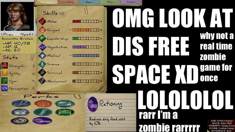
if you want to push things further I guess the perk section can be shrank down so the info box at the bottom center can fit in seamlessly and free up the entire right half, perhaps for a highly detailed spinning inventory item graphic or similar
kurz-gelacht_gross.jpg
 
Self-Ejected

Excidium

P. banal
Joined
Aug 14, 2009
Messages
13,696
Location
Third World
Cover mechanics are horrible anyway, unless you mean like in Silent Storm where it traces bullets to the target and if it strikes something first it becomes a miss or a reduced damage hit. Since it's a 3D engine I think it is possible. If so that would be great.
yes, I mean something in that vein. Basically, all objects should have different armor and HP values or whatever, nothing too complex but just the logical stuff (sand bags protect more than dinner tables, etc). Then If the target of an attack is behind cover, the object takes the damage instead. Damage that exceeds what the cover can absorb, goes through it.

This would be poor design. Staying behind cover = magical shield from where you can shoot safely until you run out of mana.
No. Staying behind cover = what any sensible person does in a firefight.

But I understand what you mean, if this game works like Fallout where everyone is borderline impervious to bullets, cover mechanics wouldn't add anything to the game. But I'd kinda expect a more realistic model from a game like this.
 

Zed

Codex Staff
Patron
Staff Member
Joined
Oct 21, 2002
Messages
17,068
Codex USB, 2014
I don't like "equip in inventory". That's for JRPGs and console games. I want a character/avatar paper doll!

EDIT: err, what I mean is, I want a paper doll thingy to show what's equipped, rather than outlining an object in the inventory container.
 

A user named cat

Guest
Temple of Elemental Evil = JRPG console game?

Paper doll would be better but I'm not a graphic artist. Just using what's out there.
 

Lumpy

Arcane
Joined
Sep 11, 2005
Messages
8,525
Yes. The images shown were the UI as it will be at release. Got ya.

:hearnoevil:
So, this GUI looks nothing like the final version - okay, why post it then? And since a Kickstarter is coming, doesn't it make a lot of sense to criticize any aesthetical issues, since that's going to be one of the key points the game is judged on?

Anyway, this GUI looks like crap. I was going to say that they should get the AoD guy to design their GUI, but problem is they've already got the AoD guy so I dunno... pay him better?
 

OSK

Arcane
Patron
Joined
Jan 24, 2007
Messages
8,115
Codex 2012 Codex 2013 Codex 2014 PC RPG Website of the Year, 2015 Codex 2016 - The Age of Grimoire Make the Codex Great Again! Serpent in the Staglands Dead State Divinity: Original Sin Project: Eternity Torment: Tides of Numenera Wasteland 2 Shadorwun: Hong Kong Divinity: Original Sin 2 BattleTech Pillars of Eternity 2: Deadfire
Why are so many people complaining about how "clean" it looks? I thought this game is going to take place shortly after a zombie outbreak. It's not like a city is going to turn into Junktown overnight.

Also, I don't think I can spot a single, actual classroom on the first floor of that school.
 

EG

Nullified
Joined
Oct 12, 2011
Messages
4,264
Why are so many people complaining about how "clean" it looks? I thought this game is going to take place shortly after a zombie outbreak. It's not like a city is going to turn into Junktown overnight.

Also, I don't think I can spot a single, actual classroom on the first floor of that school.

My town is plenty dirty . . . and there isn't even a horde of zombies shuffling about. (I was not entirely serious in the critique. It's a game -- it gets away with being less real than real life by its very nature.)
 

ironyuri

Guest
The Fallout GUI fit the aesthetic feel of the game, this GUI clashes with the theme of Dead State.
You probably have not been following the game too closely, but where Fallout combined the 1950s retro-futurism with the nuclear apocalypse theme, Dead State combines (for better or worse) school-related motifs (school being the main base of operations in the game) with those of the zombie apocalypse. It's rather clear that it's precisely this combination that is intended to give DS a special aesthetic feel. You may or may not like the idea, but it does make the game stand out -- and in this light, the UI certainly does not clash with the aesthetic theme. On the contrary, the visibility of the desk and the placement of individual components would seem to re-inforce the idea; it actually slightly favours aesthetic ambiance over usability. I can see room for improvement in balancing the two (preserving the school theme while enhancing readability), but other than that, it's fine.

My dear Marquess, you're right about the school feel. My criticism was that it looks sloppy-
the icon superimposed on the index card is a good example. It looks like they've got
a background which is photographic, but with animated icons superimposed which do
not look like they belong. The Fallout pipboy drawings were drawn onto little cards
but they were made to "fit", here the superimposition of the icon (over the red
border of the index card no less) just looks like a sticker that's been slapped on
top of a photograph.

I like the school aesthetic, but as Surf Solar says:


I like the direction the DS UI is going, but I too would prefer a bar on the bottom like in the mocked up interface the bros posted here.
Also - more personal preference, but the UI, especially the Character screen, looks too "clean" to me. Ofcourse you don't have to go overboard with the grittines, but some grunge sprinkles here and there, a stain of questionable liquid on a paper and such wouldn't hurt to add, IMO. Hell, even my workplace looks more worn and torn and I am not even living in a goddamn zombie apocalypse ridden world.;)

-25/10 obvious troll is obvious, what do you mean you have a
personal preference and that they need to add grittiness?

How dare you?
 

Kos_Koa

Iron Tower Studio
Developer
Joined
Feb 12, 2006
Messages
315
I'm the artist that did the DS UI and I just wanted to let you all know that you suck and are stupid.

I also wanted to mention that the mock-ups that are being posted aren't considering different aspect ratios. An interface has to be clear on a 4:3 to a 12:9 (Edit: 16:9 herp derp) ratio, which is why certain design decision have to be made. You can critique the artwork itself, I have no issues with that, but the layout was designed for a reason. About the grittiness issue, personally I don't think that two/three weeks of neglect would turn everything grimdark, but maybe I can downplay the cartooniness a bit. Even though most of you clearly don't know what you are talking about, your feedback and input is appreciated. ;)

ironyuri said:
here the superimposition of the icon (over the red
border of the index card no less) just looks like a sticker that's been slapped on
top of a photograph.
It's a sticker, that's the idea.
 
Joined
Apr 2, 2010
Messages
7,428
Location
Villainville
MCA
Oh geez, people dare find something to criticize? They obviously have no idea what we're talking about. Fuck your smelly hot air of authority, the lay out is SHIT. As usual, JA2 to the rescue:

gsr8M.jpg


JsKO2.jpg


It looks like whatever bullshit made-up reason you have for the layout, a game from 1998 clearly didn't need it. Fucking smelly snake oil salesman.
 

EG

Nullified
Joined
Oct 12, 2011
Messages
4,264
It's okay as it is currently, though. It's KotOR, with a couple . . . random orphaned buttons on the right and left.
 

Kos_Koa

Iron Tower Studio
Developer
Joined
Feb 12, 2006
Messages
315
Oh geez, people dare find something to criticize? They obviously have no idea what we're talking about. Fuck your smelly hot air of authority, the lay out is SHIT. As usual, JA2 to the rescue:
Yeah, and it plays great in widescreen.

It looks like whatever bullshit made-up reason you have for the layout, a game from 1998 clearly didn't need it. Fucking smelly snake oil salesman.
:hmmm:
 

JoKa

Cipher
Joined
Nov 22, 2006
Messages
689
Location
Nordland
kurz-gelacht_gross.jpg

I hope that's your way of saying that I have wrought order from chaos or we are going to be forum enemies sir

what are those red things anyway

Your pic just reminded me of this art form of ordering things. And those red things are carrot pieces. Maybe not the best pic but it was the first one i could find with both the original and the 'ordered form' on the same pic. Carry on, good sirs.
 

As an Amazon Associate, rpgcodex.net earns from qualifying purchases.
Back
Top Bottom