-
Welcome to rpgcodex.net, a site dedicated to discussing computer based role-playing games in a free and open fashion. We're less strict than other forums, but please refer to the rules.
"This message is awaiting moderator approval": All new users must pass through our moderation queue before they will be able to post normally. Until your account has "passed" your posts will only be visible to yourself (and moderators) until they are approved. Give us a week to get around to approving / deleting / ignoring your mundane opinion on crap before hassling us about it. Once you have passed the moderation period (think of it as a test), you will be able to post normally, just like all the other retards.
You are using an out of date browser. It may not display this or other websites correctly.
You should upgrade or use an alternative browser.
You should upgrade or use an alternative browser.
KickStarter Mechajammer (formerly Copper Dreams) - cyberpunk RPG from Whalenought Studios
- Thread starter Infinitron
- Start date
grimace
Arcane
- Joined
- Jan 17, 2015
- Messages
- 2,105
we can't run when our number's up
the codex used to send supplies
now it just sends people
we better round ourselves up and ship off to Calitana
notoriously the least enjoyable to live in
second only to the codex
- Joined
- Jan 28, 2011
- Messages
- 100,125


http://whalenoughtstudios.com/community/forums/topic/copper-dreams-character-creation-mockup/
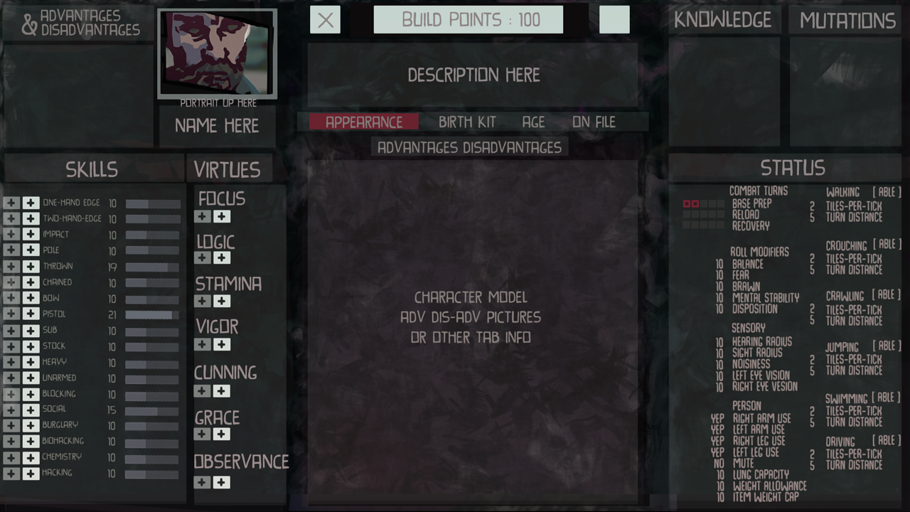

We’re hoping to get an early version of character creation in when we start beta testing the game soon, and we got to mocking up a wireframe with some random art to start getting ideas:
It’s similar to the layout of the character sheet, as familiarity between UX is always a good idea. However with a single panel like this, tabs are needed to go through all the options you have building your character: appearance, birth kit, age, on-file, and advantage/disadvantages, as well as all their info or pictures to go with them. Tabs are efficient, but are about as fun as a fax machine to think about using.
You create your character pretty much immediately. The Dungeon Master tells you that you’ve been picked up for some trivial crime to be shipped off, and it opens with your character silhouetted in a restraint-bag hanging from a ceiling-conveyer belt network, bobbing through some rooms until halting in a comfortable looking office where an emigration officer hails you and starts taking your information for deportation.
What we thought would be a bit more interactive with this was transitioning to an overhead shot of the ‘desk’ between the two of you and using modular panels you can drag around to represent the different pieces of paper on a desk in front of you. These would stack and overlap, and you could arrange it anyway you want.
We previously had this system setup with character inventory bags at one point, and can repurpose it for this for testing. We really like the idea of making it seem more physical — like creating a p&p character, minus having a pen to doodle around the edges, which, maybe we should also add in that case [Hannah edit: no]. Thematically for the feels of the game — this is a dystopian, cyberpunk world that is analog, a future without internet or touchscreens. Being able to include that into interfaces where we can is an idea we like, and character creation would allow us to start off on the right foot.
We’ll hopefully get something like that running mid-month and show it off! Should be fun.
buffalo bill
Arcane
- Joined
- Dec 8, 2016
- Messages
- 1,072
http://whalenoughtstudios.com/community/forums/topic/copper-dreams-character-creation-mockup/
We’ll hopefully get something like that running mid-month and show it off!
Heretic
Arcane
- Joined
- Dec 1, 2015
- Messages
- 844
From colors, font, affordances, even frikkin text alignment, this game seems to strive to be as unusable, overwhelming and incomprehensive as possible.
This will be a text case for the decades to come in how NOT to design a visual interface.
I can point out several mistakes in each of the screenshots and I'm an amateur who just read a few books:
I'm not even talking about the graphics, where each square shows five things at once, not prioritizing them, again, low contrast everywhere, everything blurs together...
I also have my reservations about the useless innovation and confusing naming in "Virtues" and "Aptitudes" (aka Attributes and Skills - a long used terminology): Vigor vs Stamina, Cunning vs Grace? Why? What for?
What is "Stock", what is "Chained", what is "Sub"? How do attributes influence skills?
[Why] [is] [everything] [in] [square] [brackets] [?]
This is all one graphical mess.
A game where form trumps function, and the form is ugly.
This will be a text case for the decades to come in how NOT to design a visual interface.
I can point out several mistakes in each of the screenshots and I'm an amateur who just read a few books:
- Low contrast everywhere, in text as well as in line graphs
- All caps text is harder to read
- Font with chaotic letters - different baseline and skew for each letter
- Hard to read at a small size
- Missing max skill values
- Data shown before labels in the status pane
- Unclear buttons (dark gray vs light gray plus sign, what?)
- Information of unclear value - turn distance
- Information better presented on a paper doll (can use limbs)
- Centered Virtue names make scanning harder
I'm not even talking about the graphics, where each square shows five things at once, not prioritizing them, again, low contrast everywhere, everything blurs together...
I also have my reservations about the useless innovation and confusing naming in "Virtues" and "Aptitudes" (aka Attributes and Skills - a long used terminology): Vigor vs Stamina, Cunning vs Grace? Why? What for?
What is "Stock", what is "Chained", what is "Sub"? How do attributes influence skills?
[Why] [is] [everything] [in] [square] [brackets] [?]
This is all one graphical mess.
A game where form trumps function, and the form is ugly.
Last edited:
Deleted Member 16721
Guest
Looks fine to me.
buffalo bill
Arcane
- Joined
- Dec 8, 2016
- Messages
- 1,072
Maybe those are all theoretical flaws in a graphic design class on good contemporary videogame graphix & UI, but nothing in the actual picture presented is even slightly hard to read or ambiguous. Like, at all. It's clean and simple, no bs. Maybe worst problem is all the numbers will scare away casuals, but I see that as a positive.From colors, font, affordances, even frikkin text alignment, this game seems to strive to be as unusable, overwhelming and incomprehensive as possible.
This will be a text case for the decades to come in how NOT to design a visual interface.
I can point out several mistakes in each of the screenshots and I'm an amateur who just read a few books:
- Low contrast everywhere, in text as well as in line graphs
- All caps text is harder to read
- Font with chaotic letters - different baseline and skew for each letter
- Hard to read at a small size
- Missing max skill values
- Data shown before labels in the status pane
- Unclear buttons (dark gray vs light gray plus sign, what?)
- Information of unclear value - turn distance
- Information better presented on a paper doll (can use limbs)
- Centered Virtue names make scanning harder
I'm not even talking about the graphics, where each square shows five things at once, not prioritizing them, again, low contrast everywhere, everything blurs together...
I also have my reservations about the useless innovation and confusing naming in "Virtues" and "Aptitudes" (aka Attributes and Skills - a long used terminology): Vigor vs Stamina, Cunning vs Grace? Why? What for?
What is "Stock", what is "Chained", what is "Sub"? How do attributes influence skills?
[Why] [is] [everything] [in] [square] [brackets] [?]
This is all one graphical mess.
A game where form trumps function, and the form is ugly.
buffalo bill
Arcane
- Joined
- Dec 8, 2016
- Messages
- 1,072
Also, the only words in square brackets are tokens of the word "able" next to "walking", "crouching", "crawling", etc. You seriously can't understand why it might say that there?
Heretic
Arcane
- Joined
- Dec 1, 2015
- Messages
- 844
I am talking about all three screenshots shown this week:Also, the only words in square brackets are tokens of the word "able" next to "walking", "crouching", "crawling", etc. You seriously can't understand why it might say that there?
[+] [-] [X] [ABLE] [VIGOR 10] [LOGIC 4]
It is not clean and simple, at all.Maybe those are all theoretical flaws in a graphic design class on good contemporary videogame graphix & UI, but nothing in the actual picture presented is even slightly hard to read or ambiguous. Like, at all. It's clean and simple, no bs. Maybe worst problem is all the numbers will scare away casuals, but I see that as a positive.
Let me show you a few screenshots from games made by similar small teams.
This is the pinnacle: Clear sections, clear labels, active elements immediately recognizable, good use of screen estate. Text contrast could be a bit higher.
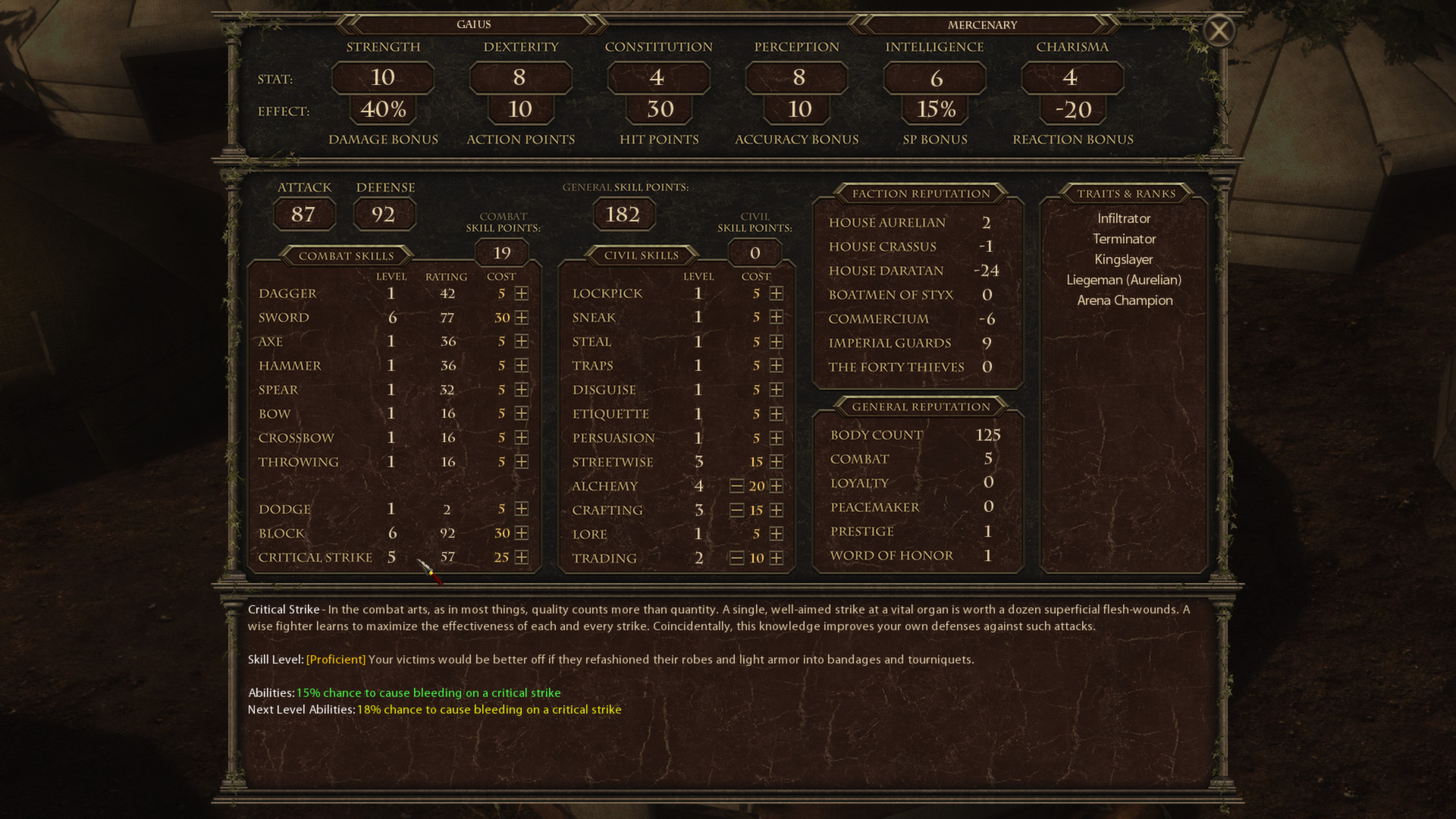
Next: Good readability (nice font and contrast), good sections, could use more screen estate and better text alignment of what is basically tabular data
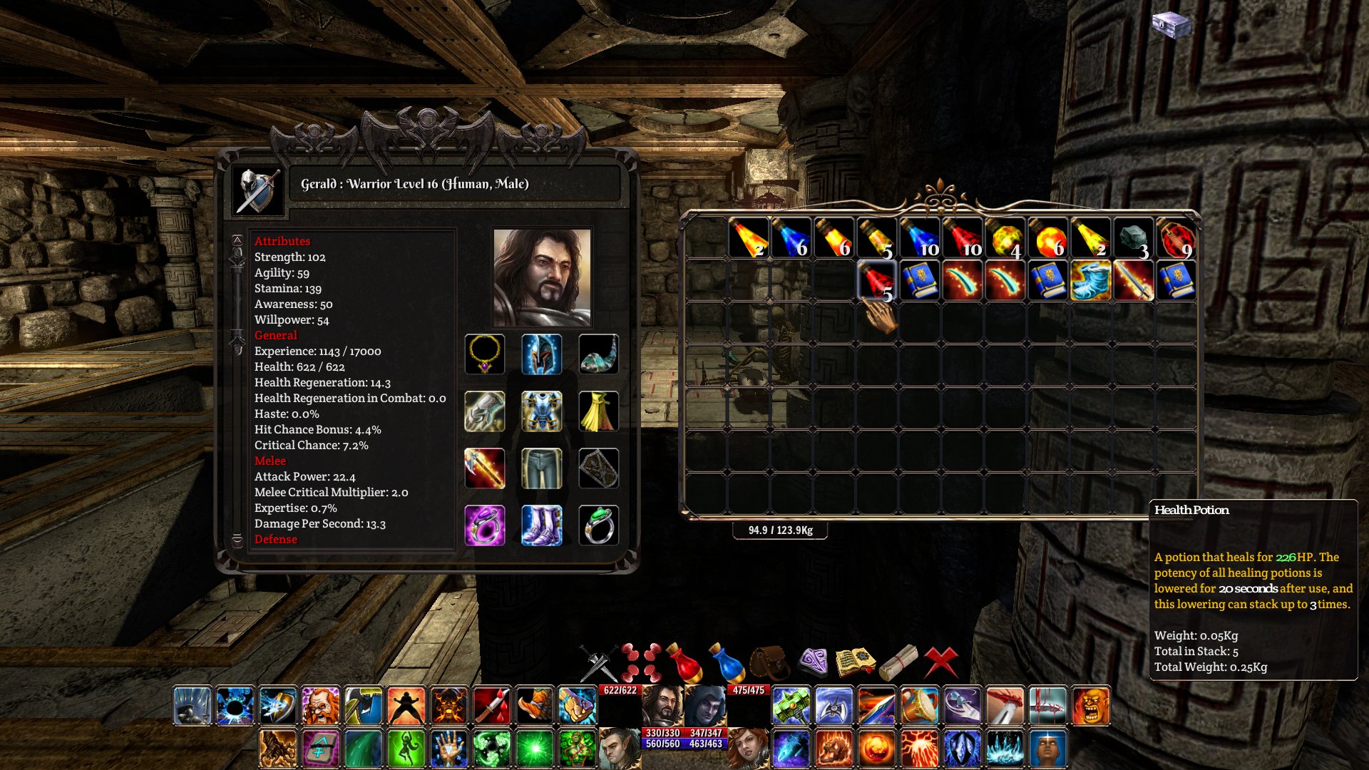
Created by just one man, looks like developer design: Good sections, nice readability although the contrast could be higher, could use better typography and not centering everything. Active elements ("Reset last levelup") should be clearer.
Still, overall well comprehensible
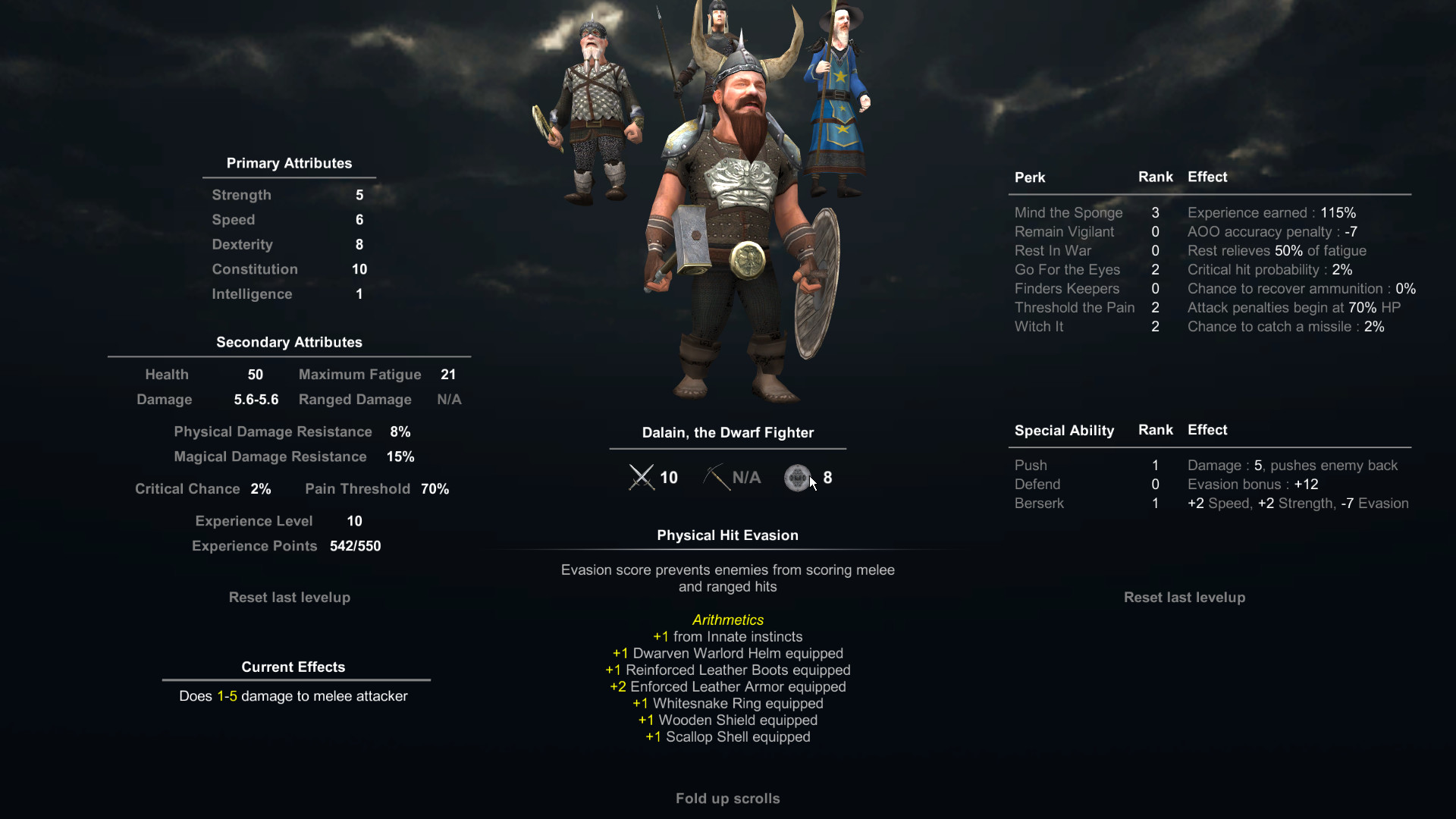
Going on, worse readability because of the font and the color, could use more screen estate instead of scrolling, but very nice display of tabular data, clear active elements (skill increase/decrease buttons) and informative sections.
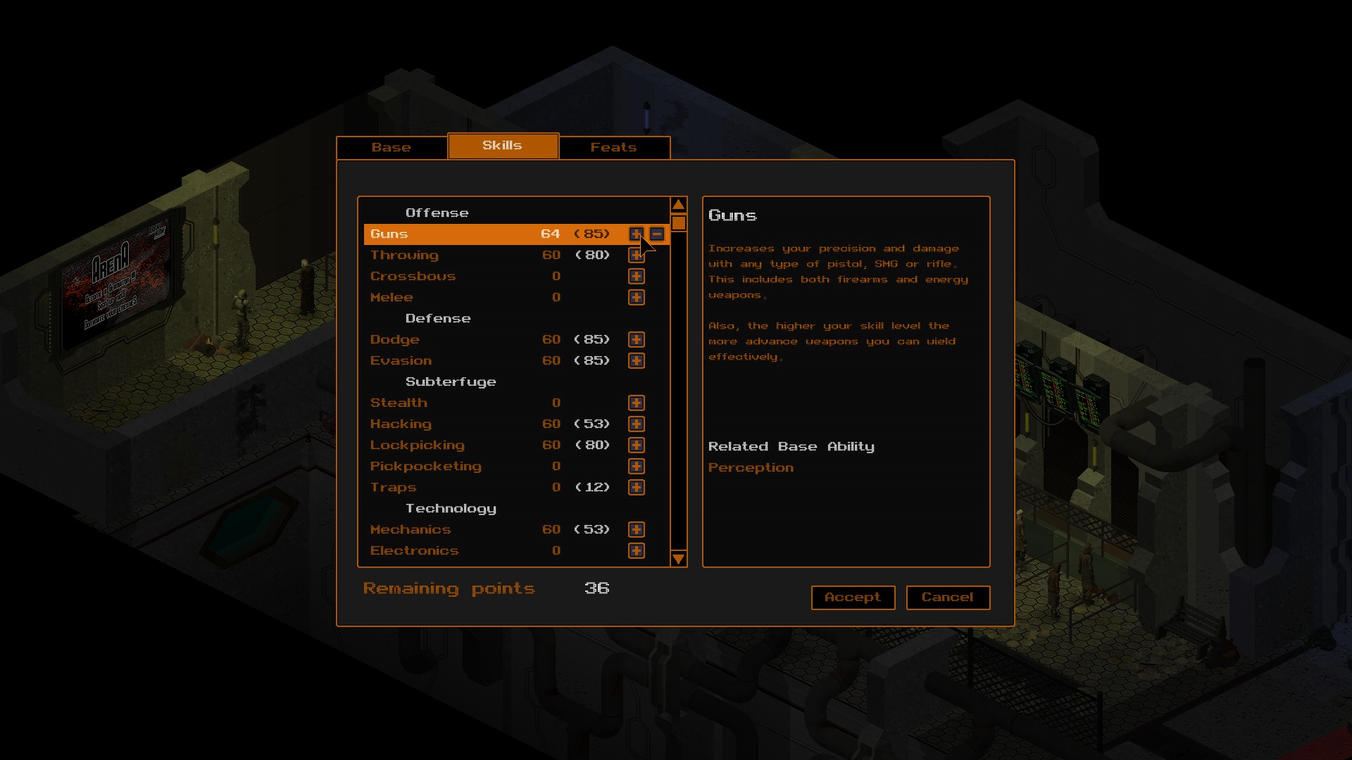
The perennial non-designer: Could use more screen estate, but great readability despite the decorative font, great alignment of labels and data, informative skill sections
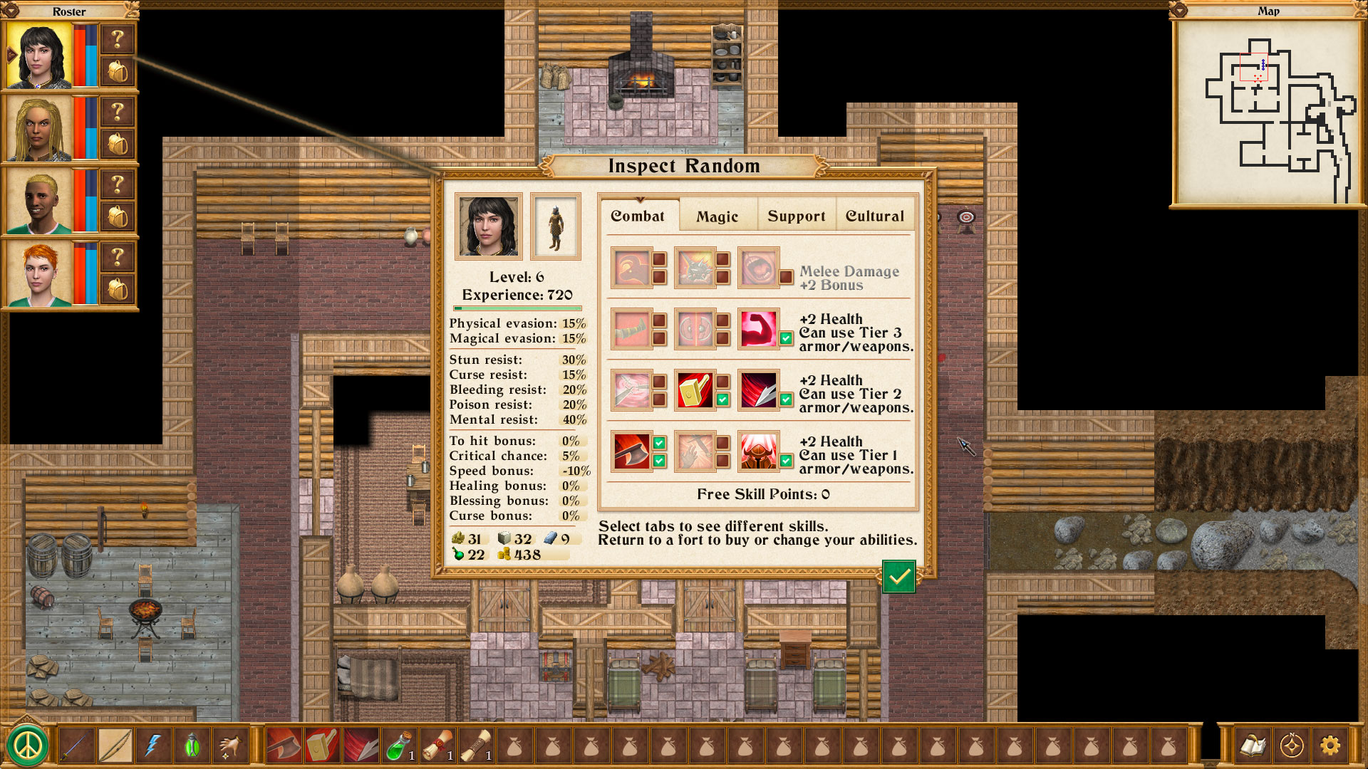

Created by just one man, looks like developer design: Good sections, nice readability although the contrast could be higher, could use better typography and not centering everything. Active elements ("Reset last levelup") should be clearer.
Still, overall well comprehensible

Going on, worse readability because of the font and the color, could use more screen estate instead of scrolling, but very nice display of tabular data, clear active elements (skill increase/decrease buttons) and informative sections.

The perennial non-designer: Could use more screen estate, but great readability despite the decorative font, great alignment of labels and data, informative skill sections

Now compare the abomination we're talking about
No sections, all skills mashed up together, unreadable font combined with all caps and low contrast colors, bad information hierarchy (Attributes aka Virtues are the most important, but not placed accordingly), bad naming (Virtues, Aptitudes, Sub, Stock, Chained)

I know this is just a mockup, but still: Again, bad font, low contrast, unclear information hierarchy, no skill sections, unclear active elements (What does the X next to the portrait do? Are the words "Appearance, Birth Kit, Age, On File" tab switches, dropdown toggles, labels...?)

Last edited:
Deleted Member 16721
Guest
Actually Copper Dreams is much better looking.
- Joined
- Jan 19, 2014
- Messages
- 14,349


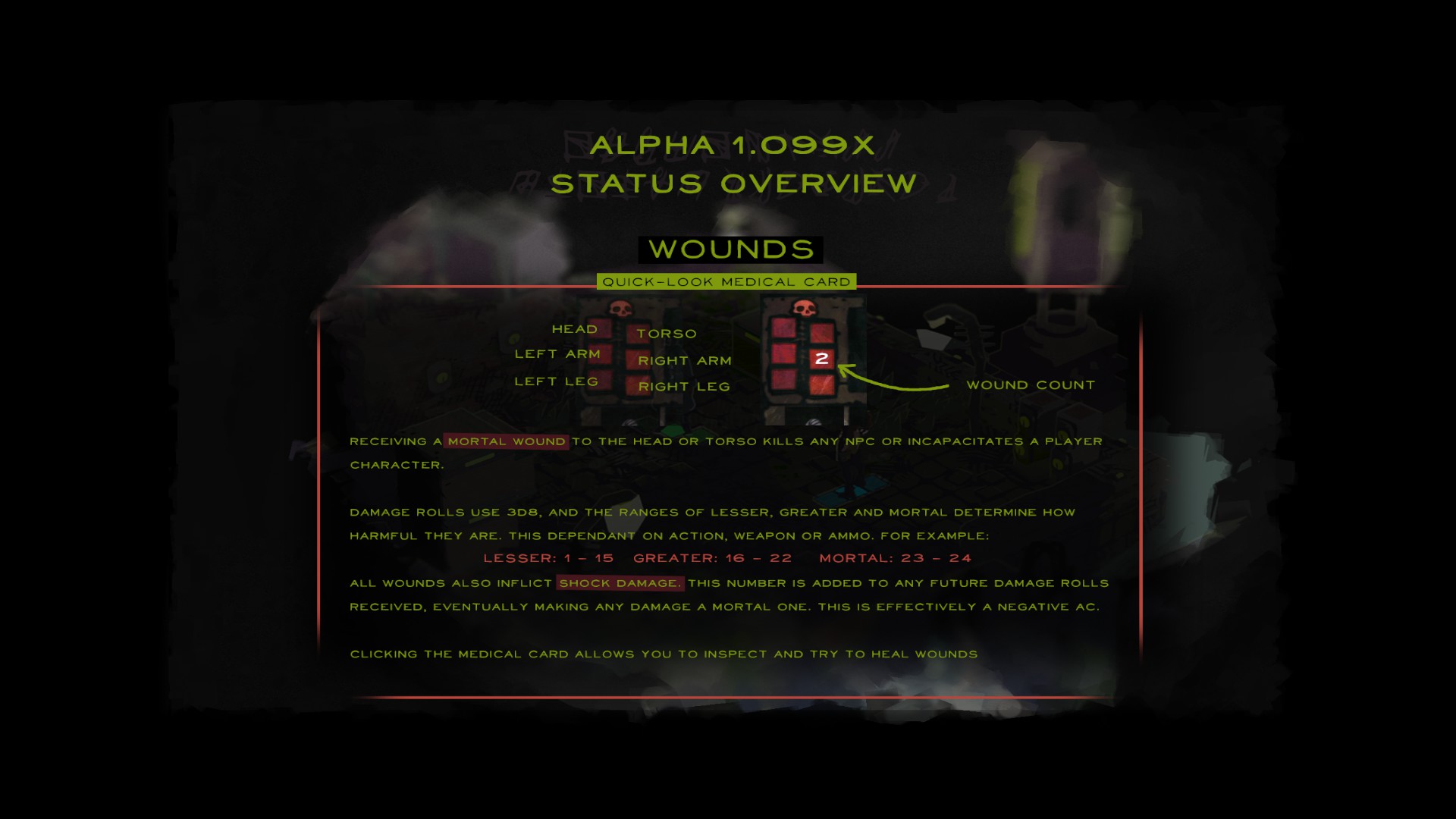
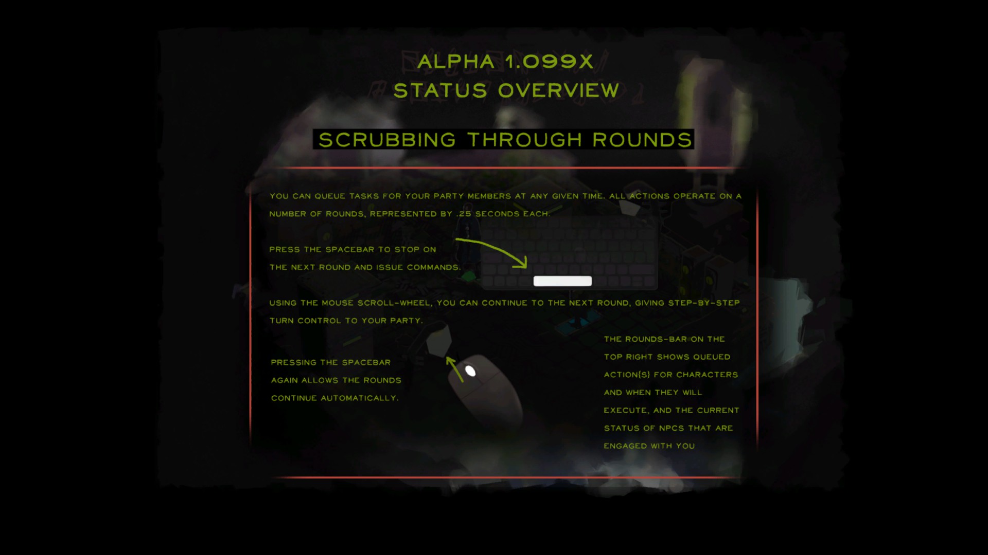
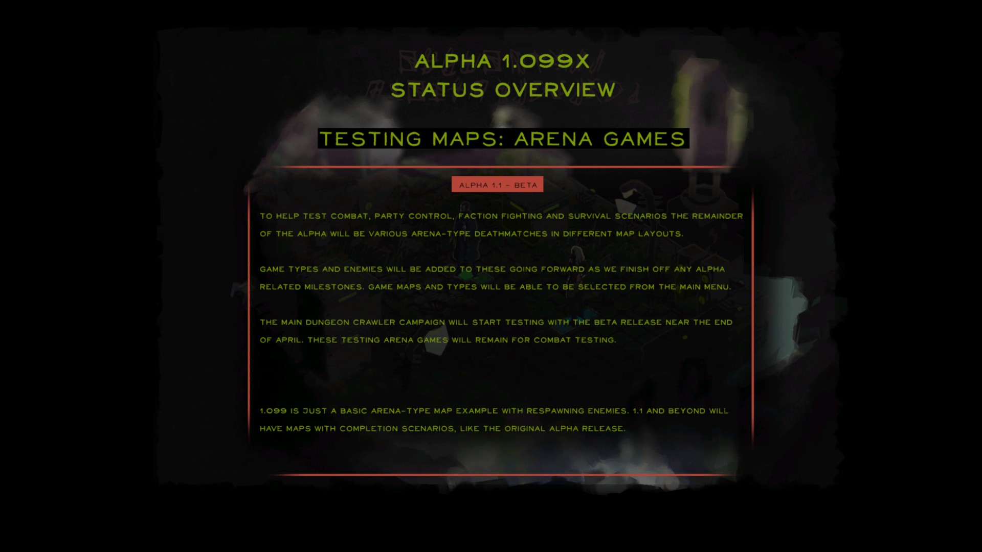
I messed around with the alpha for 10 minutes. Visually, it is a mess and from a gameplay perspective, they kinda just throw you into the game without much explanation. Still believe that I will like the game in the end, but they should maybe have waited a bit more for alpha. Combat felt like a mess. Here are some descriptive text. I'm eager to try out 1.1.


- Joined
- Jan 28, 2011
- Messages
- 100,125


Deleted Member 16721
Guest
I think opening up the alpha for playing can be a bit of a mistake. People will tear it apart and it's only in alpha, not even beta yet.
- Joined
- Sep 25, 2012
- Messages
- 30,121


That's the point you mongo.People will tear it apart and it's only in alpha, not even beta yet.
Deleted Member 16721
Guest
That's the point you mongo.
Mongo? You're like a comedian way past his prime trying to get a cheap laugh. Your act is old. Sad.
- Joined
- Sep 25, 2012
- Messages
- 30,121


I'm still right.That's the point you mongo.
Mongo? You're like a comedian way past his prime trying to get a cheap laugh. Your act is old. Sad.


