Putting the 'role' back in role-playing games since 2002.
Donate to Codex
Good Old Games
  • Welcome to rpgcodex.net, a site dedicated to discussing computer based role-playing games in a free and open fashion. We're less strict than other forums, but please refer to the rules.

    "This message is awaiting moderator approval": All new users must pass through our moderation queue before they will be able to post normally. Until your account has "passed" your posts will only be visible to yourself (and moderators) until they are approved. Give us a week to get around to approving / deleting / ignoring your mundane opinion on crap before hassling us about it. Once you have passed the moderation period (think of it as a test), you will be able to post normally, just like all the other retards.

Indie Passageway of the Ancients - Baldur's Gate-Like RPG with Dual-Persona Character Development

JonG

Passageway Games
Developer
Joined
Aug 8, 2023
Messages
83
They rarely cross over, unless you somehow pull a miracle and capture them. Those people here who claim that barely play any of these games. They've played Disco Elysium and now claim they don't play that arcadey style 99% of the time. And if they do cross over, they inevitably cause the decline of many beloved settings/games. Do not fall for their lies if you want to keep your setting pure.
From a purely psychological standpoint your argument is prrobably valid. People tend not to change. In reality I don't expect much from them. I certainly agree with you that developers should stay loyal to the group that they created their game for in the first place.
 

d1nolore

Savant
Joined
May 31, 2017
Messages
666
Hi JonG - could you add micro-transactions to the game? I would love to have some extra exp and shiny red boots from the beginning of my adventure. How many DLC's do you plan to add? And how many genders are already implemented to the game? Any chance to become a dragon at some point? One persona could be body-positive black lesbian dragon and the other might be e.g.some king of fragile fairy or elven prince.
Covr; In the game you play a character that is basically a Dragonkindt in shapeshifted form. Shapeshifted forms include dwarf, elf and human. In addition you can assume your dragonkindt form anytime you wish. You are in shapshifted form because of the political climate on Arieyon. Snce Dragonkindt mature rather late sexually you are free to chose the male or femal gender and can with the morphing sliders fashion any sexual identity that is possible between these poles. If the response to the game is good we will be offering DLC. The contents of these DLC's wlll be largely driven by our user base. We will NOT charge anything for these DLCs since part of our mission statement is to keep the cost of fantasy games low and we object to continuously picking the pockets of our loyal patrons.

What exactly is a morphing slider for sexual identity? I get it for like Lizard appearance and stats but what would it change in the character and game?
 

JonG

Passageway Games
Developer
Joined
Aug 8, 2023
Messages
83
What exactly is a morphing slider for sexual identity? I get it for like Lizard appearance and stats but what would it change in the character and game?
lets take feminine appearance for example. Curvilinear hips indicate a more feminine appearance while more rectilinear hips are usually associated with more of a male appearance. A morph slider moving from more curvilinear hips to more rectilinear ones would change the appearance of the characer from a more female look to a more male one.
 

Üstad

Arcane
Joined
Aug 27, 2019
Messages
8,533
Location
Türkiye
PotA-steam-magicalitems-615-v03.gif
Artstyle and UI seems like hybrid of modern indie RPGs, cRPGs from 2000's and old abandonware. I like it.
 

Üstad

Arcane
Joined
Aug 27, 2019
Messages
8,533
Location
Türkiye
Personally I agree with you, I would prefer to keep it mostly in written format but how do I reach all those younger gamers that hate reading anything? You know it gives me hope to hear from people like you and Bester! Maybe we should just wait and see how people respond to this game entry. If you have any other thoughts about this issue please share
You won't able to get people those people on the hook with those graphics, as the people enjoying cutscenes mainly enjoy the cinematics and graphics, which is why gameplay is secondary concern for them. I don't mind these graphics as it has soul and I wouldn't want any cutscenes at all.
 

JonG

Passageway Games
Developer
Joined
Aug 8, 2023
Messages
83
You won't able to get people those people on the hook with those graphics, as the people enjoying cutscenes mainly enjoy the cinematics and graphics, which is why gameplay is secondary concern for them. I don't mind these graphics as it has soul and I wouldn't want any cutscenes at all.
Your sentiments are shared with many members of this thread. If you have time read my analysis of the cut scent issue (its the long one) on page three of this thread
 

ItsChon

Resident Zoomer
Patron
Joined
Jul 1, 2018
Messages
5,381
Location
Երևան
Steve gets a Kidney but I don't even get a tag.
The game looks really interesting and it has definitely caught my attention. Honestly the only thing that stands out as off-putting are the animations/visuals in combat. Seeing the characters stacked directly on top of each other makes the combat look messy and it seems like enemies/allies clump up on top of each other when initating combat which looks pretty bad. The animations themselves are also not ideal as they seem weirdly fluid but also disjointed? Any input on whether or not this is something that could be addressed or alleviated?
 

JonG

Passageway Games
Developer
Joined
Aug 8, 2023
Messages
83
The game looks really interesting and it has definitely caught my attention. Honestly the only thing that stands out as off-putting are the animations/visuals in combat. Seeing the characters stacked directly on top of each other makes the combat look messy and it seems like enemies/allies clump up on top of each other when initating combat which looks pretty bad. The animations themselves are also not ideal as they seem weirdly fluid but also disjointed? Any input on whether or not this is something that could be addressed or alleviated?
Sorry you are irritated by the combat animations. I don't know how to fix somethig that is at the same time both fluid and disjointed. Can you take another stab at explaining what you mean by that? Clumping is an issue in almost all iso based combat in fantasy RPG's. We are still tinkering with this issue and trying to minimized this effect. What you can't see in the prmo materials is that we allow the player to zoom in fairly far while conducting combat which alleviates this clumping issue a fair amount since the clumping phenomenon is to some extent a function of Zoom level.
 

ItsChon

Resident Zoomer
Patron
Joined
Jul 1, 2018
Messages
5,381
Location
Երևան
Steve gets a Kidney but I don't even get a tag.
The game looks really interesting and it has definitely caught my attention. Honestly the only thing that stands out as off-putting are the animations/visuals in combat. Seeing the characters stacked directly on top of each other makes the combat look messy and it seems like enemies/allies clump up on top of each other when initating combat which looks pretty bad. The animations themselves are also not ideal as they seem weirdly fluid but also disjointed? Any input on whether or not this is something that could be addressed or alleviated?
Sorry you are irritated by the combat animations. I don't know how to fix somethig that is at the same time both fluid and disjointed. Can you take another stab at explaining what you mean by that? Clumping is an issue in almost all iso based combat in fantasy RPG's. We are still tinkering with this issue and trying to minimized this effect. What you can't see in the prmo materials is that we allow the player to zoom in fairly far while conducting combat which alleviates this clumping issue a fair amount since the clumping phenomenon is to some extent a function of Zoom level.
Disjointed isn't exactly the right word, maybe jerky might fit better. Just to give a general example about animations that I find a bit bothersome is the fight in the video from 0:23.5 to 0:25.5 roughly.

The attacks from both the player character and the enemy seem to phase right through each other. There is no heft to anything, and then the way they reset to deliver the exact same animation is jarring. An idea of how to alleviate this might be to have a transitory animation, or make the character do two-three seperate attacks before resetting the sequence over again to repeat so that combat doesn't look repetitive/simplistic. From 0:22 to 0:23.5 we see a bit of that too as it just looks like a bunch of enemies swinging at nothing almost, and since they're all pretty much the same animation from a first glance, it just feels a bit clusterfucky. The backswing after an attack to reset the animation is I think the bit that I'd consider to be "disjointed" or "jerky", though I might be using the wrong adjectives.

The fight is admittedly taking place at a door frame but still.

In Baldur's Gate the game is generally played more zoomed out, with sprites being smaller than in your game, so you didn't really notice the animations repeating and/or the clumping nearly as much as you do here, which is why I feel like it does detract a bit from the visual clarity and overall appeal which is what you're alluding to with your post. Perhaps when the game is more zoomed out it isn't as bad or even noticeable, but I am just going by what I can see in the trailer.

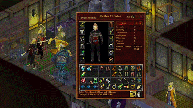
As a side note, I will also say that while I think the art itself is actually pretty good, a minor thing is the saturation or contrast in some of the images seems weird? Some of the surfaces seem to blend together due to similar colors and/or undefined lines between objects, though I really only noticed this in the areas where there are bright/light colors being used such as shown below.
1692758507012.png

1692758601481.png

Other parts of the trailer that are darker looked quite good such as these screenshots.
1692758682065.png

1692758702247.png

Although in the bottom screenshot the way the light looks on the shopkeeper does again look a bit weird, although it's a nonissue in that screenshot. The background of the fight against the Kobald where I was talking about the animations above also looks good as another example.

And do note that while my first post in the thread is criticism and some others in the thread have done the same, both constructively as well as in a cringe, edgy manner, I am still excited to see the game! If it is good, rest assured it will receive its laurels and I'm sure many others will be happy to buy and play it. That being said whenever we get a chance to critique something that we see wrong in the game especially to an active dev, it is an opportunity that we shall take in hope that the game is either improved or our concerns are alleviated. So keep up the good work!
 

d1nolore

Savant
Joined
May 31, 2017
Messages
666
Save fine turning for next game. Just focus on making it fun, relatively bug free, and actually releasing.
 

ItsChon

Resident Zoomer
Patron
Joined
Jul 1, 2018
Messages
5,381
Location
Երևան
Steve gets a Kidney but I don't even get a tag.
There is nothing wrong with basic feedback/criticism, especially as the visuals of a game are incredibly important when it comes to getting people into the door. When I first saw the trailer, the way the combat animations/visuals looked was an instant turnoff, and I'm literally the target demographic for this game. If it'll take an exorbant amount of time to fix these issues than obviously the time can be better served elsewhere, but that's for the developers too decide. As a consumer I just give the feedback as I see it.
 

JonG

Passageway Games
Developer
Joined
Aug 8, 2023
Messages
83
Disjointed isn't exactly the right word, maybe jerky might fit better. Just to give a general example about animations that I find a bit bothersome is the fight in the video from 0:23.5 to 0:25.5 roughly.
Before I reply to your issues I want to thank you for taking the time to be so detailed in your response. Honest and rigorous feedback like yours is what I am most happy to receive. You have nothing to apologize for.
About the lighting issues the game allows the user to set the amount of light there is in a scene and some of these images you cite were captured with an insane amount of light added by the player/user. I guess I will have to be more proactive when reviewing these materials and cull out the over bleached ones. If you don't mess with the lighting sliders then the game looks mostly like the last two images you posted.
I think what you are talking about when you say disjointed is the transitions between bits of animation business. These are interpolations by the Unity animation engine over which we have no control. To avoid this we would have to create a gigantic pile of transition animations that only the huge studios with gigantic animation and graphics budgets can afford. Actually I believe that most of the high priced entries have solved this problem by keeping the camera zoomed way out so the user can see little to nothing of what is really going on. I disliked this approach so we allow the user to zoom in somewhat. I guess no good deed goes unpunished eh. If it bothers you just zoom out a bit where it doesn't hit you in the face. After all you are just falling back to what most of the big boys are presently doing you have lost nothing. Or Maybe we back off on the zoom range and limit a bit further the size of the user's zoom window to help heal this issue. Next game we will plan on doing our own transitions so there will be no issues.
About clumping, we are going to take another stab at this one since we have a tweak in mind that address this better than what we have in place now for this issue.
This game focuses mostly on a fantastic story line with unique and solid game play and game mechanics. Since you like detail I think you will be well pleased with our battle mechanics they are truly special.
 

JonG

Passageway Games
Developer
Joined
Aug 8, 2023
Messages
83
Save fine turning for next game. Just focus on making it fun, relatively bug free, and actually releasing.
Never fear we will be releasing the demo version of this game in October with the final release scheduled for jan or Feb of next year.
 

ItsChon

Resident Zoomer
Patron
Joined
Jul 1, 2018
Messages
5,381
Location
Երևան
Steve gets a Kidney but I don't even get a tag.
About the lighting issues the game allows the user to set the amount of light there is in a scene and some of these images you cite were captured with an insane amount of light added by the player/user. I guess I will have to be more proactive when reviewing these materials and cull out the over bleached ones. If you don't mess with the lighting sliders then the game looks mostly like the last two images you posted.
Great! The game actually does look pretty good from what I can see, so very happy to hear that.
I think what you are talking about when you say disjointed is the transitions between bits of animation business. These are interpolations by the Unity animation engine over which we have no control. To avoid this we would have to create a gigantic pile of transition animations that only the huge studios with gigantic animation and graphics budgets can afford. Actually I believe that most of the high priced entries have solved this problem by keeping the camera zoomed way out so the user can see little to nothing of what is really going on. I disliked this approach so we allow the user to zoom in somewhat. I guess no good deed goes unpunished eh. If it bothers you just zoom out a bit where it doesn't hit you in the face. After all you are just falling back to what most of the big boys are presently doing you have lost nothing. Or Maybe we back off on the zoom range and limit a bit further the size of the user's zoom window to help heal this issue. Next game we will plan on doing our own transitions so there will be no issues.
I doubt I'll be playing as zoomed in as was shown in the trailer, so assuming you're correct about the animations smoothing out a bit when zoomed out, it really is not a problem at all that y'all need to worry yourselves about.
About clumping, we are going to take another stab at this one since we have a tweak in mind that address this better than what we have in place now for this issue.
Sounds great.
This game focuses mostly on a fantastic story line with unique and solid game play and game mechanics. Since you like detail I think you will be well pleased with our battle mechanics they are truly special.
Definitely looking forward to it! A few side questions about the game in general just to get an idea of what we have to look forward to.

- What is the general length of the game?
- How difficult do you expect the combat to be? Can you compare it to any other RPGs that have currently been released?
- What is the general scope of the story in regards to its setting?

And a question for you,

- What are a few RPGs that you consider to be your favorite?
 

JonG

Passageway Games
Developer
Joined
Aug 8, 2023
Messages
83
I doubt I'll be playing as zoomed in as was shown in the trailer, so assuming you're correct about the animations smoothing out a bit when zoomed out, it really is not a problem at all that y'all need to worry yourselves about.
I may have a fix for the janky disjointed combat weapon animations. If this little gremlin is hiding where I think he is a relatively minor fix may be implementable in a very small time. If this works out you should get credit for taking the time to help me "see" and resolve this imperfection.
What is the general length of the game?
- How difficult do you expect the combat to be? Can you compare it to any other RPGs that have currently been released?
- What is the general scope of the story in regards to its setting?
The general length of the game is 40 hours
There are three levels of difficulty: Standard Advanced and Expert. No our combat system for both weapons and magic is unique. The long range objective here is to engross the player in a somewhat detailed view of combat . Let the player be there and both control and view the action at a fairly fine level. of granularity However we try to do so in such a fashion that it doesn't burden the player with exorbitant amounts of input detail.
The story line is epic in proportion, While you are learning about the planet Arieyon and its star Xi-Shei you are also charged with solving the murder of your parents and recovering the holy Tazvox. In addition you learn about the mythology of this infiverse. You are exposed to how the Divine Essence came into being and the creatures he/she/it fashioned. Complicating things further is the fact that your character is actually a Dragonkindt. A species reviled on Arieyon. They suvive there because they can shapeshift into the form of any of the huminoid species living on the planet.

What are a few RPGs that you consider to be your favorite?
I like the Ultima stuff at least some of it (not the later stuff), Baldur's Gate, Morrowind, Oblivion, a lot of the Obsidian offerings and when I am in an arcade mood some early Diablo titles or Torchlight. This is a very truncated list.
 

covr

Prophet
Patron
Joined
Sep 3, 2006
Messages
1,325
Location
Warszawa
I was going to joke that spelling is correcdt, but instead I will give you some advise JonG, because in my mind I am brilliant game designer with a thousand years of experience.

Based on the screens, IMO you are using too many different fonts. Try to stick just two, get rid of that gothica font, it is unreadable, repulsive and some may say it's nazi. At the same time try to avoid using arial black or whatever basic front you are using for most of the game.

Your 3D character models are bad, try to zoom out as much as possible. It also concerns character creation, don't show that huge model in the middle of the screen, it's ugly.

I feel, like I am almost sure, that your game is going to have massive lore dumps and enormous lengthy dialogues. Don't do it, try to be brief and to the point. Show, not tell. You can compare writing of two Baldurs Gate clones: Pillars of Eternity with its massive, boring and meaningless walls of text vs Black Geyser with little text, leaving much space for imagination and actual gameplay. The consensus on this very prestigious site was that Black Geyser writing was much better than what PoE had.

My previous post regarding DLC's, black lesbian dragon and other modern crap, was a joke. Don't include any of this in your game - it clearly is a product of love, a homage to old, better times, don't spoil it with current year poison. Also, not being so serious might help you a bit. You can expect ton of shit after the demo/full game is released, distancing from it will help you to survive.

You might also try giving another shot at your game logo design, currently it looks like something done for a mobile game/my little princess type of software.
 

RPK

Scholar
Joined
Apr 25, 2017
Messages
340
Disjointed isn't exactly the right word, maybe jerky might fit better. Just to give a general example about animations that I find a bit bothersome is the fight in the video from 0:23.5 to 0:25.5 roughly.
Before I reply to your issues I want to thank you for taking the time to be so detailed in your response. Honest and rigorous feedback like yours is what I am most happy to receive. You have nothing to apologize for.
About the lighting issues the game allows the user to set the amount of light there is in a scene and some of these images you cite were captured with an insane amount of light added by the player/user. I guess I will have to be more proactive when reviewing these materials and cull out the over bleached ones. If you don't mess with the lighting sliders then the game looks mostly like the last two images you posted.
I think what you are talking about when you say disjointed is the transitions between bits of animation business. These are interpolations by the Unity animation engine over which we have no control. To avoid this we would have to create a gigantic pile of transition animations that only the huge studios with gigantic animation and graphics budgets can afford. Actually I believe that most of the high priced entries have solved this problem by keeping the camera zoomed way out so the user can see little to nothing of what is really going on. I disliked this approach so we allow the user to zoom in somewhat. I guess no good deed goes unpunished eh. If it bothers you just zoom out a bit where it doesn't hit you in the face. After all you are just falling back to what most of the big boys are presently doing you have lost nothing. Or Maybe we back off on the zoom range and limit a bit further the size of the user's zoom window to help heal this issue. Next game we will plan on doing our own transitions so there will be no issues.
About clumping, we are going to take another stab at this one since we have a tweak in mind that address this better than what we have in place now for this issue.
This game focuses mostly on a fantastic story line with unique and solid game play and game mechanics. Since you like detail I think you will be well pleased with our battle mechanics they are truly special.
You do have SOME control over the transition between animations in Unity. if you haven't fiddled with it much, take a look at the animation state transitions. You get to it by clicking on the little arrow/line between your states (probably an Idle state and and Attack state) in this case. Sorry if you already knew this, but if not, it can really make you animations seem more fluid without have to have more actual animations. Tweaking the overlap and the duration of the overlap makes a big difference.

https://docs.unity3d.com/Manual/class-Transition.html
 

covr

Prophet
Patron
Joined
Sep 3, 2006
Messages
1,325
Location
Warszawa
Your 3D character models are bad, try to zoom out as much as possible. It also concerns character creation, don't show that huge model in the middle of the screen, it's ugly.
No they look pretty decent tbh
Not this one, it's just a tier above Prelude to Darkness level. I would advise not to expose it so much. E.g there is so much info on the panel on the left that could be extended, it will be beneficial to UI to make the char model smaller and include extra info on classes, make some fonts and buttons bigger and generally more consistent (you can see how many different fonts, text sizes&colours, or even backgrounds are being used, it is a mess).

ss_c8da50874a704b0a74e5e87d9163c74b8836004f.jpg
 

As an Amazon Associate, rpgcodex.net earns from qualifying purchases.
Back
Top Bottom