- Joined
- May 25, 2006
- Messages
- 8,363
The title screen has been posted too:A few more screenshots:
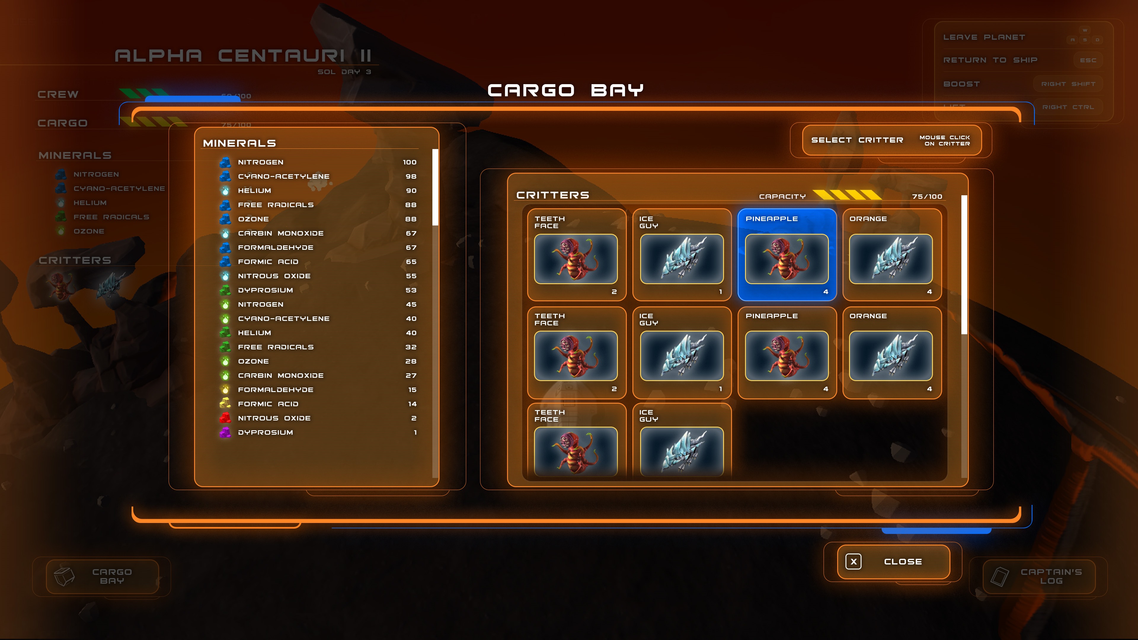
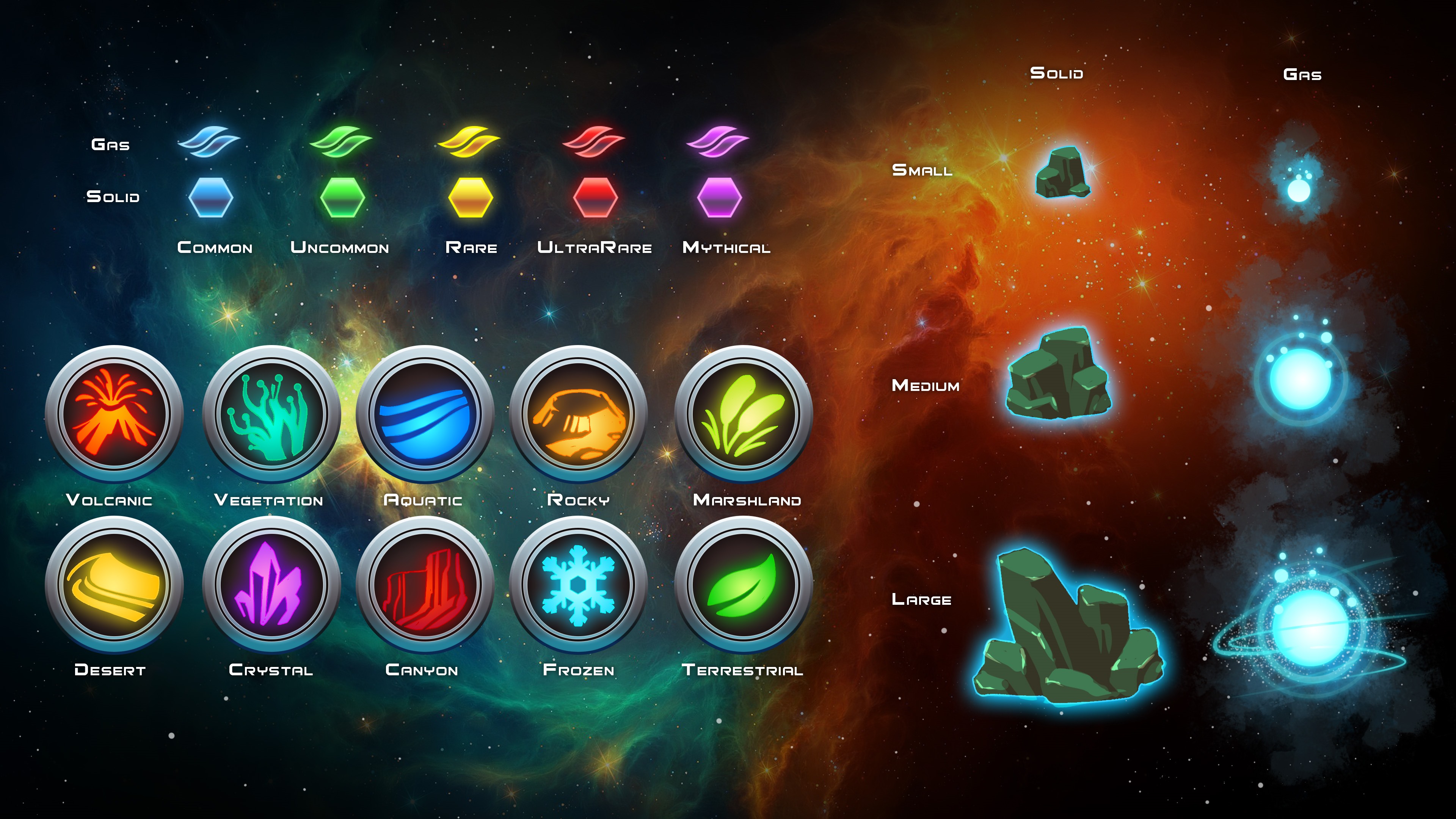
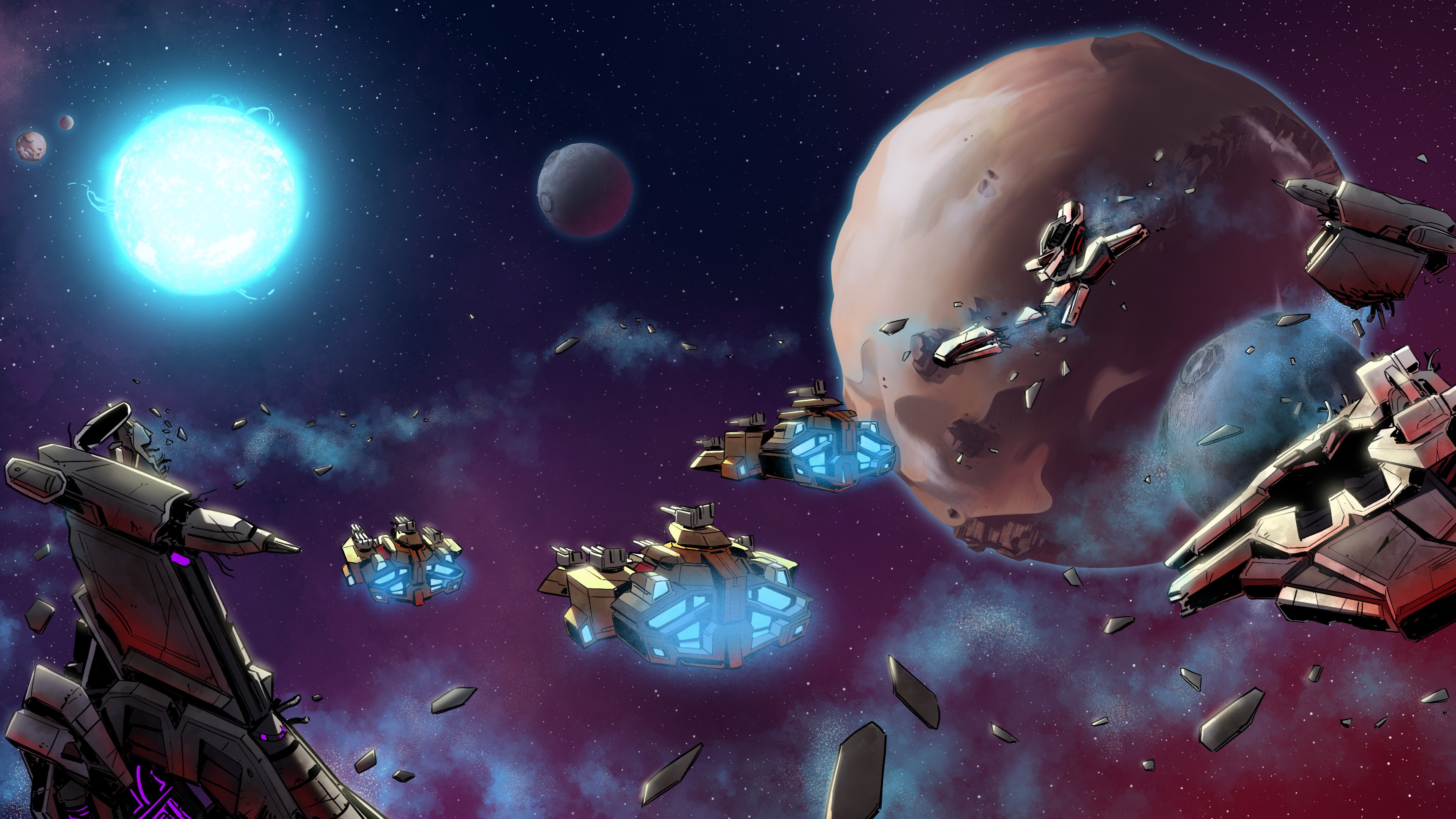

The title screen has been posted too:A few more screenshots:


Do you look at that and feel like you're seeing actual gameplay?What's pre-rendered looking about it? I thought pre-rendered scenes were supposed to look unrealistically good. It looks like a typical lowish budget 3D game to me.
The way he went from the galaxy map to the planet scan & landed on the planet seamlessly, then explored the entire planet in like 5 seconds? Which has NOTHING interesting to offer? Then there's stuff like terrain no way that probe will navigate through, the dark side of the planet (and the vehicle headlights).... it all looks like someone doing a concept video, a "wouldn't it look cool if..." promo, without any thought on how gameplay will actually work.
Can weA few more screenshots:


The artstyle looks so crappy. SC2 had something that resembled old pulp sci fi, wtf is this shit supposed to be? They can't even get something as basic as the look of the game right...modern devs
![The Year of Incline [2014] Codex 2014](/forums/smiles/campaign_tags/campaign_incline2014.png)


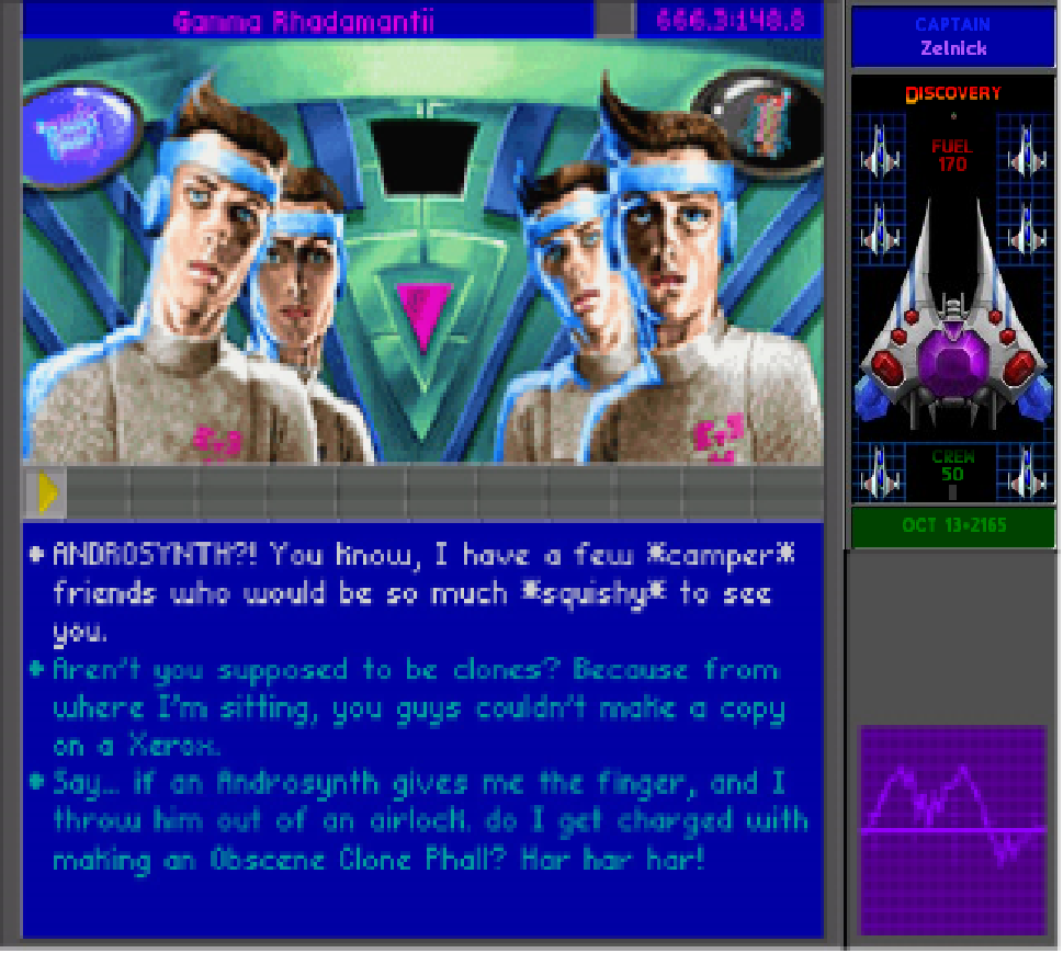


Rayman Origins?Has there ever been a game with "Origins" subtitle that haven't sucked?


![The Year of Incline [2014] Codex 2014](/forums/smiles/campaign_tags/campaign_incline2014.png)


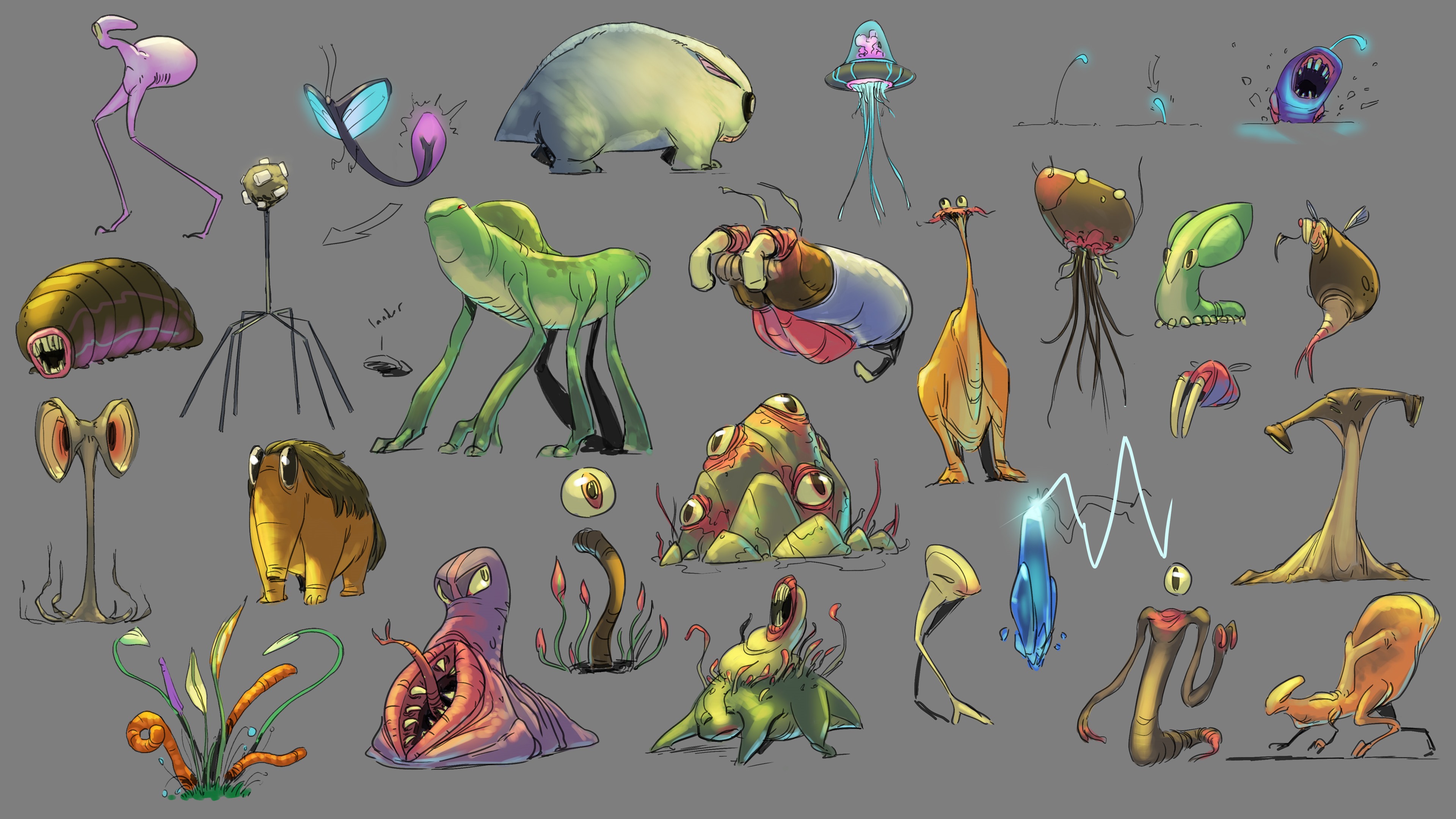
One minus though is "procedurally generated" aliens. That doesn't feel right at all.


Gavin on TTON was from Cracked.com too. I hadn't realized it was such a farm team for game writers! (In fact, I'm not actually sure what Cracked.com publishes. I had in my head that it was like an imitation of Mad magazine?)The writing team, led by Cracked.com's Chris Bucholz, has a compelling sci-fi story that is also very much in the style you expect from a Star Control game.
![The Year of Incline [2014] Codex 2014](/forums/smiles/campaign_tags/campaign_incline2014.png)


The writing team, led by Cracked.com's Chris Bucholz, has a compelling sci-fi story that is also very much in the style you expect from a Star Control game.
