Planet (or space station) silhouettes are a staple of scifi. Space is vast and empty and these shots impress that upon you.
That's why I said Mass Effect's start screen showed how it was trying to bring back classic science fiction.
I'm going to say this comes down to diverging tastes. Personally, I dislike the busy renaissance scenes depicted in most fantasy cover/menu art. I prefer things kept simple and clean, conveying the tone without depicting much at all. Brevity is the soul of wit and all that.
I didn't post those main menu screenshots because fantasy > science fiction, but because I had them installed and I could point out how for example Dungeon Lords, a game about going into dungeons, killing monsters and getting loot has all that baked into the menu. It has nothing to do with taste, unless you mean that if the main menu doesn't appeal to you then the rest of the game probably won't either.
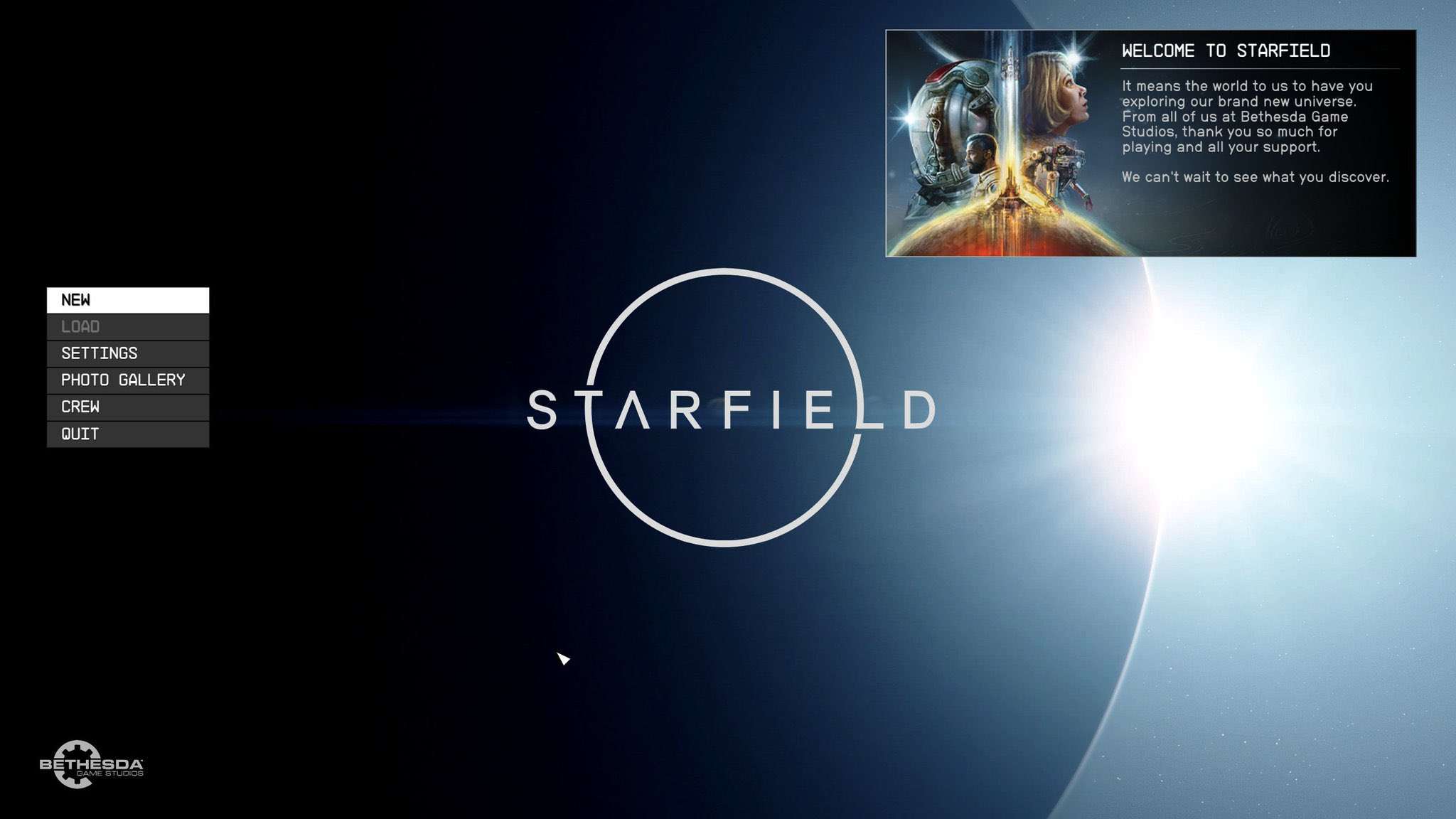
Obviously Starfield is going for a stock science fiction vibe with the main menu, but we can do better than that when analyzing it. But before we do we should look at one of your examples of this common motif, Alien Isolation.
Again the main menu screen sums up the entire game, it's a game with exceptional production values and highly cinematic qualities. The great flaw of the game is present too, that we have already seen it in the film the game was based on and that it will be a repeat. Within the game itself there are repetitious segments, such as a crafting system, slow but high fidelity animations that play when you interact with things, and it's a stretched out recap of what happened in the film. The UI is minimal and the focus is on the expensive art assets the developers have labored on, just like the focus in the game. All this can be seen in the main menu.
Now let's take a look at Starfield for a comparative analysis.
What immediately hits the viewer is the ugly but now common DLC shill square where you'll get pestered with ads in a game you paid full price for. It shows where Bethesda have their priorities, which are to squeeze every penny out of the players. The actual menu to the left is highly reminicent of Fallout 4's UI, showing us that it's still a NetImmerse title underneath the not so great rendering update the game got, and that you can expect Fallout 4 with a thin layer of paint. The actual background art is a dark featureless planetoid, reminding us of the swarthy cast and the desolate contentless planets with nothing on them that players will be "exploring" during the game. One can think of it as the empty black void that delusional people think can ever be filled with mods, just like how others think their lack of a sex life can be filled with BG3 tier loverslab mods.
The background art is also reminding the viewer of 2001, the pretentious film written by a hack writer and that aimed for topics so big it couldn't but underdeliver. 2001 with Bethesda writing, the mysteries of the cosmos answered by a mouth breathing retard without even the pizazz of Kubrick's rainbow ride.
From an artistic standpoint it's also very ugly, it doesn't have the utopian futuristic factor that Mass Effect had, where you could assume there were locations looking like Syd Mead had drawn them to explore, with the vibrant greens and blues of its opening screen. Nor does it have the aesthetic sense that Alien Isolation has. None of the charm of Sundog, nor the focus on space travel which was indicated by the starship coming from the planet in that splash screen.
Finally the photo gallery button shows us that it's not really much of a game at all, it's a platform for coomer modders to take tasteless screenshots with and share online.


