GUI Overhauls and Portraits
Keep on Polishing
The seemingly
endless string of GUI overhauls continues as we finish up the peripheral screens, as well as the actual
Main Screen itself. I also continue to get sidetracked by
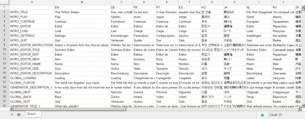
localization and
modding support - every object and class now has a serialization helper class that makes breaking the object down into XML or bringing it back into the game incredibly easy. I also put in some
extra effort to add full sprite and sprite sheet support to the mod elements so people can really go
crazy with theme.

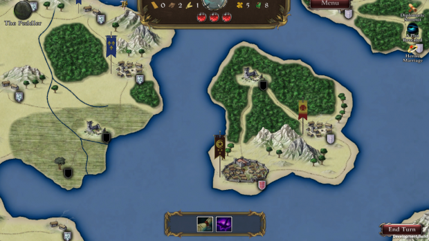
The Main View finally got its overhaul, we had left this to the end because we wanted to continue to
maximize the map view as I really prefer letting the map speak for itself. In the end you have what you see before you, let's go through the features and see
what's what.
- At the Bottom - This is the area that gives quick information for whatever is selected, and in the current situation where nothing is selected it shows your Old One abilities you can activate.
- At the Top - the Main Header has three major components, the Dark Orbs show how much power you have accumulated (and how much longer till you wake), your resources are shown at top, and the mirror in the center allows access to your Agent recruitment screen.
- To the Left you can see a single icon, this is where your "world effects" and modifiers accumulate as simple icons
- Further to the left all your active agents are shown with what action they are currenly performing - when doing nothing it is simply the blank grey slate shown.
- Back to the far right are any current events
Also you can see our 3D banners now on the map, the larger they are the larger the military present (though that can be deceptive, as some units are much stronger than others). We do want to add
units holding the flag to represent their composition, but that would be part of our
kickstarter art.

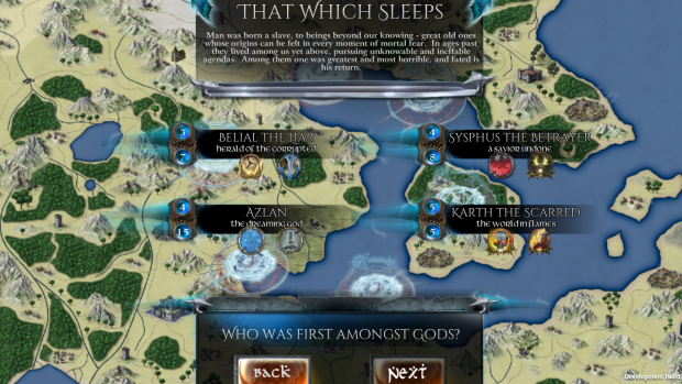
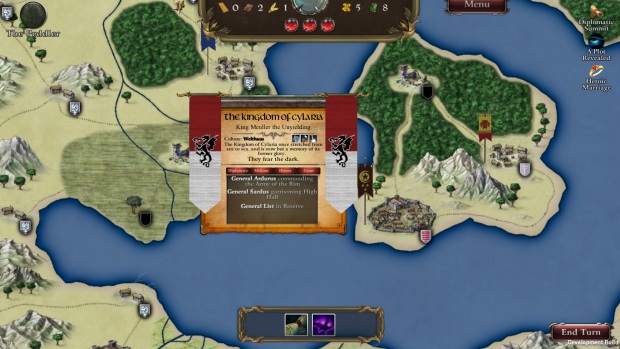
This is the
Kingdom screen, giving you quick information about a given power on the map.
As usualeverything is
Tooltip enabled to see more information. We broke down a lot of the information into the bottom pane which is accessed via the buttons above, and instead of describing the
benefits and traits of the nation we put them as icons near the top.
Laws and Edicts are now part of the Court page, as most nations have very entries in Court.
Portraits
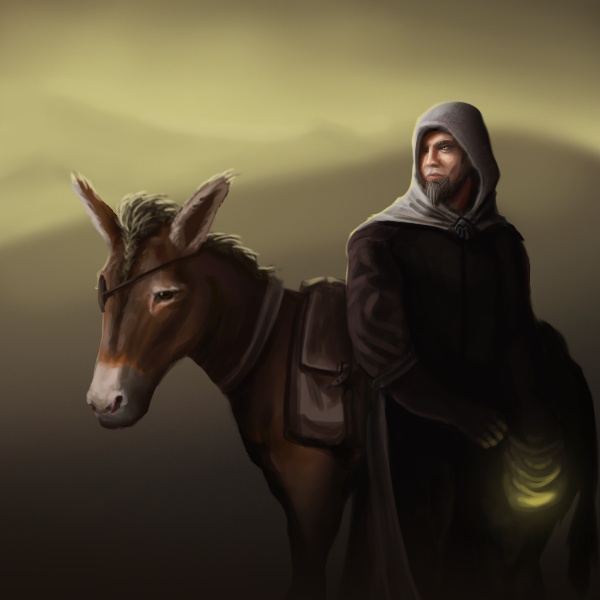
Lots of back end work, lot of GUI work, and a whole lot of localizing have gotten us back to where we were two weeks ago but with a much more polished product. In celebration of that we had the same fine artist
Julio Iglesias, whose work can be seen
here, make us some portraits. Here's a sample of the Peddler.

He's got something special in that bag of us, and damn that Donkey is clearly calling the shots. We are fans of
having portraits in the game because Theme is all-important, and a proper image can help establish that feel.
Wrapup
All this work was something we had told ourselves we wouldn't do until after Kickstarter, but it just seemed to make sense. I still have some
cleanup work to do on the Serialization, and a few of the GUI screens just aren't quite looking right yet, but right after that gets done this week we will be
back on schedule remaking the videos with our new art and releasing them one after the other.
It's always hard to decide when to stop, loop back, and try and improve on what you have versus moving forward as planned. I think we made the right call here, the level of increased interest we've seen raises the prospect of a good
Kickstarter, and that raises the prospect of this game getting the treatment it deserves.


