Putting the 'role' back in role-playing games since 2002.
Donate to Codex
Good Old Games
  • Welcome to rpgcodex.net, a site dedicated to discussing computer based role-playing games in a free and open fashion. We're less strict than other forums, but please refer to the rules.

    "This message is awaiting moderator approval": All new users must pass through our moderation queue before they will be able to post normally. Until your account has "passed" your posts will only be visible to yourself (and moderators) until they are approved. Give us a week to get around to approving / deleting / ignoring your mundane opinion on crap before hassling us about it. Once you have passed the moderation period (think of it as a test), you will be able to post normally, just like all the other retards.

The New DOOM Thread (2016)

UserNamer

Cipher
Joined
Nov 6, 2010
Messages
692
what's up with the enemy design. I really hate some of them. Also I don't like the scale of the mancubus and the caodemon.

The pinata effect when you kill enemies is distracting (also what's the point of removing health regen if every enemy carries health.... idiots), the highlight effect too.

level design seems as linear as ever . yeah I know old games were technically linear, I mean linear in the sense that they are now literal straight lines with the occasional stair case or badly placed crate to give the illusion of not going in a straight line (in reality accentuating it even more).

Seriously the crate placement seems as bad as ever lol, even in the teaser there is a giant crate in the middle of a corridor for no reason lol.

Other than that the game doesn't seem frantic or tense enough. Many pussy points to id because they explained doom guys agility and strength with a lame halo power armor instead of letting him double jumping and ripping and tearing with only the power of his muscles.

Biggest problems for me however are:

-shitty as shit enemy design and boring visuals
-every enemy is a pinata so there is no stress at all about ammo or health, there is no point in removing health regen if you are going this very lame way
-cramped fight spaces and the usual linear corridor exploration stuff
-weak sounding rocket launcher and plasma rifle
-gay zerg \diablo 3 design for the cyberdemon
 

DraQ

Arcane
Joined
Oct 24, 2007
Messages
32,828
Location
Chrząszczyżewoszyce, powiat Łękołody
Then play fusion.bsp, gorgeus lightning without any additional mods, mapmaker squeezed out of Q2 what original creators weren't capable of.
Except that's the whole point - what the original creators weren't capable of.
It's not about the engine itself, it's nowhere near Unreal's but it's more than robust enough, along with its lighting system. It's not even assets as BSP based engines give authors so much freedom that even with arguably BSB Quake 2 monster models and textures you could make some striking masterpieces.

The point is that original creators' idea of good lighting was mostly washed-out puke colored glow, sometimes replaced by red, or rarely blue. When it got more elaborate it usually meant sticking garish multi-colored lights everywhere. There are some exceptions but mostly the lighting was crap or at best boring.
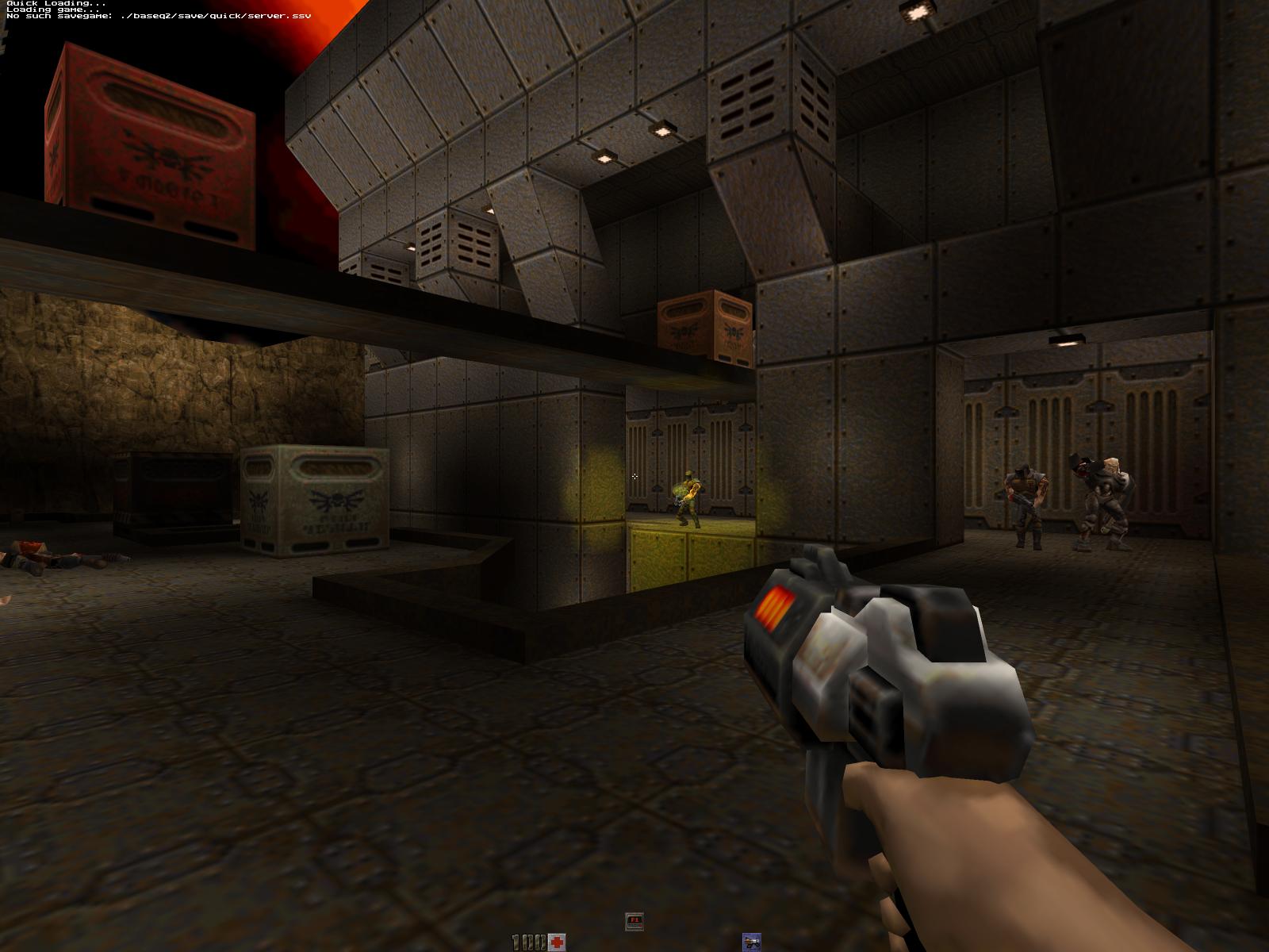
Same with levels, they may have good layouts, but the original creators' idea of interesting levels generally consisted of techcorridors with crates - crippling if you're designing game with well over 30 levels (though no more crippling than the complete joke of enemy mechanics).

Keep everything else but revamp enemies mechanically and touch up the levels visually to make them less boring and the alleged classic becomes an actual one.
 
Last edited:

skacky

3D Realms
Developer
Joined
Mar 5, 2013
Messages
2,506
Location
The City
The Palace maps were the only genuinely interesting levels in terms of visuals and architecture tbh.
 

Lyric Suite

Converting to Islam
Joined
Mar 23, 2006
Messages
58,301
They were interesting only because they had a couple of gothic textures amrite?

Muh emotional experience. If Quake 2 had the same theme variation as the original with everything else being exactly same you guys would be praising it as an underrated masterpiece.
 

skacky

3D Realms
Developer
Joined
Mar 5, 2013
Messages
2,506
Location
The City
No, they were interesting because they had a unique style and weren't the same re-hashed rusty hi-tech complex or warehouse #4680.
 

Lyric Suite

Converting to Islam
Joined
Mar 23, 2006
Messages
58,301
That's what i fucking said. You are judging the aesthetic rather than the design. If all the other levels had been like that, while retaining the same exact structure or gameplay, you'd be praising the rest of the game as well.
 

skacky

3D Realms
Developer
Joined
Mar 5, 2013
Messages
2,506
Location
The City
What part of "The Palace maps were the only genuinely interesting levels in terms of visuals and architecture" did you not understand? I'm not talking about how they play. The other levels would still be boring as shit even with this aesthetic because Q2 is a boring game, and the Palace maps are still boring because of that.
 

DraQ

Arcane
Joined
Oct 24, 2007
Messages
32,828
Location
Chrząszczyżewoszyce, powiat Łękołody
The Palace maps were the only genuinely interesting levels in terms of visuals and architecture tbh.
Palace maps also have tons of optional content and may even have a bit of nonlinearity as well (I don't remember them well enough to say) - they are game's highlight in terms of layout as well.
They were interesting only because they had a couple of gothic textures amrite?

Muh emotional experience. If Quake 2 had the same theme variation as the original with everything else being exactly same you guys would be praising it as an underrated masterpiece.
In the absence of good gameplay Q2 direly needs some other way to distinguish between individual instances of executing bunches of hapless cyborgs. Without that it becomes >30 level long, puke colored blur.

That's what i fucking said. You are judging the aesthetic rather than the design. If all the other levels had been like that, while retaining the same exact structure or gameplay, you'd be praising the rest of the game as well.
No because there is still the matter of shit gameplay. :M

What part of "The Palace maps were the only genuinely interesting levels in terms of visuals and architecture" did you not understand? I'm not talking about how they play. The other levels would still be boring as shit even with this aesthetic because Q2 is a boring game, and the Palace maps are still boring because of that.
This.
Admittedly Q2 has a lot of (squandered) potential but its flaws are crippling. A challengefag won't play it because it offers no challenge and an atmospherefag won't play it because it consists of the same boring shit repeated over and over with minor variations.

In terms of gameplay Q2 is broken by very forgiving AI (with nerfed damage, if the AI alone wasn't enough) and by SSG and RG being OP in the gameplay's context.

Leaving the crippled AI alone Q2 could still go a long way if:
  • Enemies done same damage as player with analogous weapon and achieved similar ROF (so Enforcers and some bosses would use *real* chainguns)
  • Enemies used armor system similar to the player, with visibly more armored enemies having heavier grade armor (that alone might be enough to make SSG less OP, would also make CG more circumstantial)
  • Some enemies used more powerful weapons - for example Icarus would probably be far more interesting with dual RL rather than pewpew (attacking from the above it would be able to use splash effectively as well), Iron Maiden would probably need to be upgraded to BFG to be any threat, tank should probably have MG replaced with HB and multibarreled blaster with SSG while Brains should have *something* to harm the player with (and full frontal invulnerability from shield)
  • Some enemies had SSG or comparable CQB capability
  • RG got nerfed in some way while still keeping it interesting - other than ROF and ammo count maybe it could do much lower base damage but deal substantial secondary damage per every point of initial damage absorbed by armor (this would simulate spalling) making it preferable against heavily armored foes, but wasteful agaisnt weakly armored ones unless lining up many of them at once.
  • There were more concerted attacks by multiple enemies.
The weapons themselves are still fairly interesting mechanically if not particularly creative, although SG and RL could both use a boost in gameplay utility, but the game fails to provide opportunity to use those weapons in an interesting manner.

As it is Quake 2 only gets scary from tackling multiple gunners and up with blaster.
Also the AI crouch height should be fixed to match the animation.
 

DraQ

Arcane
Joined
Oct 24, 2007
Messages
32,828
Location
Chrząszczyżewoszyce, powiat Łękołody
So, Unreal then :smug:
I mean "lights" as in artificial light sources as seen here:
348ss8x.jpg

This should showcase both the blandness and arbitrary garishness all at once.

Unreal, as showing off as it might be, generally tried to achieve sensible given circumstances, if often dramatic lighting - and succeeded.
:obviously:
 

shihonage

Second Variety Games
Patron
Developer
Joined
Jan 10, 2008
Messages
7,183
Location
United States Of Azebarjan
Bubbles In Memoria
They were interesting only because they had a couple of gothic textures amrite?

Muh emotional experience. If Quake 2 had the same theme variation as the original with everything else being exactly same you guys would be praising it as an underrated masterpiece.

Well I really do think Quake 2 level design (lack of visual variety aside) was severely underrated and unjustifiedly forgotten. It was the last hurrah of classic FPS level design. In my opinion Q2 levels were better designed than Q1 levels. Q1 was still closer to an engine experiment (with great atmosphere) while Q2 was closer to a game.

Then Half-Life came and ruined everything with its "directed experience" nonsense, changing FPS scene forever.
 

Lyric Suite

Converting to Islam
Joined
Mar 23, 2006
Messages
58,301
Quake_II_(PC)_39.jpg

Quake_II_Screenshot.jpg

Quake_II_(PC)_24.jpg

Quake_II_(PC)_34.jpg


Doesn't look all that horribru to me. Yeah Unreal did it much better for at the time this looked pretty damn good, and those shots aren't even showing the better looking areas.

And of course, if you really hate it you can always play the game in software mode.
 

Caim

Arcane
Joined
Aug 1, 2013
Messages
17,459
Location
Dutchland
Those graphics give me flaskbacks to Dark Forces II: Jedi Knight. Does it run onthe same engine?
 

Lyric Suite

Converting to Islam
Joined
Mar 23, 2006
Messages
58,301
No. Jedi Knight came a couple of months before Quake 2 and used its own engine.
 

Taxnomore

I'm a spicy fellow.
Patron
Joined
Oct 28, 2010
Messages
10,102
Location
Your wallet.
Codex 2013 PC RPG Website of the Year, 2015
Isn't the lighting in Q2 better in software mode ? Could be just an impression but I was under the feeling they went all out with the lighting effects in the OpenGL renderer and it made everything look more red and with more colored ambient lights than it should have.

Not to mention that I have always prefered a pixelated texture than a blurry low-detailed one.
 

Lyric Suite

Converting to Islam
Joined
Mar 23, 2006
Messages
58,301
It probably does:

quake10.jpg


I think you have to do something to have colored lighting in software mode, but the difference is interesting:

renderer.gif


Software mode is how a play Quake 1 because it definitely looks better. Never tried it in Quake 2.
 

Lyric Suite

Converting to Islam
Joined
Mar 23, 2006
Messages
58,301
Never had a problem with the graphics in Jedi Knight. I remember people making something of a stink at the time (understandably since the game was pitted against Hexen 2 and Quake 2), so much so i almost avoided the game until i got a chance to play the demo, which floored me. The visuals actually grow on you after a while because the devs really did manage to capture the look of the movies, more so than Raven did with their own Star Wars games. And yes, level design was amazing. Good old Lucas Arts.
 

shihonage

Second Variety Games
Patron
Developer
Joined
Jan 10, 2008
Messages
7,183
Location
United States Of Azebarjan
Bubbles In Memoria
Never had a problem with the graphics in Jedi Knight. I remember people making something of a stink at the time (understandably since the game was pitted against Hexen 2 and Quake 2), so much so i almost avoided the game until i got a chance to play the demo, which floored me. The visuals actually grow on you after a while because the devs really did manage to capture the look of the movies, more so than Raven did with their own Star Wars games. And yes, level design was amazing. Good old Lucas Arts.

Yeah uh good luck trying to look at those cube-head graphics now.

GOOD. LUCK.
 
Last edited:

Siveon

Bot
Joined
Jul 13, 2013
Messages
4,510
Shadorwun: Hong Kong
Graphicswhore detected. Smack a community HD patch on Dark Forces II and it looks fine and dandy. Beat it just last month. Levels were varied, enemies kicked me in the balls and then some and using the light saber proved to be hilarious.

I was sad to see the FMVs go in the next game though.
 
Last edited:

As an Amazon Associate, rpgcodex.net earns from qualifying purchases.
Back
Top Bottom