Putting the 'role' back in role-playing games since 2002.
Donate to Codex
Good Old Games
  • Welcome to rpgcodex.net, a site dedicated to discussing computer based role-playing games in a free and open fashion. We're less strict than other forums, but please refer to the rules.

    "This message is awaiting moderator approval": All new users must pass through our moderation queue before they will be able to post normally. Until your account has "passed" your posts will only be visible to yourself (and moderators) until they are approved. Give us a week to get around to approving / deleting / ignoring your mundane opinion on crap before hassling us about it. Once you have passed the moderation period (think of it as a test), you will be able to post normally, just like all the other retards.

The New DOOM Thread (2016)

sexbad?

Arcane
Patron
Joined
Apr 7, 2013
Messages
2,812
Location
sexbad
Codex USB, 2014
It looks better than before, but they really do just fuck around a single room repeatedly whenever there's actual combat.
Also lol just going right up to a Baron and killing it immediately with the chainsaw.

I also like how they have this moody, hellish landscape formed around the corpse of a giant demon, and then you jump down its throat and everything becomes just a gray and brown grid-based shit fest.
 

Infinitron

I post news
Patron
Staff Member
Joined
Jan 28, 2011
Messages
99,500
Codex Year of the Donut Serpent in the Staglands Dead State Divinity: Original Sin Project: Eternity Torment: Tides of Numenera Wasteland 2 Shadorwun: Hong Kong Divinity: Original Sin 2 A Beautifully Desolate Campaign Pillars of Eternity 2: Deadfire Pathfinder: Kingmaker Pathfinder: Wrath I'm very into cock and ball torture I helped put crap in Monomyth
http://www.eurogamer.net/articles/2016-04-27-dooms-single-player-campaign-detailed

On a Twitch stream creative director Hugo Martin and executive producer Marty Stratton played through a couple of stages of Doom's campaign and here's some neat details we picked up:

There's no reloading. As in the first Doom, your guns can hold an irrational amount of ammo and keep on firing until you're completely dry.

There's also a weapon wheel that allows you to select roughly a dozen weapons at any time, unlike the multiplayer that limits players to only a couple of different firearms at once. Furthermore, each weapon has various mods you can equip for them adding all new properties to their output, and these can be equipped and unequipped with the touch of a button, effectively doubling how many combat options you have at any given time. The weapon wheel slows everything down too, though it doesn't completely pause the action when you make your selection.

We also get a glimpse of Doom's ultra gory finishing moves, which offer a brief moment of invulnerability during the execution animation and are followed up by a bigger bounty of health and ammo.

The campaign will also have plenty of optional challenges, like slaying 20 demons with a single power-up or using an exploding enemy to kill another exploding enemy.

There's plenty of lore and audio diary-like pieces of intel to find for people who care about that thing. But more importantly it lets you slice brutish minotaurs with a chainsaw.
 

Luka-boy

Arcane
Joined
Sep 24, 2014
Messages
1,684
Location
Asspain
The Cult of the UAC
Ghastly stuff.
uackckwi.jpg
 
Joined
Nov 8, 2007
Messages
6,207
Location
The island of misfit mascots
wait, are they demons or aliens pretending to be demons, or alien-demons
Alien alien satanists (ie aliens worshipping alien Satan, not human judeo-christian Satan) , open a door to alien hell, with alien demons. Doomguy thinks he landed in Adelaide and started shooting before he realised his mistake.


Sent from my SM-N910K using Tapatalk
 

turul

Augur
Joined
Mar 2, 2011
Messages
149

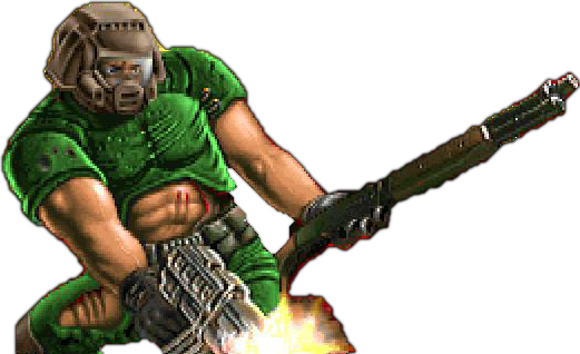
Aside from the obvious awfulness of the cover itself, what's with this Master Chief nuDoomguy? He doesn't look cool or badass in any way, just incredibly bland, boring and generic. They probably think that the original 90s Doom aesthetic wouldn't appeal to masses today but I'm sure that if they had just recreated the original Doom Marine with modern graphical fidelity and slightly darker colors, even 95% of the millenials and other moderntards would have though that he looks way more badass. Not to mention something other than a replica of Master Chief.


tumblr_inline_o494m4Qk2v1rft6m6_540.png


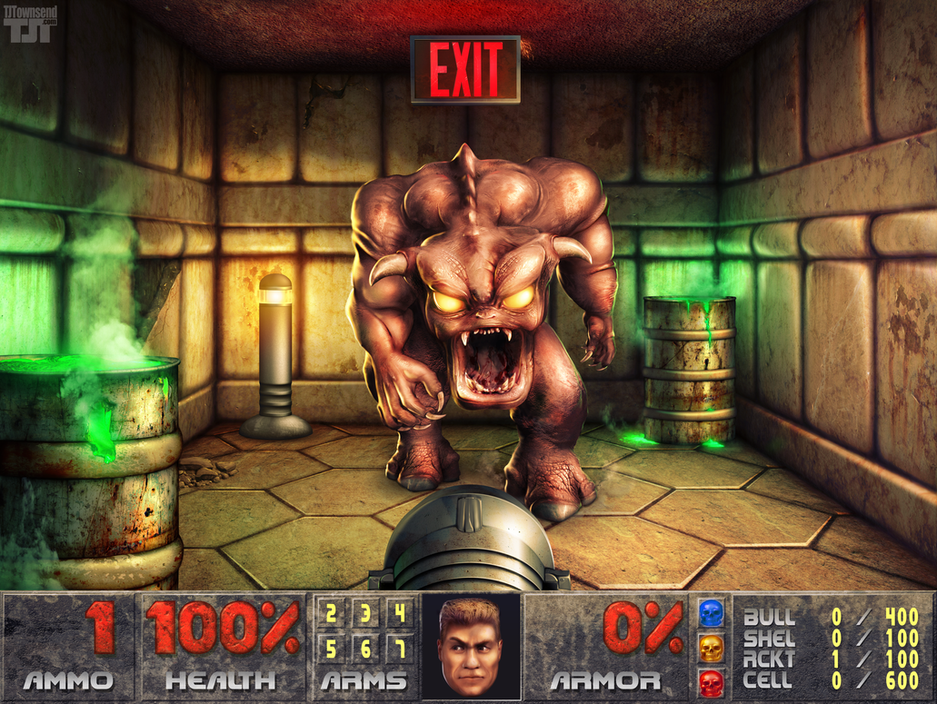
doom___pinky_demon_blocks_the_exit_by_elemental79-d5unxbd.png
 

insukk

Augur
Patron
Joined
Dec 16, 2011
Messages
327
Codex 2012
I love the constant barrage of prompts and informations. Low health, low ammo, upgrade point gained, codex entry unlocked, objective received, objective completed, rune upgrade, challenge completed. The game never shuts up. Also almost everything emitts some kind of light or puke-inducing colors.
But what is even more impressive is that you can turn off most of this in the options (even the compass!). They are marketing it with idiots in minds but player can always make it really hardcore and oldschool. C&C, bitches! :dance:
 

Durandal

Arcane
Joined
May 13, 2015
Messages
2,117
Location
New Eden
My team has the sexiest and deadliest waifus you can recruit.
My biggest issue with such a limited color palette is when the artists want to highlight something like the Mancubus' green cannons in the third screenshot of nuDoom, it just sticks out like a sore thumb. I can appreciate that Bethesda doesn't want me ruining my eyes by trying to tell something apart in their cluttered backgrounds by making items vividly colorful as opposed to fucking everything else, but it's not consistent. Serious Sam 3 did the same thing by highlighting pick-ups with bright colors, but it wasn't an assault on my eyes because most of the game was also set in a bright desert city, so the contrast wasn't as strong. Even if Doom used the whole color palette to its advantage, none of the items or creatures were bright as shit neon-colored aberrations as a result from the art director forgetting that the player needs to be able to tell shit apart from the background.
 

Luzur

Good Sir
Joined
Feb 12, 2009
Messages
41,916
Location
Swedish Empire
Looking at those videos just further cement that NuDoom looks exactly like Doom3/Wolfenstein New Order/Halo/Quake 4/other console FPS made after 2007
 

Infinitron

I post news
Patron
Staff Member
Joined
Jan 28, 2011
Messages
99,500
Codex Year of the Donut Serpent in the Staglands Dead State Divinity: Original Sin Project: Eternity Torment: Tides of Numenera Wasteland 2 Shadorwun: Hong Kong Divinity: Original Sin 2 A Beautifully Desolate Campaign Pillars of Eternity 2: Deadfire Pathfinder: Kingmaker Pathfinder: Wrath I'm very into cock and ball torture I helped put crap in Monomyth


https://www.rockpapershotgun.com/2016/04/28/doom-singleplayer-campaign/

“This isn’t Doom 4. This is actually Doom, straight up, from the beginning.”

That’s part of the introduction to an hour-long walkthrough of DOOM‘s singleplayer campaign. The video divides into three main sections, with the player jumping forward to later levels in order to show various features, and the whole thing has commentary. The combination of that commentary and the video itself has eased my concerns afterthe disappointment of the multiplayer beta. I want to play this. I’ve explained why below, as well as providing handy links so you can jump to interesting points in the video rather than watching the full thing.


That’s the whole video if you want to start from the beginning and see all that there is to see. It’s worth nothing that you’re going to see maps and monsters that you might not want to have spoiled in a video. I’m not sure how deep into the game they go but the final jump, in particular, isn’t anywhere near the opening hour.

The first thing I noticed – because I am exactly that kind of nerd – was the colourful glows around enemies. How pleasing, then, that they’re immediately explained. The blue glow shows that an enemy has been staggered, meaning you can move close and activate one of those up-close-and-personal glory kills; when you’re close enough to trigger that, the glow becomes orange.

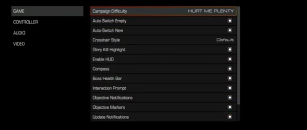
Ugh, you might be thinking. UGH. Well, you can turn all of that off. I’ve grabbed a screenshot of the menu screen that shows most of the HUD options and the commentary itself explains that objective markers, health bars and all the rest can be switched off should you want to play with a clean display (you can fiddle with FOV as well, even on the console build they’re presumably playing with here)

doommenu.jpg


The map is dealt with in a similar fashion. Some secrets will be revealed if you find an automap station – and there’s one near the beginning of each map – but they won’t reveal everything. And you can ignore them if you’d rather fill in the map as you explore.

This first section also has some story beats, delivered through video screens and codex entries. Two important things I noticed regarding the codex entries: there are 36 slots for monsters and there’s a reference to some banal bureaucracy that I decided to read in full, for some reason. I had to pause the video to do that. My reward was a reference to a suggestion form called WAD-E1M4 which must be filled in and submitted to a “Command Controller”. Hey-o!

The most pleasing information in this section is the description of combat area as abstract arenas, “like skateparks” for demon killing. That certainly seems to be the case and even though I’m not entirely convinced by the rapid disintegration of enemies (gibs should be earned, not a default death), the demon count on screen seems healthy, and the fights seem suitably kinetic.

This next section contains discussion of difficulty settings and jumps forward to a later stage in the game.


The main morsel of information here concerns the existence of an ultra-nightmare mode, which is essentially Nightmare difficulty plus ironman. You die, you start over. We’re also told that on a normal difficulty level, the campaign is around 13-15 hours in length.

Progress through the game is described as “climbing a ladder”. Every step you take, finding a bigger gun, the demons throw out something nastier to counter you. Along with new guns, there are suit upgrades, weapon modifications and runes, which provide buffs. There’s some talk about the changes (reloading still not in; jumping in) from the original, along with the upgrade system and ‘challenges’ right around here.


The final part of the video takes us to Hell, or at least a part of it. Hell has areas – ‘fractures’ – presumably with their own environmental features. I hope there’s a civil war happening in Hell and the players gets to drop into the middle of it with a chainsaw. That would be just fine.


All in all, I think this is a damn good showing. It’s fast, bloody and packed with monsters. Those melee kills also seem a lot less intrusive now that I can see how they’re aimed at parts of a monster rather than defaulting to a specific animation. Much less chance of breaking the flow this way, I reckon.

I’m excited again. I want to punch a mancubus in the face.
 

J_C

One Bit Studio
Patron
Developer
Joined
Dec 28, 2010
Messages
16,947
Location
Pannonia
Project: Eternity Wasteland 2 Shadorwun: Hong Kong Divinity: Original Sin 2 Steve gets a Kidney but I don't even get a tag. Pathfinder: Wrath

It's sad that a developer, demoing the PC version of their game cannot be arsed to use a fucking mouse in their game, instead of a controller.

EDIT: Oh, so they are in a studio, filming the whole thing. They were probably afraid that their audiance would be confused. What is that mouse thingy, this game looks too complicated!!!!!44
 

As an Amazon Associate, rpgcodex.net earns from qualifying purchases.
Back
Top Bottom