xantrius
Liturgist
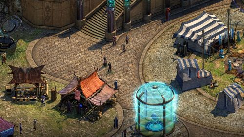
Sometimes it is necessary.I'm getting a flashback to the Wasteland 2 train wagon coupling mechanism discussion.Despite that this sounds like a troll post, i have to admit that somehow it is really weird laid out and is changing the directions in in some places at around 90° and that is unusual. Normally this is done more organic with more slight curves, or like a zipper.I am offended by those cobblestones. Nobody lays down cobblestones like that.
I was more disturbed with the edges of the cobblestones. Seemingly they just blurred them at the edge close to the other floor instead of having a natural transition. it looks lazy and bad IMO.Despite that this sounds like a troll post, i have to admit that somehow it is really weird laid out and is changing the directions in in some places at around 90° and that is unusual. Normally this is done more organic with more slight curves, or like a zipper.I am offended by those cobblestones. Nobody lays down cobblestones like that.
Take a look at the cobblestones in PST how vibrant,organic,following the road and like a mosaic. Simply beautiful.
And now at T:ToN.

Simply lazy. Four blocks that are ordered 90° to each other with the same texture.[/Q
A bit irrational to call it lazy. As has already been pointed out, Planescape: Torment was given the groundwork of its unique art direction for free from the D&D Planescape source material. All PS:T did was copy paste that framework, and then they obviously had more time to refine, elevate and add in details to the various aspects of its cityscape for Sigil etc.
That said I agree that Gesamtkunstwerk is important, a holistic perpective. Thus this new medievalesque location from T:ToN does make my eyes bleed! Of course it just had to be western medieval style of all things right? Sure just trap me in a interdimensional cage, kill me and bring me back to life over and over again for all eternity. But lolacoaster in the Ninth world the current level of technology is at a medieval level! Yeah besides the stuff that still remains from the past civilizations. Oh. Jesus. Hail generic Science Fantasy RPG number 2010102. What is this madness inane pulp within pulp elevated to ever new heights...
And the complaints about the lack of a unique overall guiding art direction have nothing to do with aversion to colorful locations nor a wish for Sigil 1.5. I guess I was just silly and took it for granted that T:ToN would have a more unique vision for its art direction by virtue of the fact that Planescape: Torment did. Albeit for free from its PnP roots which Numenera lacks. I had just naively apparently hoped that more resources had been devoted to this aspect of the game. Take the adventure game Riven - the sequel to Myst. This games interesting unique art style courtesy, to a great extent at least, of R. Vander Wende. An art style that greatly adds to the games overall ambience, it helps of course that the other aspect of that game, overall, doesn't blow unlike most of the other Myst games.
Games like Planescape: Torment, Riven, Winter Voices and Primordia, have all, to different degrees, that in common that their unique art style pick them apart from other games. And it was definitely an important, and crucial aspect in my eyes for what made PS:T unique and special. Take NWN 2: Mask of the Betrayer in contrast a lovely "game", lol but great art direction? Just ban the Codex already... At this point in T:ToN development I guess it's a moot point though more or less. Plus I'll still enjoy T:ToN overall most likely - but ugh.


