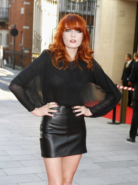
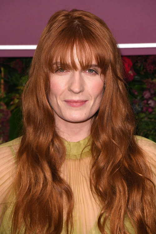
Bad Sector's post is correct: It's a reasonable adaptation of Damsel's appearance to a more realistic, less stylized graphical style.
No, she is not "realistic".
No, she doesn't look like the old Damsel. How many excuses some of you will make to try to hide the obvious? She was made uglier.
Just to be clear, my original post was only about the nose size, not the entire character. I've already mentioned before that they went with a more realistic style in this game instead of the original's hyperstylized one which, like action comics (and older games which very often had visual designs inspired more by the ideal proportions seen in action comics - this isn't me making this up btw, i have
a book from Paul Steed, one of the more known 90s 3D artists who wrote about that in there) used ideal proportions and this is why many characters look prettier there.
I do agree that she looks uglier than the original and that is partly because of the style, but also because she looks like a woman in her 40s instead of the college girl (ie. very early 20s at most) that she was supposed to be. From what i can tell this is mainly because of the visible lines under her eyes and nose/cheeks and the jaw shape being a bit too wide. Lighting doesn't help either, but i wouldn't add those details in the first place for a young character anyway.


