Can anyone say more about what's off about the art style?
1) It's not depressing
Like others have said, Diablo games are a good example where you felt NPCs cannot leave town or they will be raped to death by demons
Rogue Trader HQ seen in the video looks clean, tidy and not deteriorating (just the opposite of Diablo towns). Where is the lack of supplies? Lack of personnel? Where are injured people without limbs?
2) The palette is too colorful
It looks like the Shadowrun games, at best
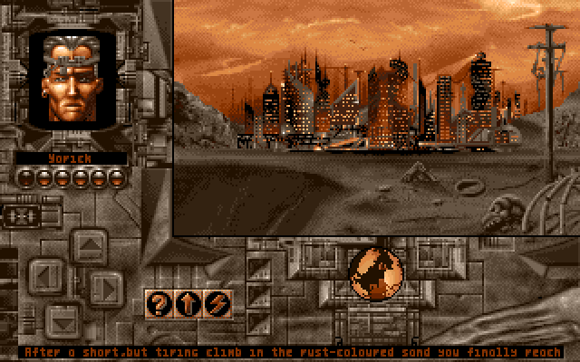
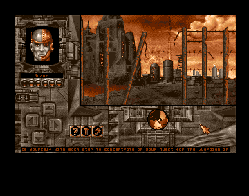
People still don't understand what a massive difference a color palette can make. Even just 2-3 properly picked colors (see Perihelion which did miracles with orange + grey)
3) Environments are well-lit
I cannot stress this enough
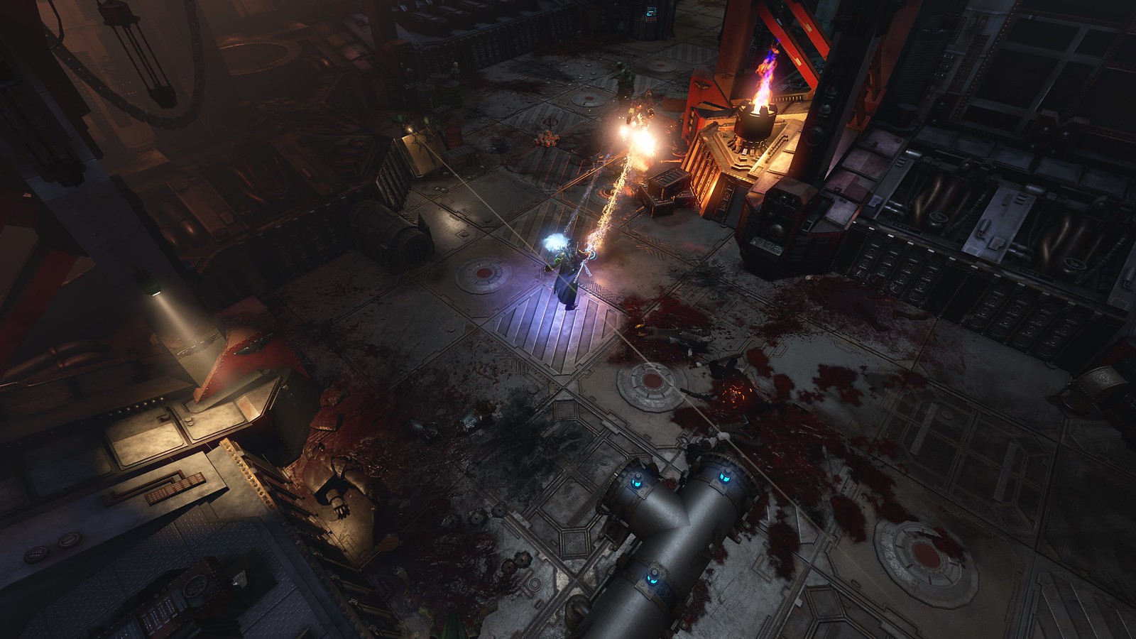
Look what a difference a light radius can make (light radius should have been the first thing to make in the engine, if one wanted to make an isometric Wh40k game)
This screenshot looks more like Wh40k and its not even the same IP
It's atmospheric and scary and you don't know what's behind the next corner. Hearing monsters before you see them does wonders
_____________________________________________________________________________________-
TLDR its simple basically
The tagline of Wh40k is as follows:
"In the grim darkness of the far future, there is only war."
War is pretty shitty and people live miserable lives
Nothing in this game looks miserable
It's not that hard to figure out, but Owlcat are retarded westernised slavs


