Let me just chip in and say Heads Will Roll is a fun game, and I'm not just saying it because of the feet.
-
Welcome to rpgcodex.net, a site dedicated to discussing computer based role-playing games in a free and open fashion. We're less strict than other forums, but please refer to the rules.
"This message is awaiting moderator approval": All new users must pass through our moderation queue before they will be able to post normally. Until your account has "passed" your posts will only be visible to yourself (and moderators) until they are approved. Give us a week to get around to approving / deleting / ignoring your mundane opinion on crap before hassling us about it. Once you have passed the moderation period (think of it as a test), you will be able to post normally, just like all the other retards.
You are using an out of date browser. It may not display this or other websites correctly.
You should upgrade or use an alternative browser.
You should upgrade or use an alternative browser.
Why do modern RPGs have 0% soul?
- Thread starter The Wall
- Start date
-
- Tags
- game development
I'm talking about presentation, not graphics you charlatan. AAA games are just as shitty in that department.That's a take worthy of a graphic whore.If the screenshots suck, the game sucks.
If these make you queasy, I don't know what to tell you:Screenshots are supposed to grab me and make me imagine all the good times the game will bring me, not repulse me and make me queasy.
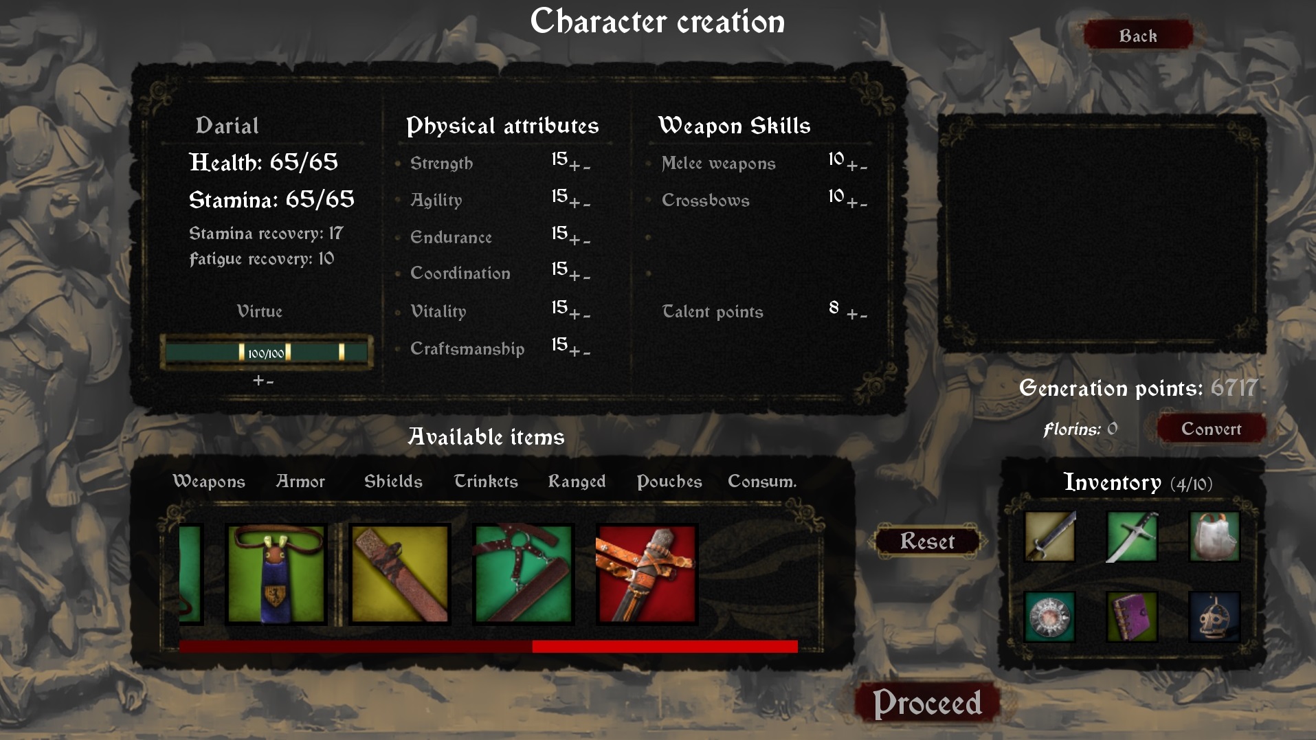


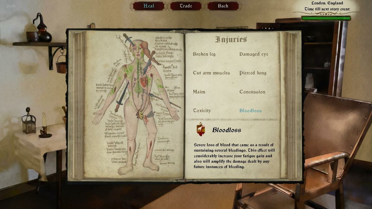
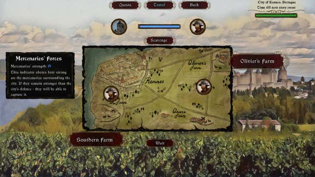
Okay, keep having fun with AAA games then.If they can't even get simple artistic presentation right, then they're not worthy of my attention. We deserve better for our money.
Not only that, but there's the huge concept of "Design by Committee". Go back a few decades, like you said, games were developed by small tight knit teams. Sometimes those teams were only one or two people. As such, what you got was the developers' vision exclusively. Now you have to run things by the publisher, the producer, whatever gay consultant group you're paying to fag up the game, and so on. And when you talk about running things by the publisher, that's often multiple people looking at it and telling you to change things not based on the merit of the idea, but what they think will sell the most copies. The same thing goes for those consultants that developers and publishers like throwing money at, only the consultants will justify you paying them by actively finding things they want you to change just to prove that you need them and pay them.On topic: I believe that many modern games have no soul because their development is characterised by compromises.
In the past, games were made by smaller teams or even individuals, so only one person was responsible for the creative version. Because of this, the creative vision of that one person came through more clearly and unfiltered. The creative vision was also more cohesive and consistent.
What's even more bizarre is that often times the consultants tell you to make changes which fly in the face of what the publishers supposedly want, which is to make money. But the publishers bend the knee to the consultants because they're agenda seeking shitheads as well. So, you wind up with the publishers tip toeing around the fagging up of the games with ideas on making money that don't intersect with the consultants which results in the push for live service games with skins and other microtransactions.
Lord_Potato
Arcane

Ok, I'll bite: what's wrong about the presentation in above screenshots? Everything is clean, visible and has the proper medieval flavor.I'm talking about presentation, not graphics you charlatan. AAA games are just as shitty in that department.That's a take worthy of a graphic whore.If the screenshots suck, the game sucks.
If these make you queasy, I don't know what to tell you:Screenshots are supposed to grab me and make me imagine all the good times the game will bring me, not repulse me and make me queasy.


Okay, keep having fun with AAA games then.If they can't even get simple artistic presentation right, then they're not worthy of my attention. We deserve better for our money.
And what games since say 2015 had such a superior presentation?
Damned Registrations
Furry Weeaboo Nazi Nihilist
- Joined
- Feb 24, 2007
- Messages
- 15,851
Honestly given what I've seen over the last 30 years, I'm convinced publishers/marketing have been doing that shit all along. When shit goes wrong they just shift blame and jump ship to a new project. The number of potentially good games that would have sold well utterly ruined by retarded interference from publishers/marketing is way too high for them to be a competent, reliable asset to the industry. Their only real skill appears to be convincing people to pay them money.only the consultants will justify you paying them by actively finding things they want you to change just to prove that you need them and pay them.
Artyoan
Prophet
- Joined
- Jan 16, 2017
- Messages
- 733
Some of it does have a soul. But all too often the approach to RPG's (and entertainment in general) is like the new Star Wars trilogy. They don't care for the source material, don't know where they are going with it anyway, hand off fundamental aspects to entirely different people with very different visions.
I do think having one creative mastermind behind a project is important. If it is a team, it needs to be a small group that is on the same page for years at a time.
I do think having one creative mastermind behind a project is important. If it is a team, it needs to be a small group that is on the same page for years at a time.
Looking at the page I thought to myself "this is a game for cell phones that creepy people masturbate to" (no offense JarlFrank) that's why they don't get my precious pennies.Ok, I'll bite: what's wrong about the presentation in above screenshots? Everything is clean, visible and has the proper medieval flavor.I'm talking about presentation, not graphics you charlatan. AAA games are just as shitty in that department.That's a take worthy of a graphic whore.If the screenshots suck, the game sucks.
If these make you queasy, I don't know what to tell you:Screenshots are supposed to grab me and make me imagine all the good times the game will bring me, not repulse me and make me queasy.


Okay, keep having fun with AAA games then.If they can't even get simple artistic presentation right, then they're not worthy of my attention. We deserve better for our money.
And what games since say 2015 had such a superior presentation?
Felvidek did get my precious pennies, however so that guy obviously presented his game much better. But really every game that tries to charge us money should be at least Blasphemous level of art and presentation.
RaggleFraggle
Ask me about VTM
- Joined
- Mar 23, 2022
- Messages
- 1,438
Again, ”too many cooks” and “general incompetence” has always been a problem. The games that failed aren’t remembered, giving a false impression that this wasn’t a problem back then. There were less activists, but there still were plenty of hacks and aimless daydreamers in the industry.Not only that, but there's the huge concept of "Design by Committee". Go back a few decades, like you said, games were developed by small tight knit teams. Sometimes those teams were only one or two people. As such, what you got was the developers' vision exclusively. Now you have to run things by the publisher, the producer, whatever gay consultant group you're paying to fag up the game, and so on. And when you talk about running things by the publisher, that's often multiple people looking at it and telling you to change things not based on the merit of the idea, but what they think will sell the most copies. The same thing goes for those consultants that developers and publishers like throwing money at, only the consultants will justify you paying them by actively finding things they want you to change just to prove that you need them and pay them.On topic: I believe that many modern games have no soul because their development is characterised by compromises.
In the past, games were made by smaller teams or even individuals, so only one person was responsible for the creative version. Because of this, the creative vision of that one person came through more clearly and unfiltered. The creative vision was also more cohesive and consistent.
What's even more bizarre is that often times the consultants tell you to make changes which fly in the face of what the publishers supposedly want, which is to make money. But the publishers bend the knee to the consultants because they're agenda seeking shitheads as well. So, you wind up with the publishers tip toeing around the fagging up of the games with ideas on making money that don't intersect with the consultants which results in the push for live service games with skins and other microtransactions.
Lord_Potato
Arcane

If there is a strong mastermind, the team can even be quite big. Vavra pulled off Kingdom Come Deliverance with a team of 100+ (there were 131 guys employed in Warhorse in August 2019) and nobody can say this game doesn't have a soul.I do think having one creative mastermind behind a project is important. If it is a team, it needs to be a small group that is on the same page for years at a time.
What gets me is that they seem to think that they can honestly piss off their customers with this stuff but make up for it with loot boxes. They also bitch about how games cost more and more to develop, but at the same time flush money down the toilet by hiring these consultants which lead to their games not selling. I've mentioned this before, but how much development time gets eaten up by following the advice of these consultants? You have to make something in order to show it to the consultants, who demand a change in that thing, at which point you have to change it. You're basically paying money to waste money and then not get money at the end of it.Honestly given what I've seen over the last 30 years, I'm convinced publishers/marketing have been doing that shit all along. When shit goes wrong they just shift blame and jump ship to a new project. The number of potentially good games that would have sold well utterly ruined by retarded interference from publishers/marketing is way too high for them to be a competent, reliable asset to the industry. Their only real skill appears to be convincing people to pay them money.
No, it hasn't. Particularly back before the 1990s.Again, ”too many cooks” and “general incompetence” has always been a problem. The games that failed aren’t remembered, giving a false impression that this wasn’t a problem back then. There were less activists, but there still were plenty of hacks and aimless daydreamers in the industry.
Lord_Potato
Arcane

I see you're avoiding answering my question:Looking at the page I thought to myself "this is a game for cell phones that creepy people masturbate to" (no offense JarlFrank) that's why they don't get my precious pennies.Ok, I'll bite: what's wrong about the presentation in above screenshots? Everything is clean, visible and has the proper medieval flavor.I'm talking about presentation, not graphics you charlatan. AAA games are just as shitty in that department.If these make you queasy, I don't know what to tell you:Screenshots are supposed to grab me and make me imagine all the good times the game will bring me, not repulse me and make me queasy.


Okay, keep having fun with AAA games then.If they can't even get simple artistic presentation right, then they're not worthy of my attention. We deserve better for our money.
And what games since say 2015 had such a superior presentation?
Felvidek did get my precious pennies, however so that guy obviously presented his game much better. But really every game that tries to charge us money should be at least Blasphemous level of art and presentation.
What's wrong about the presentation in above screenshots? Everything is clean, visible and has the proper medieval flavor.
And what games since say 2015 had such a superior presentation?
RaggleFraggle
Ask me about VTM
- Joined
- Mar 23, 2022
- Messages
- 1,438
The E.T. video gameNo, it hasn't. Particularly back before the 1990s.
Was developed by one guy, Howard Scott Warshaw who also did Yar's Revenge. So, not an example of "too many cooks" nor "general incompetence".The E.T. video game
The Jester
Cipher
- Joined
- Mar 1, 2020
- Messages
- 1,741
An inanimate object can't have a soul of its own. The soul of an art piece comes from the passion of the artist. How can modern video games have a soul when their creators are soulless corporate golems?
Tyranicon
A Memory of Eternity

- Joined
- Oct 7, 2019
- Messages
- 7,790
What gets me is that they seem to think that they can honestly piss off their customers with this stuff but make up for it with loot boxes.
The problem is they can. Gaming audiences, like all broad audiences, have ridiculously short memories and are very forgiving.
Only indies are stupid enough to try and garner a reputation for something as inconsequential as "integrity."

Uh, no I'm not I told you what was wrong and gave you two examples. Can you read?I see you're avoiding answering my question:Looking at the page I thought to myself "this is a game for cell phones that creepy people masturbate to" (no offense JarlFrank) that's why they don't get my precious pennies.Ok, I'll bite: what's wrong about the presentation in above screenshots? Everything is clean, visible and has the proper medieval flavor.I'm talking about presentation, not graphics you charlatan. AAA games are just as shitty in that department.If these make you queasy, I don't know what to tell you:Screenshots are supposed to grab me and make me imagine all the good times the game will bring me, not repulse me and make me queasy.


Okay, keep having fun with AAA games then.If they can't even get simple artistic presentation right, then they're not worthy of my attention. We deserve better for our money.
And what games since say 2015 had such a superior presentation?
Felvidek did get my precious pennies, however so that guy obviously presented his game much better. But really every game that tries to charge us money should be at least Blasphemous level of art and presentation.
What's wrong about the presentation in above screenshots? Everything is clean, visible and has the proper medieval flavor.
And what games since say 2015 had such a superior presentation?
Lord_Potato
Arcane

You told me it looks like cell phone game, which is of course bullshit. Cell phone games do not have small fonts, icons and tiny buttons. So no, your criticism wasn't worth shit.Uh, no I'm not I told you what was wrong and gave you two examples. Can you read?I see you're avoiding answering my question:Looking at the page I thought to myself "this is a game for cell phones that creepy people masturbate to" (no offense JarlFrank) that's why they don't get my precious pennies.Ok, I'll bite: what's wrong about the presentation in above screenshots? Everything is clean, visible and has the proper medieval flavor.I'm talking about presentation, not graphics you charlatan. AAA games are just as shitty in that department.If these make you queasy, I don't know what to tell you:Screenshots are supposed to grab me and make me imagine all the good times the game will bring me, not repulse me and make me queasy.


Okay, keep having fun with AAA games then.If they can't even get simple artistic presentation right, then they're not worthy of my attention. We deserve better for our money.
And what games since say 2015 had such a superior presentation?
Felvidek did get my precious pennies, however so that guy obviously presented his game much better. But really every game that tries to charge us money should be at least Blasphemous level of art and presentation.
What's wrong about the presentation in above screenshots? Everything is clean, visible and has the proper medieval flavor.
And what games since say 2015 had such a superior presentation?
As for examples, you mentioned Felivdek which I brought to the conversation. So the only game you managed to come up with was Blashphemous.
Obviously, talking about 'presentation' is already a result of your goal posts moving. The topic of this thread was 'soul', not 'presentation'.
Lord_Potato
Arcane

Yup, true. Heads will roll is a much more sophisticated game. Mechanically and storywise.tbh Felvidek fits the bill of a "mobile game" much better, given how simplistic it is, how little content there is to it relative to its price, style over substance, and how much it bites its style from shit that is popularly emulated on android
This
I'm a simple consumer, I look at a store page and I get a feeling like "phone game for perverts". That's not a me problem, that's the problem of the guy marketing it to me.
Anyways, there's nothing wrong with my examples, dumb ass nigga. Move the goal post up your ass and spin around on it.
This is the problem with you policial posters, you argue like nerds looking for little nitpicks you can feel like you won on.You told me it looks like cell phone game, which is of course bullshit. Cell phone games do not have small fonts, icons and tiny buttons. So no, your criticism wasn't worth shit.Uh, no I'm not I told you what was wrong and gave you two examples. Can you read?I see you're avoiding answering my question:Looking at the page I thought to myself "this is a game for cell phones that creepy people masturbate to" (no offense JarlFrank) that's why they don't get my precious pennies.Ok, I'll bite: what's wrong about the presentation in above screenshots? Everything is clean, visible and has the proper medieval flavor.I'm talking about presentation, not graphics you charlatan. AAA games are just as shitty in that department.If these make you queasy, I don't know what to tell you:Screenshots are supposed to grab me and make me imagine all the good times the game will bring me, not repulse me and make me queasy.


Okay, keep having fun with AAA games then.If they can't even get simple artistic presentation right, then they're not worthy of my attention. We deserve better for our money.
And what games since say 2015 had such a superior presentation?
Felvidek did get my precious pennies, however so that guy obviously presented his game much better. But really every game that tries to charge us money should be at least Blasphemous level of art and presentation.
What's wrong about the presentation in above screenshots? Everything is clean, visible and has the proper medieval flavor.
And what games since say 2015 had such a superior presentation?
As for examples, you mentioned Felivdek which I brought to the conversation. So the only game you managed to come up with was Blashphemous.
Obviously, talking about 'presentation' is already a result of your goal posts moving. The topic of this thread was 'soul', not 'presentation'.
I'm a simple consumer, I look at a store page and I get a feeling like "phone game for perverts". That's not a me problem, that's the problem of the guy marketing it to me.
Anyways, there's nothing wrong with my examples, dumb ass nigga. Move the goal post up your ass and spin around on it.
Lord_Potato
Arcane

It's alright, I accept your humble surrender.This
This is the problem with you policial posters, you argue like nerds looking for little nitpicks you can feel like you won on.
Judging a book by its cover is not something to be proud of. Every retard does exactly the same. The more you act like one the more you might get identified with one.I'm a simple consumer, I look at a store page and I get a feeling like "phone game for perverts". That's not a me problem, that's the problem of the guy marketing it to me.
Example, as if singular. Felvidek was provided by meAnyways, there's nothing wrong with my examples, dumb ass nigga. Move the goal post up your ass and spin around on it.
I used felvidek because you like it retard. It's called "finding common ground." I know this is frowned upon by people who only post about politics.It's alright, I accept your humble surrender.This
This is the problem with you policial posters, you argue like nerds looking for little nitpicks you can feel like you won on.
Judging a book by its cover is not something to be proud of. Every retard does exactly the same. The more you act like one the more you might get identified with one.I'm a simple consumer, I look at a store page and I get a feeling like "phone game for perverts". That's not a me problem, that's the problem of the guy marketing it to me.
Example, as if singular. Felvidek was provided by meAnyways, there's nothing wrong with my examples, dumb ass nigga. Move the goal post up your ass and spin around on it.
You should start judging books by their covers more, it's what smart people do. The chances of being wrong are way lower than being right. You'd know that if you thought for a second instead of just barfing out old sayings that you heard from other fools.
Lord_Potato
Arcane

You keep repeating this, but I've got 8 times more posts in GRPG than you do, my misguided black friend.I know this is frowned upon by people who only post about politics.
Sure, you've got more posts in jRPG, but then again, that's nothing to be proud of.
luj1
You're all shills

I see you're avoiding answering my question:If these make you queasy, I don't know what to tell you:


What's wrong about the presentation in above screenshots? Everything is clean, visible and has the proper medieval flavor.
its generic and artistically sterile
for starters,
- color palette is bad (uses bright, solid colors with 0 character)
- interface is too sharp and slick for a medieval game, has 0 detail, looks like a mobile game
- the injury window has a good idea but poor execution
- item icons are too large and crude, again whoever compared it to a mobile game isnt wrong
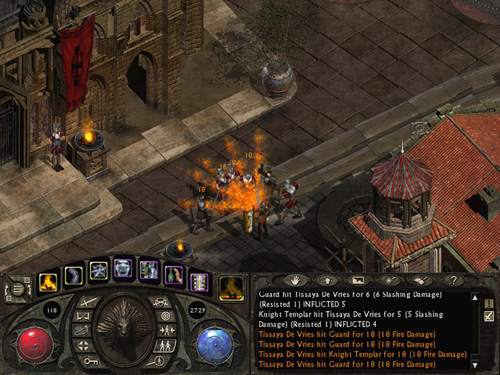
Now u mentioned medieval rpgs, take for example Lionheart Legacy of the Crusader, which was quite a mediocre game from back in the day, but can probably give lessons to the devs of this game when it comes to art design / UI / color design
These things make a huge difference when it comes to "soul" but proper art design is totally forgotten by modern devs and plebs alike. More thought went into sound design in Diablo or into Telvanni architecture in Morrowind than into entire modern games
Last edited:
Lord_Potato
Arcane

Bright, solid colors and too large icons. A clear symptom of bad visual design.I see you're avoiding answering my question:
What's wrong about the presentation in above screenshots? Everything is clean, visible and has the proper medieval flavor.
its generic and artistically sterile
for starters,
- color palette is bad (uses bright, solid colors with 0 character)
- interface has 0 detail, looks like a mobile game
- the injury window has a good idea but poor execution
- item icons are too large and crude, again whoever compared it to a mobile game isnt wrong
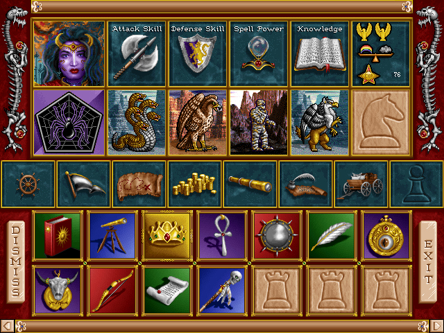
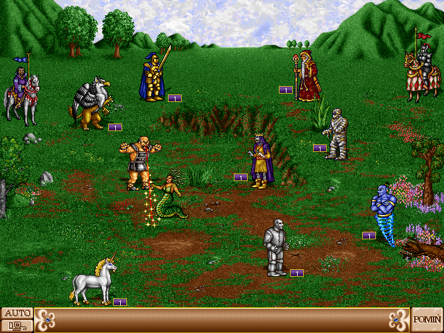
(pictures completely unrelated)
Ah yes, Legacy of the Crusader. Perfect UI (that only took 1/4 of the screen, no worries) and precursor of the brown-and-vomit color palette later associated with Fallout: New Vegas. How could I omit such an inspiring example!Now u mentioned medieval rpgs, take for example Lionheart Legacy of the Crusader, which was quite a mediocre game from back in the day, but can probably give lessons to the devs of this games wheb it comes to art design / UI / color design
