Putting the 'role' back in role-playing games since 2002.
Donate to Codex
Good Old Games
  • Welcome to rpgcodex.net, a site dedicated to discussing computer based role-playing games in a free and open fashion. We're less strict than other forums, but please refer to the rules.

    "This message is awaiting moderator approval": All new users must pass through our moderation queue before they will be able to post normally. Until your account has "passed" your posts will only be visible to yourself (and moderators) until they are approved. Give us a week to get around to approving / deleting / ignoring your mundane opinion on crap before hassling us about it. Once you have passed the moderation period (think of it as a test), you will be able to post normally, just like all the other retards.

Preview Witcher 3 Preview at PC Gamer

RRRrrr

Arcane
Glory to Ukraine
Joined
Nov 6, 2011
Messages
2,308
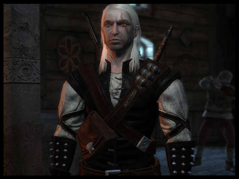
Can you post some example screenshots demonstrating the differences between Witcher 1 and Witcher 2 that make the latter "cartoony"

Not enough time right now. Look some screenshots up, it is clear that TW1 had more realistic style than TW2. Cartoony was an exaggeration, too fucking colorful is a better wording.
 

Infinitron

I post news
Patron
Staff Member
Joined
Jan 28, 2011
Messages
99,623
Codex Year of the Donut Serpent in the Staglands Dead State Divinity: Original Sin Project: Eternity Torment: Tides of Numenera Wasteland 2 Shadorwun: Hong Kong Divinity: Original Sin 2 A Beautifully Desolate Campaign Pillars of Eternity 2: Deadfire Pathfinder: Kingmaker Pathfinder: Wrath I'm very into cock and ball torture I helped put crap in Monomyth
Can you post some example screenshots demonstrating the differences between Witcher 1 and Witcher 2 that make the latter "cartoony"

Not enough time right now. Look some screenshots up, it is clear that TW1 had more realistic style than TW2. Cartoony was an exaggeration, too fucking colorful is a better wording.

That's not clear to me at all.

I think your problem is that in TW2 everything is up close and in your face, which makes the artificiality of the 3D graphics more apparent.
 

Zboj Lamignat

Arcane
Joined
Feb 15, 2012
Messages
5,777
Because I'm interested in crpg games and have read the


books as a kid?:roll:
That explains why you liked them.
I never wrote I liked the Witcher books per se, it's just people like Infinitron getting retarded and throwing fanboy tantrums when something falls out of their line of reasoning. In fact my impressions were very similar to yours. I read the books when they were coming out (not later, when "thanks" to various role models like computer game journalists these books became potato equivalent of Harry Potter and greatest works of literature for every long-haired high school student, the fallout of these events is still seen on the interent, this topic included) and really liked the first short stories printed in Fantastyka magazine and later in two tomes. Geralt was mostly bro in them, doing fun stuff and the stories were based on lots of potato folklore which added charm bonus.

However, these tomes, especially the second one, already showed signs of things to come in the later novels. That is, Geralt stopping doing the cool witchery stuff almost completely and becoming a whiny emo and an irritating, uninteresting bitch becoming the main protagonist with loltarded "teh chosen one" plotline added on top.

Never mind that, it's just an older me speaking, I still liked the adventuring parts with Geralt's company and the first four novels are a good read if you're a teenager. Just a real shame about the final book, where the time travelling drama is a definition of shitty filler and the ending is just... Well, it's just "fuck off and give me money for more alcohol".
 

RRRrrr

Arcane
Glory to Ukraine
Joined
Nov 6, 2011
Messages
2,308
I think your problem is that in TW2 everything is up close and in your face, which makes the artificiality of the 3D graphics more apparent.
You might be right. TW2 certainly looks better on screenshots (when everything is still) than ingame when actually playing. I have a hard time finding good screenshots to prove my point (google images is full of pre-release screenshots, which doesn't help much).

I played TW1 almost immediately after I finished TW1 and I remember feeling very refreshed by the graphics and actually found them better/more pleasant to look at. Even the character models were not too bad (I the high-res texture mod+ a mod for the characters).

preview.jpg


Witcher-Geralt.jpg
While the second image certainly has more polygons and everything, it still doesn't feel right.


the-witcher-217.jpg


a15be4157c_58831207_o2.png

Why does every fucking google images screenshot have to be from before the release :x
 

J_C

One Bit Studio
Patron
Developer
Joined
Dec 28, 2010
Messages
16,947
Location
Pannonia
Project: Eternity Wasteland 2 Shadorwun: Hong Kong Divinity: Original Sin 2 Steve gets a Kidney but I don't even get a tag. Pathfinder: Wrath
While the second image certainly has more polygons and everything, it still doesn't feel right.


Why does every fucking google images screenshot have to be from before the release :x
I understand if you dislike the more colorful style of TW2, but being a different style won't make it bad. I per se like the second games's more colorful approach.
 

Storyfag

Perfidious Pole
Patron
Joined
Feb 17, 2011
Messages
17,722
Location
Stealth Orbital Nuke Control Centre
While the second image certainly has more polygons and everything, it still doesn't feel right.


Why does every fucking google images screenshot have to be from before the release :x
I understand if you dislike the more colorful style of TW2, but being a different style won't make it bad. I per se like the second games's more colorful approach.

I loathe it. But it doesn't make it a bad game. It merely means TW1 is much better.
 

Roguey

Codex Staff
Staff Member
Sawyerite
Joined
May 29, 2010
Messages
36,707
RRRrrr Witcher 2 uses its specular maps awfully (like most games) so everything looks unnaturally shiny.
 

Smejki

Larian Studios, ex-Warhorse
Developer
Joined
Oct 22, 2012
Messages
710
Location
Belgistan
"Cartoony"? :roll::roll::roll:
For the lack of better word. It is certainly not clean and realistic.

Can you post some example screenshots demonstrating the differences between Witcher 1 and Witcher 2 that make the latter "cartoony"
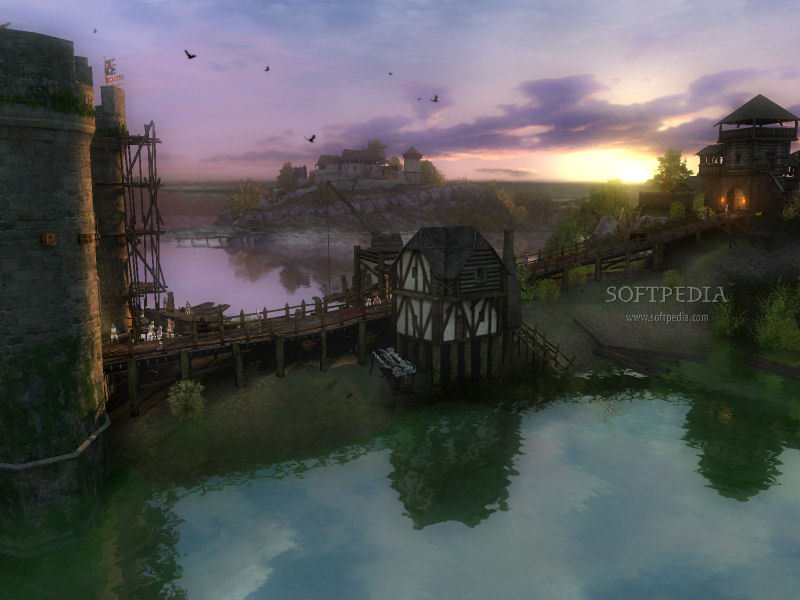
Not cartoony. Just heavily fantasy stylized. TW1 had more decent architecture for example
Vizima was normal central -european late middle-age town, forests around were normal forests
whereas the La Vallete (?) castle in the begining of TW2 is unrealistic oversized fantasy megastructure and forest around Flotsam has 100m trees

Not that I would care. I like both styles
 

BobtheTree

Savant
Joined
Nov 22, 2011
Messages
389
I think a better way to say it is that Witcher 2 looks a bit more glossy than the first game. Some of the textures reflect light in such a way that makes them look a bit plastic. That didn't but me too much, but I get why it might but someone else.
 

cvv

Arcane
Patron
Joined
Mar 30, 2013
Messages
18,956
Location
Kingdom of Bohemia
Enjoy the Revolution! Another revolution around the sun that is.
:bounce: POTATO CAN INTO GRAPHICS: x


13.jpg


witcher3_landscape.jpg


news-witcher-3-12.jpg


NEW_The_Witcher_3_Wild_Whale.png


pcg251_feat_witcher_sg3sl6.jpg

True, they can into graphic mighty fine, but somehow they can't into proper fucking ligthning to save their lives.

W2 was terrible enough in that regard and now, look at all the screenshots from W3, the lightnings and colours are hilarious.
I mean are they eating mushrooms instead of potatoes up there in Warsaw?

Also - :bounce:
 

J_C

One Bit Studio
Patron
Developer
Joined
Dec 28, 2010
Messages
16,947
Location
Pannonia
Project: Eternity Wasteland 2 Shadorwun: Hong Kong Divinity: Original Sin 2 Steve gets a Kidney but I don't even get a tag. Pathfinder: Wrath
True, they can into graphic mighty fine, but somehow they can't into proper fucking ligthning to save their lives.

W2 was terrible enough in that regard and now, look at all the screenshots from W3, the lightnings and colours are hilarious.
I mean are they eating mushrooms instead of potatoes up there in Warsaw?
No, it's just there is a difference between Crysis like fotorealistic graphics, and graphics which has more freedom in colour useage. Both exist in videogames you know. Those screenshots look very good. The last one is bad, because there is some lens flare which is not needed.
 

cvv

Arcane
Patron
Joined
Mar 30, 2013
Messages
18,956
Location
Kingdom of Bohemia
Enjoy the Revolution! Another revolution around the sun that is.
No, it's just there is a difference between Crysis like fotorealistic graphics, and graphics which has more freedom in colour useage. Both exist in videogames you know. Those screenshots look very good. The last one is bad, because there is some lens flare which is not needed.

Heh, "freedom in colour usage" is the understatement of the day.

Anyway, it's not just about that lens flare.
The colours are just way too damn oversaturated, just as they were in W2. I feel if you add a little more saturation they'd fry my damn retina.
(When playing W2 I actually had to twirl my manual monitor doodads for half an hour in order to not go blind. It took a while to figure them out because I hadn't touched them since I bought my monitor).
 

J_C

One Bit Studio
Patron
Developer
Joined
Dec 28, 2010
Messages
16,947
Location
Pannonia
Project: Eternity Wasteland 2 Shadorwun: Hong Kong Divinity: Original Sin 2 Steve gets a Kidney but I don't even get a tag. Pathfinder: Wrath
No, it's just there is a difference between Crysis like fotorealistic graphics, and graphics which has more freedom in colour useage. Both exist in videogames you know. Those screenshots look very good. The last one is bad, because there is some lens flare which is not needed.

Heh, "freedom in colour usage" is the understatement of the day.

Anyway, it's not just about that lens flare.
The colours are just way too damn oversaturated, just as they were in W2. I feel if you add a little more saturation they'd fry my damn retina.
(When playing W2 I actually had to twirl my manual monitor doodads for half an hour in order to not go blind. It took a while to figure them out because I hadn't touched them since I bought my monitor).
Would you stop overexagerating this? It was colorful, but it wasn't anything serious. God forbid you playing Psychonauts or other truly colorful games, your eyes would probably fall out from your eyes sockets.
 

Infinitron

I post news
Patron
Staff Member
Joined
Jan 28, 2011
Messages
99,623
Codex Year of the Donut Serpent in the Staglands Dead State Divinity: Original Sin Project: Eternity Torment: Tides of Numenera Wasteland 2 Shadorwun: Hong Kong Divinity: Original Sin 2 A Beautifully Desolate Campaign Pillars of Eternity 2: Deadfire Pathfinder: Kingmaker Pathfinder: Wrath I'm very into cock and ball torture I helped put crap in Monomyth
Again, the problem with TW2 was less the actual colors or art style and more the IN YOUR FACE low FOV third person perspective. It would have looked just fine if they'd let you zoom out a bit.
 

cvv

Arcane
Patron
Joined
Mar 30, 2013
Messages
18,956
Location
Kingdom of Bohemia
Enjoy the Revolution! Another revolution around the sun that is.
Would you stop overexagerating this? It was colorful, but it wasn't anything serious. God forbid you playing Psychonauts or other truly colorful games, your eyes would probably fall out from your eyes sockets.

Of course I'm exaggerating, it's a stupid unnecessary blemish on a great game. We are always most pissed about things we love.

And sure, Jaesun, I'm a Codex noob that wants to fit in and trying hard to be cool and edgy. There. Bam. Got me.
:roll:
 
Self-Ejected

Jack

█▓▒░
Patron
Joined
May 5, 2010
Messages
4,900
Location
Yondo
Insert Title Here
I much prefer the more sober and down to earth visuals of the first game to this even if it is technically superior. The first one is pretty good though, but the mountains look so tiny.
2hogpyd.jpg
 

Roguey

Codex Staff
Staff Member
Sawyerite
Joined
May 29, 2010
Messages
36,707
Again, the problem with TW2 was less the actual colors or art style and more the IN YOUR FACE low FOV third person perspective. It would have looked just fine if they'd let you zoom out a bit.
My problems have nothing to do with the camera perspective and everything to do with hackwork specular mapping that would still look bad even from a distance.
 

Turisas

Arch Devil
Patron
Joined
May 25, 2009
Messages
9,999
Some of those outdoors shots look really sparse (yes, even for desolate tundra) but I suppose they still have plenty of time to touch them up.
 

pistletoe

Educated
Joined
Nov 2, 2012
Messages
43
All the usual whinging on here I see. Can't wait for the game. CDPR actually listened to fans about the last game.
 

MasPingon

Arcane
Joined
May 13, 2007
Messages
1,919
Location
Castle Rock
Again, the problem with TW2 was less the actual colors or art style and more the IN YOUR FACE low FOV third person perspective. It would have looked just fine if they'd let you zoom out a bit.

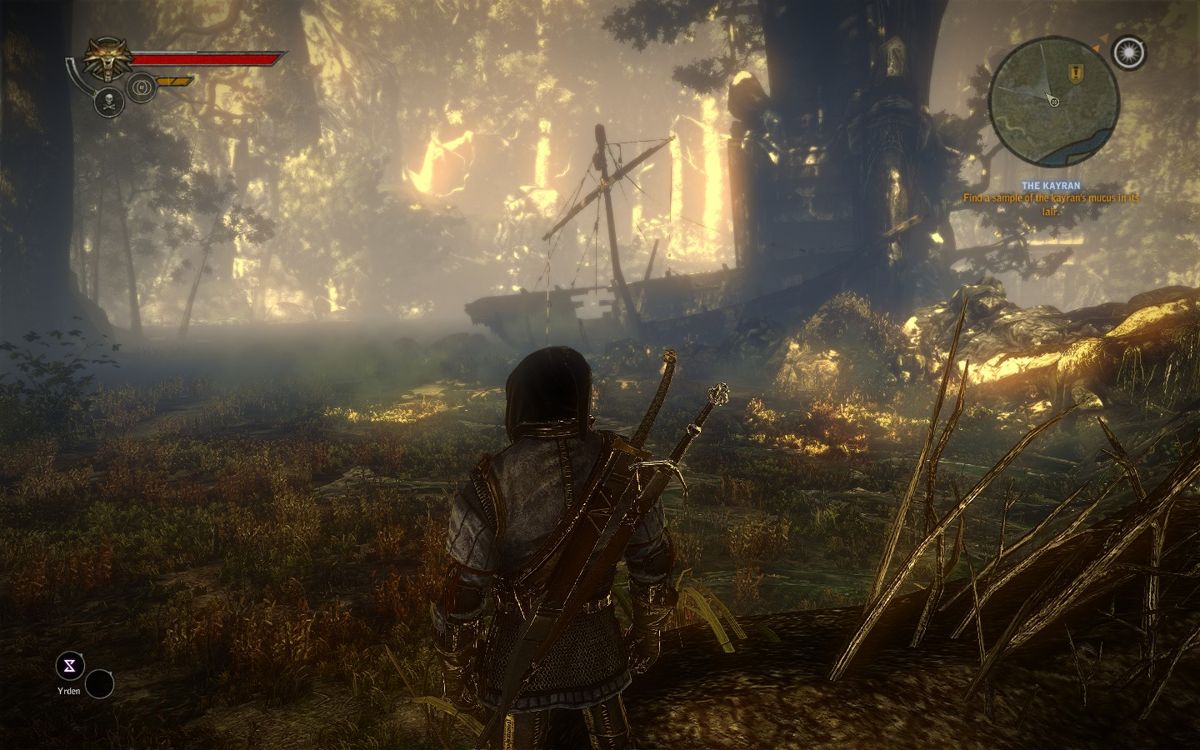
Fact - color palette was actually much more realistic in TW1

8-2122_1.jpg


267336-the-witcher-windows-screenshot-conversing-with-vizima-guard.jpg


Silly Witcher 2 lighting

1900645640.jpg

528770-the-witcher-2-assassins-of-kings-windows-screenshot-a-shipwreck.jpg
 

As an Amazon Associate, rpgcodex.net earns from qualifying purchases.
Back
Top Bottom