Putting the 'role' back in role-playing games since 2002.
Donate to Codex
Good Old Games
  • Welcome to rpgcodex.net, a site dedicated to discussing computer based role-playing games in a free and open fashion. We're less strict than other forums, but please refer to the rules.

    "This message is awaiting moderator approval": All new users must pass through our moderation queue before they will be able to post normally. Until your account has "passed" your posts will only be visible to yourself (and moderators) until they are approved. Give us a week to get around to approving / deleting / ignoring your mundane opinion on crap before hassling us about it. Once you have passed the moderation period (think of it as a test), you will be able to post normally, just like all the other retards.

Vapourware Codexian Game Development Thread

Nathaniel3W

Rockwell Studios
Patron
Developer
Joined
Feb 5, 2015
Messages
1,305
Location
Washington, DC
Strap Yourselves In Codex Year of the Donut Codex+ Now Streaming!
Hey Nathaniel3W, do you mind relinking to the shots in question?
Here they are (spoilered so I'm not double-posting spam, for those who have already seen it):
The battles have been missing something so I've been trying to add more to them. I now have flanking bonuses, informative status effect popups that look pretty snazzy too. Also, walls that give bonuses to attack and defense and attack range. Wall hexes have +1 movement cost if climbing up from a non-wall hex, unless you're moving a flying unit. Test level screenshots below. Behold my 3D-modeling skills! I can make hexagon-cylinders and cubes.

WallsBattleTest_Ranged.jpg


WallsBattleTest_Walking2.jpg


Things are still a little buggy. Sometimes the whole lance doesn't climb to the top of the wall. I should make the ranged attack arc go up more. I should probably also disable melee attacks between wall/not-wall hexes.

And I still need to add destructible gates and maybe some other things. But overall I think the changes are pretty good.
 

AdolfSatan

Arcane
Joined
Dec 27, 2017
Messages
2,028
The DOF effect looks fugly because its application makes no sense whatsoever. On one hand, it shows no concern for any kind of aesthetic values; on the other it's distorting and hiding information from the eye.
I've no idea what algorithm are you using to generate it, but it doesn't seem to be taking any actual depth into account, it looks just like random blurriness.
 

Duckard

Augur
Joined
Aug 14, 2010
Messages
354
Nathaniel3W I just looked up some screenshots of Octopath to compare with your game. I believe they're using a tilt shift effect rather than the standard DOF that it looks like you're using.

Typical DOF just blurs by sampling the depth buffer and comparing it with the specified focal distance, whereas a proper tilt shift shader will mimic the Scheimpflug principle.

This post on tilt shift both explains how the real process works if you want to go down that route, and how to fake it convincingly with an image effect. Note that the FOV and positioning of your camera will also have an impact on the look, so you can try playing with that as well.
 

Dualnames

Wormwood Studios
Developer
Joined
May 30, 2019
Messages
53
Location
Greece
Jokes aside, I do agree with what has been said, it wouldn't be a bad idea to keep experimenting with the effect till u get it right.
 

Bad Sector

Arcane
Patron
Joined
Mar 25, 2012
Messages
2,334
Insert Title Here RPG Wokedex Codex Year of the Donut Codex+ Now Streaming! Steve gets a Kidney but I don't even get a tag.
Gameplay is going to be more important than art style.

I want to focus the art style part and add that it is better to stick with a with a lo-fi and crude art style that is applied consistently than a mishmash of different art styles and qualities where some parts are high fidelity and others are low.
 

Galdred

Studio Draconis
Patron
Developer
Joined
May 6, 2011
Messages
4,496
Location
Middle Empire
Steve gets a Kidney but I don't even get a tag.
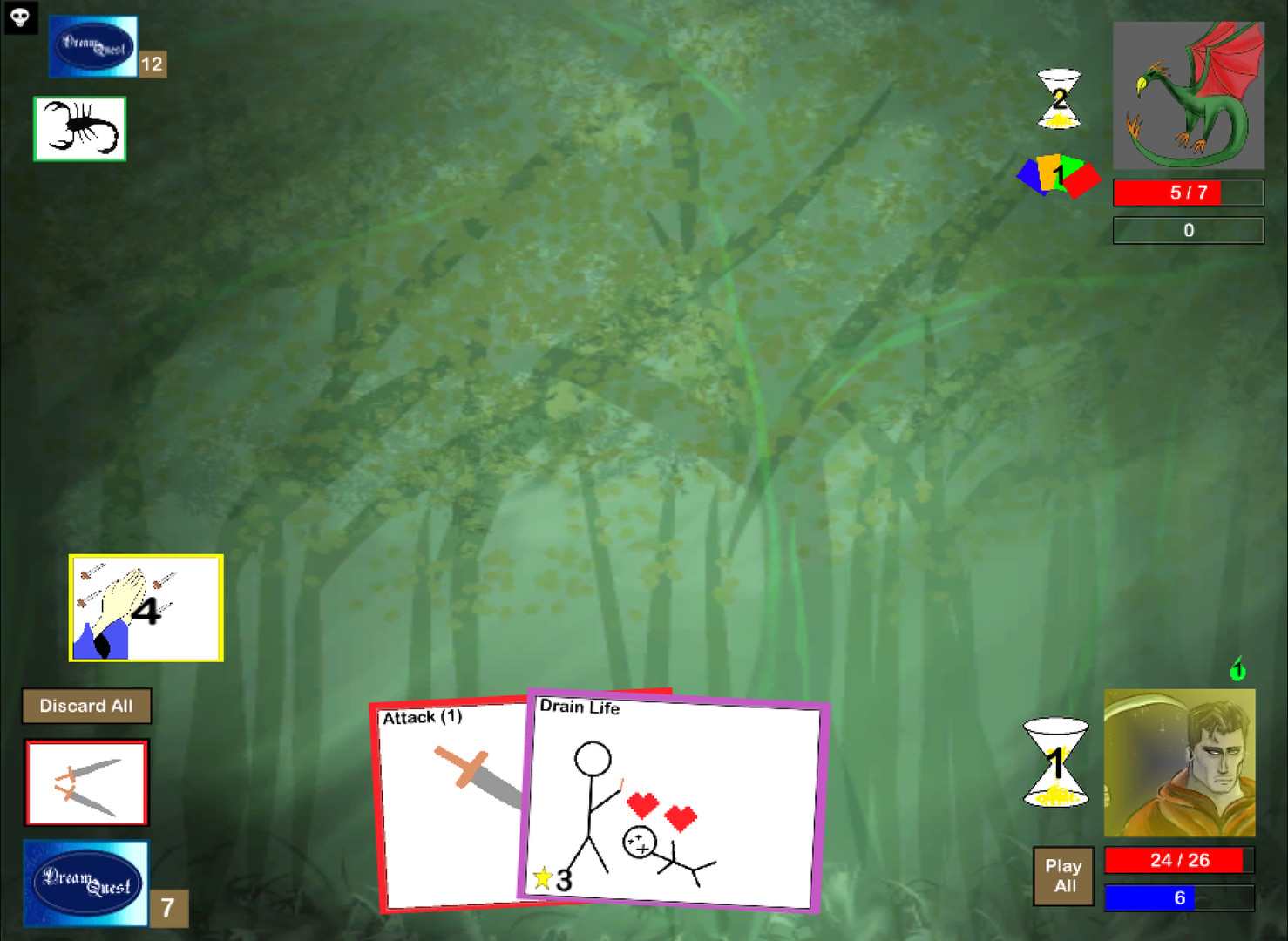
If the game is fun, I would buy it if it had stick-figure art. Fun trumps graphics any day of the week.

ss_7debc42149a25745fcd5b299780723a16fa3c9e0.1920x1080.jpg

A good exemple of game shipped with literal stick figure art.
Dream Quest is really good (and was an ancestor to Slay the Spire).
The guy sold 5000 or so games at 10€ piece, so it can be done(it is not huge by any stretch, but he also sold the game on iOS, and moved to Steam much later. Also, the game got him a job at Blizzard on Hearthstone).
 

Galdred

Studio Draconis
Patron
Developer
Joined
May 6, 2011
Messages
4,496
Location
Middle Empire
Steve gets a Kidney but I don't even get a tag.
How did you solve the "gatehouse" issue gameplay/UI wise?
Can units stand both on the top of the gatehouse, and in the gateway?


The battles have been missing something so I've been trying to add more to them. I now have flanking bonuses, informative status effect popups that look pretty snazzy too. Also, walls that give bonuses to attack and defense and attack range. Wall hexes have +1 movement cost if climbing up from a non-wall hex, unless you're moving a flying unit. Test level screenshots below. Behold my 3D-modeling skills! I can make hexagon-cylinders and cubes.

WallsBattleTest_Ranged.jpg


WallsBattleTest_Walking2.jpg


Things are still a little buggy. Sometimes the whole lance doesn't climb to the top of the wall. I should make the ranged attack arc go up more. I should probably also disable melee attacks between wall/not-wall hexes.

And I still need to add destructible gates and maybe some other things. But overall I think the changes are pretty good.
 

V_K

Arcane
Joined
Nov 3, 2013
Messages
7,714
Location
at a Nowhere near you
If the game is fun, I would buy it if it had stick-figure art. Fun trumps graphics any day of the week.

ss_7debc42149a25745fcd5b299780723a16fa3c9e0.1920x1080.jpg

A good exemple of game shipped with literal stick figure art.
Dream Quest is really good (and was an ancestor to Slay the Spire).
The guy sold 5000 or so games at 10€ piece, so it can be done(it is not huge by any stretch, but he also sold the game on iOS, and moved to Steam much later. Also, the game got him a job at Blizzard on Hearthstone).
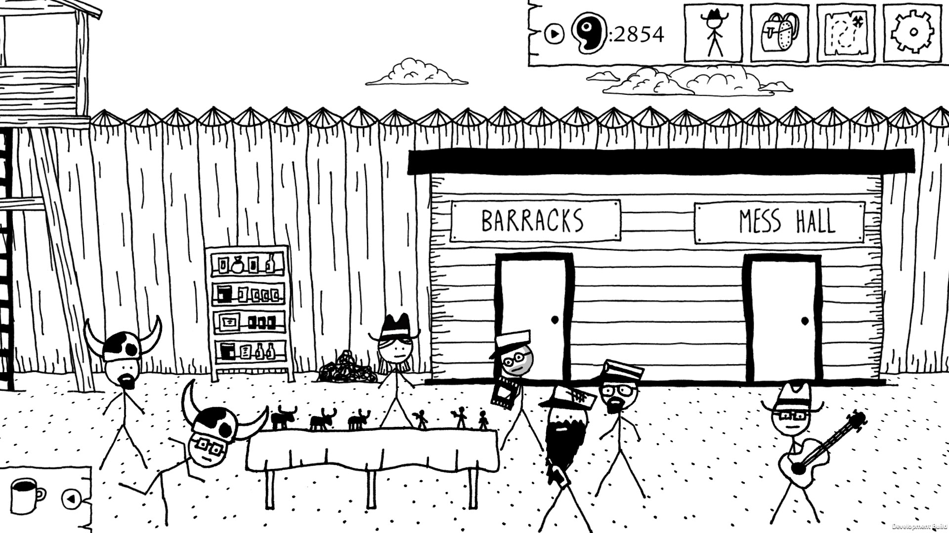
A far better example of stick figure success would be Kingdom of Loathing (100k to 150k active online players in its heyday) and its single-player sequel West of Loathing (200k to 500k copies sold according to SteamDB). Both games look like this:
 

Nathaniel3W

Rockwell Studios
Patron
Developer
Joined
Feb 5, 2015
Messages
1,305
Location
Washington, DC
Strap Yourselves In Codex Year of the Donut Codex+ Now Streaming!
How did you solve the "gatehouse" issue gameplay/UI wise?
Can units stand both on the top of the gatehouse, and in the gateway?

So right now, the gatehouse is purely decorative. There are official wall hexes that give defensive and ranged bonuses. And there are buffer hexes that flying units can cross, but no one can stand on. And then there's the gatehouse that right now just acts like any plain ground hex.

CastleDiagram.jpg

I got the idea for this castle layout from Age of Wonders III, which I recently picked up free on Humble and decided to give it a try. When you attack a city in Age of Wonders, there's a kind of a buffer hex in front of the wall hexes where the defenders stand. You can destroy the blocking buffer hex, and then move onto it, and attack the defenders from there.

I would like to add some places behind the gate, where the defender can put ranged units on top of the wall, and maybe even melee units under the wall. But that's a lot more work that I'm not ready to do just yet.
 

vdweller

Arcane
Developer
Joined
Feb 5, 2016
Messages
625
Bros how do we translate in Portuguese (Br)
DATA SAVE ICON
Please do not turn off your Nintendo Switch (TM) when this icon is displayed.
Press A to continue.
 

Viata

Arcane
Joined
Nov 11, 2014
Messages
9,894
Location
Water Play Catarinense
Bros how do we translate in Portuguese (Br)
DATA SAVE ICON
Please do not turn off your Nintendo Switch (TM) when this icon is displayed.
Press A to continue.
ÍCONE DE DISQUETE
Por favor, desligue seu Nintendo Switch (TM) quando este ícone é exibído.
Aperte A para continuar.
Also sent a PM with my paypal account. Thanks.
 
Last edited:

Zed

Codex Staff
Patron
Staff Member
Joined
Oct 21, 2002
Messages
17,068
Codex USB, 2014
the knight dude inside the gray box is my first draft that I'm somewhat happy with, but I figured I'd post something showing the progress too (from posed spear-chucker to arthurian knight). the green dude was initially just a size test and I'm not very happy with it.
the color-boxes shown contain the palette I'm restricting myself to.
npP3iJn.png
 

Tavernking

Don't believe his lies
Developer
Joined
Sep 1, 2017
Messages
1,264
Location
Australia
I wonder if Steam would let me use this as menu art? Better question: where should I place the menu option bars? (I was thinking bottom right)

Henryk_Siemiradzki%2C_Frine_alle_feste_di_Poseidone_a_Eleusi%2C_1889.jpg
 

Zed Duke of Banville

Dungeon Master
Patron
Joined
Oct 3, 2015
Messages
13,130
The menu should be up and somewhat to the left from center, assuming it's small enough to fit into the space that's entirely background.
 

pat

Arcane
Developer
Joined
Jan 1, 2015
Messages
46
Two-weapon fighting was a nightmare which seems finished but I just know that there is a problem lurking and waiting to force me to rewrite it all over again

51XQzEv.png
 

As an Amazon Associate, rpgcodex.net earns from qualifying purchases.
Back
Top Bottom