Putting the 'role' back in role-playing games since 2002.
Donate to Codex
Good Old Games
  • Welcome to rpgcodex.net, a site dedicated to discussing computer based role-playing games in a free and open fashion. We're less strict than other forums, but please refer to the rules.

    "This message is awaiting moderator approval": All new users must pass through our moderation queue before they will be able to post normally. Until your account has "passed" your posts will only be visible to yourself (and moderators) until they are approved. Give us a week to get around to approving / deleting / ignoring your mundane opinion on crap before hassling us about it. Once you have passed the moderation period (think of it as a test), you will be able to post normally, just like all the other retards.

Game News First work in progress screenshot of Wasteland 2 revealed

Ion Prothon II

Liturgist
Joined
Jan 10, 2012
Messages
1,011
Location
Ołobok Zdrój
I am very disappointed. The screenshots look really bad and the only thing they present, is oversaturized cartoonish graphics. Scene is filled with reused, crappy- looking models (is that this famous 'repository' of Unity engine they wanted so badly?). Hope it's just kind of concept art...

Fuck, I'm late

:troll:
 

Ethan Duvall

Learned
Joined
Apr 16, 2012
Messages
407
Wait, we paid for that?

That's the last time I'm doing that Kickstarter shit.
arnold_not_sure_if_serious_gif.gif
 

Roguey

Codex Staff
Staff Member
Sawyerite
Joined
May 29, 2010
Messages
36,693
Looks pretty ugly but I was expecting it to be ugly so I don't care. I mean anyone looking at The Bard's Tale or Hunted or Choplifter HD or the pre-release screens of Hei$t could see that inXile has some really god awful artists. :M
 

Stelcio

Savant
Joined
Jan 18, 2012
Messages
237
So conistency means making game in different style and cover in different, just as it was in the first game, but now doing it on purpose instead of because of technical limitations?
 

mindx2

Codex Roaming East Coast Reporter
Patron
Joined
Feb 22, 2006
Messages
4,534
Location
Perusing his PC Museum shelves.
Codex 2012 PC RPG Website of the Year, 2015 Codex 2016 - The Age of Grimoire RPG Wokedex Serpent in the Staglands Divinity: Original Sin Project: Eternity Torment: Tides of Numenera Wasteland 2 Shadorwun: Hong Kong Divinity: Original Sin 2 BattleTech Pathfinder: Wrath I'm very into cock and ball torture I helped put crap in Monomyth
Stelcio shows the decline here at the Codex :(. Complain, complain about the graphics of a PRE-ALPHA screenshot on a $3 million indie budget when game mechanics, etc. haven't even been discussed/ shown! If that is the level of graphics W2 will have but it PLAYS like or better than the original, I'll be extremely happy!!!
 

bonescraper

Guest
So conistency means making game in different style and cover in different, just as it was in the first game, but now doing it on purpose instead of because of technical limitations?
They're doing it for consistency's sake and because of technical limitations. What did you fucking expect? A Crysis 2 sequel? We're talking here about a 3 mil budget game. And i expect them to spend most of their money on, you know, actually important stuff like mechanics, content and polish, not on fucking graphics.

Anyway, what can you tell about the game's art style from that one early screenshot anyway? You haven't seen a ruined city environment yet.
 

Krash

Arcane
Joined
Nov 26, 2008
Messages
3,057
Location
gengivitis
Stelcio shows the decline here at the Codex :(. Complain, complain about the graphics of a PRE-ALPHA screenshot on a $3 million indie budget when game mechanics, etc. haven't even been discussed/ shown! If that is the level of graphics W2 will have but it PLAYS like or better than the original, I'll be extremely happy!!!


The purpose of this released screenshot is to discuss and give feedback about the graphics/character design of the game. Obviously. Why would we not talk about that?

It is the opinion of some of us that it doesn't look very good, and of other that it does. And as long as it's constructive criticism or praise, that's fine. I personally don't like it very much. However, you (and some others) are behaving like biodrones who just heard something negative about their fav bioware waifu simulator/skyways who hate everything ever.


Seriously, if you take out the attacks on posters who dislike or like the look of the game or have opinions on how it could be modified/improved, which is the whole point of the thread, this discussion would be half as long. What the fuck Codex?
 

Stelcio

Savant
Joined
Jan 18, 2012
Messages
237
Stelcio shows the decline here at the Codex :(. Complain, complain about the graphics of a PRE-ALPHA screenshot on a $3 million indie budget when game mechanics, etc. haven't even been discussed/ shown! If that is the level of graphics W2 will have but it PLAYS like or better than the original, I'll be extremely happy!!!
I don't complain about the graphics. They weren't the issue in many games I loved and won't be in Wasteland 2 as well. What I find disturbing is that whole "WOW, ÜBERCOOL SHIT, DONT YOU DARE CRITICIZE IT, BECAUSE IT'S PRE-PRE-PRE-ALPHA, THEY HAVE LOW BUDGET AND THEY PUT IT INTO MORE IMPORTANT SHIT THAN TEXTURES, YOU GRAPHIX-WHORE. ALSO CFA, YOU DUMB FUCK!" attitude. Praising it for the sake of praising even though it doesn't show anything worth it.

So conistency means making game in different style and cover in different, just as it was in the first game, but now doing it on purpose instead of because of technical limitations?
They're doing it for consistency's sake and because of technical limitations. What did you fucking expect? A Crysis 2 sequel? We're talking here about a 3 mil budget game. And i expect them to spend most of their money on, you know, actually important stuff like mechanics, content and polish, not on fucking graphics.

Anyway, what can you tell about the game's art style from that one early screenshot anyway? You haven't seen a ruined city environment yet.
So what's the fucking point of putting this shot if it doesn't show anything particular about game?

And they had technical limitations back then, when making W1. They were limited to 16 colours and analog->digital conversion was very difficult, so cartoonish was the only valid choice. Now it isn't, even in such a low budget game. Proof:
 
Joined
Mar 13, 2012
Messages
3,438
Location
Lost Hills bunker
I know it's pre alpha screenshot, but I am dissapointed. If they don't have enough money to make a nice looking game, why go 3D? Underrail looks better to me, and nobody can say Styg has more resources. And it's done in fuckin' paint, with a single dude, and another doing some freelance. Fallouts (1,2) look better, so does Fallout Tactics. Can someone say something positive about the screenshot? What exactly looks good there? I knew I'll be disappointed when they said they'll use unity store to buy premade assets etc.

And it's stupid that people that say they don't like it are branded dumbfucks and retards. This reminds me of the Diablo 3 debacle when fans were furious about graphics style but were largely ignored, and look at what we got. Sure I won't go berserk and I'll like the game even if it's fugly if it gives what was promised and fun gameplay, but must I suck inxile cock, just because? When I don't like something, I'll surely say it! And don't give me crap, W1 was cartoony... If this was cartoony (but not much, this is the limit of cartoonyness that I can take) but looked good, I would say great. However, this does not look good. It looks like pixar toy story. There are 10 year old games, and more that look better. And there are indie games that look better. And don't give me crap that they didn't carefully choose what first screenshot they will show, so if they are proud by how this looks like, I'm dissapoint.

/rant
 
Joined
Nov 8, 2007
Messages
6,207
Location
The island of misfit mascots
WL2 will truly be the game that evolves the Codex. Or kills it.

You talk like the Codex isn't already a putrid decaying corpse that animates only to consume its own flesh.

(it maintains its mass by defecating that devoured flesh in the form of general discussion posts)

On topic: obviously when a company posts pictures for feedback it's legit to make complaints as feedback. Though they'd be a lot more productive if given to the company at its website rather than bitching at the Codex.

On the other hand, if you're saying that the game itself is shit because of its graphics, then you're the fucking problem. Not because it's pre-alpha, or likely to change greatly, although those are also true. But because we've spent the past 5-10 years complaining that too much emphasis is being placed on graphics at the expense of gameplay. And because we've spent the past 5-10 years talking about how awesome older crpgs were even back in the 80s when graphics were basically nothing more than placeholders for you to superimpose your imagination over.

By all means, give them feedback on the graphics - we might get something better, though given the low budget you'd be a fool to expect it to be super-pretty (even if they were to go 2D and simply mimic the graphical styles of the infinity engine games they'd run into budget difficulty - artists with that skill-set are a lot rarer these days, the tools aren't there and they'd require more manpower on art assets than using 3D and modern tools). But if you want to talk about graphical quality as though it's positively related to game quality then I hear IGN is still around.
 

Tolknaz

Augur
Patron
Joined
Dec 21, 2008
Messages
479
Location
Estonia
Divinity: Original Sin Project: Eternity Torment: Tides of Numenera Wasteland 2
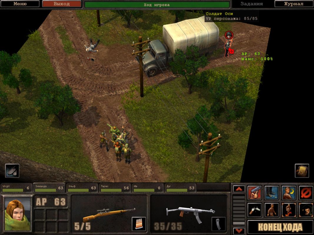
Leaving aside Tactics which I guess is too "grim dark" for the "colors = art and original" crowd, here's a low-poly game which has color and doesn't make your eyes burst into flames:
208682-s2-silent-storm-windows-screenshot-one-of-the-random-encounters.jpg


An "artist" knows where and how to use colors. And honestly, the palette is fine in that image without the maxed out saturation.

Silent Storm engine games are all fantastic, but anyone, who says, that any of them look aesthetically pleasing is either blind, drunk or russian. Or maybe a combination of the above.
 

almondblight

Arcane
Joined
Aug 10, 2004
Messages
2,625
They're doing it for consistency's sake and because of technical limitations. What did you fucking expect? A Crysis 2 sequel? We're talking here about a 3 mil budget game.

"Stasis is very much a one man game. I am doing everything from the game design to the sound and animation."


Some mockups he did inspired by the Wasteland 2 announcement:

Plane-1.jpg

Camp-Ent-2-DAY.jpg
 
Joined
Feb 19, 2005
Messages
4,638
Strap Yourselves In Codex+ Now Streaming!
Silent Storm engine games are all fantastic, but anyone, who says, that any of them look aesthetically pleasing is either blind, drunk or russian. Or maybe a combination of the above.

Dunno, looks way better than the W2 screenshot to me.

Edit: That Stasis game and the Wasteland 2 mockups look fucking sweet. Amazing stuff.
 

Bahamut

Arcane
Joined
Jul 11, 2008
Messages
1,196
Well its an early screen, but its not bad i guess, somone should just point Fargo to include saturation slider ingame options
 
Joined
Feb 19, 2005
Messages
4,638
Strap Yourselves In Codex+ Now Streaming!
On the other hand, if you're saying that the game itself is shit because of its graphics, then you're the fucking problem. Not because it's pre-alpha, or likely to change greatly, although those are also true. But because we've spent the past 5-10 years complaining that too much emphasis is being placed on graphics at the expense of gameplay. And because we've spent the past 5-10 years talking about how awesome older crpgs were even back in the 80s when graphics were basically nothing more than placeholders for you to superimpose your imagination over.

Except I didn't see anyone doing that. People who didn't like the screenshot called it out on what it is, an example of rather shitty graphics and art style. Obviously it would be hard do discuss gameplay mechanics because we don't know anything about this yet. Personly I hope Wastelands 2 gameplay will be great and if this turns out to be true I don't give a fucking damn about the graphics.

Also, whats with the bullshit about how it would be more productive to post our complaints at the official forums instead of ranting at the codex? Isn't video-game related ranting the purpose of this forum? Why not close down all W2-related topics here, after all it would be more productive if we discussed this shit over at the InExile forums.

Good fucking god, you people need to stop acting like Bioware Social retards as soon as any form of critique is brought against your pet games.

To sum it up, I guess some of us just can't force themselves to shout "wow this is so amazing" when looking at this rather crappy screenshot, especially when you compare it to something like the post-apoc mockups made by the stasis guy, which show how much is possible even with a small budget.
That's pretty much all there is to it. Nobody is saying Wasteland 2 will be a crappy game based on that screenshot.
 

Mortmal

Arcane
Joined
Jun 15, 2009
Messages
9,496
It looks like a scenery from one of my tabletop wargames, those with hand painted figurines , nothing spectacular, too much saturation, wrong hues , but nothing to rage about either. We are far from the cartoonish abomination that is the new ultima.
 

jagged-jimmy

Prophet
Joined
Jan 25, 2008
Messages
1,562
Location
Freeside
Codex 2012
Screen does not look sharp enough for me, but thats fine. I guess the purpose was just to let us know that they are aiming for a van buren look, i.e. iso 3d. I for one had no idea, how exactly the game would look like. Now we know.

Still that Stasis is way sexier. I like clean and sharp graphics.
 

TwinkieGorilla

does a good job.
Patron
Joined
Oct 19, 2007
Messages
5,480
Serpent in the Staglands Divinity: Original Sin Torment: Tides of Numenera Wasteland 2 Shadorwun: Hong Kong Divinity: Original Sin 2 BattleTech Pathfinder: Wrath
Oh good, you're back again to tell us how you're the only one who gets it and how we can't criticize what THEY show.

Oh good, you're back again to complain about stuff and tell us how everything is SHIT.

But seriously, let's talk more about how you don't like the colors. That seems like fun.
 

ghostdog

Arcane
Patron
Joined
Dec 31, 2007
Messages
11,158
"Stasis is very much a one man game. I am doing everything from the game design to the sound and animation."


Some mockups he did inspired by the Wasteland 2 announcement:

Plane-1.jpg

Camp-Ent-2-DAY.jpg


Whoa. Fargo should try to hire this guy. Obsidian should try to hire this guy.
 

Kahlis

Cipher
Joined
Jun 23, 2012
Messages
408
I'm not really as upset by the colors as I am the lack of "fine" level details - that is, small-scale details such as pebbles and weeds on the ground. The mockups posted above by almondblight are a good example of how the game's backgrounds could make use of both large-scale and small-scale detail, without necessarily having to coat everything in grunge overlays. The textures in late-90's prerendered games were never hyperrealistic either, but they were generally crisper (thanks, 16 bit color!) and I think that helped to make the backgrounds feel more "defined." I think that the cartoony style in games like Torchlight isn't really reinforced as much by the color palette or the proportions of the models as much as it is the relative lack of definition in the game world itself - completely flat floors the characters pop out against, flat walls, and so on.

Of course, as this is a WIP I'm sure the assets themselves are nowhere near close to their final iterations and hopefully there will be more densely placed details later on. I can already tell I'm going to like the presentation of this game - the elongated shadows (presumably relative to the time of day) and organic layout of the scene. I was expecting obvious tilesets.
 
Self-Ejected

Brayko

Self-Ejected
Joined
Feb 11, 2012
Messages
5,540
Location
United States of America
I'm not very impressed. :killit:

Too much saturation and lack of detail. Every other game screen posted on this thread for comparisons looks much better.
 

As an Amazon Associate, rpgcodex.net earns from qualifying purchases.
Back
Top Bottom