-
Welcome to rpgcodex.net, a site dedicated to discussing computer based role-playing games in a free and open fashion. We're less strict than other forums, but please refer to the rules.
"This message is awaiting moderator approval": All new users must pass through our moderation queue before they will be able to post normally. Until your account has "passed" your posts will only be visible to yourself (and moderators) until they are approved. Give us a week to get around to approving / deleting / ignoring your mundane opinion on crap before hassling us about it. Once you have passed the moderation period (think of it as a test), you will be able to post normally, just like all the other retards.
You are using an out of date browser. It may not display this or other websites correctly.
You should upgrade or use an alternative browser.
You should upgrade or use an alternative browser.
Good Doom/Heretic/Hexen WADs
- Thread starter AngryEddy
- Start date
STOP
This is actually my very first time playing Doom 2 campaign and I'm thankful for the helpful posts that led me GZ Doom. This shit is really fun. Thanks guys.
EDIT: Although I did play Doom 1 campaign when I was younger it was the SNES version so... plus I never finished it anyways, so essentially this is like a first time playthrough for both!
EDIT: Although I did play Doom 1 campaign when I was younger it was the SNES version so... plus I never finished it anyways, so essentially this is like a first time playthrough for both!
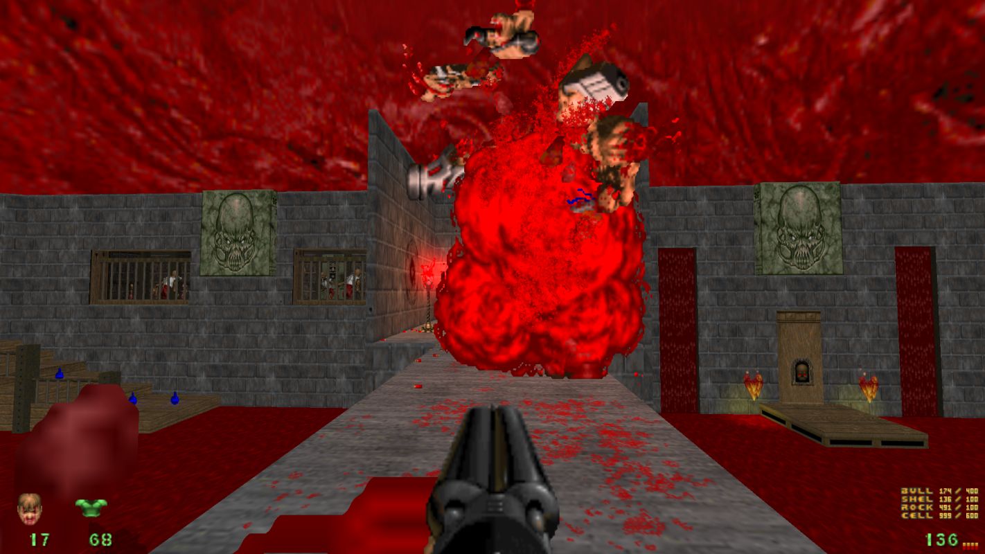
Brutal Doom is pretty cool! Is there any way to remove the super annoying blood spatter that fucking covers the entire screen?
Go to the Project Brutality Option -> Brutal Doom options. Change blood amount to realistic.
As for the music in 2.03 version which I checked, the music is still the original Doom soundtrack.
hackncrazy
Savant
- Joined
- Jun 9, 2015
- Messages
- 415
Now my only other question is: what's Brutal Doom about
https://www.moddb.com/mods/brutal-doom/addons/project-brutality
It's a total overhaul mod, when it comes to monsters behaviour and their strenght/attacks. Plus it changes the way weapons work and adds some extra gear that you can take from dead monsters.
There is a mod called Project Brutality which has 3 options of playing - vanilla, Brutal Doom V.2.0 and Project Brutality. That should give you the most easy way to test the difference between them.
There is also Beautiful Doom, which tones down the changes, but still makes the game more interesting and difficult. I use it for almost every wad.
https://www.moddb.com/mods/beautiful-doom-6100/downloads

Since you seem to understand a lot about Doom modding scene, let me ask you a couple of things (hope I'm not bothering):
1) Are Project Brutality and Brutal Doom and Beautiful Doom compatible with any custom WAD? If it isn't, I'll get some straight error by trying to playing with them or I'll have some game breaking issues that I'll just come by later?
2) If I start a save using Brutal Doom and go to level X. And reload that save without Brutal Doom, the game will be working properly?
3) Does any of these mods add hitboxes to the enemies?
Also, aweigh I never thought I'd find you here!! Have you been slowing down on blobbers?
Well I can confirm that some saves aren't compatible with some modifications, for example I tried loading a Beautiful Doom save while playing GZDoom + RH Texture Pack (without Beautiful Doom enabled), and it said it couldn't load because the save had been made with stuff that was missing, so hope that clears it up.
Obviously can't tell you which combination of mods will produce incompatible saves but I can at least let you know that it can indeed happen. As for why I'm here I got hyped for Doom Eternal and wanted to play the originals.
Obviously can't tell you which combination of mods will produce incompatible saves but I can at least let you know that it can indeed happen. As for why I'm here I got hyped for Doom Eternal and wanted to play the originals.
Sjukob
Arcane
- Joined
- Jul 3, 2015
- Messages
- 2,093
1) Are Project Brutality and Brutal Doom and Beautiful Doom compatible with any custom WAD? If it isn't, I'll get some straight error by trying to playing with them or I'll have some game breaking issues that I'll just come by later?
2) If I start a save using Brutal Doom and go to level X. And reload that save without Brutal Doom, the game will be working properly?
3) Does any of these mods add hitboxes to the enemies?
TLDR:
1) Yes
2) No
3) Both BD and PB
1) Custom wads are fully compatible, but some old ones might have minor issues with either GZDoom or Brutal Doom although it happens rarely and doesn't break the game. The real problem is balancing because absolute majority of wads are balanced around vanilla arsenal, so any mod will disrupt the intended flow.
2) You won't be able to load your save. In general GZDoom won't let you load your save if it misses at least one of the files you made that save with.
3) Both Brutal Doom and Project Brutality add hitboxes to monsters to trigger various death animations and dismemberment depending on where you shoot, the most important one is head since scoring a headshot greatly increases damage dealt.
Also aweigh you can make your UI look better by using + and - buttons.
Last edited:
hackncrazy
Savant
- Joined
- Jun 9, 2015
- Messages
- 415
1) Are Project Brutality and Brutal Doom and Beautiful Doom compatible with any custom WAD? If it isn't, I'll get some straight error by trying to playing with them or I'll have some game breaking issues that I'll just come by later?
If the wad is heavily customized - has it's own HUD, monsters, weapons, and sometimes scripts it can break your game. Weapons sprites in idle mode will be looking as intended, but then they will "transform" into Beautiful Doom ones for example. Same goes for enemies. They can look different but their corpses will be from the BD version. I had a couple of times a situation, when the keys switched their colour. I had to check an LP, because I didn't know how the hell I can't go through. As for the scripts, sometimes they don't trigger properly and you will be wondering what is happening. It's very rare, but can happen.
But this applies for really small percentage of wads, 90 % will work as intended, although as Sjukob mentioned, the balance can be really not on your side when it comes to some campaigns. Other questions have been answered by him and there is nothing that I could add.
- Joined
- May 13, 2009
- Messages
- 29,000
![The Year of Incline [2014] Codex 2014](/forums/smiles/campaign_tags/campaign_incline2014.png)


I tried revisiting "Plutonia 2" as my last playthrough ended half-way through due to a problem on my end.
I shouldn't have bothered.
"Back to Saturn" was dickish in how it created traps and filled them with enemies, but at least it stopped at that. Plutonia 2 is dickish about that and so much more. Like doors. It loves to have doors that require a switch to be opened... but only on one side. That same door can be opened perfectly fine on the other side.* A pointless nuisance. It gets worse when the switch to the door is purposefully not located in the same room (bonus point if there's a door seperating those two rooms) and there are a skrillion monsters waiting beyond the door... who for some reason refuse to pass through the door to come to you, let alone open it themselves. So it boils down to a constant running back-and-forth to slowly bleed out that other room of monsters. There are also doors there that require one key to get through, but another key to get back through the door. Clever, but used horribly in this wad.
Another major problem is damaging floors. Doom has four liquid floors: Water, Blood, Toxic Waste and Lava. Water is always safe, Blood is often safe, while Toxic Waste and Lava are always harmful. Plutonia 2 can't seem to make up its mind about Blood and Toxic Waste, though. One map may have all toxic waste be harmful, but in the next one it's safe to walk on... and then it's back to harmful in the next map after! So when it comes to those two you never know what to expect... and in one notable case (MAP23) the entire western part of the map is one gigantic blood lake that starts out safe, but then switches over to being harmful as you move further south. Consistency is actually a valuable trait in a game, not that the modders here give a shit about that.
But are the maps any good? I was not amused by how often maps had to be solved by abusing the game mechanics. Like how one Cyberdemon encounter can be resolved by entering that tiny room and fight him head-on, or enter a storage room and crawl through a vent to reach the room from behind, where the exit is conveniently (and purposefully) designed so that the player can shoot Cybie, but he can't shoot back. Then there are the various forms of monster closets. Sometimes it's the classic version, but Plutonia 2 mostly enjoyes using invisible monster pits, where the monsters are located underneath the floor and are then instantly raised to ground level as the player crosses a trigger. This doesn't always work properly, as monsters sometimes refuse to exit from their pits. I enjoyed MAP17 and MAP20, but the rest just started to feel annoying real quick. I gave up at MAP28, but took a minute to hop over to MAP30 to see what it was like. Nope.avi, not having that. MAP32 ("Go 4 It") is supposed to be an upgraded version of Plutonia's infamous MAP32 ("Go 2 It") but somehow manages to feel weaker than the original.
On top of all of this, Plutonia 2 isn't 100% compatible with Brutal Doom as the BD Cyberdemon is slightly taller than the normal one, meaning that several Cyberdemon-based traps fail to work as they can't fit into the teleporter. Even more hilariously is when Cybies are placed into floor pits and their heads comically stick out of the floor, so they can be killed in a round of Whack-A-Mole.
The original Plutonia tried to be ball-breakingly tough, but Plutonia 2 is only trying to troll the player. I can't recommend it, though I'm certain someone reading this will enjoy it nevertheless.
* EDIT: This point needs clarifying. The 'switch' side of the door is the one you start on. The opposite makes perfect sense to lay out a trap room, but when the switch is on your side it becomes pointless.
Last edited:
Curratum
Guest
So, in short, you don't like Doom and its gameplay in general? :D
I fnished Plutonia: Revisited Community Project.
I expected a lots of rage inducing traps and monsters coming for you the moment you feel relatively safe. The difficulty is set high, considering the original Plutonia wasn't a walk in the park either. I really didn't like the chaingunners placement in some of the early maps, plus overusing Arch-Viles as well. The last level with two Cyberdemons guarding the switches for the Romero of Sin was horrible, but everything also was acceptable. Some of the encounters were great, and the monster wars are always a pleasure to watch. Many sections require patience and methodical approach in eliminating threat due to the teleport traps. Now I need to test Plutonia 1024: The Plutinya Exeriment.
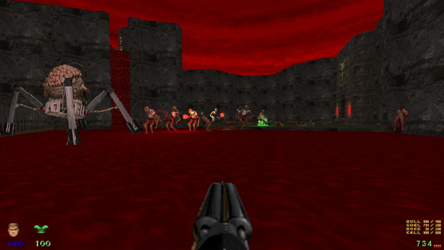
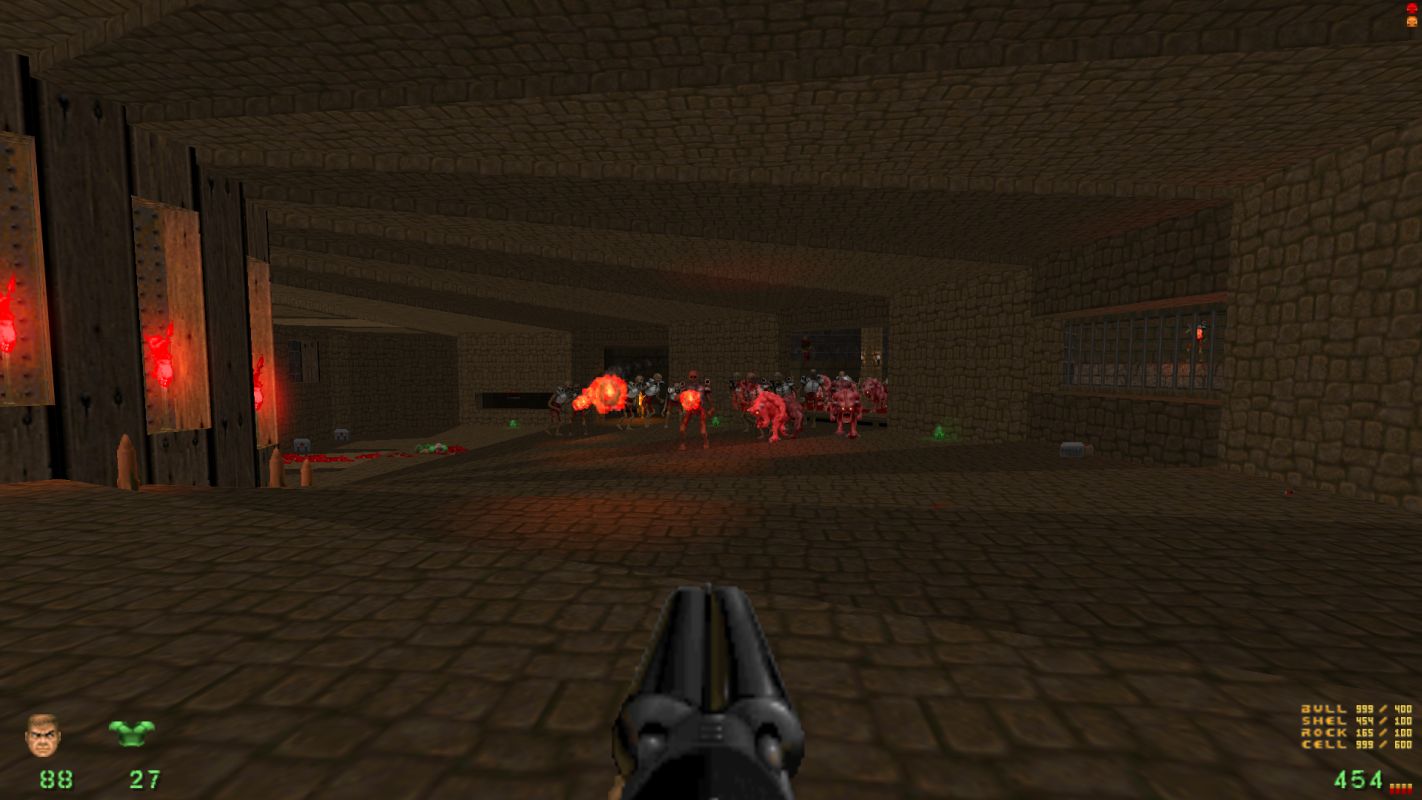
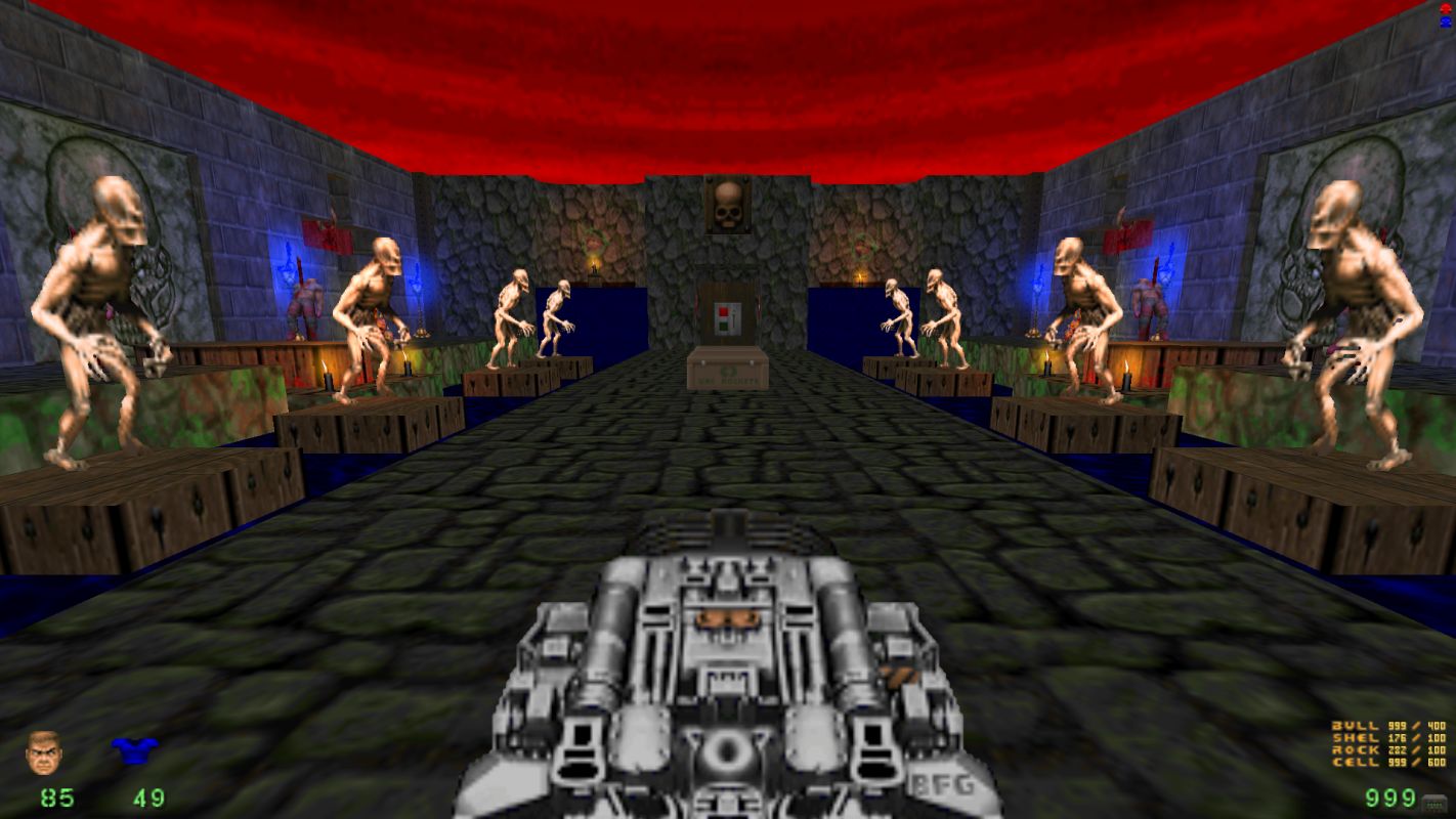
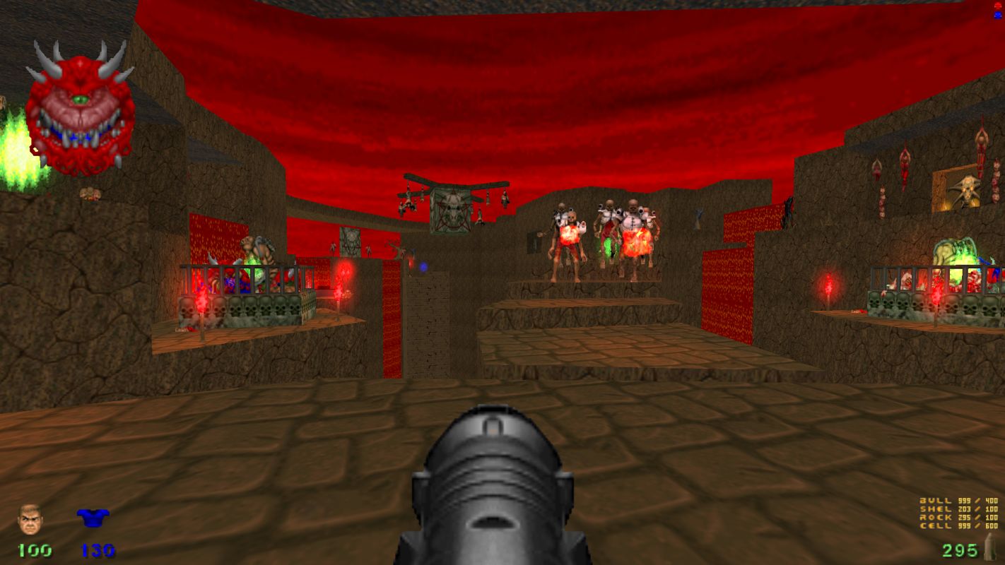
I expected a lots of rage inducing traps and monsters coming for you the moment you feel relatively safe. The difficulty is set high, considering the original Plutonia wasn't a walk in the park either. I really didn't like the chaingunners placement in some of the early maps, plus overusing Arch-Viles as well. The last level with two Cyberdemons guarding the switches for the Romero of Sin was horrible, but everything also was acceptable. Some of the encounters were great, and the monster wars are always a pleasure to watch. Many sections require patience and methodical approach in eliminating threat due to the teleport traps. Now I need to test Plutonia 1024: The Plutinya Exeriment.


Bigg Boss
Arcane
- Joined
- Sep 23, 2012
- Messages
- 7,528
So, in short, you don't like Doom and its gameplay in general? :D
Maybe he doesn't like Plutonia style map design?
PrettyDeadman
Guest
Last edited by a moderator:
Luzur
Good Sir
Netronian Chaos v3.1: Project Manhattanova
Astral Rag
Arcane
- Joined
- Feb 1, 2012
- Messages
- 7,771
The Dutch Ghost
Arbiter
- Joined
- May 26, 2016
- Messages
- 685
Ugh forgot to post that news here despite that I was one of the playtester of that mod.
Hope to have an article or review of the mod soon ready for NMA.
Hope to have an article or review of the mod soon ready for NMA.
Astral Rag
Arcane
- Joined
- Feb 1, 2012
- Messages
- 7,771
- Joined
- May 5, 2014
- Messages
- 1,677
Baron Dupek
Arcane
Though there were more project like this?
Anyway - how is going with that guy who made roguelike DOOMrl? Still kickin' or hide forever after suing?
Anyway - how is going with that guy who made roguelike DOOMrl? Still kickin' or hide forever after suing?


![Glory to Codexia! [2012] Codex 2012](/forums/smiles/campaign_tags/campaign_slushfund2012.png)


