Ol' Willy
Arcane


"Species" word is fine. We still can say "inferior species"


"Species" word is fine. We still can say "inferior species"



Hi Josh, I'm a 3D environment artist at blizzard, and one of my favorite game, if not the one, is fallout new vegas. I have a question about landmarks. I remember you mentioning the landmark rule from new vegas and bethesda games, which is the ability to see 3 landmarks at any given time to always give the player, points of interests to explore. I was wondering how you can tackle something like this in a top down game, like pillars of eternity, since your camera technically can’t see far away.
That’s a great question. When were in the document and block-out phases of developing a Pillars/Deadfire level, one of my requirements for area designers was a screen grid placed over the map. This was an important step to help everyone understand scale and to understand what the player would see at any given point on the map.
This isn’t a real block-out/mock-up, but for the sake of illustrating what I’m talking about, I put some vague screen guidelines over this map from Gamepressure.
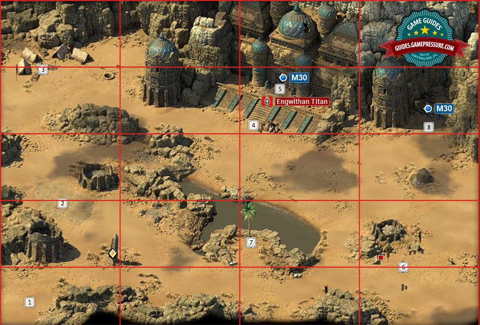
When I look at this map, I’m looking for any sections of open ground that cannot see edges of physical features on a normal screen view, at which point the player may become disoriented. I’m also looking for distinctive features that can help the player orient themselves: the two different tower ruins, the obelisk, the palm tree, the xaurip camp, the quicksand, the VTC camp, the edges of the oasis, and the entrance to the ruins themselves.
On interiors, we try to do the same thing, but also paying attention to things like differences in lighting, differences in prop decoration, and so on. Dungeons can be very disorienting and we intentionally avoided using minimaps or guide arrows on the main game view. This puts a heavier responsibility on us as designers to ensure that players can intuitively navigate through the space by using the physical features of that space.
Here is an example from Pillars 1. I don’t do much area design these days, but on Pillars 1, I did the documentation layout (but not actual block in or area design) for six exterior maps. This is Magran’s Fork, which was a “4x4″ – a term we have used since Infinity Engine days to define the number of screens that a map take up. For us, 1 screen = 1920x1080 pixels. At some point, Pillars 1′s lead area designer, Bobby Null, came up with a % to follow that, e.g. 3x3x50%, which indicated that 50% of the screenspace was empty – useful for dungeons with a lot of negative space.
This way of defining a map helps production and environment artists a lot when we’re scheduling work. Anyway, here’s my map:

While there are a few spots that are simply “open ground” (or light forest), I placed landmarks throughout the map to help with orientation. Note that at this point I was not designing content for the area, simply a physical layout. Area designers created the content much, much later. This process is atypical, as area designers usually define their own map layouts, but was necessary in this case because we had more environment art time than area designer time and I felt confident in my ability to do a solid wilderness area layout.
Here’s the actual map, again courtesy of Gamepressure:
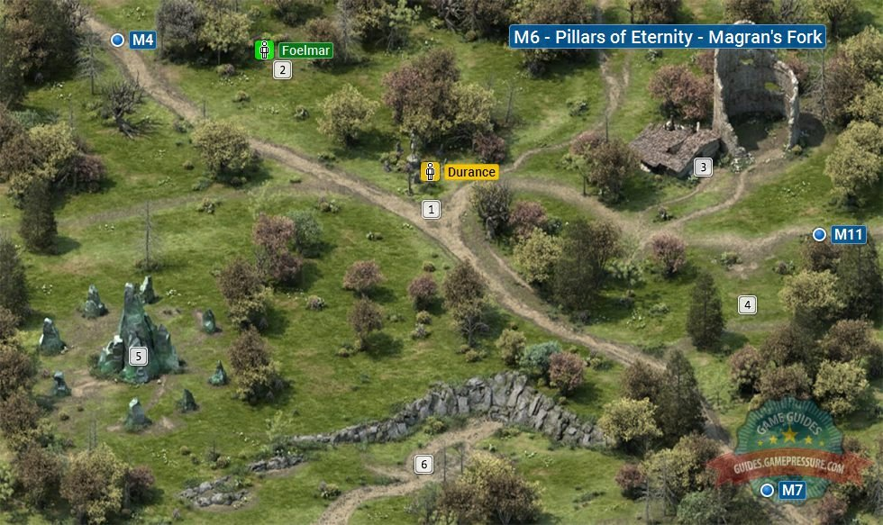
While it is not 1:1, it’s quite close, and the artist added additional physical features to help further aid navigation.
The process isn’t foolproof, but it provides a solid foundation that allows for relatively easy navigation and re-traversal without requiring a mini-map, which was the goal.
As a side note, the Deadfire world map was not designed with the goal of making the player feel secure while exploring. Exploring while sailing in Deadfire requires the player to spend a fair amount of time in open water with no landmarks at all to guide their way. I intentionally developed and tweaked the layout of the map to induce a measure of insecurity and (mild!) anxiety when venturing out into open water. If the player was navigating into open water without a specific destination in mind, I wanted them to feel some unease about what could happen.
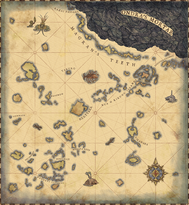
I’ve talked at length about things I did wrong with the sailing and ship combat mechanics, but I did like the sense of exploration in Deadfire and feel that I accomplished what I set out to (with some notable exceptions).

I'm still so very amused that this whole "race" nonsense basically came into being because allegedly liberal minds projected violent orcs as black people.


overthinking: the post
But WHAT could happen? The storms are highly telegraphed; an enemy ship might attack you if you use the wrong flag, but they are basically just easy loot and you can easily out run them if you don't feel like fighting; there is no shortage of food & water unless you purposefully fuck yourself up. I feel no unease at all traversing the uncharted waters of Deadfire, I just feel bored. Sunless Sea has randomly generated maps yet sailing in that game actually feels exciting due to tight resource management and deadly encounters, until you get burned out from permadeath and all the grind, that is.I wanted them to feel some unease about what could happen.
sawyer spends all this time on nonsense because he has no idea how to design a good game
I'm still so very amused that this whole "race" nonsense basically came into being because allegedly liberal minds projected violent orcs as black people.
reminds me of the study that found white liberals treat minorities like children
https://www.miamiherald.com/news/nation-world/national/article222424675.html

overthinking: the post
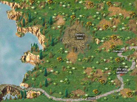
average baldur's gate map is designed better than the average deadfire map


ok josh
ok josh :D
Is it though?Race has always been the same as species, though.


Nope. Different races of the same species can have fertile offspring, different species - even if they can breed (e.g. a horse breeding with a donkey to produce a mule) - cannot have fertile offspring.Is it though?Race has always been the same as species, though.


