Momock
Augur
- Joined
- Sep 26, 2014
- Messages
- 669
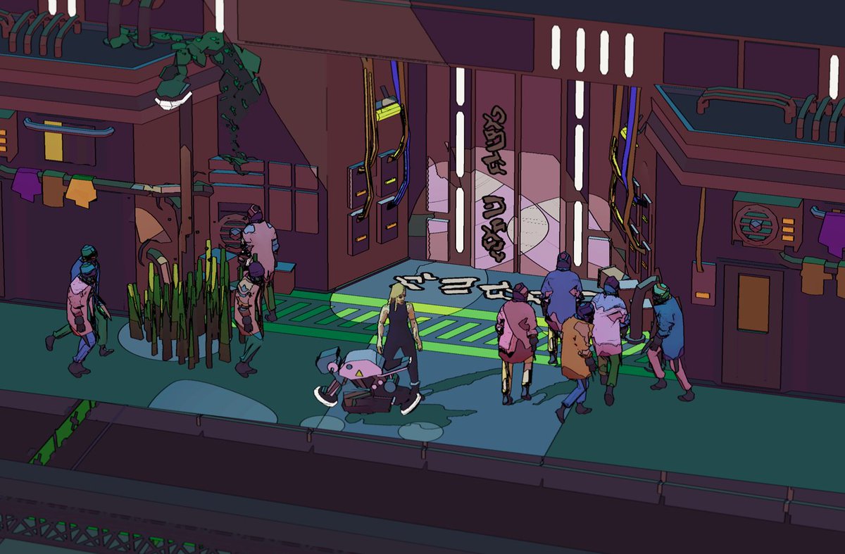
The steam burger bullets ara the raison d'être of the new artstyle (they don't look so silly anymore!)All I'm interested in if bullets will still look like steaming burgers.
The steam burger bullets ara the raison d'être of the new artstyle (they don't look so silly anymore!)All I'm interested in if bullets will still look like steaming burgers.
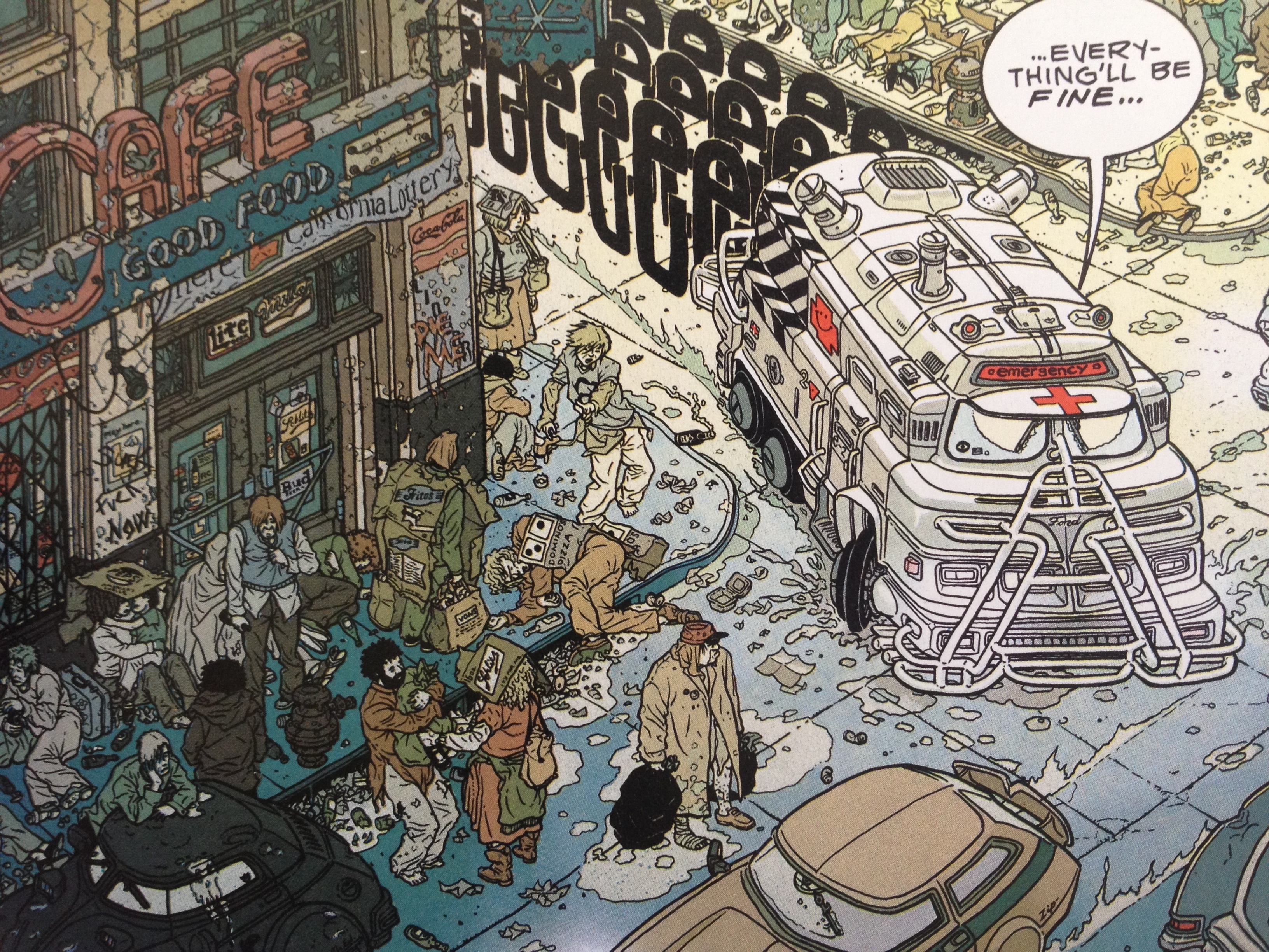
Joe didn't build the new style from scratch in a single week.I'm curious if this game shown on E3 inspired them to change style:


Wow, reminds me of Geof Darrow. Which came first, the Darrow or the Gonzalez?Reminds me of certain cyberpunk comics art, Josan Gonzalez for example: https://www.artstation.com/josan


Fuck...this looks like GTA V now. At least it’s TPP cyberpunk. Mebrilia .
In all seriousness, i’m loving this art style. Great job Whalenought_Joe.
I do like the idea of the old one, but man if this aint something unqiue and fresh.
Altho tbh, this color pallete is closer to the original logo artwork. Although that was a bit darker.
EDIT: Fuck this looks better everytime I look at it.

Merlkir imagine yourself as a more casual player browsing through the Steam catalogue or a gaming news/site blog lookin' for new games to check out. Which is more likely to make you stop and read more about what this thing is:


Laughin' at all the people who preferred the nondescript Russian-shovelwarey look it had before this. These graphics are more likely to get 'em noticed, the other style wouldn't.
Could swear I read that somewhere.
Could swear I read that somewhere.
Could swear I read that somewhere.
I remember it too.
I think neither is going to appeal more to a casual player.


