-
Welcome to rpgcodex.net, a site dedicated to discussing computer based role-playing games in a free and open fashion. We're less strict than other forums, but please refer to the rules.
"This message is awaiting moderator approval": All new users must pass through our moderation queue before they will be able to post normally. Until your account has "passed" your posts will only be visible to yourself (and moderators) until they are approved. Give us a week to get around to approving / deleting / ignoring your mundane opinion on crap before hassling us about it. Once you have passed the moderation period (think of it as a test), you will be able to post normally, just like all the other retards.
You are using an out of date browser. It may not display this or other websites correctly.
You should upgrade or use an alternative browser.
You should upgrade or use an alternative browser.
KickStarter Mechajammer (formerly Copper Dreams) - cyberpunk RPG from Whalenought Studios
- Thread starter Infinitron
- Start date
Haha, nice joke, but I'm afraid the dev missed Fools day. Let's see some real screenshots from the game.
Jinn
Arcane
- Joined
- Nov 8, 2007
- Messages
- 5,597
My first thought when I saw this on twitter was "I wonder if Joe and Hannah are worried about how the codex will react to this?"
While I enjoyed the initial style, I'm happy with this shift too. Whatever those two decide they need to do to ensure their dream comes to fruition, I support.
While I enjoyed the initial style, I'm happy with this shift too. Whatever those two decide they need to do to ensure their dream comes to fruition, I support.
Diggfinger
Arcane
Can only re-state what I said earlier: this game is nigh impossible to follow, in that it changes art/direction so often it's hard to picture what to 'expect'. Even previous updates had radically different styles with each new screenshot.
If this is really the look they are going for...well, let's wait for next updates to clarify further.
In the end, I chose to (slacker) back this because the sci-fi/horror/RPG premise sounds super cool (wait, that hasn't changed right...RIGHT!?!":!?).
If this is really the look they are going for...well, let's wait for next updates to clarify further.
In the end, I chose to (slacker) back this because the sci-fi/horror/RPG premise sounds super cool (wait, that hasn't changed right...RIGHT!?!":!?).
- Joined
- Nov 17, 2015
- Messages
- 5,664


They sold their house for this - Habbo hotel on acid?
- Joined
- Nov 17, 2015
- Messages
- 5,664


Oh, and I have backed this and would do it it again, probably. Just confused.
What I don't like is the horror aspect.
What I don't like is the horror aspect.
Diggfinger
Arcane
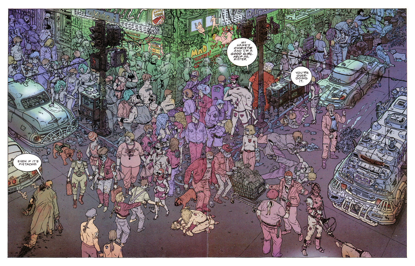
Why does grass grow there from a concrete sidewalk and why does everyone wear pink and violet?
Reminds me alot of Hard Boiled (comic that inspired Leonard Boyarsky while making Fallout)

Last edited:
LootSeeker
Educated
- Joined
- Jul 14, 2017
- Messages
- 73
I'm already missing the old style. However, this picture isn't enough for me to decide whether I truly hate or like it. I need to see more of this new art direction before making a final judgment. Until then..
 https://imgflip.com/gif-maker
 https://imgflip.com/gif-maker
- Joined
- Dec 23, 2014
- Messages
- 297

Here on the codex some people will rant, but there, outside, the average gamer is going to like much more the new style and colour. Business wise, I think they have made the best choice by a long shot. If the game ends up working well is another discussion, but now they are on a better position to sell more.
And personally I quite like it the new style. It also opens much more possibilities to the world design than the old 4 different greys palette.
Reminds me also a bit to transmetropolitan

I hope they end with a success in their hands, they deserve it
And personally I quite like it the new style. It also opens much more possibilities to the world design than the old 4 different greys palette.
Reminds me also a bit to transmetropolitan

I hope they end with a success in their hands, they deserve it
Last edited:
hello friend
Arcane
Yeah, need to see it in action. How does it look when everything's moving around in a 3d landscape? My immediate reaction is skepticism - I really liked the first psx-y style, but who knows? Could be really cool.
- Joined
- Nov 17, 2015
- Messages
- 5,664


As a true Codexer love everything that's trans.And personally I quite like it
Reminds me also a bit to transmetropolitan


well fuck it
CyberWhale
Arcane

Whalenought_Joe please do not throw away the really cool atmospheric oldschool 3D look that you had going before this, the new style doesn't look half as good.
Oldschool 3D look was the first style presented in the Kickstarter pitch (looked like high res MGS or Vagrant Story), the one before this was basically the same like this one but without all the colours.
I prefer original style the most, but this latest is definitely an improvement compared to all others. I do think it might not fit the promised dark tone, but comic books they took the inspiration from weren't really deficit on that front either.
CyberWhale
Arcane

Honestly, the graphics weren't especially important to me then and they aren't now either, but I'm concerned that this back and forth is getting costly.
I agreed with you at first, but TBH I think they're using the same models over and over and just changing/experimenting with the texturing/colouring/lighting method.
- Joined
- May 5, 2014
- Messages
- 1,677
I really hope they aren't wasting cash and time going through all this art.
- Joined
- Nov 17, 2015
- Messages
- 5,664


Well, they could always sell their home to finance this. Wait...what?I really hope they aren't wasting cash and time going through all this art.
ArchAngel
Arcane
- Joined
- Mar 16, 2015
- Messages
- 21,975
Or if they are really desperate they could sell Hanna's hair. Wait.. what?Well, they could always sell their home to finance this. Wait...what?I really hope they aren't wasting cash and time going through all this art.
- Joined
- Sep 25, 2012
- Messages
- 30,445


Apparently the transition is quite seamless and they don't got to redo nothing. I asked them.I really hope they aren't wasting cash and time going through all this art.


