Putting the 'role' back in role-playing games since 2002.
Donate to Codex
Good Old Games
  • Welcome to rpgcodex.net, a site dedicated to discussing computer based role-playing games in a free and open fashion. We're less strict than other forums, but please refer to the rules.

    "This message is awaiting moderator approval": All new users must pass through our moderation queue before they will be able to post normally. Until your account has "passed" your posts will only be visible to yourself (and moderators) until they are approved. Give us a week to get around to approving / deleting / ignoring your mundane opinion on crap before hassling us about it. Once you have passed the moderation period (think of it as a test), you will be able to post normally, just like all the other retards.

Screenshot thread

Darth Roxor

Rattus Iratus
Staff Member
Joined
May 29, 2008
Messages
1,879,031
Location
Djibouti
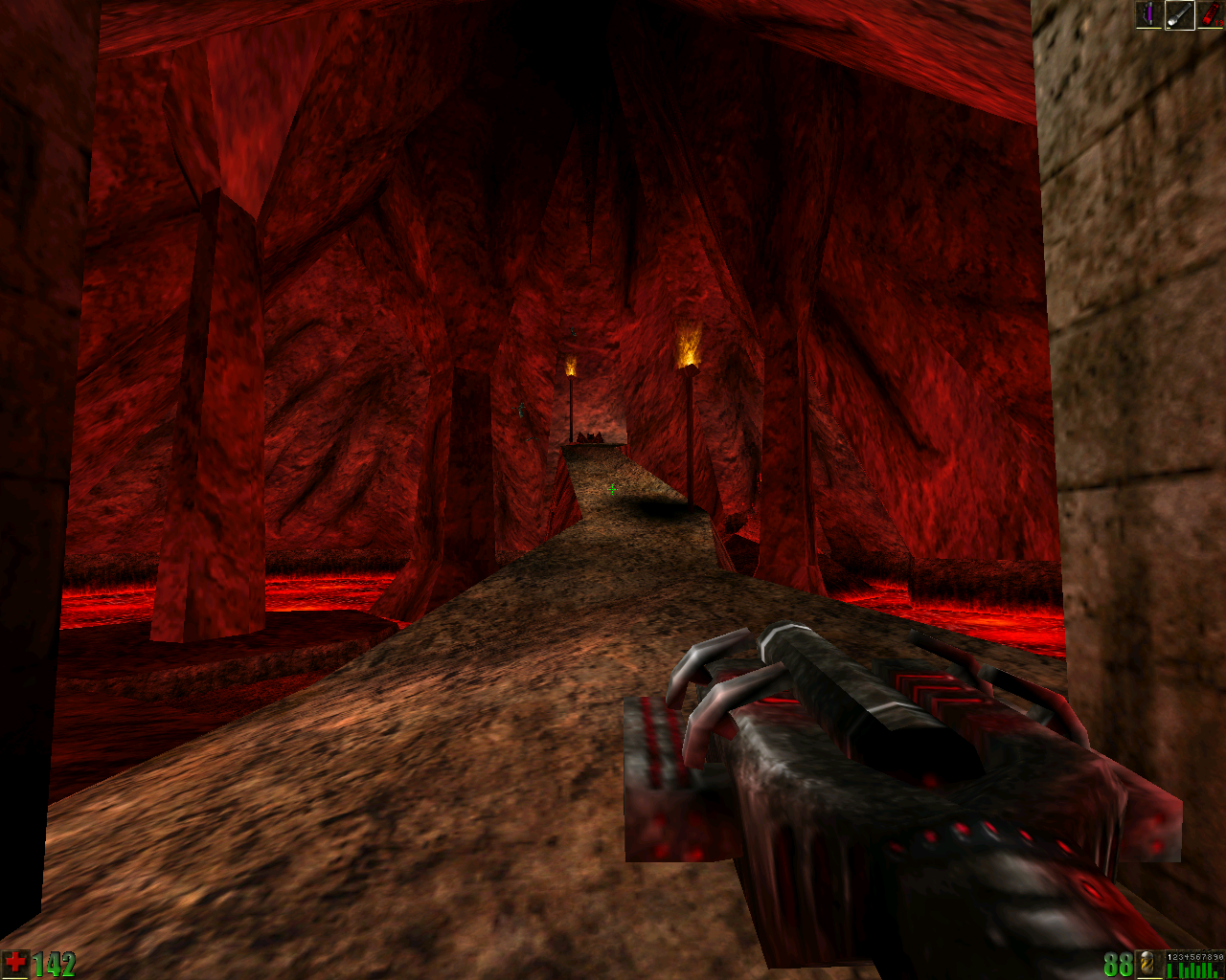
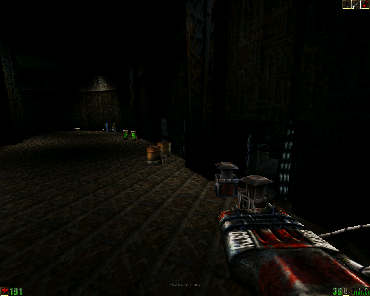
unreal4.png


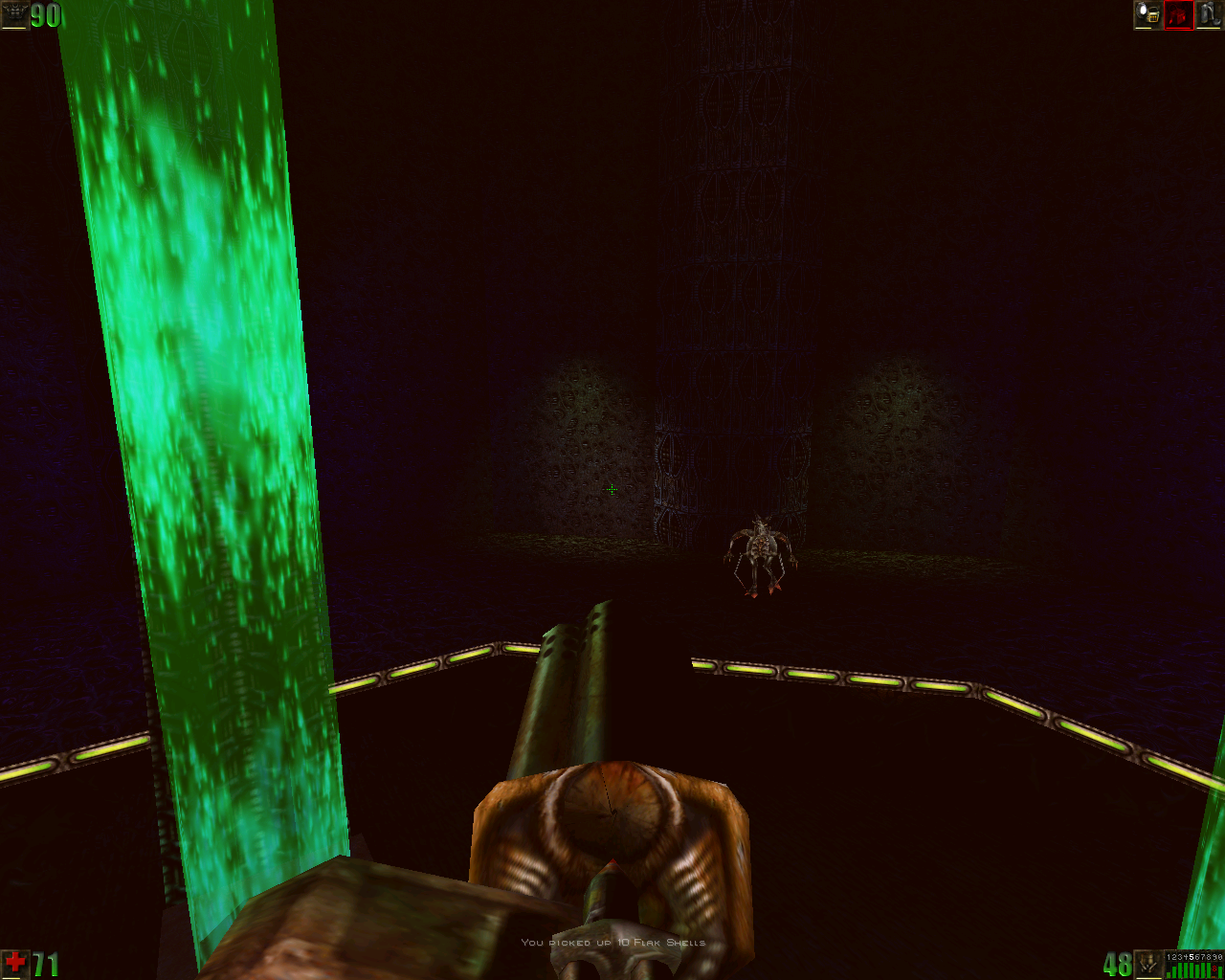
All this gothic architecture in the late game is a little out of place.

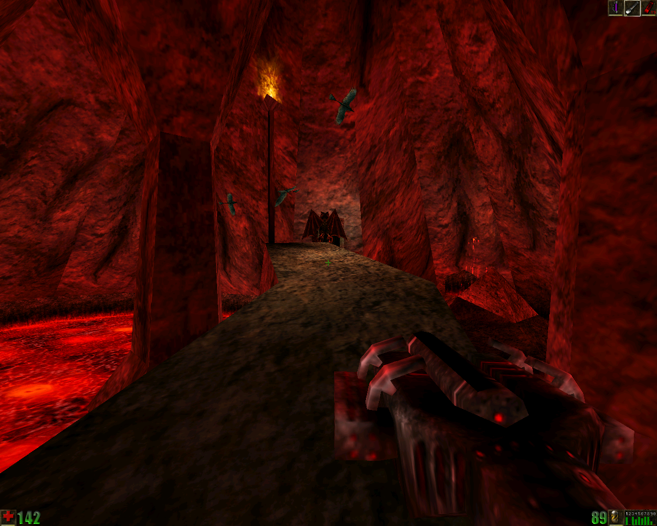
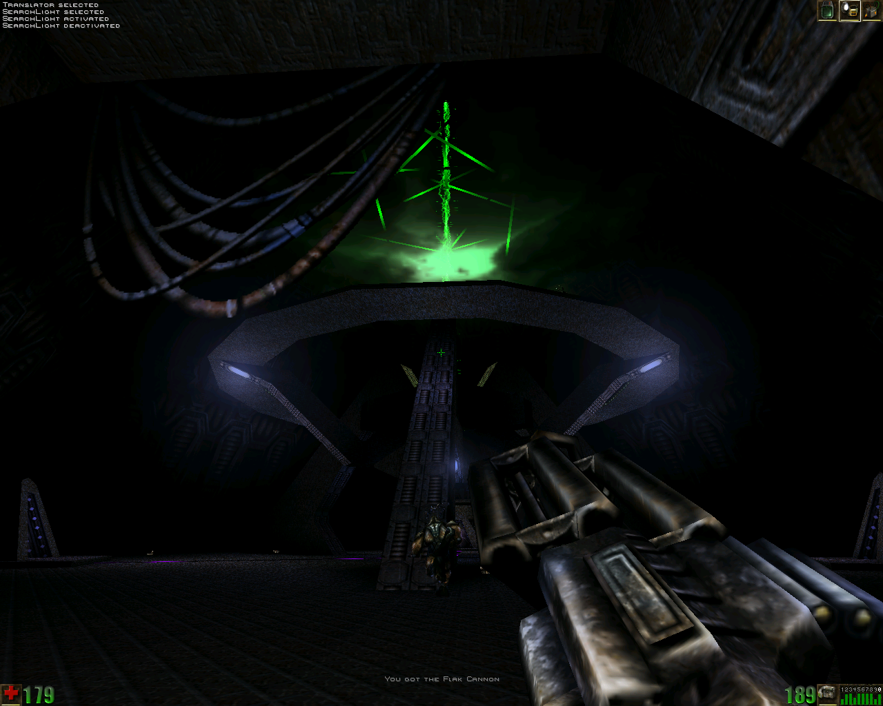
unreal5.png


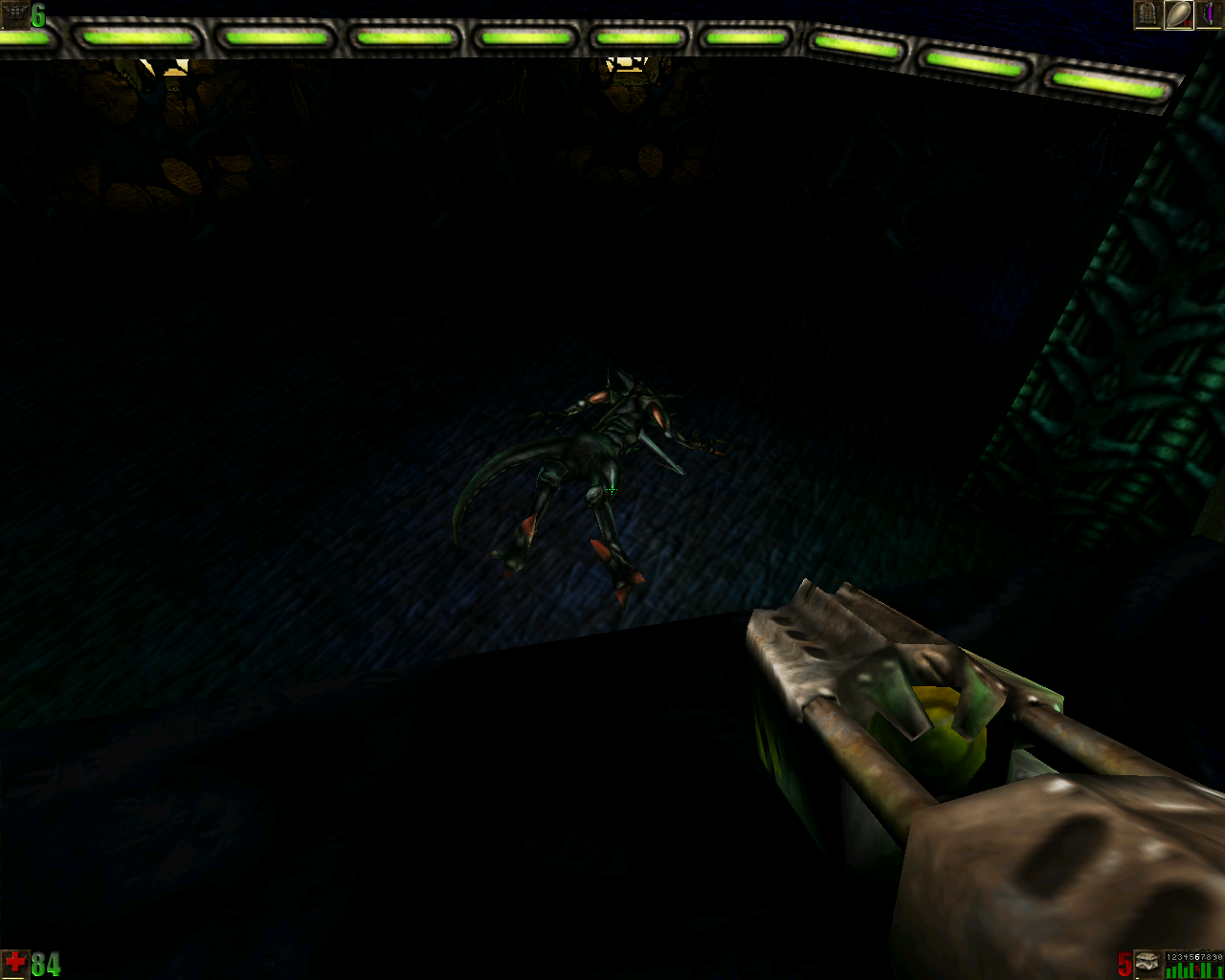
behead all skaarj including their women and children

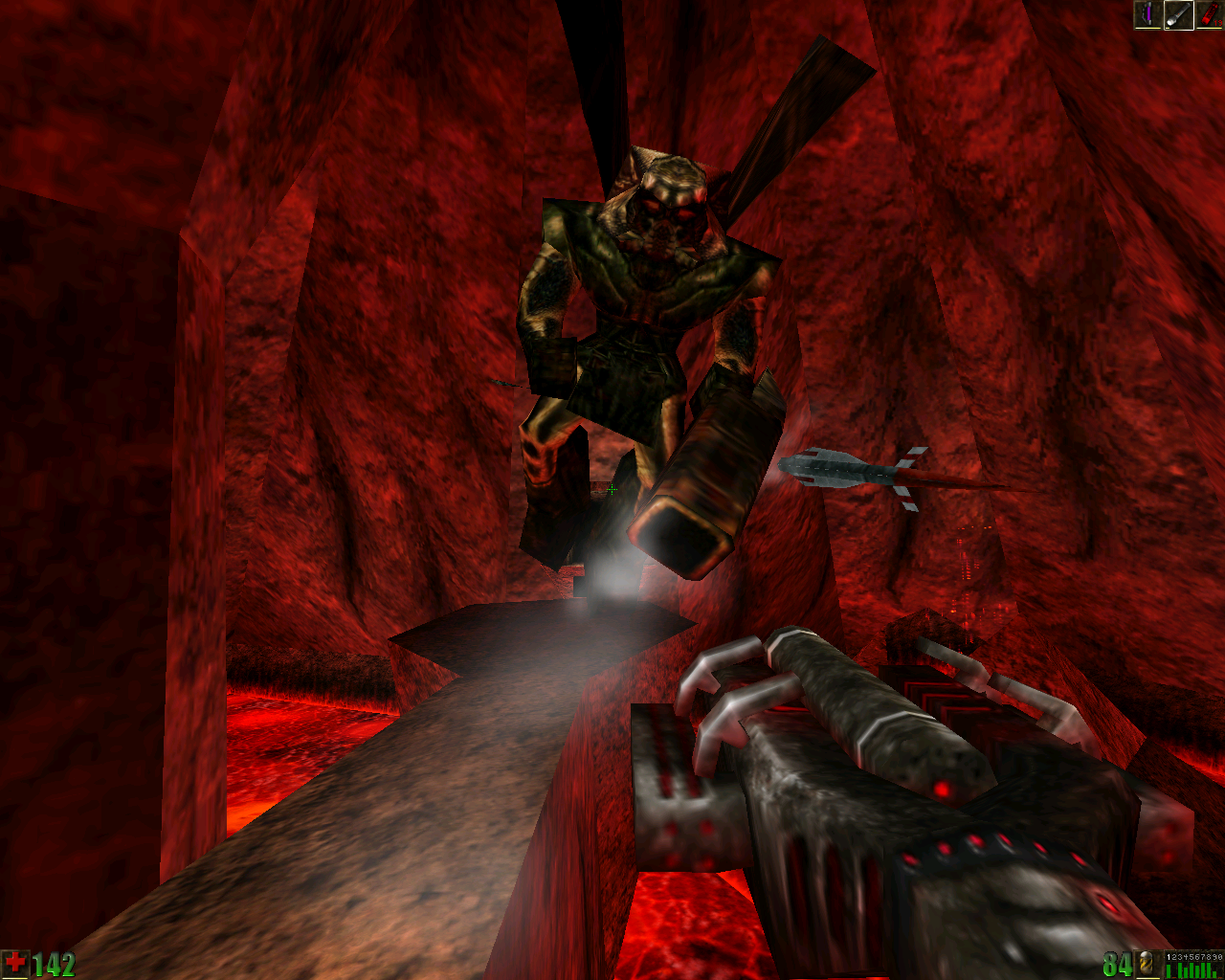
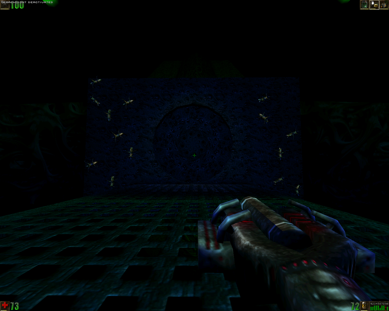
unreal6.png


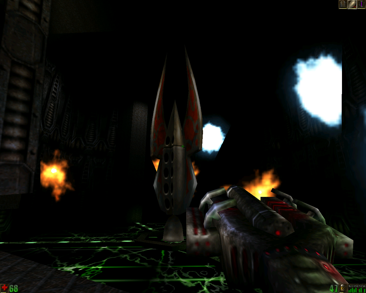
this is totally not a trap

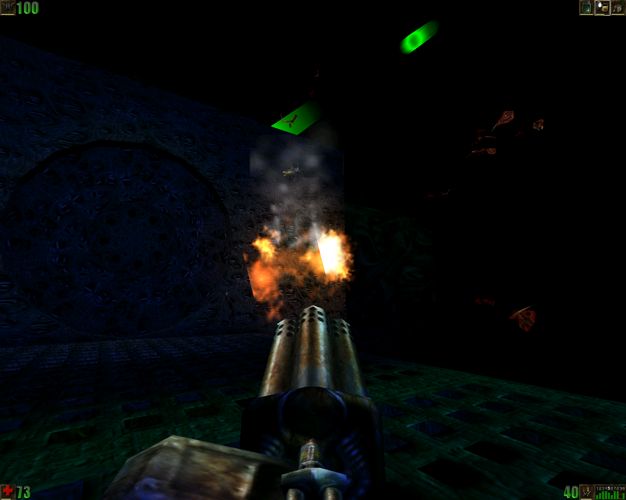
unreal7.png


OMG IT WAS A TRAP AFTER ALL

unreal8.png


how it started

unreal9.png


how it's going

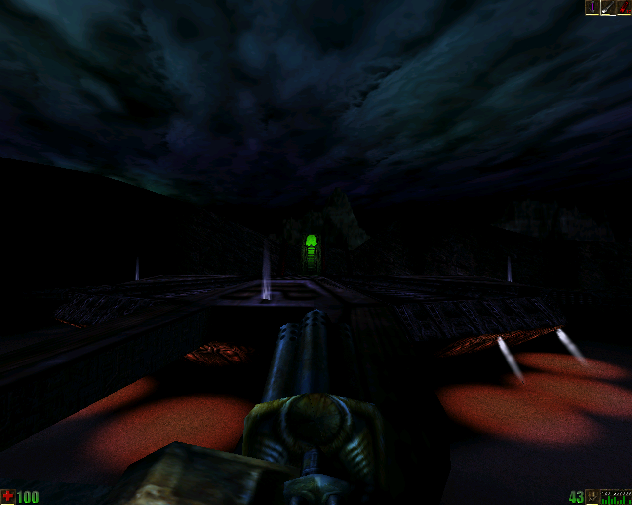
unreal10.png


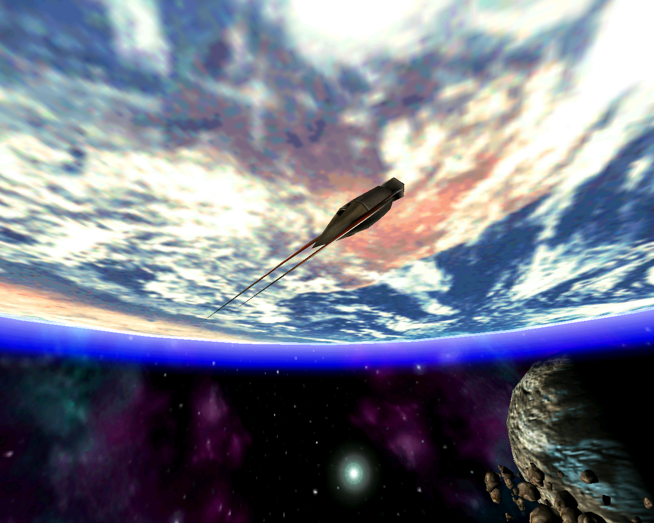
well this place looks familiar
 

HansDampf

Arcane
Joined
Dec 15, 2015
Messages
1,543
What's the difference between Quakespasm and Quakespasm Spiked?
Going above 72 fps messes with the game's physics. Spiked fixes this. There are some other improvements, but this is the reason why I needed it.


The trick to vores (that's what they're called) is to keep moving until you can make a really sharp turn to guide their missiles into walls. Luckily, the missiles don't move very fast so you can keep outrunning them forever!

The even better trick is to guide their missiles into hitting other enemies, who will then attack the vores. Enemy infighting is even more important in Quake than it was in Doom.
Yeah, that works great in those big fights in AD.

Honestly, Tears of the False God isn't even the best Arcane Dimensions map. Maybe the most visually impressive, but not the best.

And once you're done with Arcane Dimensions, there's Alkaline waiting for you...
Hmmm... I hope this doesn't turn into yet another addiction. How am I supposed to play all these Doom WADs, SMW hacks, and Quake mods, and still have time left for other games?


The level design was underwhelming? I think it's among the most interesting in early shooters because the designers could finally make full use of three dimensions and unrestrained movement, while at the same time the approach to geometry and hazards was still quite abstract, not being constrained by attempts to create realistic-looking locations.
No, exploring the levels was fun. I was mostly annoyed by how monsters are placed. There were some maps where I was often thinking, "ugh, not another one of those bastards!" Like the game was slowing me down.

Judging by the screenshots, you've turned off most of the graphical ‘enhancements’, which makes the game look close enough to its original version. Maybe only fires and particles are different, if what I tried (Quakespasm Spiked Multiplayer) is the same as the version you're using. Then there's the missing distortion on the weapon textures which only appears in the software renderer. You can always try Mark V, I think all it needs to run is to be extracted into a base folder with id1 folder in it, and PAK0.pak and PAK1.pak inside the latter.
I've used this blog article as a baseline: https://quake.blog/configuring-quakespasm-for-a-modern-retro-look.html
Also adjusted gamma and contrast.
If I decide to play through Quake again, it will probably be in DOSBox on Nightmare.

I wouldn't say it's as good as the original game, as it deviates in some important ways from its encounter design, levels, and pacing.
I prefer this style. I've played a few more maps now (trying to go through them in chronological order), and there is some more variety here. It's not all big arena fights like in Tears of the False God.


---
Speaking of which...

quakespasm-spiked-winm2e76.jpg

Found the last 2 runes. Cheeky portals!
And as a reward I got to see the real finale.

quakespasm-spiked-winaoi1g.jpg

Unexpected.

quakespasm-spiked-winfhf4i.jpg

It mad.

quakespasm-spiked-wint1dt4.jpg

One of secrets in this map has a belt that protects you from your own rocket splash. You know what this means? Free rocketjumps everywhere! I like the secrets in this map.

quakespasm-spiked-windjfzc.jpg

Another familiar face.

quakespasm-spiked-winoecau.jpg

:positive:
 

schru

Arcane
Joined
Feb 27, 2015
Messages
1,142
unreal4.png


All this gothic architecture in the late game is a little out of place.

unreal5.png


behead all skaarj including their women and children

unreal6.png


this is totally not a trap

unreal7.png


OMG IT WAS A TRAP AFTER ALL

unreal8.png


how it started

unreal9.png


how it's going

unreal10.png


well this place looks familiar
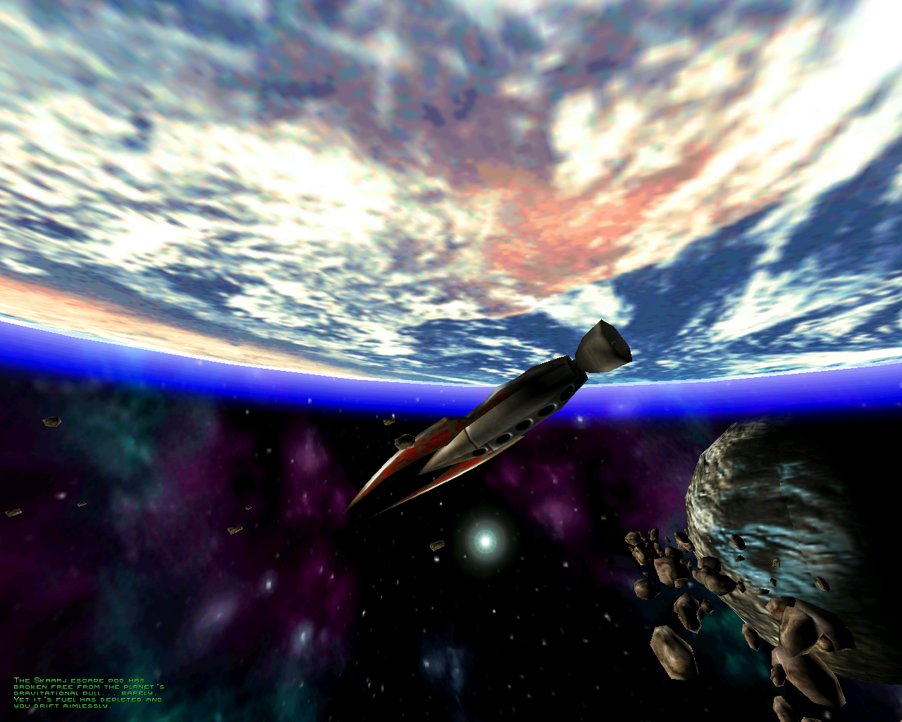
I take it you're playing in 16-bit colour mode, but does the sky look quite correct in that last screenshot?

I don't know what your set-up might be, perhaps the game looks different than in screenshots, but trying it with Old Unreal patch (or without) and dgVoodoo (emulating the first Voodoo card, gamma ramp off) with 3dfx renderer (so 16-bit colour mode), the sky in this map looks like this for me:

(this time the dithering is set to its original scale, though it's rendered at a resolution the game wouldn't have been run at originally, so the pattern is very fine; either way dgVoodoo probably doesn't handle dithering the way actual Voodoo cards did, as you pointed out before, although there are a few examples of it in the link to Kentie's site below;

the resolution before upscaling is 512x384, hence the HUD is much larger;

the C.R.T. filter is optional, I just prefer how things look with it;

despite using the Old Unreal patch and dgVoodoo, I wasn't able to adjust the brightness in the game's menu, I'm not sure if this was always the case; I disabled dgVoodoo's gamma ramp to get the game to look as close to how it would with standard settings as possible, but I don't think it should be this dark, so I increased the brightness in dgVoodoo to about 130 per cent)


01.png


02.png


The second map's sky is always a good point of reference for verifying if everything is working right. For example, the MultiTexture technique causes what seems like a tonal layer not to blend with the main texture correctly, resulting in something like white smudges. It seems that MultiTexture support was added to the game's engine in a later patch and while it didn't interfere with the way the game looks on the first Voodoo chipset, Voodoo 2 did support MultiTexture and it couldn't be even disabled in the renderer's advanced settings. The problem is also present in Direct3D and OpenGL renderers, but MultiTexture can be disabled in them.

This is how it's supposed to look:

03.png


The problem caused by MultiTexture:

nyleve-voodoo3-unreal-224.jpg


There's more about it here on Kentie's web site, but his Direct3D 10 and 11 renderers aren't accurate either: https://kentie.net/article/multipass/index.htm.

* * *

All that aside, I think the Gothic architecture gives the setting a very unique and exotic feeling—kind of like sci-fi introduing into a mixture of Nepal or Tibet and Quakesque brutalist Gothic.
 
Last edited:

schru

Arcane
Joined
Feb 27, 2015
Messages
1,142
schru How do you get that scanlines effect?
It's an option in dgVoodoo, scaling settings in the first tab.

There are better C.R.T. effects out there available through shaders, and perhaps it would be possible to combine them with dgVoodoo's output with the help of ReShade or a similar tool.
 

schru

Arcane
Joined
Feb 27, 2015
Messages
1,142
An impressive level of autism for a skybox.
Unreal's skyboxes are special, though come to think of it, many other games of the time had unique or at least very atmospheric skyboxes—Quake, Half-Life, Duke, even Quake II. None of these games would feel right without them.
 

Darth Roxor

Rattus Iratus
Staff Member
Joined
May 29, 2008
Messages
1,879,031
Location
Djibouti
I take it you're playing in 16-bit colour mode, but does the sky look quite correct in that last screenshot?

The screens look slightly off because they save at 0 brightness, which hides a lot of the detail.

And yeah I'm running it 16-bit because that's the only mode available with 3dfx, and I can't run OpenGL because that makes the brightness not work at all - which must be a problem with the engine vis a vis modern setups because I had the same issue when playing Rune.

I don't know what your set-up might be, perhaps the game looks different than in screenshots, but trying it with Old Unreal patch (or without) and dgVoodoo (emulating the first Voodoo card, gamma ramp off) with 3dfx renderer (so 16-bit colour mode), the sky in this map looks like this for me:

Listen fella, when I play games that are 25 years old, I'm generally happy if they just launch when hitting .exe after a standard installation and I don't need much more. If that's the case, and it is the case with Unreal, I don't browse the web in search of every single patch or mod out there, because I simply don't see the point and I also can't be bothered spending time on this. It looks, plays and feels good, as it should, and as I remember it. Cranking the juices up to 11 for whatever purpose has no importance whatsoever to me.

This is how it's supposed to look:

And again, as someone who's played this game at release and remembers what it looked like back then, it is absolutely not what it's supposed to look. Those ugly fucking scan lines that some people seem to have a fetish for have simply never been there originally, and I'd have get dropped on my head to consciously rape this game's visuals by pursuing that kind of effect.
 

schru

Arcane
Joined
Feb 27, 2015
Messages
1,142
I take it you're playing in 16-bit colour mode, but does the sky look quite correct in that last screenshot?

The screens look slightly off because they save at 0 brightness, which hides a lot of the detail.

And yeah I'm running it 16-bit because that's the only mode available with 3dfx, and I can't run OpenGL because that makes the brightness not work at all - which must be a problem with the engine vis a vis modern setups because I had the same issue when playing Rune.

I don't know what your set-up might be, perhaps the game looks different than in screenshots, but trying it with Old Unreal patch (or without) and dgVoodoo (emulating the first Voodoo card, gamma ramp off) with 3dfx renderer (so 16-bit colour mode), the sky in this map looks like this for me:

Listen fella, when I play games that are 25 years old, I'm generally happy if they just launch when hitting .exe after a standard installation and I don't need much more. If that's the case, and it is the case with Unreal, I don't browse the web in search of every single patch or mod out there, because I simply don't see the point and I also can't be bothered spending time on this. It looks, plays and feels good, as it should, and as I remember it. Cranking the juices up to 11 for whatever purpose has no importance whatsoever to me.

This is how it's supposed to look:

And again, as someone who's played this game at release and remembers what it looked like back then, it is absolutely not what it's supposed to look. Those ugly fucking scan lines that some people seem to have a fetish for have simply never been there originally, and I'd have get dropped on my head to consciously rape this game's visuals by pursuing that kind of effect.
Running it in 16 bits is good in my book as that's what it was made for. And yes, the old OpenGL renderer has compatibility problems; the one included with the Old Unreal patch is fully functional and maintains the original look, however. Not that it's needed, if the 3dfx one can be made to work correctly.

Again, adding any mods or visual ‘enhancements’ is not my intention. The scan lines weren't the point, as they're just an option in the wrapper, the blending of the sky textures was. Isn't it good to have everything work as it was supposed to?

I take it you're a little irritated, but you're welcome.
 

schru

Arcane
Joined
Feb 27, 2015
Messages
1,142
Darth Roxor, here are the same screenshots without the C.R.T. filter, but the dithering stays, as it certainly should be there to prevent the 16-bit colour banding, in fact even more pronounced than in these screenshots, if a resolution like 640 x 480 were to be blown up to this size (it's rather possible that Voodoo cards may have had a subtler way of doing it). This is emulation of the first Voodoo chipset, this time without any brightness increase, and it matches promotional images and what are supposed to be accurate, updated Direct3D and OpenGL renderers, save that the gamma is a bit darker here.

Unreal-2023-08-29-22-19-42-06.png


Unreal-2023-08-29-22-21-00-10.png


As you can see, the skies are still pretty smooth and the image isn't darkened and sort of low-contrast, as the case may be with certain configurations.

Perhaps what alerted me in your screenshot was just the undithered look, but I would still encourage you to check what those day-time skies are like, because when I switch dgVoodoo to emulate Voodoo 2 without dithering, the castle level looks very much like in your screenshot; even the shade of the paved road seems to be the same:

Unreal-2023-08-29-23-20-34-71.png


Now, it's not clear if there's any problem here apart from the lack of dithering, but if I switch to the second level with the same rendering settings, the broken sky mentioned above appears:

Unreal-2023-08-29-23-20-18-50.png


It's the same way if nGlide, which is pre-installed with the GOG version, is used, since it emulates Voodoo 3, but it doesn't seem like you're using it, since it always forces 32-bit colour mode, regardless of the input from the game:

Unreal-2023-08-29-22-56-01-89.png


Well, this is the state Epic left the game in after releasing patches in 1999 that added or changed support for Voodoo 2's two texture mapping units in collaboration with 3dfx. It's doubtful that this look was supposed to be a new feature, though, as those later patches changed the appearance of some skies on later Voodoo cards entirely and added white smudges where there were none in promotional and front-cover images. The readme for the game recommends both Voodoo and Voodoo 2 for high-end systems, without making a distinction between them. I suppose it was a bit like the 3dfx patches for Shadow Warrior and Blood, which added hardware acceleration to begin with, but broke a bunch of things.
 

Darth Roxor

Rattus Iratus
Staff Member
Joined
May 29, 2008
Messages
1,879,031
Location
Djibouti
I take it you're a little irritated, but you're welcome.

A little, yes, because I already said once I don't care, so repeated drive-by with BUT BRO THE SKYBOX is a little irksome.
 

As an Amazon Associate, rpgcodex.net earns from qualifying purchases.
Back
Top Bottom