Putting the 'role' back in role-playing games since 2002.
Donate to Codex
Good Old Games
  • Welcome to rpgcodex.net, a site dedicated to discussing computer based role-playing games in a free and open fashion. We're less strict than other forums, but please refer to the rules.

    "This message is awaiting moderator approval": All new users must pass through our moderation queue before they will be able to post normally. Until your account has "passed" your posts will only be visible to yourself (and moderators) until they are approved. Give us a week to get around to approving / deleting / ignoring your mundane opinion on crap before hassling us about it. Once you have passed the moderation period (think of it as a test), you will be able to post normally, just like all the other retards.

Screenshot thread

Turjan

Arcane
Joined
Mar 31, 2008
Messages
5,047
Fuck you guys for graphicwhoring morrowind, I had to play it on a fagtop with 0 view distance. :(
But today you've got a better PC, right?
Morrowind was actually quite benign regarding the hardware requirements. I remember that I started playing the game on a computer that was clearly below the minimum specs that were mentioned on the box, and while it was a bit sluggish, it was definitely playable.
 

Konjad

Patron
Joined
Nov 3, 2007
Messages
5,471
Location
Strap Yourselves In Codex Year of the Donut Codex+ Now Streaming! Torment: Tides of Numenera Wasteland 2 Steve gets a Kidney but I don't even get a tag.
I played it on GF4MX and regretted I had no pixel shaders to see the amazing water.

Fuck, during these times new technical stuff in games was fascinating and incredibly looking, today we have only shitty gimmicks like bloom to hide terrible texture resolutions :(
 

potatojohn

Arcane
Joined
Jan 2, 2012
Messages
2,646
Morrowind runs at 15 fps on all hardware, from geforce 1 to the latest shitnozzles. It's just how it is. Only with external tools like MGE/MFO does it achieve good performance.
 
Joined
Mar 13, 2012
Messages
3,438
Location
Lost Hills bunker
I should not need to say what game this is.
I don't mind texture replacers. For me what ruins modded copies of Morrowind are those who replace the models and slather the screen with pixel shaders. Something about those blatantly photographed textures (whether they be the original or replacers), not marred by chunky specular maps and bloom, is really nostalgic for me. I love the look of early 2000's games, with their dim, moody lighting and high contrast, defined low-poly models. It makes everything feel "primeval" or something to me.

uS4jl.jpg

nsu3k.jpg

qn16v.jpg

xV7AS.jpg

Is this vanilla or are you using some mod ('cause this looks beautiful)?

Would you recommend any mod which stays truthful to the game, but improves it?
 

JarlFrank

I like Thief THIS much
Patron
Joined
Jan 4, 2007
Messages
34,393
Location
KA.DINGIR.RA.KI
Steve gets a Kidney but I don't even get a tag.
A good comparison. I've always been fond of the lighting in movies from the 1970s and early 1980's for some indescribable reason. It has a sort of radiant, long-exposure quality to it:

raider-of-lost-ark.jg.JPG


And speaking of Indiana Jones in particular, I'm reminded of how Last Crusade had so many crisp, focused shots on the characters whilst Kingdom of the Crystal Skull had this horrible soft lighting and bloom muddling all of the scenes.

That movie screenshot, with the lighting and atmosphere, slightly reminds me of the old Tomb Raider games, which also had a superb atmosphere:

tr_realta_41.jpg

tombraiderthelastrevela.jpg

screen13d.jpg


There's something about late 90's and early 00's 3D games that makes them just look right. Something like Crysis might pride itself on looking realistic, but those modern games never manage to look as real as the games from around the millenium. There was a lot more focus on atmospheric lighting, a contrast between light and darkness, appropriate texturing...

It's just a completely different way of graphic design, a lot more atmospheric and subtle, while modern games are all about throwing hundreds of AWESOME effects right into your face.

It seems that proper use of lighting is a lost art both in games and in movies. Didn't the Dishonored devs say recently that they removed darkness-based stealth and the ability to extinguish light sources for "artistic reasons" because too much darkness would hide all the great graphics their artists designed?
This is exactly what's wrong with modern visual design. Everything needs to be clearly visible and in your face. The concept of subtle and subdued atmosphere-building has been lost.
 

Kahlis

Cipher
Joined
Jun 23, 2012
Messages
408
There's something about late 90's and early 00's 3D games that makes them just look right. Something like Crysis might pride itself on looking realistic, but those modern games never manage to look as real as the games from around the millenium. There was a lot more focus on atmospheric lighting, a contrast between light and darkness, appropriate texturing...
Exactly. I've never been able to tactfully describe what happened between then and now. I think one thing that the older games handle better is shadowing. There's usually very little ambient light or no support for it at all in Quake/Goldsrc era engines. When there is, it's usually not tinted, so everything gradually just seems to fade away into this sleepy, impassive dimness. Except for when you're outdoors, there's usually very little ambient lighting in real life. Just light and shadow. I think modern games overcomplicate the formula. Modelling too - everything in Oblivion has this inflated, bulky look to it that never sat right with me.

Could it also just be an advantage of the low resolution textures producing a more consistent-looking setting overall? Maybe I'm just more used to the visuals of older games than new ones, but I think the higher resolution the game gets the harder it is to create a sense of a unified color palette and "level of detail." Especially with multiplatform games, everything seems so much more inconsistent now - door frames that are higher resolution than the ground, etc.
 

MetalCraze

Arcane
Joined
Jul 3, 2007
Messages
21,104
Location
Urkanistan
It's time for some of that dead and forgotten singleplayer mode!

Combat Mission Shock Force, Marines DLC

Marine recon team sneaking under the cover of night past enemy positions

nM038.jpg


Artillery bombardment of the village

KvZac.jpg


Moving past the compound with potential enemy contact which is being suppressed by the AAV

ZxUH1.jpg
 

dibens

as seen on shoutbox
Patron
Joined
Dec 4, 2011
Messages
2,629
Watching Morrowind screenshots is like finding pictures of my ex. I'm amazed of how beautiful and hot she is, even find myself missing her a little bit. Then I meet her in real life and after ten minutes of conversation I remember why we split up in the first place.
 

Kahlis

Cipher
Joined
Jun 23, 2012
Messages
408
Is this vanilla or are you using some mod ('cause this looks beautiful)?

Would you recommend any mod which stays truthful to the game, but improves it?
I don't remember what replacers I use. The most comprehensive one that stays true to the vanilla feel is Connary's texture replacers, which are packed into a BSA and used to be on Megaupload someplace. Not sure if he has an official page some place for them. There's also Darknut's replacers for weapons, armor and creatures.

For gameplay I've never really explored mods that much, but I more or less agree with most of what's listed on BTB's Morrowind Mod List. Never bothered with some of the more recent things like the SpeedTree-style vegetation and Morrowind Advanced, though.
 

sser

Arcane
Developer
Joined
Mar 10, 2011
Messages
1,866,893
There's something about late 90's and early 00's 3D games that makes them just look right. Something like Crysis might pride itself on looking realistic, but those modern games never manage to look as real as the games from around the millenium. There was a lot more focus on atmospheric lighting, a contrast between light and darkness, appropriate texturing...
Exactly. I've never been able to tactfully describe what happened between then and now. I think one thing that the older games handle better is shadowing. There's usually very little ambient light or no support for it at all in Quake/Goldsrc era engines. When there is, it's usually not tinted, so everything gradually just seems to fade away into this sleepy, impassive dimness. Except for when you're outdoors, there's usually very little ambient lighting in real life. Just light and shadow. I think modern games overcomplicate the formula. Modelling too - everything in Oblivion has this inflated, bulky look to it that never sat right with me.

Could it also just be an advantage of the low resolution textures producing a more consistent-looking setting overall? Maybe I'm just more used to the visuals of older games than new ones, but I think the higher resolution the game gets the harder it is to create a sense of a unified color palette and "level of detail." Especially with multiplatform games, everything seems so much more inconsistent now - door frames that are higher resolution than the ground, etc.

I chock it up to the uncanny valley argument.

We know games aren't real, so when they present themselves as real as possible it is very easy to mess it up and get an "off" feeling about them. The same is true for movies. When sets are sets and monsters are hand-crafted moving artwork our brain just nods and says alright. When sets are vivid and super colorful and made to look like real-life and monsters are graphically animated, well, our minds go "Ew, what the hell" and skirt back. That could just be me, though. I love the speculative genres, but they have become way more hit and miss as technology has advanced. e.g. Indiana Jones. A guy drinking from the wrong chalice, aging and turning to literal dust? Badass. A bunch of animated ants moving in waves and eating soldiers? What the fuck. For some reason, I think this is also why I really didn't like the last Lord of the Rings movie -- all the graphics and animated monsters got notched way up compared to the first film which had more of a hand-made feel to it. (And probably because of the ten endings tacked onto one another for thirty-minutes beyond the actual conclusion of the plot.)
 

JarlFrank

I like Thief THIS much
Patron
Joined
Jan 4, 2007
Messages
34,393
Location
KA.DINGIR.RA.KI
Steve gets a Kidney but I don't even get a tag.
I don't have a problem with this uncanny valley effect at all, it's more like modern games having a much too sterile feel about them compared to older ones. Shitty effects that make character models look like they're covered in plastic foil and make surfaces that are shone upon glow brightly just make everything look so artificial and crappy. Something like Thief might look like a low-res version of a real life scene. Anything from Unreal Engine 3 looks like shit precisely because of all the horrible effects used there.

Comparison pics:
Dishonored, which runs on UE3 and look how horribly shiny most surfaces are:
dishonored_e3_2012_004.jpg

dishonored_5.jpg


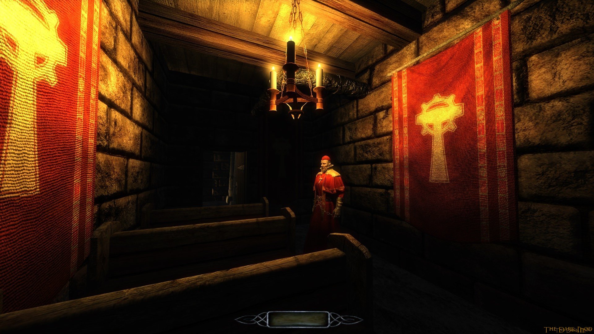
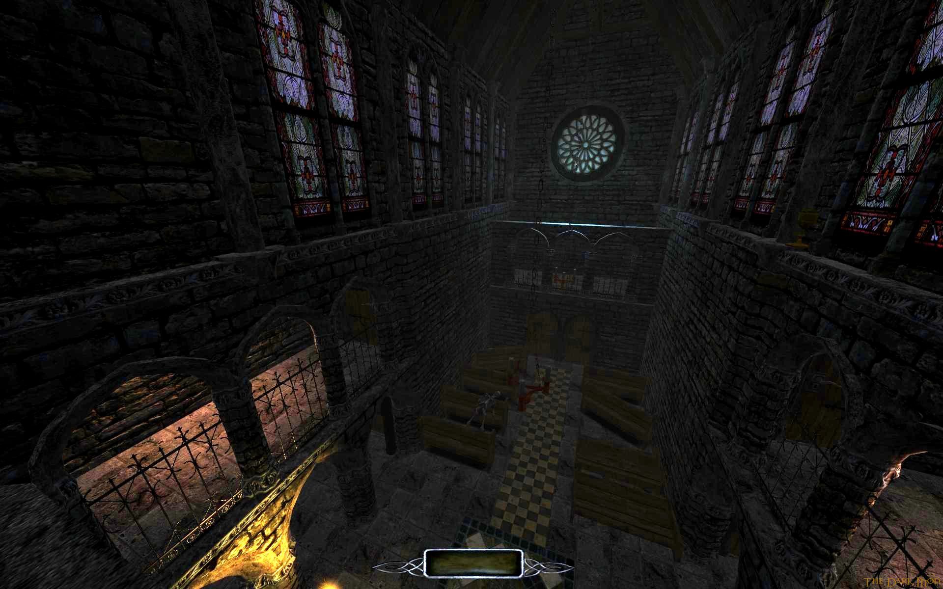
Compare that to the Dark Mod, which also has too much bloom for my tastes but much more tasteful lighting:
lockdown_6.jpg

alberics_3.jpg


And good old Thief 2:
6b4ca429121f.jpg

cityoldyd2.jpg


Thief 2 looks the most "real" to me, due to the lack of glow-effects on lit surfaces. Dark Mod has some annoying bloom, but the lighting is done rather well and adds to the atmosphere. Dishonored is by far the brightest and shiniest, which detracts a lot from the atmosphere. If every surface glows when light falls on it, it doesn't look realistic at all, but artificial and unnatural.
 

Multi-headed Cow

Guest
If you base your enemy's strength on the size of his/her nipples (And really, why wouldn't you?) you know you're in for some trouble when you get a gander of these.

751D97B6198B0963C32492BF93F118AEF5301C78
 

Multi-headed Cow

Guest
Disliking this less than Guild Wars 1, but it's not really grabbing me. I have an ok time when I launch the game and play but I rarely feel motivated enough to play it as opposed to TL2, BL2, or whatever else. Almost wish I knew how to play the auction house well enough to make enough in-game currency to max out my character slots/bank slots for fear the price of "Gems" will rise later. Hell, not even sure if my baby 25 silver is enough to really play the AH anyway.

Edit: Oh yeah, also kinda bummed by the lack of change in my armor's appearance from level 1 to 13ish. Only real change was a mask, which I disabled the appearance on to keep my ugly mug in sight.

2D6FF3DCAF39540CF4AADA67C8CFC160DC0BAE12
 

fizzelopeguss

Arcane
Joined
Oct 1, 2004
Messages
970
Location
Equality Street.
I don't have a problem with this uncanny valley effect at all, it's more like modern games having a much too sterile feel about them compared to older ones. Shitty effects that make character models look like they're covered in plastic foil and make surfaces that are shone upon glow brightly just make everything look so artificial and crappy. Something like Thief might look like a low-res version of a real life scene. Anything from Unreal Engine 3 looks like shit precisely because of all the horrible effects used there.

Comparison pics:
Dishonored, which runs on UE3 and look how horribly shiny most surfaces are:
dishonored_e3_2012_004.jpg

dishonored_5.jpg


Compare that to the Dark Mod, which also has too much bloom for my tastes but much more tasteful lighting:
lockdown_6.jpg

alberics_3.jpg


And good old Thief 2:
6b4ca429121f.jpg

cityoldyd2.jpg


Thief 2 looks the most "real" to me, due to the lack of glow-effects on lit surfaces. Dark Mod has some annoying bloom, but the lighting is done rather well and adds to the atmosphere. Dishonored is by far the brightest and shiniest, which detracts a lot from the atmosphere. If every surface glows when light falls on it, it doesn't look realistic at all, but artificial and unnatural.

you're talking bollocks, dishonored is obviously aping a cartoony, exaggerated style.

must try harder fishing for old fag kkkredit.
 

JarlFrank

I like Thief THIS much
Patron
Joined
Jan 4, 2007
Messages
34,393
Location
KA.DINGIR.RA.KI
Steve gets a Kidney but I don't even get a tag.
Even with a cartoony style you don't have to overuse effects, especially this slightly plasticy feel of characters which somehow every UE3 game has.
 
Joined
May 6, 2009
Messages
1,876,743
Location
Glass Fields, Ruins of Old Iran
Is this vanilla or are you using some mod ('cause this looks beautiful)?

Would you recommend any mod which stays truthful to the game, but improves it?
I don't remember what replacers I use. The most comprehensive one that stays true to the vanilla feel is Connary's texture replacers, which are packed into a BSA and used to be on Megaupload someplace. Not sure if he has an official page some place for them. There's also Darknut's replacers for weapons, armor and creatures.

For gameplay I've never really explored mods that much, but I more or less agree with most of what's listed on BTB's Morrowind Mod List. Never bothered with some of the more recent things like the SpeedTree-style vegetation and Morrowind Advanced, though.

iirc Connary pulled the files because of modder drama ( :eek: ). The textures are on BTB's list, but they are hosted on 4shared, which requires (free) registration. As soon as I get my laptop back, I'll try to upload it somewhere else for all the tinfoil hats on Codexia.

As for gameplay. BTB's own mod is based on fan-favorite Wakim's Game Improvements (WGI), and contains what I consider a nice alternative to another fan favorite, Galsiah's Character Development (GCD).
 

potatojohn

Arcane
Joined
Jan 2, 2012
Messages
2,646
Yeah that's a rather low quality dungeon. You kill a million skeletons and rats and then at the end is the biggest asshole enemy in the entire game who's stronger than all the enemies in Morrowind combined.
 

felipepepe

Codex's Heretic
Patron
Joined
Feb 2, 2007
Messages
17,312
Location
Terra da Garoa
eZYHUh.jpg


I really like Mount & Blade, but FFS, I just made the bloody KING prisoner and that is worth NOTHING! Either he magically escapes after a few days, or I sit my ass on a castle and wait a lot for some ransom money... I should be able to turn him to my leader and become a baron, or just kill him for fun...

Also, lol at this:

iFHy7h.jpg
 

As an Amazon Associate, rpgcodex.net earns from qualifying purchases.
Back
Top Bottom