Putting the 'role' back in role-playing games since 2002.
Donate to Codex
Good Old Games
  • Welcome to rpgcodex.net, a site dedicated to discussing computer based role-playing games in a free and open fashion. We're less strict than other forums, but please refer to the rules.

    "This message is awaiting moderator approval": All new users must pass through our moderation queue before they will be able to post normally. Until your account has "passed" your posts will only be visible to yourself (and moderators) until they are approved. Give us a week to get around to approving / deleting / ignoring your mundane opinion on crap before hassling us about it. Once you have passed the moderation period (think of it as a test), you will be able to post normally, just like all the other retards.

The Darkness Below: a retro CRPG in the making - now available on Early Access

vlzvl

Arcane
Developer
Joined
Aug 7, 2017
Messages
208
Location
Athens
Speaking of your game, have you tried keeping sprites properly rotated (direction of camera + 180 degrees @ Y axis) instead of looking at the origin? Just asking whether it's intentional or not since it looks somewhat bizarre to me. ;)

Do you mean why i am not rotating sprites so they look straight in their front square rather my camera origin? like in rotating steps of 90 degrees per orientation ???
Well, it's because i never tried that way :(
Currently, i am just using a quick mathematical formula that computes the correct Y-axis rotation with 2 inputs, my camera position and the object's position.
It's pretty handy and straightforward, however it causes some weird looks and i agree. I just did some tests:

Current rotation mechanism.

Objects are looking at my camera center, perfectly rotated quads:

img-1.jpg


Alternative.
Objects are rotated so to look at their front square perfect, as well in my own direction:

img-2.jpg


Obviously, the second variation looks better.
I am going to play with a new rotation mechanism to get better results, which in addition need to be frame-friendly.
I cannot just rotate the objects 180 degrees as turning is done in real time and also uses a number of frames.
Mechanism needs to take into account the number of frames and rotate little by little to reach the results of second image.
Regardless, it looks much better in second image and the sprites are not distorted :)
Added to my big TODO list to play with, thanx :)
 
Last edited:

PrettyDeadman

Guest
You need to add various interactable objects on the walls like in Grimoire Heralds of the Winged Exemplar which would contain various puzzles, items, secrets, flavour texts, flavour visuals, secret dungeons and etc.
 

vlzvl

Arcane
Developer
Joined
Aug 7, 2017
Messages
208
Location
Athens
You need to add various interactable objects on the walls like in Grimoire Heralds of the Winged Exemplar which would contain various puzzles, items, secrets, flavour texts, flavour visuals, secret dungeons and etc.

hey, thanx for the comment. I did not played Grimoire that much because i had performance issues with it. However, my inspiration goes much deeper than Grimoire, mostly Eye of the Beholder and (indoor) Might and Magic. At the moment the only interactive objects are chests and doors but i will add levers and wall buttons as well.

The scenario is not 100% ready but it will involve an underground (but civilized) world, so secret levels and boatloads of puzzles will certainly exist.
Actually secret levels or dungeons are part of my event triggering; some big events may open specific areas, which otherwise be closed. One possible example is when you have to do a quest to upgrade your profession or your status in the underground world. All of this is still in paper i.e. notepad++ for us devs.

At the moment i am already improving some visual candies, specifically spells and concetrating on character depth. I prefer character depth rather game depth at the moment, but in the end both will be very deep. Thanx!
 

vlzvl

Arcane
Developer
Joined
Aug 7, 2017
Messages
208
Location
Athens
Game is progressing well but it was not possible to release a demo, just yet.
Instead i post a lot of images for the newer stuff.
Full time job and M.Sc. does not help me at the moment and i feel extremely tired to even put up a video :/
The demo (whenever it gets out) will consist of 3 areas, a forest, a small dungeon (storeroom) and a small city.
So here are the images, along with some description:

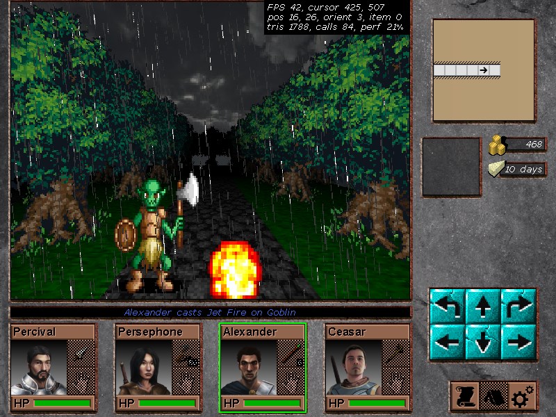
The new spell system displays effects in full 3D,
coming out roughly by caster towards the center of monsters.
Here the 3rd character casts a spell from a Wand (with limited charges).


image.jpg


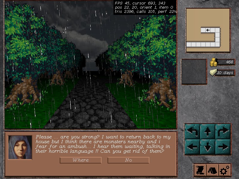
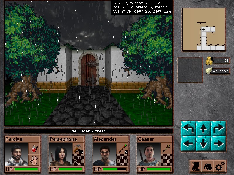
The second event in the demo.
An afraid woman asks for help in the forest. This exploits a lot of the event mechanism.
If you don't fully help her, you won't be able to visit a specific area later.


image.jpg


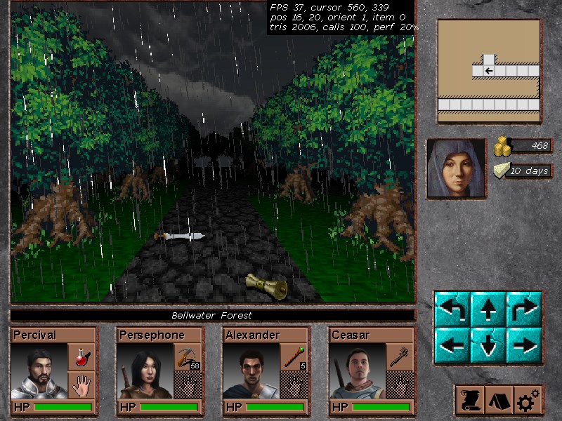
The party can place (or take) scattered items from the ground.
There are 4 possible squares to place the items and multiple ones can be placed in a square, in the same way as in Eye of the Beholder.
Before that, chests were the only place one could place its items.

image.jpg


How a typical "door of interest" will look like.
These doors does not open, in the common sense.

This is a house where you knock and some event happens. Towns include a lot of such doors i.e. shops, quests.

image.jpg


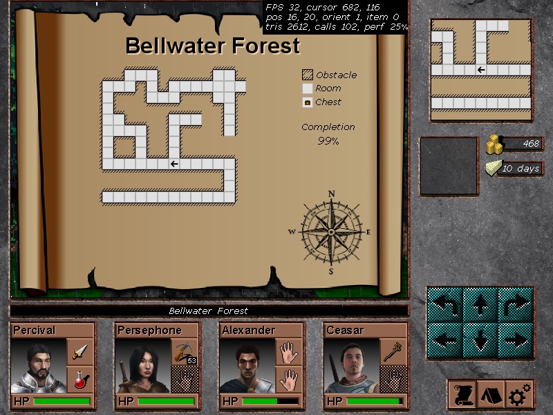
The map.
I am going to change this a bit, making as large as the screen to be able to show the *entire* map, rather the part where the party is centered at which seemed good at first... I imagine something like Lands of Lore.

image.jpg


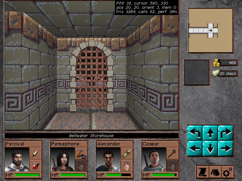
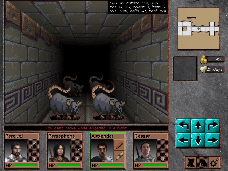
Inside the first dungeon.
Those places are almost pitch black like Might & Magic 3; it's lit because i have used a Light Minor spell. Without such spells or torches (develop later), a dungeon wont be a simple grind fest; it will be a hell because you literally wont be able to see the next square. Here you see a closed portcullis with some rats lurking beyond.

image.jpg


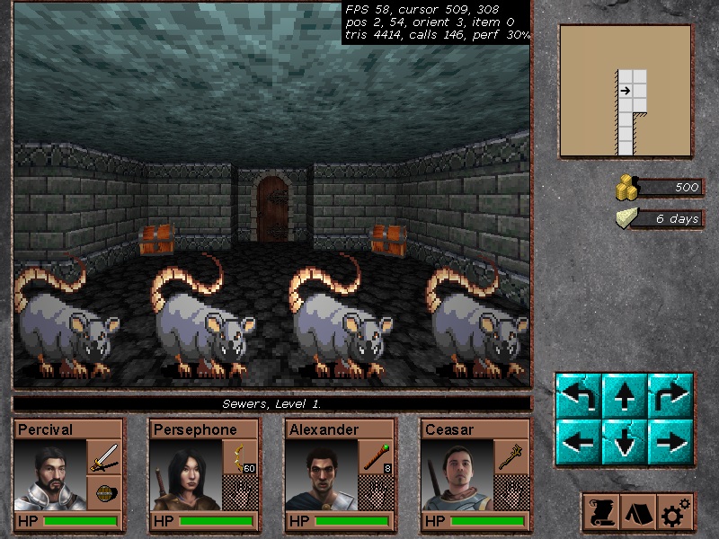
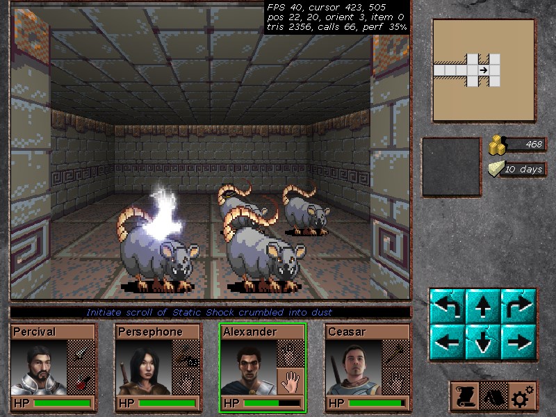
Battling the rats!
Here you see a Scroll of Static Shock, a spell belonging to Air Element and obviously is 1-time use, hitting the left rat. However, rats have increased resistances so damage wont be full.

image.jpg


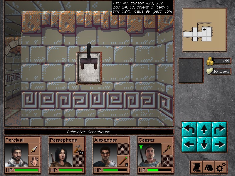
The levers!
Those things can trigger specific events, either when they're pulled or pushed. Up to 4 levers can occupy a single square, each one with different direction and they're fully 3d with a decent "3d" animation when they're pulled / pushed.

image.jpg


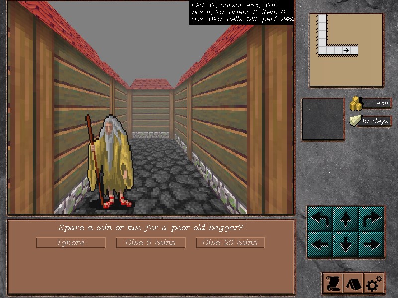
The third area, the misty town of Bellwater.
At the moment only the map is designed. The only inhabitant is that old beggar that asks for coins. The event is yet to be designed. I had to design a simple 4-frame animation for the beggar as well, which was also a new addition to the engine: NPC, which means something that walks (or may not) but does not attack you.

image.jpg


Demo will be ready after i implement the whole city (without shops or other exotic staff that take time) and improve other areas with newer stuff like placing some NPCs here or there and add some additional items there or here.
I like where this goes, although a bit slow since the amount of work is frustrating. I hope you like it as it is by now.
 
Last edited:

Punch

aaaaaa
Patron
Joined
Jan 1, 2018
Messages
132
Grab the Codex by the pussy
Those look pretty cool but the advanced lighting effects look off alongside the classic looking dungeons and sprites.
 

vlzvl

Arcane
Developer
Joined
Aug 7, 2017
Messages
208
Location
Athens
Those look pretty cool but the advanced lighting effects look off alongside the classic looking dungeons and sprites.

Yes, the lighting is too strong for dungeons but its a left-off of my tests and since i only have light spells and not torches, i decided to leave it that way until i develop light sources for the rest of classes such as torches.
I uploaded some images to show the real lighting without light sources and with minor lighting via spells:

Without light sources:
One can not even see the wall at the next square but at least orientation is preserved without minimap.

6-1.jpg


After casting a Light Minor spell:
The sphere of lighting increases but you can still see the shadows starting on the next square.
I think this resembles the normal lighting of classic first-person crawlers.

6-2.jpg


How some monsters looks under Light Minor effect:
Without lighting, only the front row is shown; the other are biting in the dark.

6-3.jpg


I tried to resemble as much as i could the lighting approach of pixel art first-person crawlers into my 3D one, using shaders. At the moment it just looks ok to me. Although, i wish i could make a shader producing dithering and such retro effects instead of light attenuation :) but thats out of my league.
 
Last edited:

vlzvl

Arcane
Developer
Joined
Aug 7, 2017
Messages
208
Location
Athens
I had an intense M.Sc. semester that kept me back on my game, only allowing me a few hours per week for quite some time. I emerged back and worked a lot on the game, improving both the game and the level editor, adding and removing graphics, sounds, fixing event system and buying some additional stuff like monsters and some nice wall textures. Below you'll find some newer images of the game. I also ask for some feedback on some graphics i want to use:

The new look of a dungeon.
Those are new wallsets of higher resolution, as well new floor tiles. I will be using 4 new of such textures on in-door places like dungeons & castles. You can also see a dropped club in front of the party.

screenshot-3.jpg


screenshot-1.jpg


screenshot-2.jpg


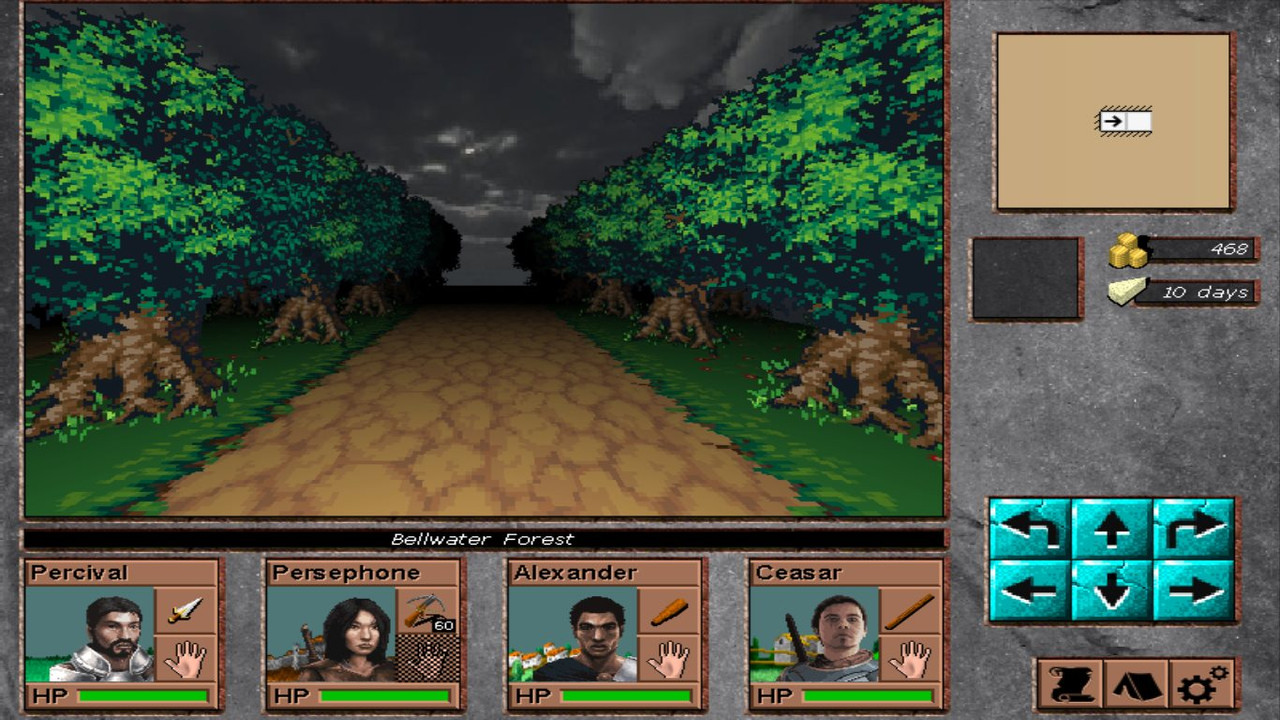
Above images are showing some new graphics of out-door levels such as a forest:

Which are quite different from earlier versions of the game.

Those images above differs on character portraits; the one (above) shows the characters with a gradient background with centered portrait. The newer image shows character portraits with some landscape behind them, such as a town or plains or some village and their portrait are shifted a bit to the right.
My idea is to use those areas behind characters to carve some history about them on character generation.

Which one do you prefer?
The gradient-background portraits or the newer one?

I like the newer approach but i do not know how much it adds to the game, so i could really use one or three different opinions :)

PS. This post came really fast as i just wanted some feedback since my graphics are changing. I will make a proper post with a lot more content, showing the entirety of my late work.
 
Last edited:

Jack Dandy

Arcane
Joined
Feb 10, 2013
Messages
3,039
Location
Israel
Divinity: Original Sin 2
Very nice progress, first of all!
Second, I think I prefer the gradient picture, although I definitely understand what you were going with, with the 'character history background' thing. Maybe save that for the full character sheet?
 

Dorateen

Arcane
Joined
Aug 30, 2012
Messages
4,422
Location
The Crystal Mist Mountains
Have to agree that the landscape background on character portraits is a nice touch, as long as it is not intrusive. Perhaps some hills or mountains for a dwarf character.

I really like those outdoor graphics. I much prefer the old school pixelated art direction to shiny Grimrock-clone modern dungeon crawlers. The dirt road cutting through dense forest under grey, overcast skies has charm and atmosphere.
 

vlzvl

Arcane
Developer
Joined
Aug 7, 2017
Messages
208
Location
Athens
I really like those outdoor graphics. I much prefer the old school pixelated art direction to shiny Grimrock-clone modern dungeon crawlers. The dirt road cutting through dense forest under grey, overcast skies has charm and atmosphere.

Yes, exactly. While i liked to play the first Grimrock, i could never get into Grimrock 2 or MMX for that matter. It seems to me that they tried to replicate retro gameplay with modern graphics which also led to a bunch of copy-cat clones that does exactly that, bumpmapped graphics with shinny, outlined monsters.
Obviously, those are just my preferences and what i liked to do from the start. I am trying to dress up my game with pixel-art as much as possible and my goal is to make it look like EOB/MM3-5, although thats a long shot since my game works with a 3D renderer with shaded lights rather pixeled blocks and i would be satisfied if i just touched the atmospheric gameplay of those 2 games along the way.
However, i am afraid that those skies are going to be removed :( and replaced with MM3-like skies since its too damn hard to "fit" realistic 3D skyboxes into this kind of pixel-art graphics and its also hard already to find skyboxes that fits with all of my pixelart environments that have appropriate license (no GPL). Something like this for example seems good enough for me:

screenshot-1.jpg


Currently, i am just using something like that which i do not like it since the game turned pixelart - they look a lot more detailed than necessary:

screenshot-2.jpg


I find those skies are not really fit the ground, monsters etc.
Of course those are just early adjustments and more layers / objects like cactuses, small-trees etc. are yet to be inserted in the editor.
 

Poseidon00

Arcane
Joined
Dec 11, 2018
Messages
2,216
I like the idea, I like the looks of it, I'll most likely try it out.

The character portraits hurt me inside though and I wish they would be changed.
 

vlzvl

Arcane
Developer
Joined
Aug 7, 2017
Messages
208
Location
Athens
I like the idea, I like the looks of it, I'll most likely try it out.

The character portraits hurt me inside though and I wish they would be changed.

Thanx for feedback! I am always in the hunt of removing the graphics that just does not fit. I agree, those portraits are quite detailed and despite my efforts they still looks detailed. It's not that easy to find a good set of pixelart portraits but i will make a note for this as well.
 

Jack Dandy

Arcane
Joined
Feb 10, 2013
Messages
3,039
Location
Israel
Divinity: Original Sin 2
You might want to note that you'll need to either cartoonify the character portraits, or realistic-ify (Forgive my butchery of the English language) the monster sprites.
Right now they're as different from each other, stylewise, as possible.

EDIT: But of course, that is a very small problem in the grand scheme of things. Right now the game comes first!
 
Last edited:

vlzvl

Arcane
Developer
Joined
Aug 7, 2017
Messages
208
Location
Athens
I did some progress on the game, namely portaits and better indoor environment:

screenshot-1.jpg


As you can see, i am now using some excellent portraits (hand painted, then converted to pixel art on photoshop) that gives the first person dungeon crawler feeling i wanted, along with some new wallset and floor. I also added some items on characters for eye-candy.
I quite like the interior environments for now. However, i also have exterior areas and i fear they may not reach the level of my interior areas, graphically.
In any case, i am going to improve the external areas with another layer of objects, perhaps plants, small trees, high grass and such thing to improve the outdoor graphics, to give an equal level in both of them.
My main problems were graphics, because i am not a pixel artist and i think i solved a great deal of it.
More exciting things are yet to come :) Hope you like it
 

Jack Dandy

Arcane
Joined
Feb 10, 2013
Messages
3,039
Location
Israel
Divinity: Original Sin 2
Looking good! Don't break your head too much about the overground parts. The style of game you're making never really got these lookin good, unless you're friggin Grimrock.
 

vlzvl

Arcane
Developer
Joined
Aug 7, 2017
Messages
208
Location
Athens
Ok, first post after a year but better late than 2 years :)
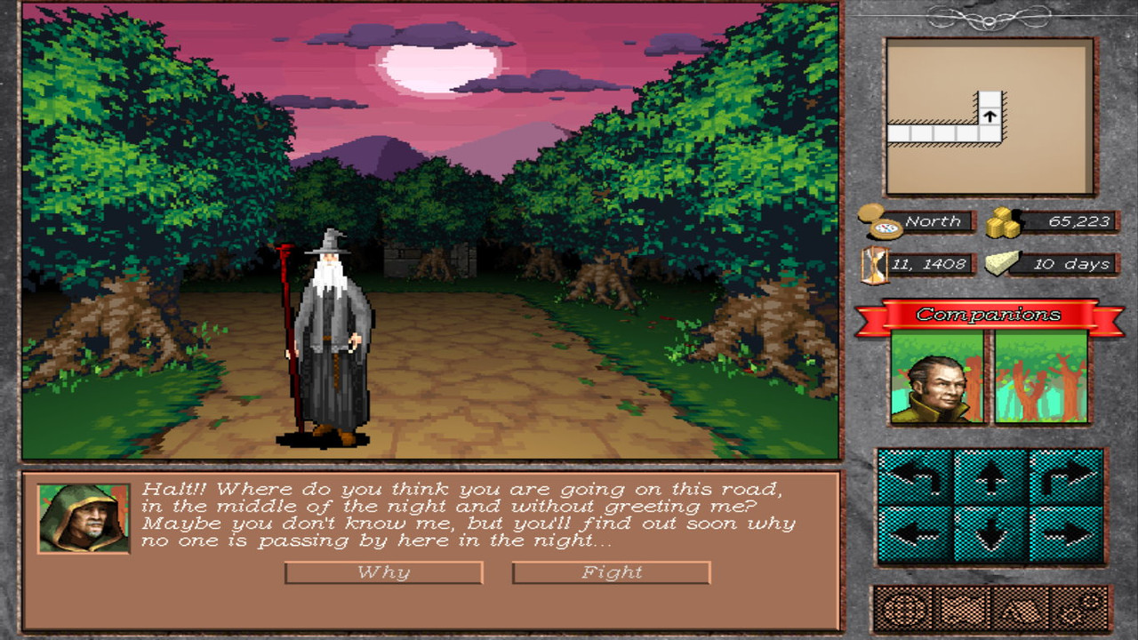
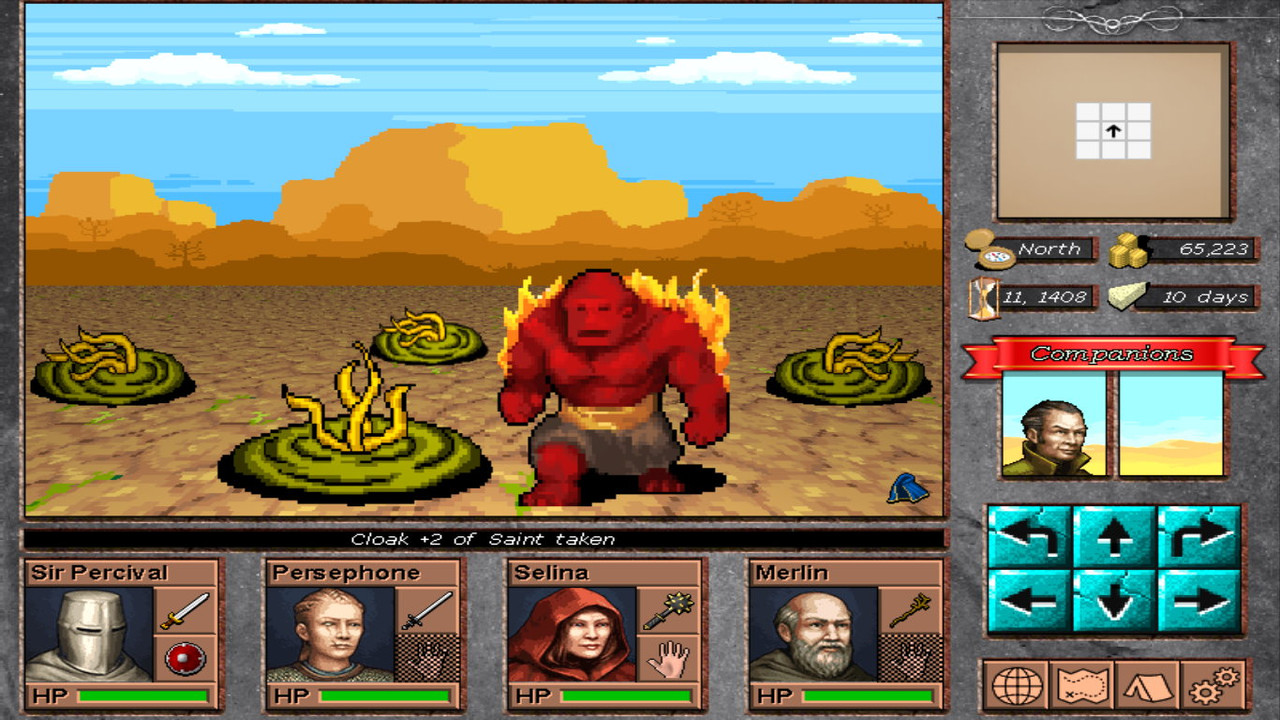
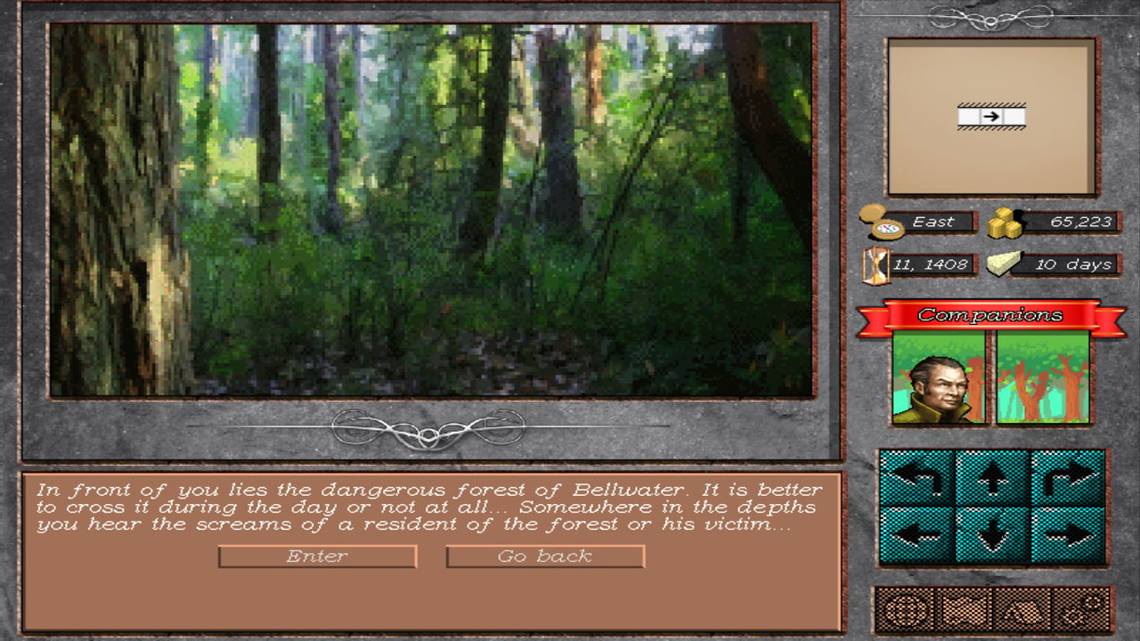
I dealt mostly with my terrible UI & i think i managed to bring it to a playable state, since i am not a designer & have tons of other things to work on the game. More to say in the end of post, just check a handful of in-game images first:

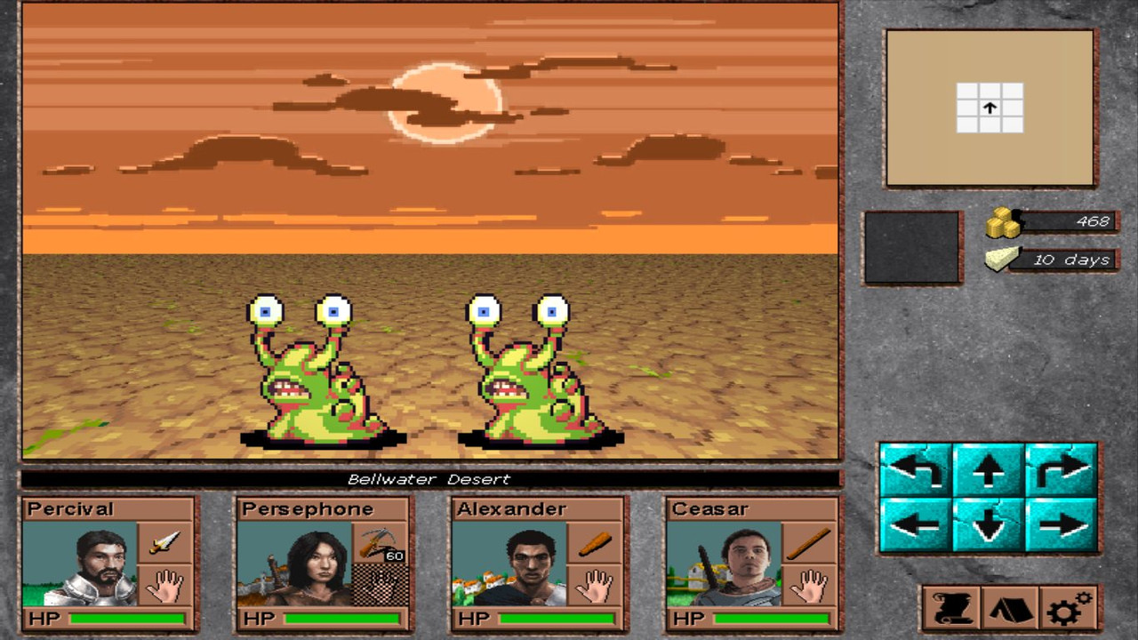
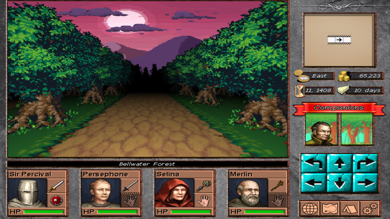
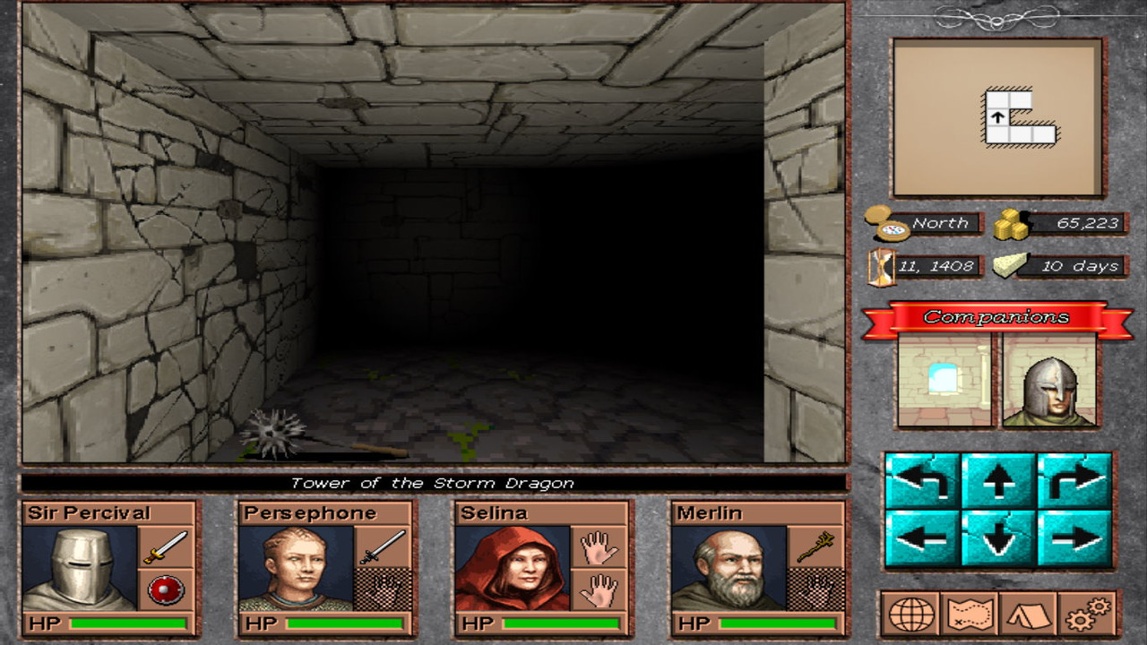
screenshot-1.jpg


screenshot-2.jpg


screenshot-3.jpg


screenshot-4.jpg


screenshot-5.jpg


screenshot-6.jpg


Ok, lets describe some things out:

UI:
the side on the right has been mainly the subject of my recent time. Since i am not a designer, i spent quite some time searching, assembling & putting things together. My main goal was initially to not make it look funny & amateurish. Making it fit with the big picture & provide one or three of classic RPG functionalities would be enough for me. Work is not complete on that department, but at least i think it looks more blobberish than ever.

NPCs:
Also called companions in the game and they usually work supplementary to the party. They can be quest NPCs (they follow the party until you fullfil their needs or you kicked them out) or mercenaries NPCs, providing a specific set of skills as long they stick to the party, requiring some money in the end. Finally, there will be the masters NPCs, which trains some party members to their next level of expertise and it might actually take a while to do that and so there is a new NPC type for them. You might have noticed the background behind NPCs. Instead of setting a dull black or any abstract background for NPCs, i decided to compute a fitty 2D background, based on the current environment the party currently ventures. Neat! Personally, i think it makes the NPCs look more attached to the environment & therefore more lively & close to the group.

Horizons:
Those horizons have a variable number of parallax layers & they're used whenever the party turns either left or right. They're blending nicely with the rest of pseudo-3D environment, providing the necessary level of depth & atmosphere. Most of horizons have a day/night variation so they can change based on current time of the day. Finally, the style i think it fits quite well with the style of game and current graphic assets in general.

Items:
The itemization department went through an overhaul to provide a better experience to the user. Items can now possess base features, for example a Shield provides a static AC, a weapon provides a static damage etc., as well magical features or enchantments, for example an arrow from a Freezing bow (a base item) will cause an additional Cold damage etc. Items can also be magically enchanted by name, providing a fixed set of affections, for example a Ring of Protection will provides AC+ to its wearer, a Cloak +2 of Saint (check pre-last image) will make its wearer immune to Possessed condition etc. Goal is to make items memorable & easier to find out what they're providing by using simple conventions.

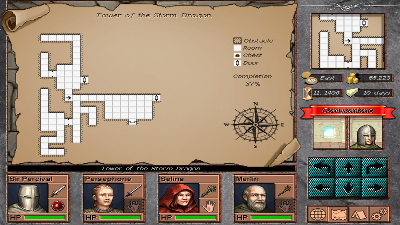
Map:
The automapping has changed in style and is now more fitty to the game's style. I will try to keep it clean & only providing the necessary information. The maps of the game will all be 24x24 and they will fit on this map, without weird scrolling. Map is rendered in its entirety on the big map & the party is the one that moves on it, in contrast with the minimap (the party stays always in the center). I think it works best this way.

Quests:
The quests you see in the images are not part of the game's content & they just got entered to show stuff. The logic is to provide the party with some images & text & some choices. These choices may lead to another set of choices, either in current quest or to another quest after 20+ hours in the game. Those quests & the choices you make will be remembered for the rest of the game (they're saved in file). It's not of Baldur's Gate or Mass Effect caliber or other RPGs with massive text but it's better than having no interaction at all. Some quests will require some stat (the highest in the party) to make some options visible. This will increase the optional side quests in the game, which is much desired.

Monsters:
There is a good number of monsters in the game already, although most of them don't have animation yet. This will take some time to be fully able to use them in-game. Monsters will share similar (if not, the very same) statistics with the party, in the way D&D is doing. My goal is to not make a statistic distinction to the things you kill. This will also increase the number of attacks, actions, magic etc. of each creature you deal with, which will, hopefully, require a different strategy. Creating strong evil characters & memorable unique monsters in the way D&D does is the goal.

I guess that's all for now :)
Working & posting will be quite more frequent from now on. Thanx!
 
Last edited:

Lagi

Augur
Joined
Jul 19, 2015
Messages
827
Location
Desert
I want to play this. Graphic is amazing. UI looks elegant.

I notice there is only 1 important factor for weapons (damage), f.ex. katana is straight better than Mace, I think besides MinDmg & MaxDmg, should be some speed stat (like you strike sooner with spear than with 2h sword).
How would armor work? Decrease chance to be hit?

Could you share your rules doc?
 

vlzvl

Arcane
Developer
Joined
Aug 7, 2017
Messages
208
Location
Athens
I want to play this. Graphic is amazing. UI looks elegant.

I notice there is only 1 important factor for weapons (damage), f.ex. katana is straight better than Mace, I think besides MinDmg & MaxDmg, should be some speed stat (like you strike sooner with spear than with 2h sword).
How would armor work? Decrease chance to be hit?

Could you share your rules doc?

Thanx man!
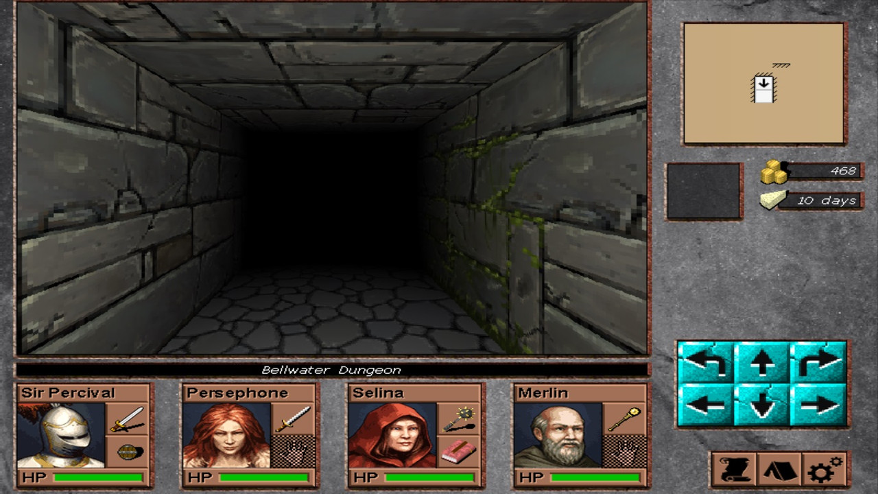
It feels quite satisfying to read that about the UI, it took me too much time & headache pills.
About the items, yes, items have some base features which are essential to their purpose; shields provide armor, weapons does damage etc.
However, i still use some additional information to create items, such as the following:

Efficiency:
Some items have an efficiency array of values, based on context & their evolved value i.e. +1. For example, say that a Long sword have efficiencies of [0,3,6,10] and does 8-12 damage as a base. If it's a +0 weapon, it will use the first index of array & apply that to min/max damage, which changes nothing. On the other, a Long sword +1 will deal an improved damage of 8+3/12+3 or simply 11-15. Efficiency works on the base feature of the item. Rule of thumb, an item that does not have evolved values, it doesn't have efficiencies.

Enchantment:
All items can be infused with enchantments, either in base level or by named enchantment. You may find a cursed Long sword in some dungeon that may give ridiculous boosts & a deadly tradeoff because numerous enchantments can be infused with it. Note that i am not talking about magical enchantments but simply enchantments. I can easily add a new enchantment to my fixed list of enchantments that may set the use speed of an item, such an attacking weapon. Provided this, you can imagine the numerous combination an item may have.

About the speed modifier, i never really thought about. You see, the combat is turn based & the player chooses which of his active character's hands will be used first. After that hand is used, it becomes disabled (or used) and the player has the option to use the other hand or move to the next character in combat order. I did not considered the item's speed since it doesn't matter i think. A character can only act 2 times at most in his turn and that's it. A real-time based RPG obviously will make heavy use of item's speed of use.

The armor has a fixed armor class (or simply protection in the game). At the moment there's no missing an attack, either by party or monsters. Party & monsters reduces their taken damage by either their protection (physical damage) & resistances (magical damage). System is not complete at all & the rulebook contains alreaedy a lot of mathematics & the programming code to apply those on future games. I followed the easier road (for now) to use simpler rules in order to make it friendlier (to me, at first) & easily manageable while i am still developing everything. Things are modified constantly & obviously that's the case for rulebook as well, since it has only been developed by one person, which doesn't sounds right :)

I will upload the current state of rulebook as a PDF in short.

EDIT:
Here's the downloadable link to the current rulebook (PDF).
 
Last edited:

As an Amazon Associate, rpgcodex.net earns from qualifying purchases.
Back
Top Bottom