Putting the 'role' back in role-playing games since 2002.
Donate to Codex
Good Old Games
  • Welcome to rpgcodex.net, a site dedicated to discussing computer based role-playing games in a free and open fashion. We're less strict than other forums, but please refer to the rules.

    "This message is awaiting moderator approval": All new users must pass through our moderation queue before they will be able to post normally. Until your account has "passed" your posts will only be visible to yourself (and moderators) until they are approved. Give us a week to get around to approving / deleting / ignoring your mundane opinion on crap before hassling us about it. Once you have passed the moderation period (think of it as a test), you will be able to post normally, just like all the other retards.

The Darkness Below: a retro CRPG in the making - now available on Early Access

Kliwer

Savant
Joined
Oct 19, 2018
Messages
216
This game looks so gorgeous that I have almost received a heart attack. Good luck in Your further work. I hope this project will be finished in the countable future. Turn-based bloober with the appearance of M&M3-5/EoB... So cool. I count on good puzzles in dungeons.
 

vlzvl

Arcane
Developer
Joined
Aug 7, 2017
Messages
208
Location
Athens
This game looks so gorgeous that I have almost received a heart attack. Good luck in Your further work. I hope this project will be finished in the countable future. Turn-based bloober with the appearance of M&M3-5/EoB... So cool. I count on good puzzles in dungeons.

Thank you for inspiring words!
I'm constantly adding to the game, step by step, mostly in technical level, being an engine programmer myself.
The short-term plans involve a good playable demo and some quests, with a little bit of everything,
to get a successful feedback from as many people as possible.

Full game will take some time, though.
The plans involve a gigantic world map, with lots of interconnected areas, many events interacting with each other,
plus an epic/abstract kind of scenario to justify the content. Stories, quests & interconnectted events are taking
serious time, perhaps the most, but it's not the right time to do such thing. Messing technical improvements &
writing content requires a different kind of mindset.
I plan to infuse the whole game with lots of advices/guiding from JohnFour tips, which i admire a lot.
 

vlzvl

Arcane
Developer
Joined
Aug 7, 2017
Messages
208
Location
Athens
Ok, after some ~3 weeks of rigorous work, here's the update.

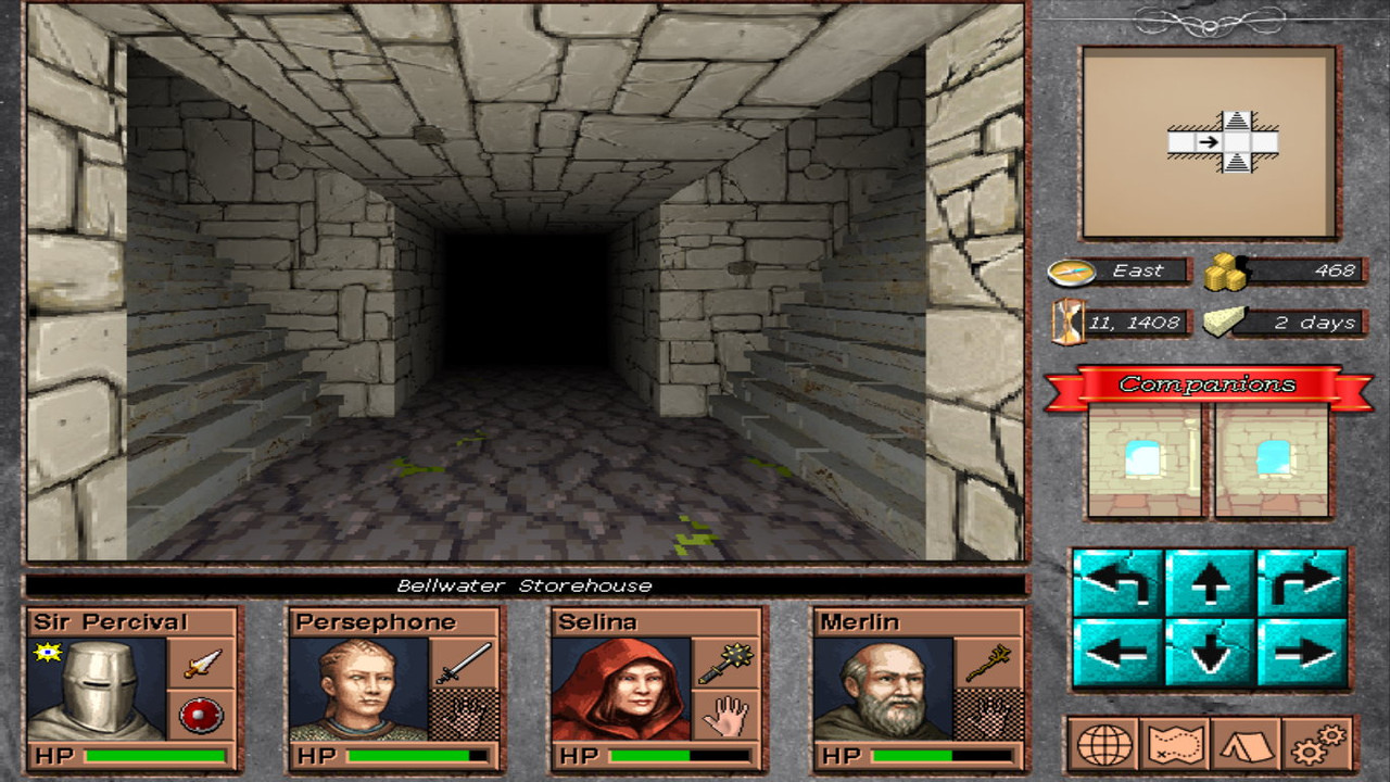
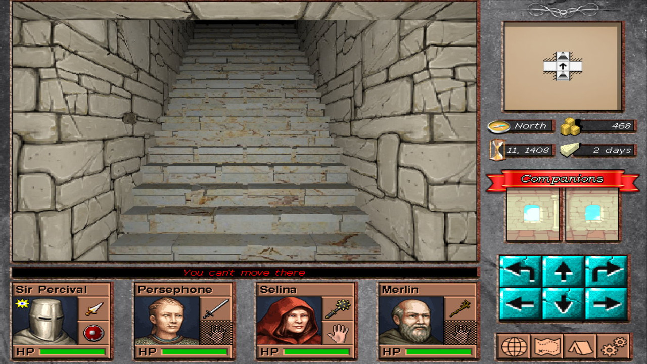
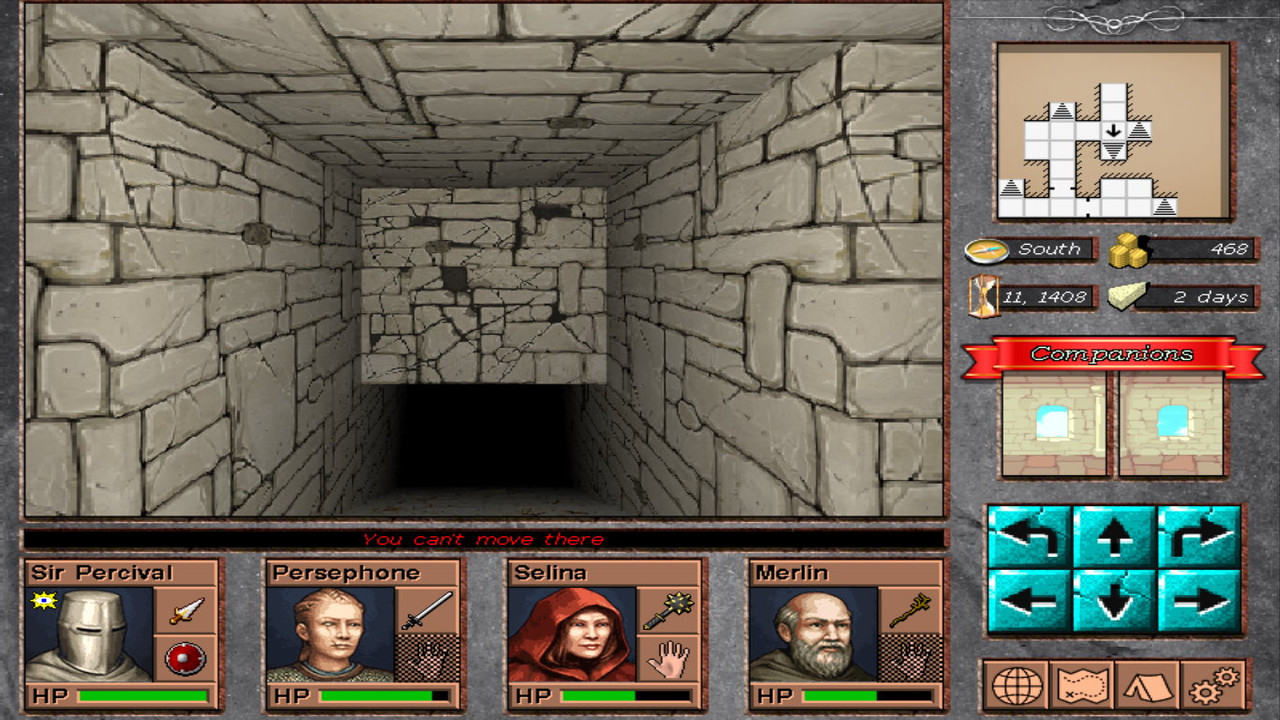
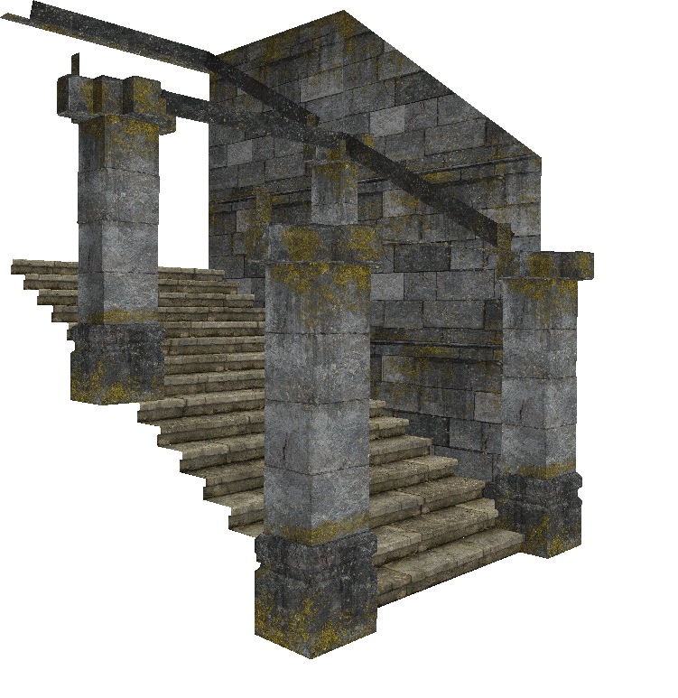
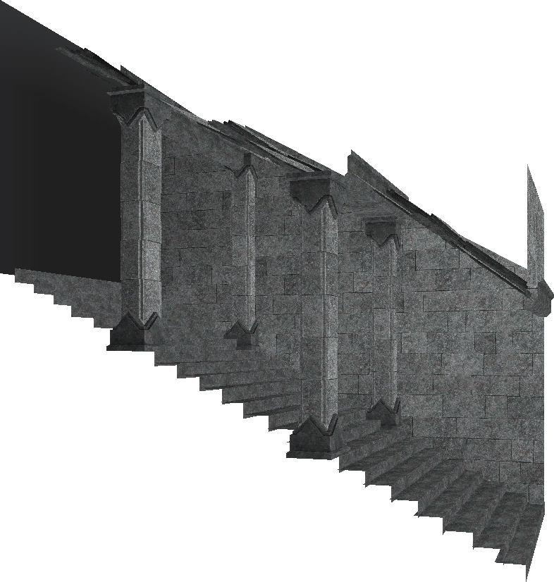
Stairs
The game is labeled as a first person dungeon crawler but it was seriously missing a good set of stairs, as well the mechanism behind that.
Work is not done on that department as more models and/or textures may come. However, i can now happily connect my dreamy sewer dungeon through a series of stairs, allowing numerous interconnected levels to an interior area! Not really 100% satisfied with the result but it "passes" for now, work will be continued. Check some pics.​

screenshot-14-1.jpg


screenshot-14-2.jpg


screenshot-14-3.jpg


Crafts
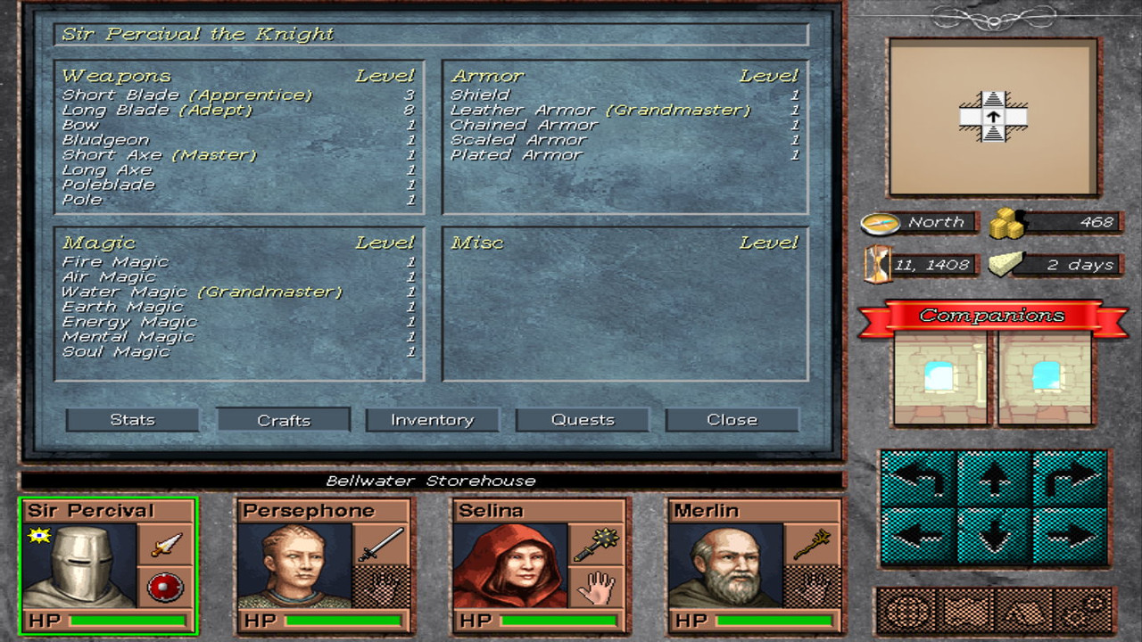
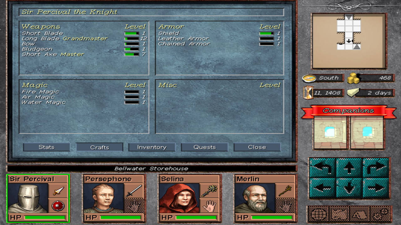
I've implemented the "training" mechanism for crafts. I decided that providing points after a gained level is not a realistic mechanism of improving one's abilities. A character is trained on his/her crafts by using them, in the appropriate way. That is, a character gains experience in Long blade craft when he strikes with a Long blade weapon on a target & causes damage! A wizard gains experience on Fire magic by causing damage to a target with a Fire-based spell! Thus, A character has additional levels & experiences for his/her crafts and he gains craft levels by reaching the next craft level, the same way he would in her character levels. After a while, characters are eligible to advance in their expertise, providing a new set of bonuses/features. More information on Rulebook, but for now check how a character's crafts page would look like (a ridiculously buffed-out character, that is).

screenshot-14-4.jpg


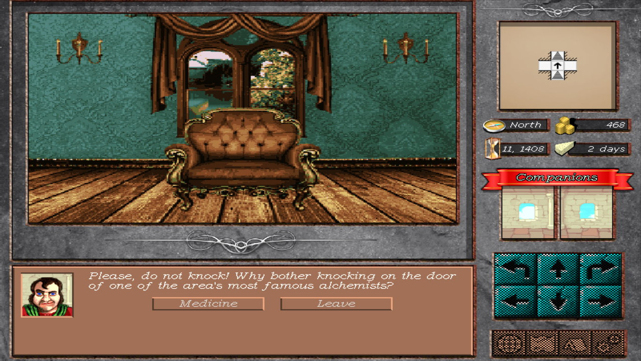
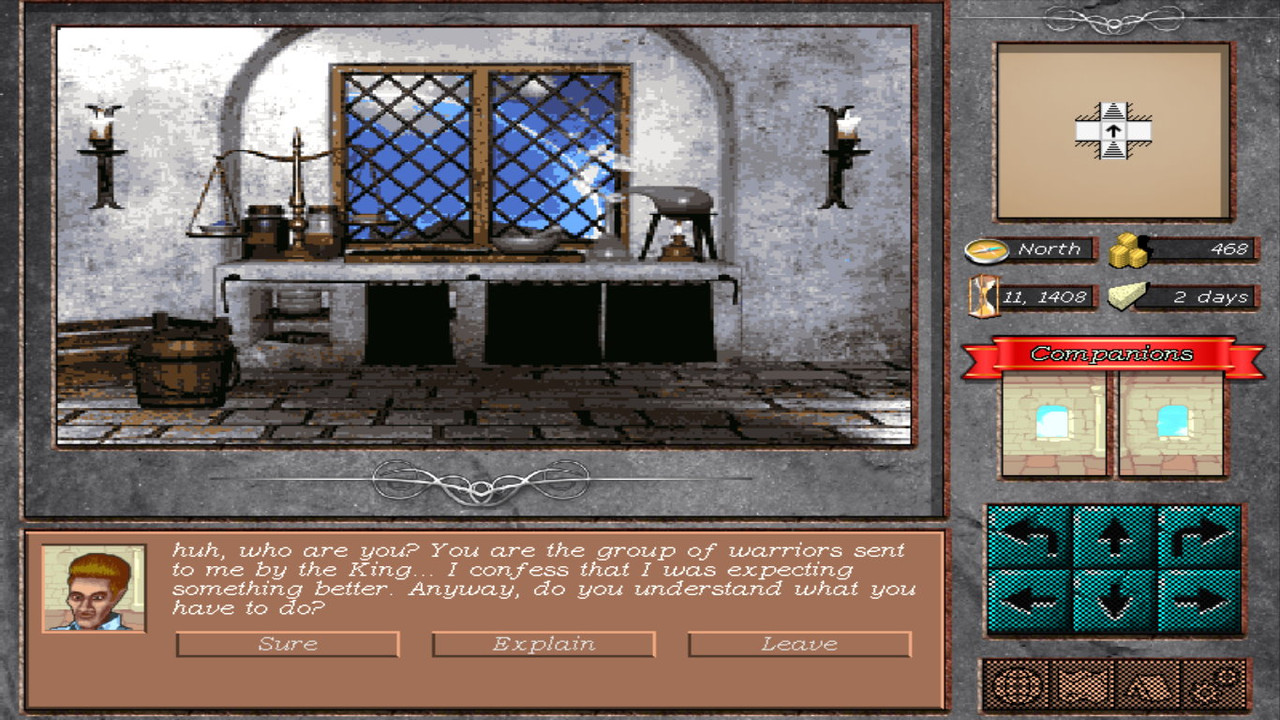
Event backgrounds
I assembled some newer event backgrounds & decided to make 1 or 2 events to show how a quest/discussion would look like. Quests shown are just for showing, working on content has not started yet. Those scenes were literally made up in 5 minutes.

screenshot-14-5.jpg


screenshot-14-6.jpg


Ok, that was it...
Nothing too excessive, just improving the game day by day.
I hope you like it... I will be happy to get some feedback.
Thanx!
 
Last edited:

vlzvl

Arcane
Developer
Joined
Aug 7, 2017
Messages
208
Location
Athens
Somehow the Alchemy bench image looks less sharp than the couch one.

Yeah, it somehow looks like that.
Those graphics were reindexed to 16-colors during the procedure so this causes some images to lose more or less sharpness.
I believe the second image allocate more colors into its wall, leaving fewer colors elsewhere which causes that effect.
The couch image seems sharper but it really isn't; it's just the colors are allocating this way.
I believe that images with many uniquely-colored areas are behaving better & give better results; others (bench) not so, but not bad either.
Both images are originally 1920x1536 in dimensions, ending in 320x dimensions.
The game is originally developed in a 800x600, shader based, resolution.
 

Kliwer

Savant
Joined
Oct 19, 2018
Messages
216
I've implemented the "training" mechanism for crafts. I decided that providing points after a gained level is not a realistic mechanism of improving one's abilities. A character is trained on his/her crafts by using them, in the appropriate way. That is, a character gains experience in Long blade craft when he strikes with a Long blade weapon on a target & causes damage!

Everything looks great. But I do not like this "training by using" mechanism. It is not realistic, and it works bad in almost any game (TES...). EXP points are much more functional for me.
 

vlzvl

Arcane
Developer
Joined
Aug 7, 2017
Messages
208
Location
Athens
Everything looks great. But I do not like this "training by using" mechanism. It is not realistic, and it works bad in almost any game (TES...). EXP points are much more functional for me.

Thanks!
Yes, i understand the dangers of doing that. I remember Daggerfall and its system of "training by doing" which only allowed leveling by increasing a complex combination of minor, major & primary stats through training, forcing you into useless stats. That's not the case. Character levels & craft levels are not connected.
What i am striving for is to force players and/or characters to work for it, making them worthy for it & their time/money invested.
The real difference between the systems is that:
  • one is using the skills to increase character levels (TES, etc.)
  • the other (mine) makes a distinction between skill levels & character levels. Training in one doesn't affect the other. One doesn't requires the other.
Character's level will be used in other occasions i.e. hp advancement by class per level, epic paths, guilds etc. anywhere that the character's general prowess could be checked. Obviously, it is not a tested system by me, yet. I have to research more related games such as Lands of Lore, Stonekeep, TES games etc.
 

CryptRat

Arcane
Developer
Joined
Sep 10, 2014
Messages
3,625
Yes, Morrowind is a terrible example, everything is horrible about its system especially the way increasing skills is linked with increasing base stats (Strength ...), yet people can't stop mentioning it when talking about learn-by-doing (what about Wizardry 8, Jagged Alliance 2 ...?).

If the skill experience is distinguished from character level it is indeed better in my opinion.

I think that one important thing is that the skill experience is tight to difficulty and challenge of the task (the same way character's base xp generally is). It must not be about repairing bad armors you don't care about to be able to repair good ones nor about picking locks of wooden doors to be able to pick later metal ones while bashing would work with the former but not with the latter. I don't think you need to go as far as the Wasteland way, which is if it's hard just retry a few times and gain a lot of xps and succeed, but I'm almost sure you can't do without something in this direction.

That said be careful with the "realistic mechanism" argument because there's also the "natural way to play a game" argument which is at least as much important and here increasing a skill so you can use it is much more natural than using a skill so you can use it. But that can be linked with my previous point, skill xp or not it should be gained when struggling against a challenge (I guess crafting a strong weapon is, crafting one more bomb is not, exactly like the experience gained from killing hordes of trash mobs should not be substantial compared with, depending on the game, killing a boss, reaching the end of a dungeon or bringing back a relic).
 

Bad Sector

Arcane
Patron
Joined
Mar 25, 2012
Messages
2,334
Insert Title Here RPG Wokedex Codex Year of the Donut Codex+ Now Streaming! Steve gets a Kidney but I don't even get a tag.
I just noticed that in the screenshots, in some parts of the UI the light seems to be coming from the top right (e.g. portrait bevels, dialogue buttons) and in other parts from the top left (navigation buttons, crafts screen bevels - though the buttons in it have the light come from the top right). You should fix that since these clash visually.
 

vlzvl

Arcane
Developer
Joined
Aug 7, 2017
Messages
208
Location
Athens
That said be careful with the "realistic mechanism" argument because there's also the "natural way to play a game" argument which is at least as much important and here increasing a skill so you can use it is much more natural than using a skill so you can use it. But that can be linked with my previous point, skill xp or not it should be gained when struggling against a challenge (I guess crafting a strong weapon is, crafting one more bomb is not, exactly like the experience gained from killing hordes of trash mobs should not be substantial compared with, depending on the game, killing a boss, reaching the end of a dungeon or bringing back a relic).

Yes, i have to deal with that as well. I certainly don't want it to become a pain to increase in skills, but also not making it a cakewalk either, a matter of clicking after clearing a dungeon & getting 1000 XP by a poor damsel for returning her lost tiara, increasing nonsense crafts in the process. Struggling comes in the form of using the item multiple times, like its an extension to the character. Perhaps that struggling factor may be dynamic, like in rare items or difficulty of use, but that may introduce other balancing issues & may introduce exploits. At the moment, all professions gets 1 XP in a craft when they appropriately use an item belonging to that craft, making it a sample-based procedure. I undestand completely about the dangers you referred in using realistic mechanisms & messing them to natural ways to play a game. I guess a demo will reveal more on the topic :)

I just noticed that in the screenshots, in some parts of the UI the light seems to be coming from the top right (e.g. portrait bevels, dialogue buttons) and in other parts from the top left (navigation buttons, crafts screen bevels - though the buttons in it have the light come from the top right). You should fix that since these clash visually.

For this update, i programmatically enabled medium-lighting (like a lit torch) to show more details in stairs depth etc. In previous screenshots, i don't enable the lighting so everything is dark. Is this you're referring to; Because i am not changing the light position in any way (lighting is a simple shader point light, positioned in party's center & moves as the party moves). If that's not the case, can you show me what you're referring to with an image;
 

Bad Sector

Arcane
Patron
Joined
Mar 25, 2012
Messages
2,334
Insert Title Here RPG Wokedex Codex Year of the Donut Codex+ Now Streaming! Steve gets a Kidney but I don't even get a tag.
For this update, i programmatically enabled medium-lighting (like a lit torch) to show more details in stairs depth etc. In previous screenshots, i don't enable the lighting so everything is dark. Is this you're referring to;

No, i meant the bevels in the UI (buttons, panels, etc), some look like the light comes from the top left of the screen, others from the top right (and one part looks as if the light comes overhead). The light sourcing looks inconsistent. Check those examples i point here with arrows:

SFrSmBm.jpg


The same applies for the text, the offsetted dark text used to make it look as if it has a shadow (e.g. the text in crafts) and the light text to make it look as if it is inset (e.g. the text in the portraits at the bottom) use a top left light source, but the bevels (especially in the portraits) are drawn as if the light comes from the top right.
 

vlzvl

Arcane
Developer
Joined
Aug 7, 2017
Messages
208
Location
Athens
No, i meant the bevels in the UI (buttons, panels, etc), some look like the light comes from the top left of the screen, others from the top right (and one part looks as if the light comes overhead). The light sourcing looks inconsistent. Check those examples i point here with arrows:

Ah.. i see, nice catch!
I would never have thought of that... Added to my list, thanx!
 

infidel

StarInfidel
Developer
Joined
May 6, 2019
Messages
497
Strap Yourselves In
IMHO the arrow buttons are a bit too bright. They stand out on every screenshot when they're active with that cyan. I would prefer if they were like other buttons or "stony" like the background. Same thing with the red companions banner, very vibrant and catchy for not much reason.
 

vlzvl

Arcane
Developer
Joined
Aug 7, 2017
Messages
208
Location
Athens
IMHO the arrow buttons are a bit too bright. They stand out on every screenshot when they're active with that cyan. I would prefer if they were like other buttons or "stony" like the background. Same thing with the red companions banner, very vibrant and catchy for not much reason.

You have some point, they're indeed bright but i thought they merge nicely with the rest. It was implemented early on, using some low-res graphics, scaled-up when the UI was almost non-existent. It now warrants a closer look, added to my list, thanx! I will also take a good on the banner, it seems the lighting on it plays a role as well.
 

Glop_dweller

Prophet
Joined
Sep 29, 2007
Messages
1,226
However, i can now happily connect my dreamy sewer dungeon through a series of stairs, allowing numerous interconnected levels to an interior area! Not really 100% satisfied with the result but it "passes" for now, work will be continued. Check some pics.
Legend of Grimrock did a good job with the stairs. The actual mesh model spans two tiles; it avoids having stairs that are far too steep to be credible.
LoG1_stairs.png


Grimrock 2 staircases spanned three tiles.
LoG2_stairs.png
 

Grauken

Arcane
Patron
Joined
Mar 22, 2013
Messages
13,173
if you want to see good stair transitions in a TB blobber, Wizardry Dimguil did it well
 

Tyranicon

A Memory of Eternity
Developer
Joined
Oct 7, 2019
Messages
7,790
There's some clear progress in this thread, looking forward to seeing more.
 

vlzvl

Arcane
Developer
Joined
Aug 7, 2017
Messages
208
Location
Athens
Legend of Grimrock did a good job with the stairs. The actual mesh model spans two tiles; it avoids having stairs that are far too steep to be credible.

Their stairs are good indeed. I will probably scale somehow the model in X-Z axes. It seems too many steps are provided in the model & they're far too steep.

if you want to see good stair transitions in a TB blobber, Wizardry Dimguil did it well

I will check the game, thanx!

There's some clear progress in this thread, looking forward to seeing more.

Thanx!
Yes, i'm working on the game intensively the last months, after a 1-year pause due to some hard academic obligations...
Working hard towards a fully playable demo is the short-term plan.
 

vlzvl

Arcane
Developer
Joined
Aug 7, 2017
Messages
208
Location
Athens
Another update, worthy of some ~20 days of work.

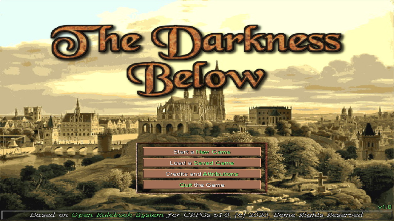
Title Screen
Perhaps its a bit early to deal with that but a demo still needs a title screen & a nice, spooky background music. After many revisions, here's how The Darkness Below title screen would look like:

screenshot-15-1.jpg


The audio used in the title screen:


Experience bars in Crafts
As said in previous posts, crafts (or skills) are based on experience points. An appropriate use of a craft through, say, an item will provide experience points in that craft. The craft level is increased automatically with an appropriate message & the player understands which craft was increased and by whom. Here's how those experience bars will look like in the crafts tab:

screenshot-15-2.jpg


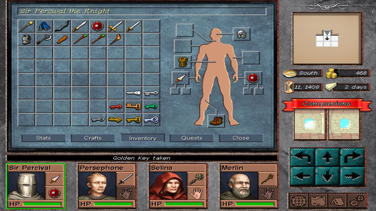
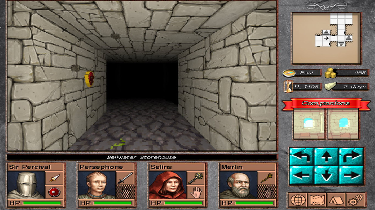
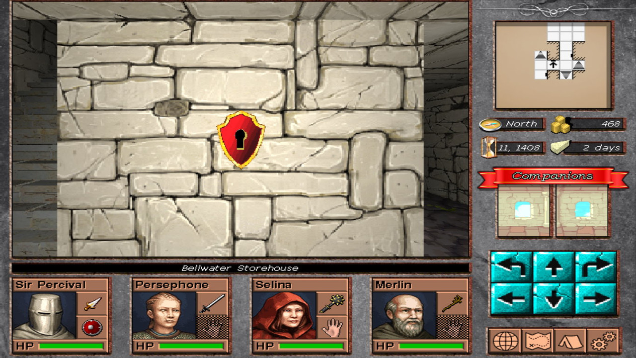
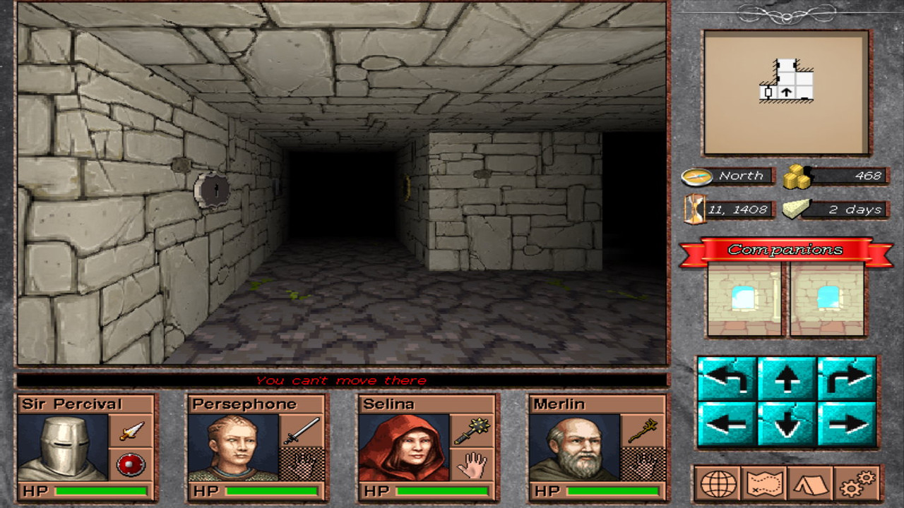
Torch, keys & keylocks
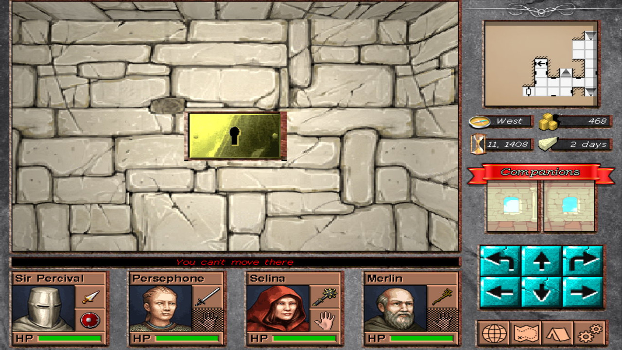
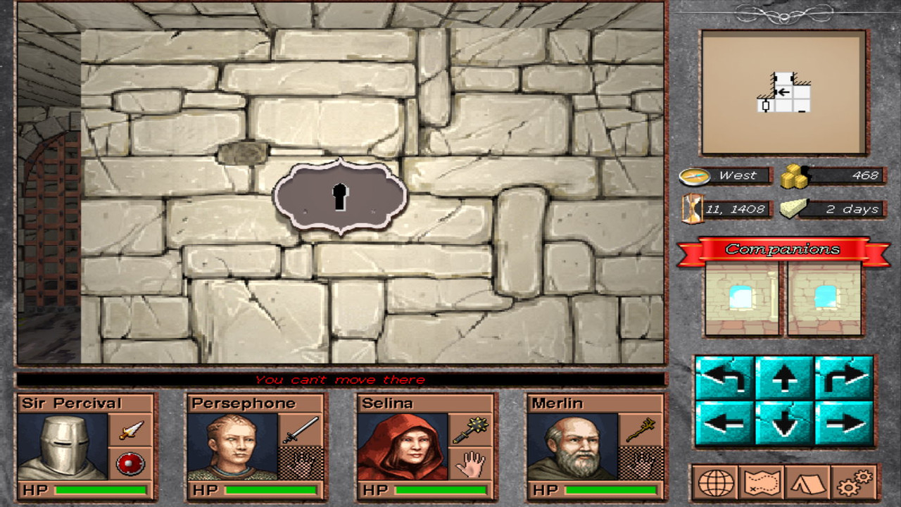
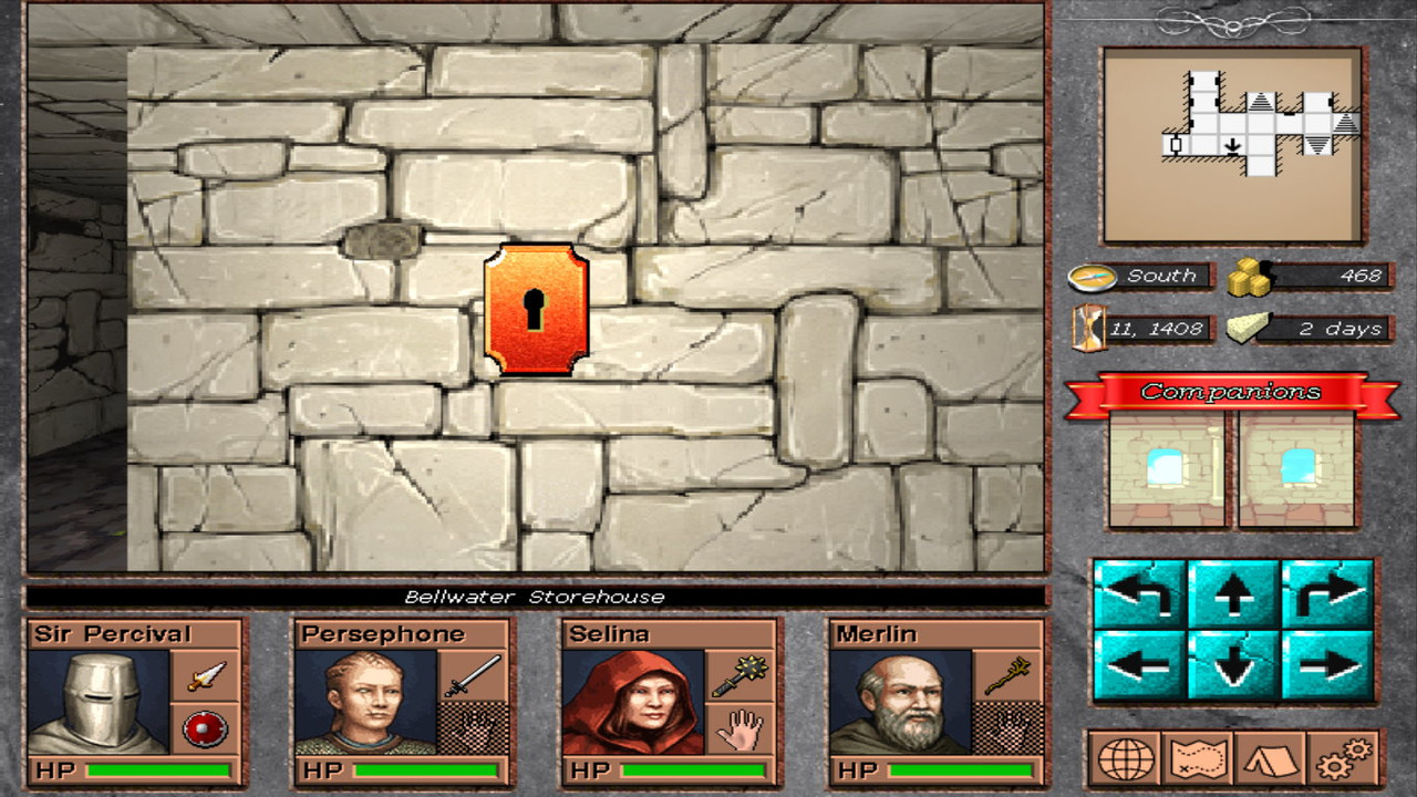
A long awaited update was keys & keylocks. Work is not done, due to lots of required work on that department, both in game, editor, graphics etc. Keys unlocks doors but can also trigger events which may have any consequence to any part of the dungeon. This adds another weapon in the puzzle department & content creation in general. Finally, a torch item has been implemented (check it just below the sword). Torches provide some light for a specific period of time & are extremely useful if your party doesn't have a wizard (what?).
Check some images, mostly the keys & some keylocks. Not all keylocks are implemented:

screenshot-15-3.jpg


screenshot-15-4.jpg


screenshot-15-5.jpg


screenshot-15-6.jpg


That's all for now, hope you like it.
I think i am getting close to some alpha release with just the basic stuff (not a demo or anything), plus a ton of fixes till then.
 

Stormcrowfleet

Aeon & Star Interactive
Developer
Joined
Sep 23, 2009
Messages
1,062
I know not everyone will agree but I love your keylock because they stick out. I hate it when you walk past interactive feature because they are (unwittingly) hidden on the wall graphics. Good job.
 

vlzvl

Arcane
Developer
Joined
Aug 7, 2017
Messages
208
Location
Athens
I know not everyone will agree but I love your keylock because they stick out. I hate it when you walk past interactive feature because they are (unwittingly) hidden on the wall graphics. Good job.

Thanx man! Well, i cannot, for the life of me, rival the pixelart brilliancy of old games on a 3D-based game such as this. What i can do, though, is adding little 3D details wherever i can, such as modelling 3D outlines from a texture & producing a nice 3D keylock on-the-fly. Bluntly & lazily render 3D quad keylocks above walls, using multitexture techniques on something that should be separated in whole, not my thing. It will take me longer to do the model way, but it is much more satisfying & long-term requires less improvements.
 

vlzvl

Arcane
Developer
Joined
Aug 7, 2017
Messages
208
Location
Athens
Ok, this took a bit longer but things are getting more interesting from now on.
Check below for more.

Improved keylocks
I invested time into improving the visuals of keylocks & i believe they now look more concrete with added shadows, which adds points when you're looking them from some angle. Check some images:

screenshot-16-1.jpg


screenshot-16-2.jpg


screenshot-16-3.jpg
screenshot-16-4.jpg


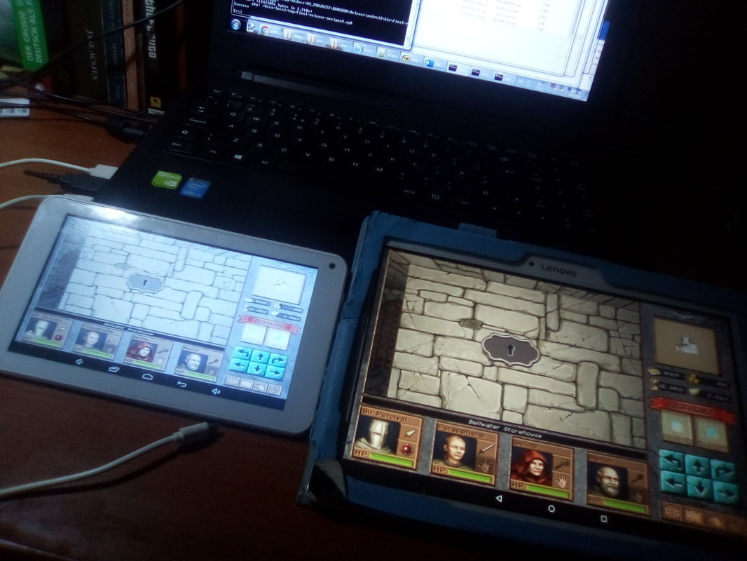
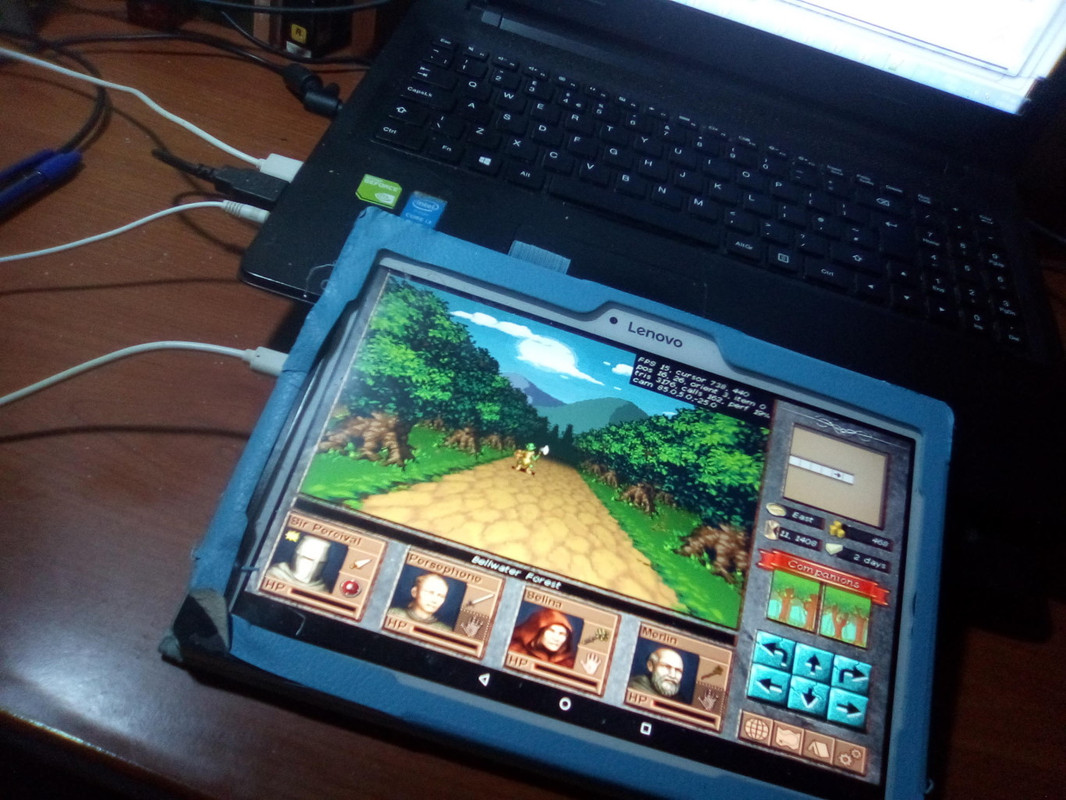
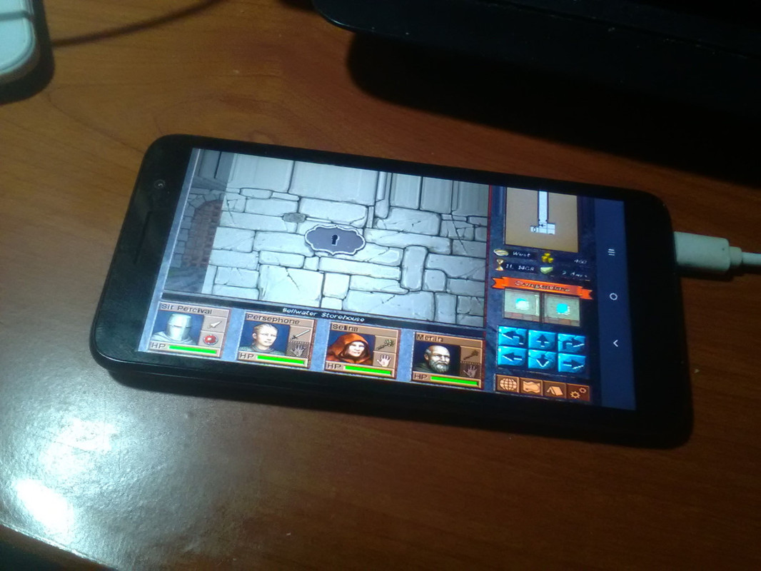
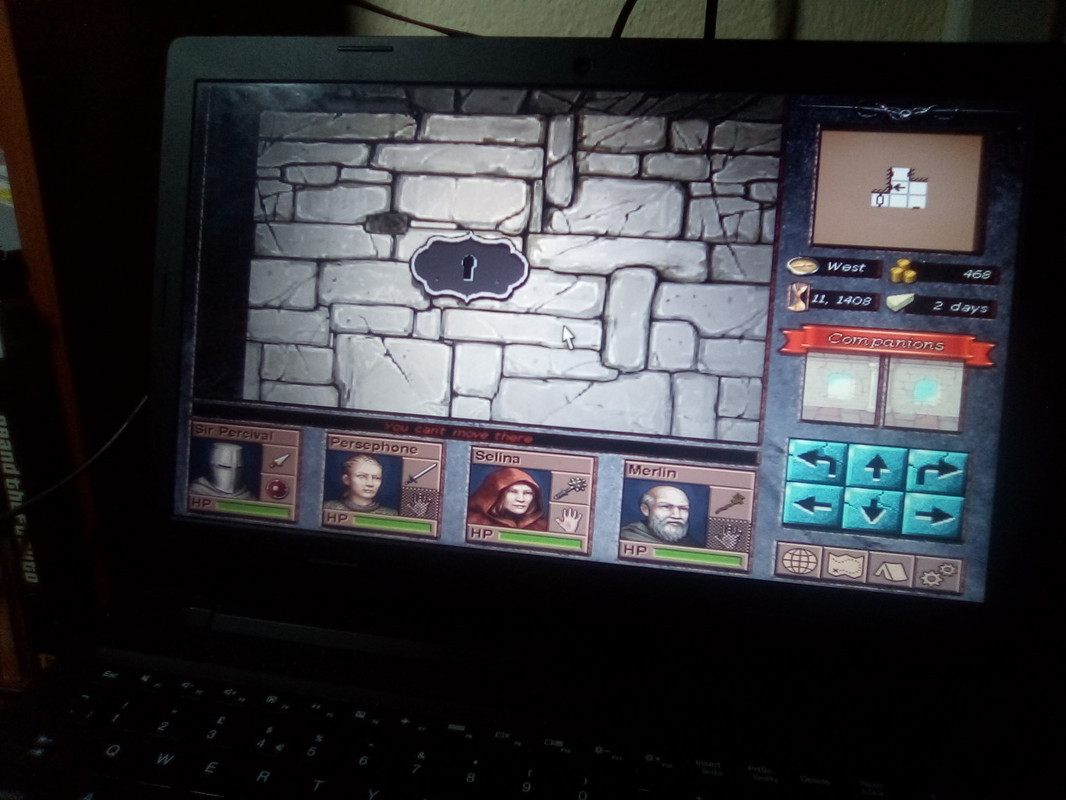
Mobile Adventures

Played a lot with Android NDK & my engine to make the game run and managed to build some binaries. Frame rate is ugly ass for now, mainly because of my old ass devices, as well as the dread tiled rendering architecture they work on which doesn't play well with rendering to texture. Since my engine renders everything to texture, its a problem that needs to be solved. Check some pics:

screenshot-16-5.jpg


screenshot-16-6.jpg


screenshot-16-7.jpg


screenshot-16-8.jpg


World Map!
I'm happy to announce the world map has been completed in whole. Well, not yet as content is still awaiting, which will certainly cause map updates (cities, roads and such). There are some villages, towns, ruins & castles in the map already, more will be added. I managed to convert a gigantic map from Donjon into my own editor, which took me many days, lots of coffee & lots of clicking. Check the map & estimate how long to beat the game..

screenshot-16-10-2.jpg


Ok, that was it... A demo can't get released without a proper world map.
Hope you like it.
 
Last edited:

AdolfSatan

Arcane
Joined
Dec 27, 2017
Messages
2,028
Damn, this thread looks so promising. Time depends on a lot of other factors besides map sizer, but looking at that I guess... 80h?
 

As an Amazon Associate, rpgcodex.net earns from qualifying purchases.
Back
Top Bottom