Putting the 'role' back in role-playing games since 2002.
Donate to Codex
Good Old Games
  • Welcome to rpgcodex.net, a site dedicated to discussing computer based role-playing games in a free and open fashion. We're less strict than other forums, but please refer to the rules.

    "This message is awaiting moderator approval": All new users must pass through our moderation queue before they will be able to post normally. Until your account has "passed" your posts will only be visible to yourself (and moderators) until they are approved. Give us a week to get around to approving / deleting / ignoring your mundane opinion on crap before hassling us about it. Once you have passed the moderation period (think of it as a test), you will be able to post normally, just like all the other retards.

The Darkness Below: a retro CRPG in the making - now available on Early Access

vlzvl

Arcane
Developer
Joined
Aug 7, 2017
Messages
208
Location
Athens
Damn, this thread looks so promising. Time depends on a lot of other factors besides map sizer, but looking at that I guess... 80h?

Hey thanx, doing my best :)
It was actually a trick question as even i can't estimate that, yet...
Although certainly more than 80h, an awful lot more i hope, just check the updated map.
The fun factor is a lot more important though, just wanted to fulfil the size requirement first.
 

infidel

StarInfidel
Developer
Joined
May 6, 2019
Messages
497
Strap Yourselves In
screenshot-16-4.jpg

If you're still accepting feedback on the overall look - I've noticed your floor texture seems to be of lower resolution than the walls, the pixels are way larger. Maybe it would be better if you uprezzed it a bit.
 

vlzvl

Arcane
Developer
Joined
Aug 7, 2017
Messages
208
Location
Athens
If you're still accepting feedback on the overall look - I've noticed your floor texture seems to be of lower resolution than the walls, the pixels are way larger. Maybe it would be better if you uprezzed it a bit.

Thanx!
Yes, i'm continously balancing the graphics and this one already got my attention. The main problem was not the low-res floor but also the high-res wall set, as well the limited quantity of both. I also had to balance the indoor and the outdoor environment.
I decided to invest in more retro resources, a sample of which you can check in the following image:

screenshot-16-5-1.jpg


More will be revealed in the new update in coming days, hope it looks fitty :)
 

vlzvl

Arcane
Developer
Joined
Aug 7, 2017
Messages
208
Location
Athens
Ok, this was a hard one to make.
I tried to do a little bit of everything, from improving graphics to fix the spell system to animate monsters to improve the editor and about a hundred more.
It seems there's always something more to do, so i instead focused on weaknesses & what's missed from the game. So, here's the visual log:

New monsters & indoor environemt
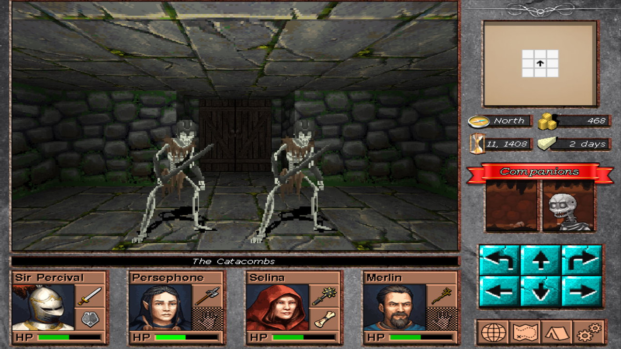
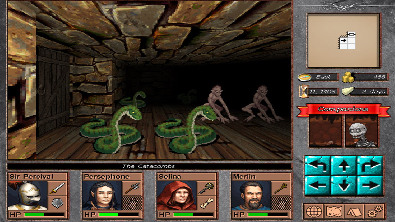
I invested in a goodly amount of new resources to cover the glaring weakness of indoor environment. Now it should start looking more & more like a game. Check the following images for the first monsters & new indoor environment, to get a taste of the (final) graphic direction. I also changed some portraits & items, because i was tired of the previous ones:

screenshot-17-1.jpg


screenshot-17-2.jpg


Tile editor
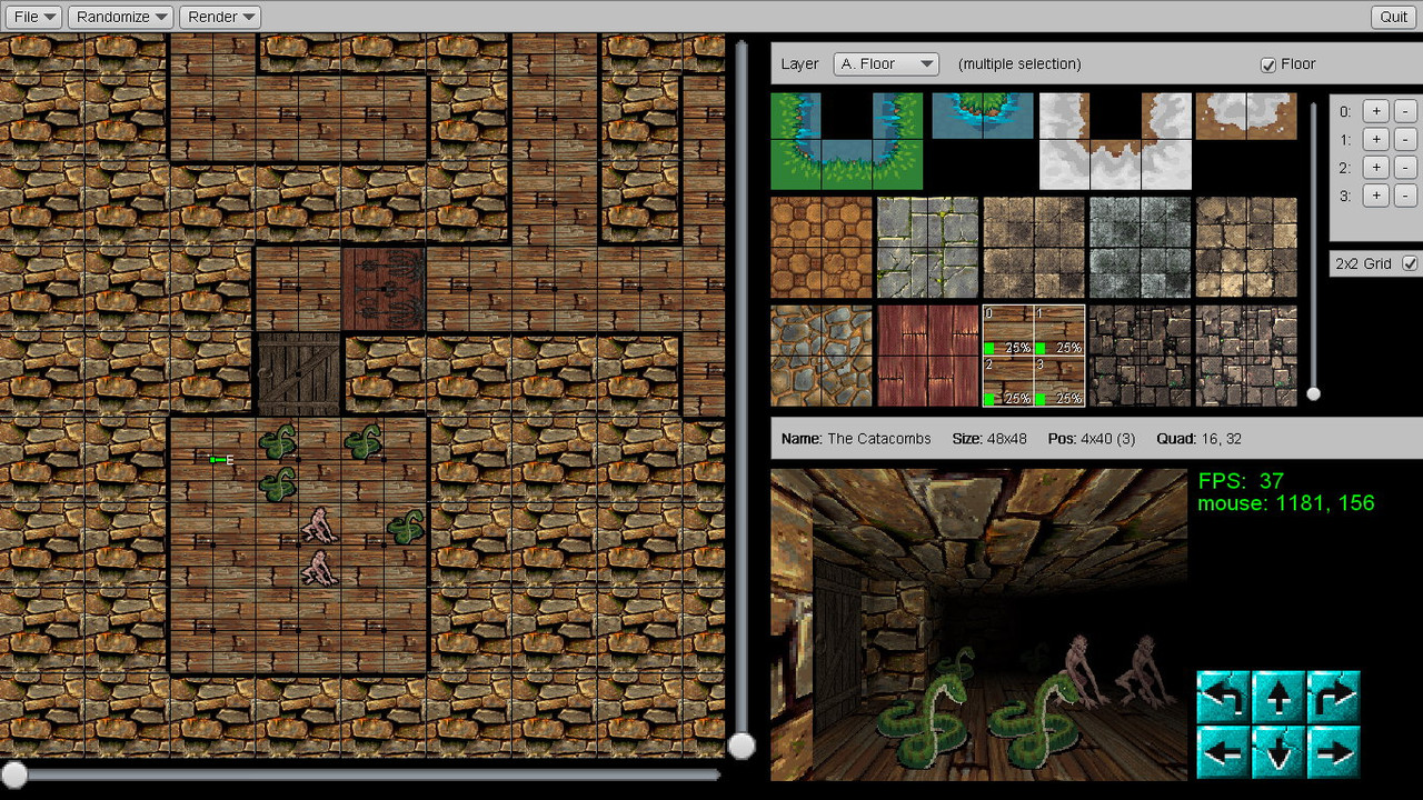
Perhaps not interesting enough like the game, but the editor itself was improved as well, especially in rendering window. Not many things to say, as you see its an editor for developers only and super unfriendly. I'm wondering if i get it to a point to be usable by others, i hope so:

screenshot-17-3.jpg


Spell system
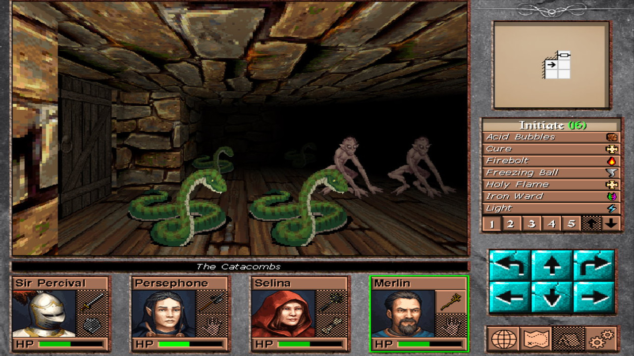
The system was undergone a mini-overhaul to be able to support more abilities. One of such ability / requirement was, for example, for a spell to dictate a target to cast i.e. think about a Cure spell. Another requirement was to allow a monster to take such decisions as well, like using Cure on his fellow undead as well. My longterm goal is to have a good amount of interesting, as well complex, spells that could rival those of pen & paper spells. All previous spells were removed in favor of new spells, which at the moment are eight (8) in number, properly balanced between Cleric & Wizard. Not wanting to say anything about that at the moment, since this update is on the graphics / usage side. Here's how a (reworked) spellbook will look like when a caster uses a spellbook-like item, such as staff:

screenshot-17-4.jpg


In the game, the spell levels are sorted into expertise levels (Initiate, Apprentice etc.) which are interpreted above in numbers 1, 2 etc. There's also an icon to show the element the spell is using i.e. draw power from. There are no components like in pen & paper systems to cast a spell.


Doors
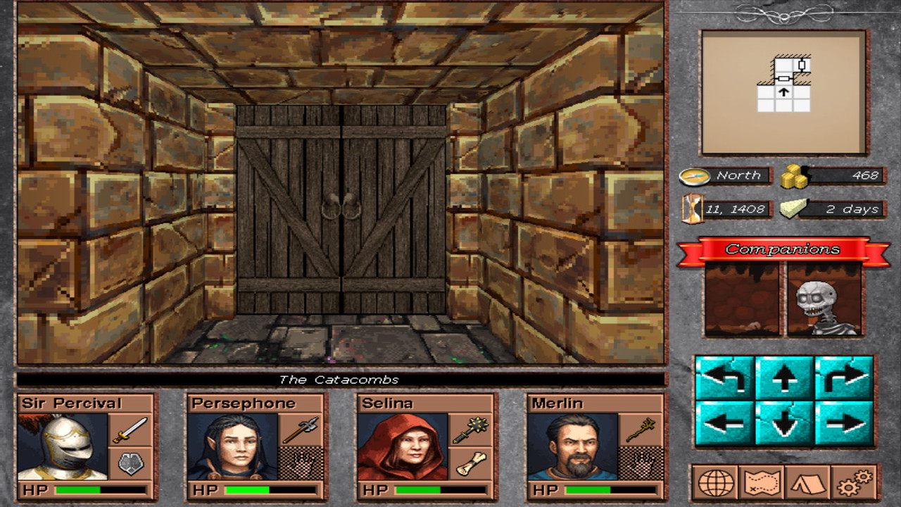
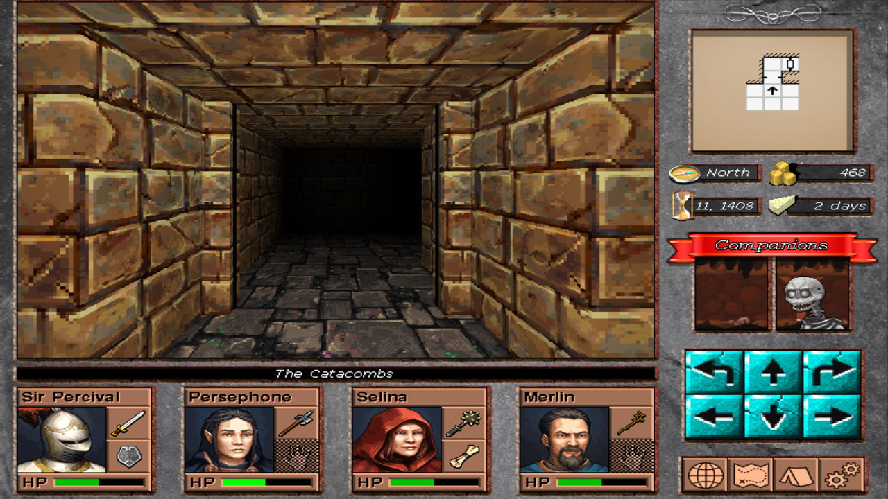
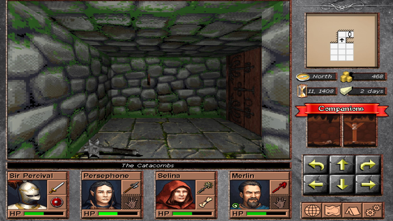
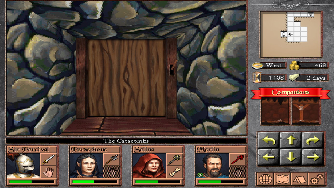
This one took me quite some time, given the graphical & internal changes i had to make. The previous door system feels so awkward now compared to this one. Obviously, its about the same way EOB & DM render their doors & that was exactly my intention. At the moment i only have two (2) doors but no button to open them, so this will be the next step. Check some images:

screenshot-17-5.jpg


screenshot-17-6.jpg


Ok, that was it... This update feels like some kind of a milestone.
In the end, i kinda like what i'm seeing, i hope you too as well.
In any case, leave a feedback or three :)
 

vlzvl

Arcane
Developer
Joined
Aug 7, 2017
Messages
208
Location
Athens
New update!
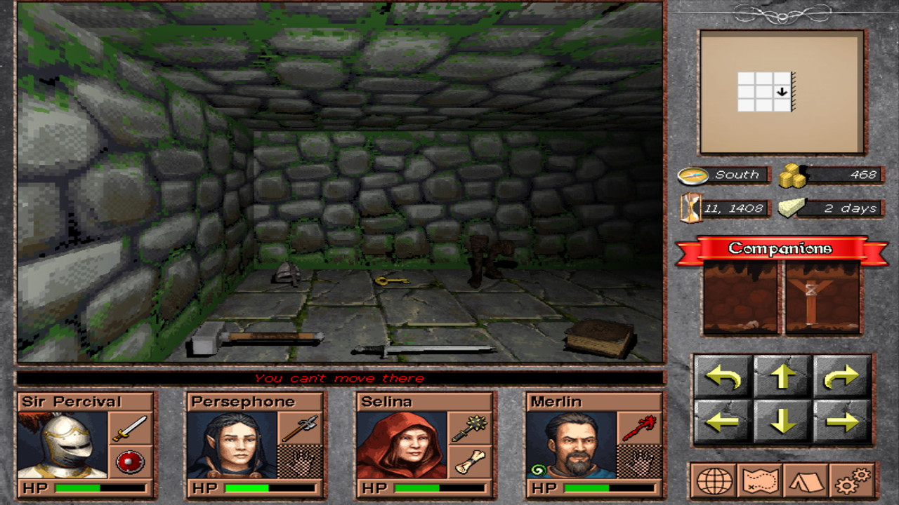
I worked a lot on ground items since they play a major role (graphically) on realism and there are about 25-30 in the game.
Not lazy stuff, all those are models converted to pixel & shadowed. I'm not a modeller so this consumed a lot of my time to get them done.
Not final, but the major part has been done. Some items will be reworked and/or replaced.
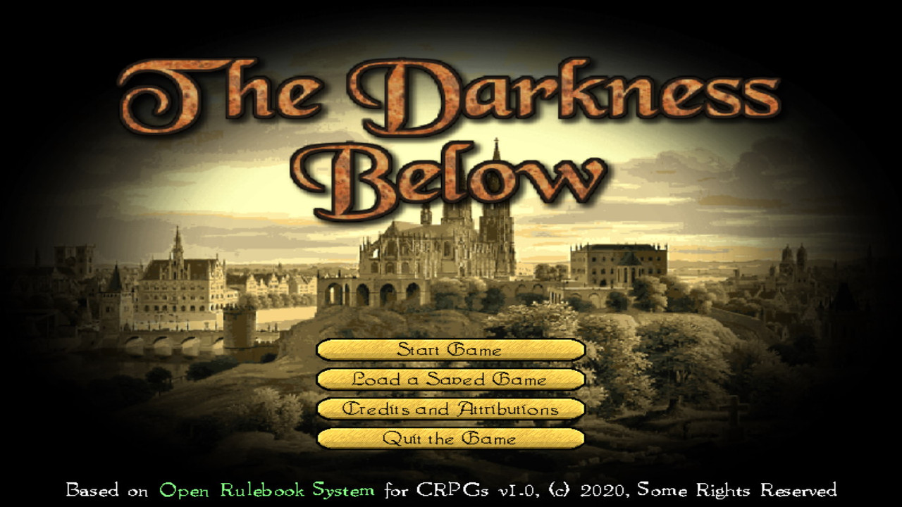
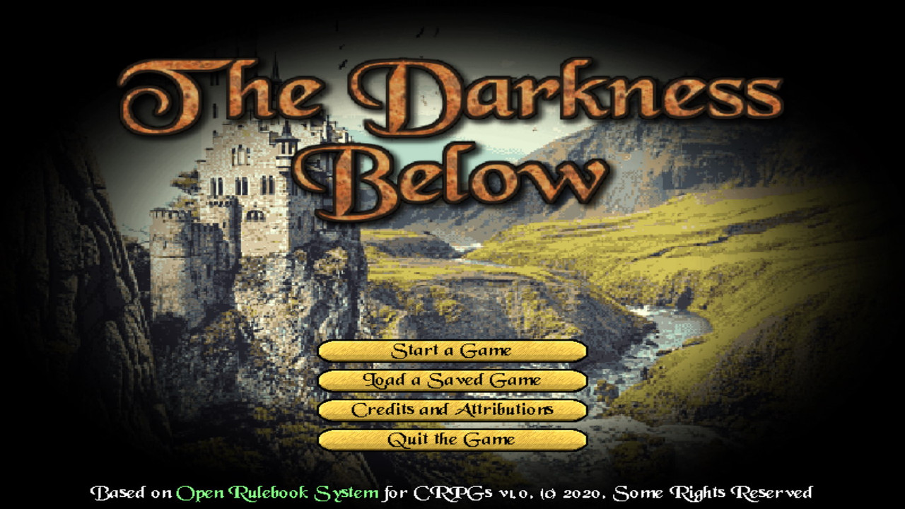
Elsewhere, i reworked my title screen, designed my new navigation cursor, implemented a new lever (DM inspired) & changed my fonts on character window.
Nothing fancy but a necessary step to technical completion that a demo requires.
There are still some lighting issues on the world (mainly walls). I will deal with them in time.
Hope you like it & add some feedback. Check some images:

screenshot-18-1.jpg


screenshot-18-2.jpg


screenshot-18-3.jpg


screenshot-18-4.jpg
 

Bad Sector

Arcane
Patron
Joined
Mar 25, 2012
Messages
2,334
Insert Title Here RPG Wokedex Codex Year of the Donut Codex+ Now Streaming! Steve gets a Kidney but I don't even get a tag.
Looks nice, though all the screenshots look blurry. Is this just a case of you resizing them on upload or the game looks blurry like that? It is a shame that nice pixel art to become blurry due to scaling.

EDIT: also i noticed that you fixed the light direction and shadows which is great but you forgot the inner shadow in the minimap which still looks like there is light coming from the top right direction instead of top left like the rest of the UI.
 

vlzvl

Arcane
Developer
Joined
Aug 7, 2017
Messages
208
Location
Athens
Looks nice, though all the screenshots look blurry. Is this just a case of you resizing them on upload or the game looks blurry like that? It is a shame that nice pixel art to become blurry due to scaling.

Thanx man! Yes, they do look blurry as they're scaled-up (to 1366x768) & i have to deal with that in time. The game is developed on a 800x600 resolution (fake one, using a dynamic resolution shader). This creates a pow2 texture (not sure what size, i assume a bigger pow2 one), used as a rendering target to render the scene. However, the whole texture then it's scaled-up (or down; have to check what texture size the shader creates) to fill the rest of my desktop screen for the fullscreen, which causes the blurring.
In fact, the above images are the non-filtered ones (they're direct buffer screenshots); in the game i'm applying bilinear filtering to smooth-out fonts and stuff but this is not good for pixel-art. I'm not sure if i have to create a non-pow2 texture (if one supported by the device; although im worrying about that solution for compatibility i.e. embedded devices) or play with the +0.5 trick to center the pixels.

EDIT: also i noticed that you fixed the light direction and shadows which is great but you forgot the inner shadow in the minimap which still looks like there is light coming from the top right direction instead of top left like the rest of the UI.

Heh, for some reason i can't catch this stuff :) Will fix it, thanx again.
 
Last edited:

Farewell into the night

Guest
Man, this looks promising. I'll keep my Eye on this thread.
 

Bad Sector

Arcane
Patron
Joined
Mar 25, 2012
Messages
2,334
Insert Title Here RPG Wokedex Codex Year of the Donut Codex+ Now Streaming! Steve gets a Kidney but I don't even get a tag.
Thanx man! Yes, they do look blurry as they're scaled-up (to 1366x768) & i have to deal with that in time. The game is developed on a 800x600 resolution (fake one, using a dynamic resolution shader). This creates a pow2 texture (not sure what size, i assume a bigger pow2 one), used as a rendering target to render the scene. However, the whole texture then it's scaled-up (or down; have to check what texture size the shader creates) to fill the rest of my desktop screen for the fullscreen, which causes the blurring.

Hm, then perhaps it'll be a good idea to add an option for point/nearest filtering? Also if it is developed for 800x600 then i think you should also have it at 4:3 aspect ratio when rendering (or at least add an option).

Though i do not think it is a good idea to use fixed resolutions anymore, these really look good only on CRTs and those are very niche nowadays :-/. What i'd personally do is to find the closest integer scale to the "source" vertical resolution (so, e.g. for 800x600 rendering to 1920x1080 would be 1.8 so the integer scale would be rounded up to 2) and then "compose" the UI out of its individual elements in code so that they are "docked" at their proper positions while still remaining sharp. Also i'd try to center the elements on screen so that they do not look too spaced out in wider screens.

The current UI might look ok (if a bit stretched) in 16:9 but imagine someone running the game on an ultrawide monitor. E.g. here is one of the screenshots above scaled to fit in an ASUS ROG Strix XG49VQ (with a human head outline on top to approximate the head's position over the monitor, scaled based on average human head width vs the monitor's width):

e744SzQ.jpg


So if nothing else, i'd at least add an option to center the entire output at 4:3 aspect ratio.
 

vlzvl

Arcane
Developer
Joined
Aug 7, 2017
Messages
208
Location
Athens
Man, this looks promising. I'll keep my Eye on this thread.

Thank you :)

Cheers mate. Did you come up with any unique mechanics?

Thanx! Some of the stuff i'm considering unique, although there's not much in content, just yet. I'm still in technical development phase.
- The game uses its own rulebook (being written, link in my signature) and there are some stuff in there that could be considered unique.
For example, crafts. A character not only will need to find a Master to advance his craft expertise but that Master will need to be in
the party for a specific time period, training / evaluating the character, plus acting as an extra member (in the party's companions list), potentially
providing actions & dialogue options (although not equipping him).
- Events. The game uses an XML-based event system, enabling or disabling certain events to appear, based on the past choices. Dynamic choices based on passive stat checks, similar to D&D.
- Summoning or recruiting monsters / animals as a companion.
- The monsters follow a more D&D-ish approach, having vulnerabilities, resistances & a number of actions to choose from, allowing strategies.
- Homebrew-like professions & more specialized versions of them, opening new paths & content.
- Epic paths, long-term quests, becoming king/demon/lich/deity etc.

In short, things you can find in homebrew d&d content can become a thing in the game. There's not much to write, since that
part is not developed yet, but it will be massive. The technical part has to be completed first, or at least a major part of it before moving on content stuff.

Every time i see a new post in this thread, i get :bounce:

Thanx! I will have better content to show when i'm done with the technical part :)


Hm, then perhaps it'll be a good idea to add an option for point/nearest filtering? Also if it is developed for 800x600 then i think you should also have it at 4:3 aspect ratio when rendering (or at least add an option).

Though i do not think it is a good idea to use fixed resolutions anymore, these really look good only on CRTs and those are very niche nowadays :-/. What i'd personally do is to find the closest integer scale to the "source" vertical resolution (so, e.g. for 800x600 rendering to 1920x1080 would be 1.8 so the integer scale would be rounded up to 2) and then "compose" the UI out of its individual elements in code so that they are "docked" at their proper positions while still remaining sharp. Also i'd try to center the elements on screen so that they do not look too spaced out in wider screens.

The current UI might look ok (if a bit stretched) in 16:9 but imagine someone running the game on an ultrawide monitor. E.g. here is one of the screenshots above scaled to fit in an ASUS ROG Strix XG49VQ (with a human head outline on top to approximate the head's position over the monitor, scaled based on average human head width vs the monitor's width):

Thanx for the detailed post. I'm considering a mix of nearest-neighbor and integer scaling, along with some necessary fixes in the engine to improve usability. I actually tried to play the game in two (2) resolutions in my Lubuntu VM, one 800x600 and one 1920x1080 and got some screenshots. I was delighted to not see huge difference in the larger resolutions. However, i didn't thought of such monstrous monitors and how difficult it could be on my game. I will definitely consider of adding a 4:3 option. I attached the larger screenshot.

800x600

screenshot-800x600.jpg


1920x1080 (i believe postimg.cc cut it but that's the look)

screenshot-1920x1080.jpg
 

FrancoTAU

Cipher
Joined
Oct 21, 2005
Messages
2,507
Location
Brooklyn, NY
Looks really nice. I know it's a one man job, but I like that you're punching up the details in the dungeon graphics so it's not just the same walls and floor copy and pasted throughout the whole dungeon. I grew up on that simple style of blobber but the charm is lost to me now. I'd like to not just focus on the minimap the whole time to recognize where I am. It also makes your game not look like shovelware.
 

vlzvl

Arcane
Developer
Joined
Aug 7, 2017
Messages
208
Location
Athens
Looks really nice. I know it's a one man job, but I like that you're punching up the details in the dungeon graphics so it's not just the same walls and floor copy and pasted throughout the whole dungeon. I grew up on that simple style of blobber but the charm is lost to me now. I'd like to not just focus on the minimap the whole time to recognize where I am. It also makes your game not look like shovelware.

Thanx for the kind words, man!
I'm always trying to make the best matching of all of the available resources. Some people might disagree but visual immersion is a damn strong factor for a CRPG, especially for a FPDC that repeats graphics all over, and given that I'm not an artist, I double my effort & time on that department. I try to stay away from cheap solutions to accelerate the game's production as well, which unfortunately increases the development time but so be it. Sometimes it works, other times its a wasted time but, in every case, I am not going to release a game that I don't feel its working for me, both visually & content-wise. The feedback I get is great & I plan to continue with that mindset.
 

vlzvl

Arcane
Developer
Joined
Aug 7, 2017
Messages
208
Location
Athens
Another update which took a little more than usual, still fixing / completing the technical part.
Highlights of the update are:
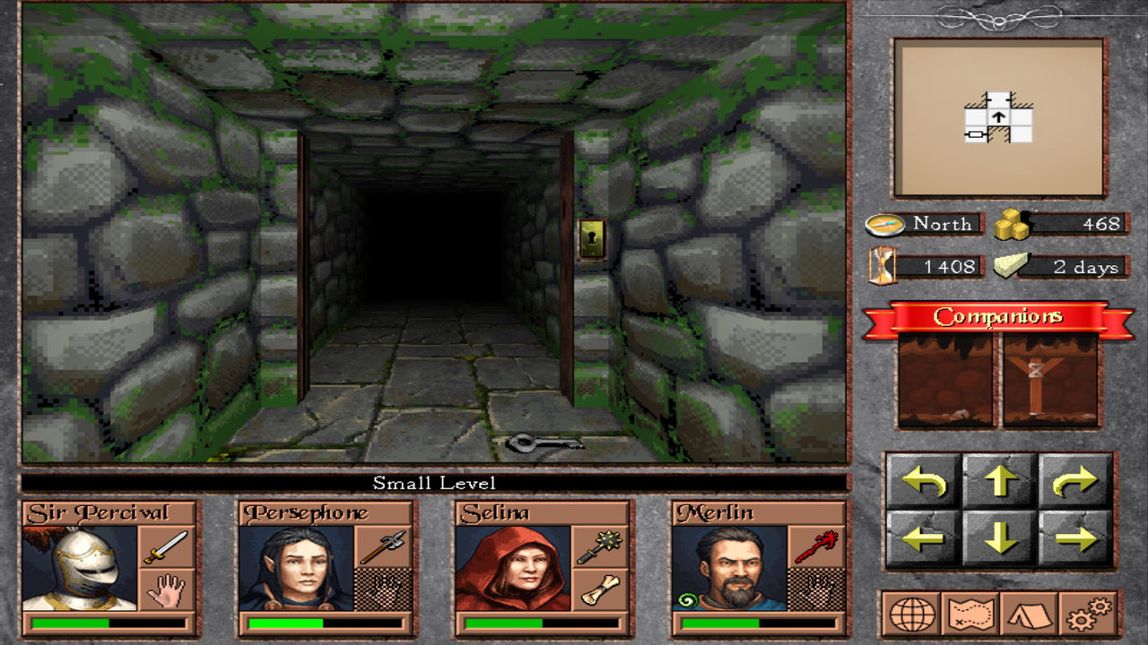
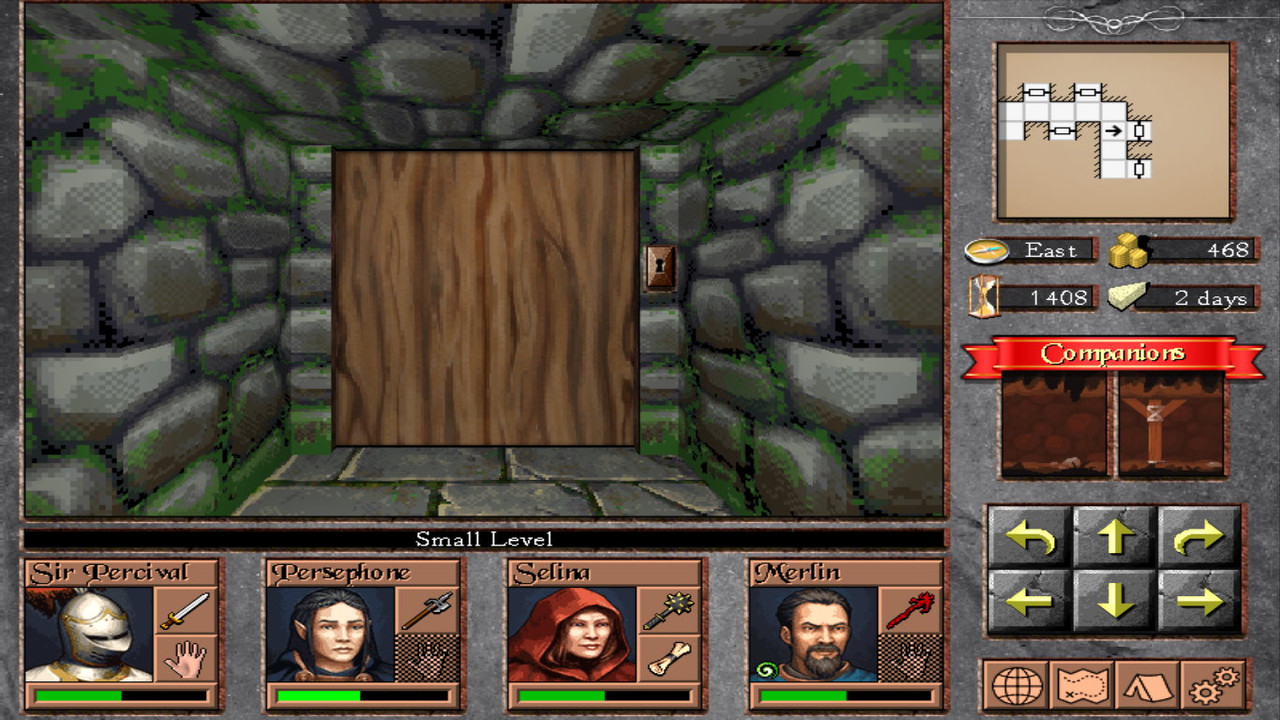
  • Reworking of the keylock system. I decided to move the locks to the doors instead of having them stick to random walls, mostly for practical reasons. Otherwise, i would be forced to add a new keylock / lever for each door. Now each door can either have a lever handle / keylock attached or nothing at all.
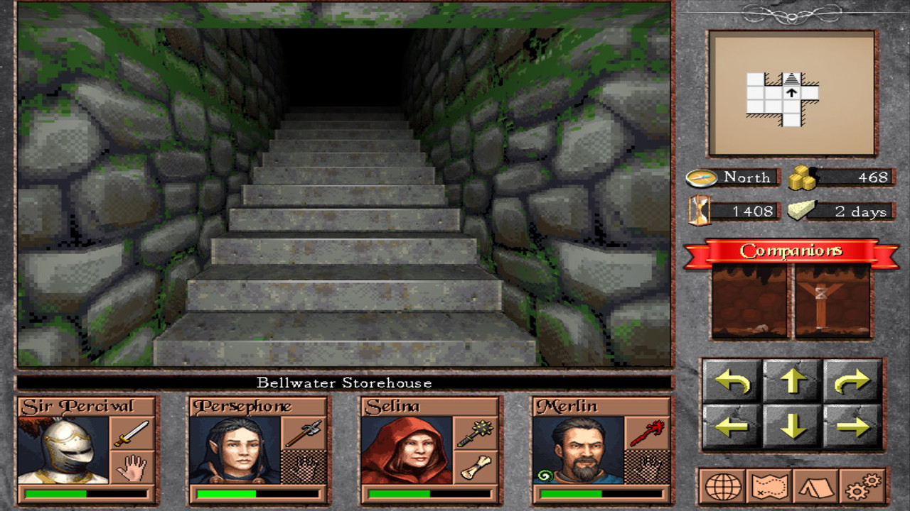
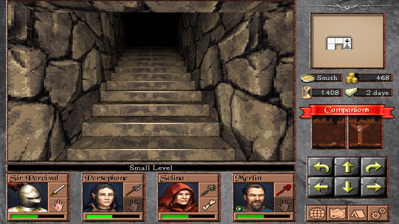
  • Reworking of stairs. Added more depth to them, plus some graphical variety which matches the floor being used.
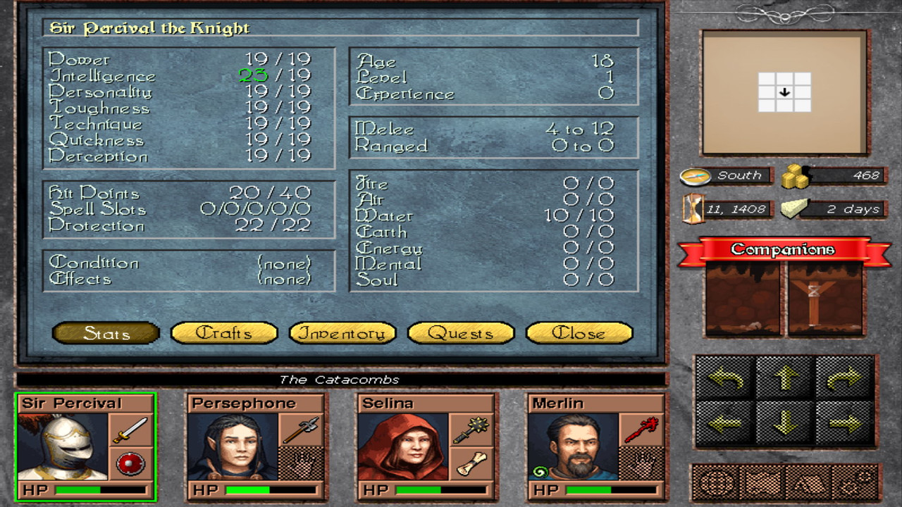
  • Quest system. The journal contains all the quest information, their state (active, complete & failed), plus some statistics which shows the general progress. The All statistic is a useful statistic for the player to know how much of the game's content did solve. Finally, there's a description showing all the fine details of the quest. NOTE: those quests are just a sample from the great game Exiled Kingdoms, they don't belong to game's content.
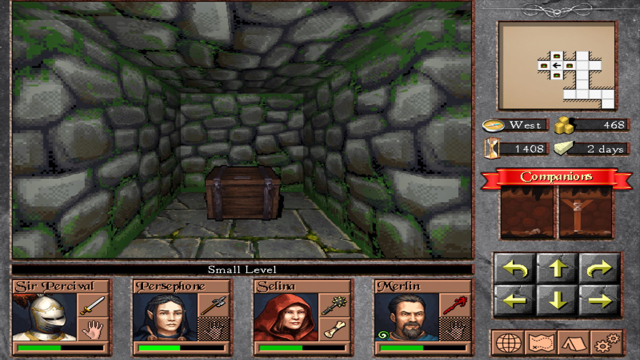
  • Finally, i added 2 types of chests, removing the previous low-res type. They occupy an entire square and its mechanism resembles the one used in Lands of Lore, Anvil of Dawn etc. a click on them retrieves an item from the chest.
Check a number of images:

screenshot-19-1.jpg


screenshot-19-2.jpg


screenshot-19-3.jpg


screenshot-19-4.jpg


screenshot-19-5.jpg


screenshot-19-6.jpg


screenshot-19-7.jpg


screenshot-19-8.jpg


screenshot-19-9.jpg


That's all for a month's work :)
Hope you like it
 

vlzvl

Arcane
Developer
Joined
Aug 7, 2017
Messages
208
Location
Athens
Looking great. Any progress?

Hey thank you :)
Yes there's progress, although a great part of it was a grand refactoring / compacting of code to more easily adapt to new mechanisms.
Not the usual visual stuff. Mostly dealing with outdoor environments right now, after a lot of indoor work, to get it on par with indoor graphics.
A lot of work has also been done on combat mechanics to fasten it up.
I will post an update these days.
 

DavidBVal

4 Dimension Games
Patron
Developer
Joined
Aug 27, 2015
Messages
3,037
Location
Madrid
PC RPG Website of the Year, 2015 Codex 2016 - The Age of Grimoire Make the Codex Great Again! Grab the Codex by the pussy Insert Title Here RPG Wokedex Strap Yourselves In Codex Year of the Donut Codex+ Now Streaming! Enjoy the Revolution! Another revolution around the sun that is. Pathfinder: Wrath
Is this going to run on mobiles as well? You have a market there, believe me. A game like The Quest, but party based, would certainly be popular

EDIT: I saw the pics in the previous page. Good! On mobiles you *can* and *should* make this profitable for yourself. On PC, you'll have a harder time.
 
Last edited:

vlzvl

Arcane
Developer
Joined
Aug 7, 2017
Messages
208
Location
Athens
Is this going to run on mobiles as well? You have a market there, believe me. A game like The Quest, but party based, would certainly be popular

Yes, i'm definitely going to support Windows, Linux & Android on day 1. In fact, i have already built some binaries to test the waters & current performance, you can check this page (a patreon post) where i'm showing some Android images (smartphone + tablet).
Although, i can't tell the same thing about iOS.
Game is supported on Mac OSX as well, although not thoroughly at the moment and the OpenGL state is bad on iOS because of Metal support, which my game doesn't support at the moment. I have yet to deal with proper Apple hardware, adding metal support in my code base and become an Apple developer and such stuff to properly support that part of mobile world.
 

Darth Canoli

Arcane
Joined
Jun 8, 2018
Messages
5,737
Location
Perched on a tree
Just found out about your game and now i wish i didn't, i'll just have to wait and suffer through years of waiting...
Or do I?
Maybe you're prepared to release it next month?

Release it already!
 

vlzvl

Arcane
Developer
Joined
Aug 7, 2017
Messages
208
Location
Athens
Just found out about your game and now i wish i didn't, i'll just have to wait and suffer through years of waiting...
Or do I?
Maybe you're prepared to release it next month?

Release it already!

Thanks :)
I plan to release a small demo next month or two, where i believe all technical issues should be over by then...
Only thing i know for sure: the game is certainly going to get released in 2021 (no ETA).
There's a lot of work already in the game which can be properly shown in a short demo.
The content writing procedure for the full game will then start after that demo.
 

vlzvl

Arcane
Developer
Joined
Aug 7, 2017
Messages
208
Location
Athens
Yet another update.
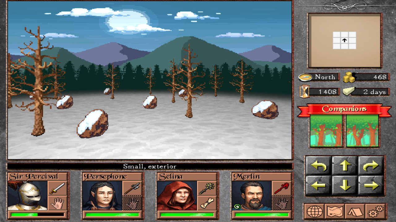
On this update i mostly focused on required refactoring / performance of code, which i hope justifies the increased delay q:)
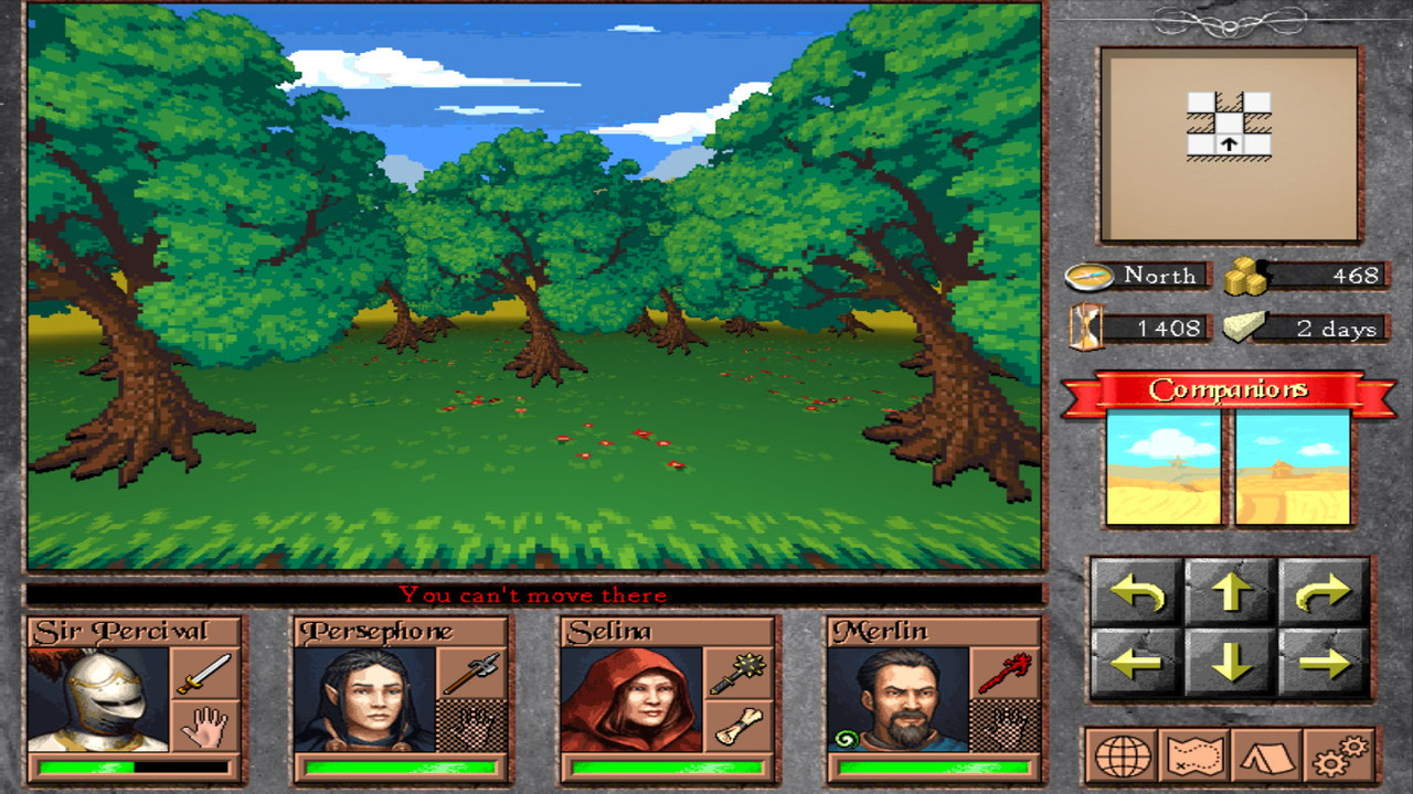
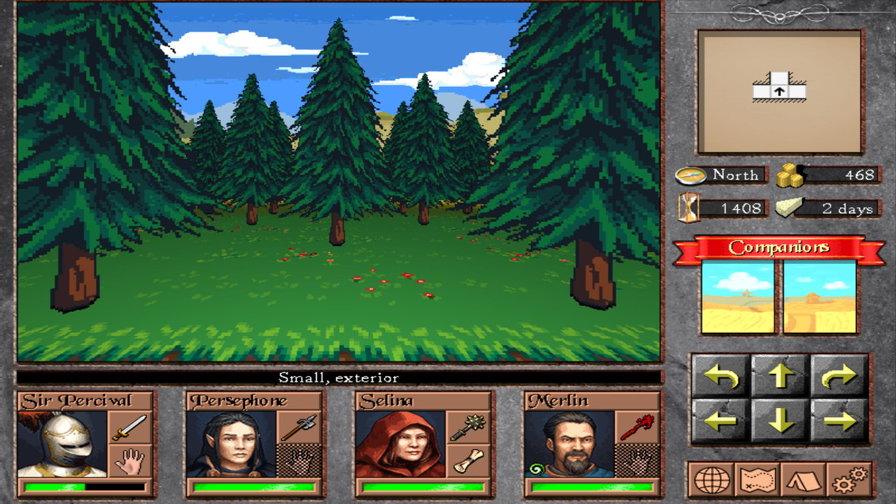
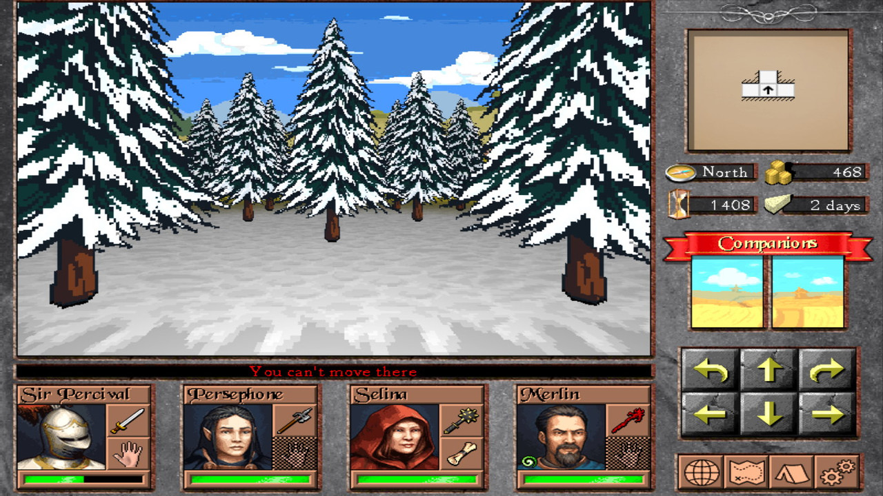
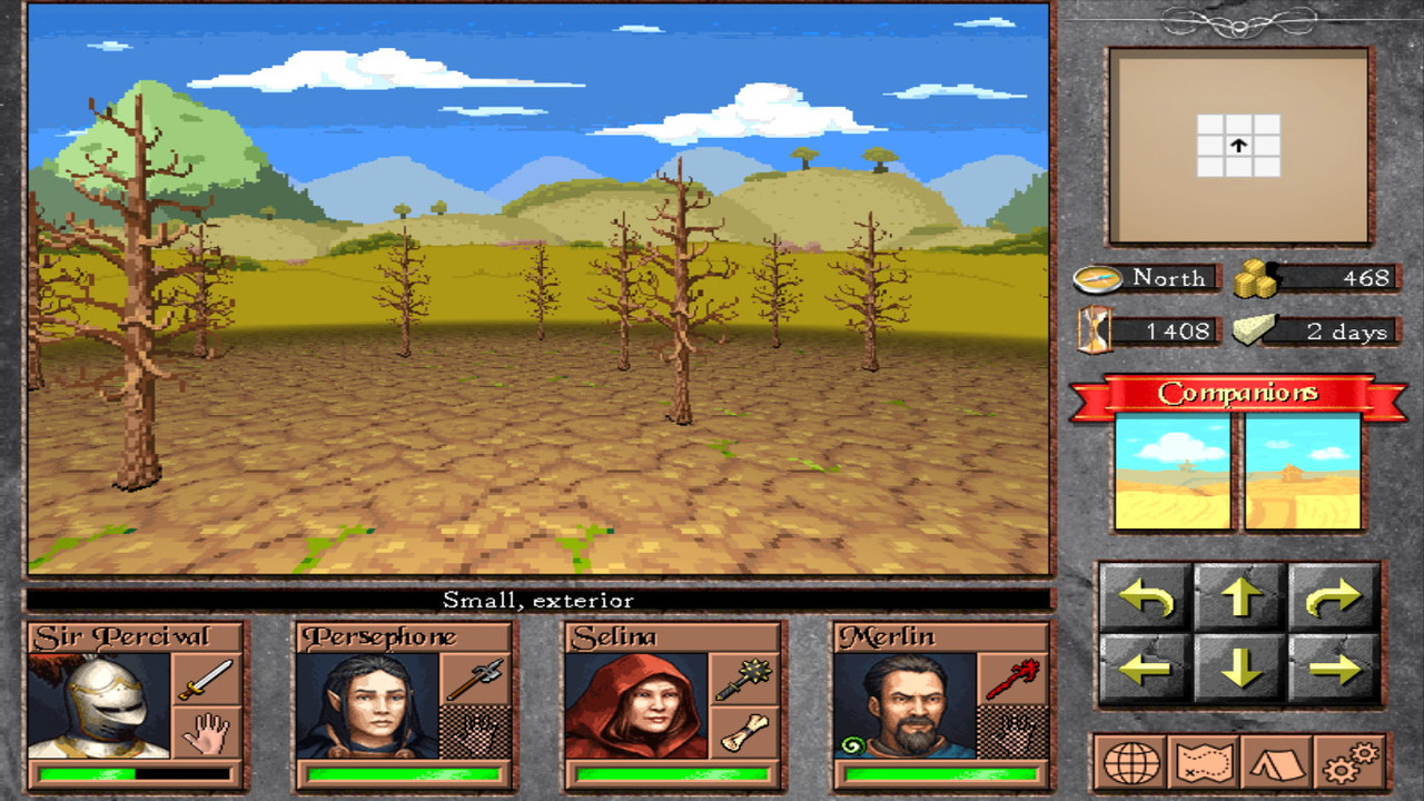
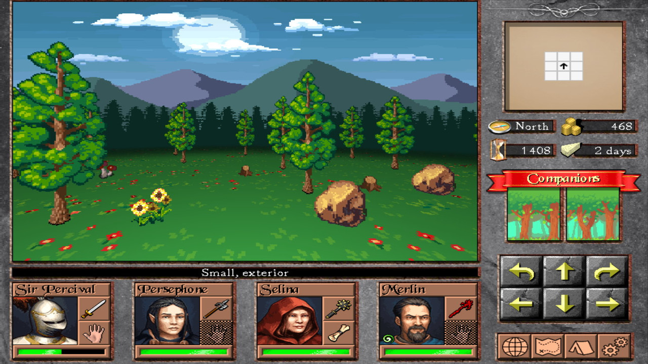
I also worked on improving exterior areas; hopefully they're now on par with interior areas.
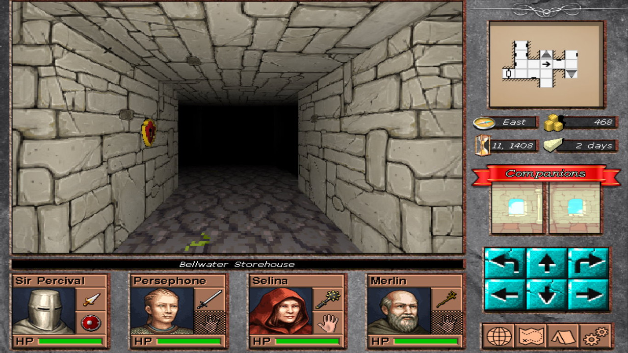
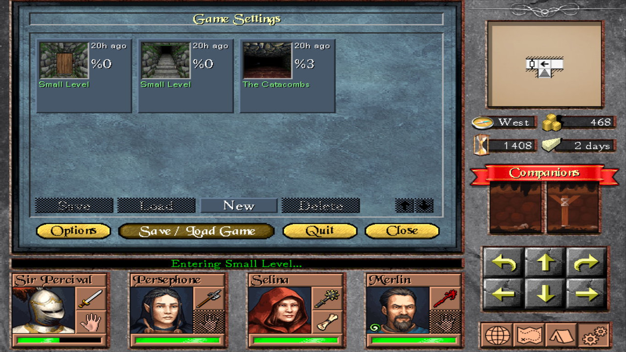
Finally, i revamped my options / save system, allowing unlimited save slots / pages & thumbnails because who likes one or three slots.
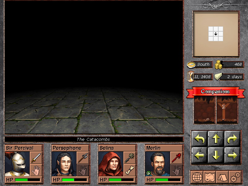
Check the following images:
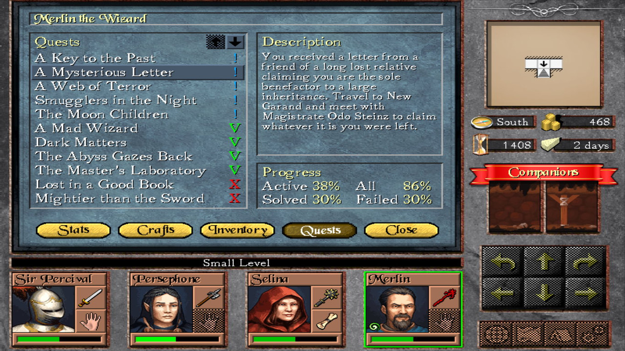
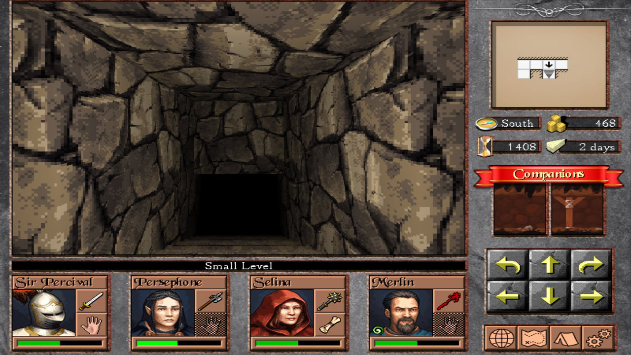
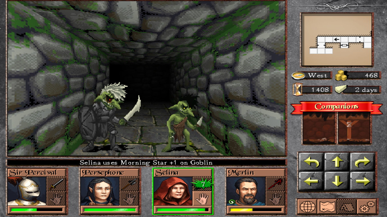
screenshot-20-1.jpg


screenshot-20-2.jpg


screenshot-20-3.jpg


screenshot-20-4.jpg


screenshot-20-5.jpg


screenshot-20-6.jpg


screenshot-20-7.jpg


screenshot-20-8.jpg


screenshot-20-9.jpg


Ok, that was it.
The next update might be a demo.
 

Tom Selleck

Arcane
Joined
May 6, 2013
Messages
1,223
This game looks like home, endless summer nights, drink-stained graph paper and "just one more room".
 

As an Amazon Associate, rpgcodex.net earns from qualifying purchases.
Back
Top Bottom