Putting the 'role' back in role-playing games since 2002.
Donate to Codex
Good Old Games
  • Welcome to rpgcodex.net, a site dedicated to discussing computer based role-playing games in a free and open fashion. We're less strict than other forums, but please refer to the rules.

    "This message is awaiting moderator approval": All new users must pass through our moderation queue before they will be able to post normally. Until your account has "passed" your posts will only be visible to yourself (and moderators) until they are approved. Give us a week to get around to approving / deleting / ignoring your mundane opinion on crap before hassling us about it. Once you have passed the moderation period (think of it as a test), you will be able to post normally, just like all the other retards.

KickStarter We need more buttons

Semiurge

Cipher
Joined
Apr 11, 2020
Messages
7,779
Location
Asp Hole
And why is this a premium button? Should be included in the free pack.

Should, but for some reason the new negative ratings are kept away from it.

It needs a complete overhaul to fit in more.

Or perhaps the existing buttons do...

:troll:

I've reworked ''It was the Alien'' and made a ''bait'' one.

GucGcC9.gif


U9fJNQ9.gif


I mean, RPG Codex has a unique mascott, what was the need to back down on a stale, seven year old meme from another forum? Worst decline ever. We've even had decent and unique suggestions by other members for ''cope'' as well (not even counting mine). What an odd decision.

At least anyone can be at ease at posting their own versions of various buttons now, as whatever is being selected is certainly not indicative of what is creative or qualitative.


It does look out of place but not because the current buttons have any sort of cohesion. They originate from all sources and resolutions. So anything beind added can only fit with some the buttons, not all.

The bait could stand out better from the background, and it doesn't need to be animated at all. Remember that even the existing buttons drag down the site's performance.
 
Self-Ejected

Zizka

Self-Ejected
Joined
Jan 15, 2020
Messages
429
That's a sad state of mind.
And believe me, I'm familiar with sad states of mind.

Making fun of you at this point would be punching down so I won’t, it’d be like laughing at the handicapped kid. But, Christ, don’t you think it’s about high time you start setting your priorities straight and maybe turn your life around? Do you really want to be the middle aged guy who spends his free time sending pm to the rpg codex’s females in hopes of luring them to your parents’ apartment with a fucking Frankfurt, sauerkraut or whatever it is German people eat, in hopes that they’ll pity fuck you? Don’t you think you have more urgent matters to attend to than complaining about the state of buttons on 4 chan 2.0?

Like, stop trying so hard in being a cunt and maybe you won’t feel like a totally worthless loser at the end of the day, has this crossed your mind? I’m sorry this sounds harsh but you needed an urgent wake up call about 20 years ago. Now get your shit together and stop whining on how sad you are. The last thing you need is another shoulder to cry on and tit to suck on.


The bait could stand out better from the background, and it doesn't need to be animated at all. Remember that even the existing buttons drag down the site's performance.

The problem is the outline. It’s so small that it looks off if I use one (as it ends up being 1/3 of the size). Regarding the animation, one of the buttons you like is the rage one and it’s pretty intensive animation wise but I guess you mean to only animate when it’s absolutely necessary. I just think a plain hook won’t be much to look at. I’ll give it a shot anyway.
 

Ismaul

Thought Criminal #3333
Patron
Joined
Apr 18, 2005
Messages
1,871,834
Location
On Patroll
Codex 2014 PC RPG Website of the Year, 2015 Codex 2016 - The Age of Grimoire Make the Codex Great Again! Grab the Codex by the pussy Insert Title Here RPG Wokedex Strap Yourselves In Codex Year of the Donut Divinity: Original Sin Project: Eternity Torment: Tides of Numenera Shadorwun: Hong Kong Divinity: Original Sin 2 BattleTech A Beautifully Desolate Campaign My team has the sexiest and deadliest waifus you can recruit.
Do you really want to be the middle aged guy who spends his free time sending pm to the rpg codex’s females in hopes of luring them to your parents’ apartment with a fucking Frankfurt, sauerkraut or whatever it is German people eat, in hopes that they’ll pity fuck you?
Sounds like the American dream.
 

Zombra

An iron rock in the river of blood and evil
Patron
Joined
Jan 12, 2004
Messages
11,892
Location
Black Goat Woods !@#*%&^
Make the Codex Great Again! RPG Wokedex Strap Yourselves In Codex Year of the Donut Codex+ Now Streaming! Enjoy the Revolution! Another revolution around the sun that is. Serpent in the Staglands Shadorwun: Hong Kong Divinity: Original Sin 2 BattleTech Pillars of Eternity 2: Deadfire Pathfinder: Kingmaker Steve gets a Kidney but I don't even get a tag. I'm very into cock and ball torture I helped put crap in Monomyth
Yeah, the concept isn't great. I wanted a pixel art looking slut, but the icons are already so small you can't make it lower fidelity and read at all.

Upside, "Begone Thot!" is a close enough substitute and gives me a reason to use it.
 

ELEXmakesMeHard

Learned
Joined
Jun 19, 2021
Messages
807
Surely peepostare should be added. It'd be invaluable in the cases where you want to communicate "I see your post, and I'm not sure what's wrong with you or how I should react, but I think something is probably wrong with you".

3x.png
 
Last edited:
Self-Ejected

Zizka

Self-Ejected
Joined
Jan 15, 2020
Messages
429
i like the spaceship. i think it's your best creation. you are improving, keep going, eventually one of your works will becone a codex button!
Thanks very much!

I've reworked It was Aliens again (animation might be too long)
2zIo8eO.gif


Regarding the baits:
This looks the best to me:
tHyDpIo.png


Outline doesn't work for me:
JdXrBEe.png


Doesn't stand out as much:
jJCQGHA.png
 

Morenatsu.

Liturgist
Joined
May 6, 2016
Messages
2,572
Location
The Centre of the World
Surely peepostare should be added. It'd be invaluable in the cases where you want to communicate "I see your post, and I'm not sure what's wrong with you or how I should react, but I think something is probably wrong with you".

3x.png
For a long while I've wanted a button that was just ‘ok.’

Please add the OK button instead of this dumb forg
 

Semiurge

Cipher
Joined
Apr 11, 2020
Messages
7,779
Location
Asp Hole
Surely peepostare should be added. It'd be invaluable in the cases where you want to communicate "I see your post, and I'm not sure what's wrong with you or how I should react, but I think something is probably wrong with you".

3x.png
For a long while I've wanted a button that was just ‘ok.’

Please add the OK button instead of this dumb forg

makeawish.png
 
Self-Ejected

Zizka

Self-Ejected
Joined
Jan 15, 2020
Messages
429
I've made a few baits:
H2mFxBK.png

8QJ6Vi8.png

They're harder to see because of the background color.

I find the ''honk'' atrocious to look at so I'm working on an alternative. Anything pepe-related needs to disappear from the surface of planet Earth (and the solar system). Rpg Codex deserves better.
Lg6N8LE.gif

Static concepts:
1EoZ2iN.png

ZhjuCpR.png

lsEnhrA.png


Mostly based on the clown in IT.
 

Ghulgothas

Arcane
Joined
Feb 22, 2020
Messages
1,610
Location
So Below
I find the ''honk'' atrocious to look at so I'm working on an alternative. Anything pepe-related needs to disappear from the surface of planet Earth (and the solar system). Rpg Codex deserves better.
Lg6N8LE.gif

Static concepts:
1EoZ2iN.png

ZhjuCpR.png

lsEnhrA.png


Mostly based on the clown in IT.
Beautiful, only one suggestion to make it more inline with the purpose of the "Honk Honk!" button;

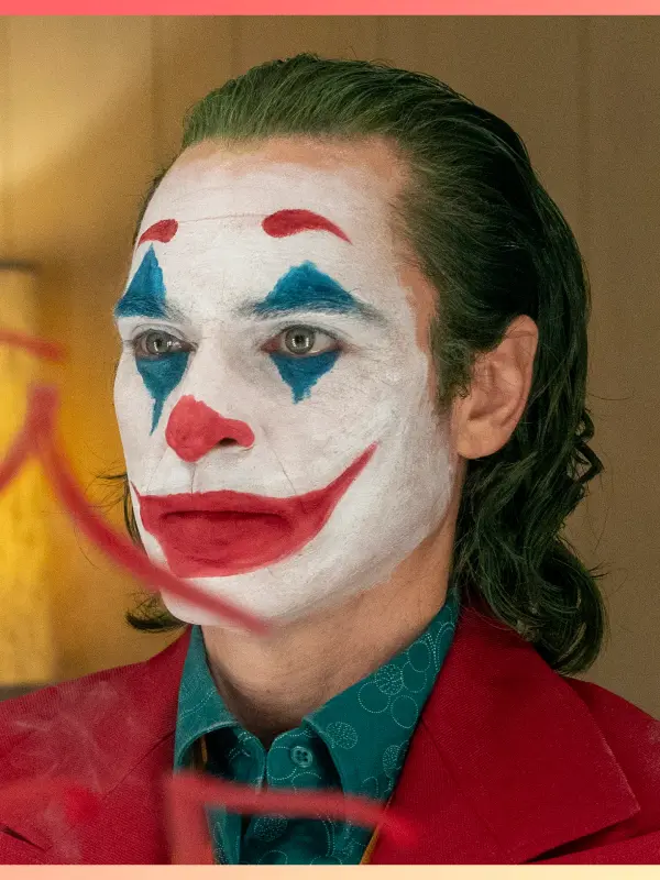
Joker-ify him. White makeup coupled with the colored facial marking would be more readable and more striking as a button; big red nose, grin and eye marks. Keep the colored shadows in his hair, though. That's a good improvement.
rev-1-jok-14466-high-res-jpeg-p-sf-sq.webp
it-1990-pennywise.webp
From what I've seen of your work, you tend to err on the side of more realistic portrayals of facial anatomy. A good skill to have, but for the purposes of forum buttons I'd recommend something stylized to be simple yet highly expressive. The little black dot-eyes of the bottom-most Pennywise are in-line with this.
 
Last edited:
Self-Ejected

Zizka

Self-Ejected
Joined
Jan 15, 2020
Messages
429
Joker-ify him. White makeup coupled with the colored facial marking would be more readable and more striking as a button; big red nose, grin and eye marks. Keep the colored shadows in his hair, though. That's a good improvement.

You mean like this? Or this too detailed still?
JmrMd4w.png


...and this is with the original hair like you mentioned:
WRXOv4k.png
 

Ghulgothas

Arcane
Joined
Feb 22, 2020
Messages
1,610
Location
So Below
Joker-ify him. White makeup coupled with the colored facial marking would be more readable and more striking as a button; big red nose, grin and eye marks. Keep the colored shadows in his hair, though. That's a good improvement.

You mean like this? Or this too detailed still?
JmrMd4w.png


...and this is with the original hair like you mentioned:
WRXOv4k.png
Better. Lose the eyebrows so the only thing against the forehead is the upper-blue triangle, and trade the eye-whites for wholly white skin. The Pennywise-hair has a better silhouette.
 
Self-Ejected

Zizka

Self-Ejected
Joined
Jan 15, 2020
Messages
429
Better. Lose the eyebrows so the only thing against the forehead is the upper-blue triangle, and trade the eye-whites for wholly white skin. The Pennywise-hair has a better silhouette.

I *think* I get what you meant. I've included one version with eyebrows just to test things out but made it less noticeable.

A. No eyebrows
Gkl3bNg.png


B. eyebrows
5klgbl7.png


C. Different eyes and mouth shape
GIDf1gS.png


D. Another set of eyes and mouth shape
FORN8D9.png


E. Yet another set of eyes
oioJr7M.png


F. Eyes more like Pennywise and yet a different mouth
pavT04N.png


G. Different mouth again
F25I5kU.png


H. Ears showing and yet another mouth
P0vtOJs.png


Could you point out which one is closer to what you meant? Do you think I should mix certain elements from one with another (the mouth for example)?


This is the reference I'm using:
rFebAfE.png

FhsFcc8.png

Think I'm getting closer to 200 buttons.
 

Ghulgothas

Arcane
Joined
Feb 22, 2020
Messages
1,610
Location
So Below
E. Yet another set of eyes
oioJr7M.png
This one is my favorite. One suggestion for editing; the blue triangles. Currently he looks like a four-eyed monster. Which is an effective visual, but the clownyness could be better served by altering his eyes and makeup. Like so;
clown-5862845-960-720.webp
Specifically the eyes and eye-marks. Beadier, bigger, blacker eyes with some space between the blue triangles. I'd also recommend a wider-grin like the penultimate two Skarsgaard buttons you have up there. As well as keeping his eyebrows shaved; a vacant expression with beady-black eyes marked by the two blue triangles and a wide grin would cinch it.

Oh yeah, and WHITE, HIM, UP.

A. No eyebrows
Gkl3bNg.png


B. eyebrows
5klgbl7.png
For the eyebrows, make them arched. His expressions here comes across as smug and bemused, arched-eyebrows would make him out as more unhinged and serve the button purpose better. Forgive me, but I am going to use an emoji to illustrate what I mean:
10-2-clown.jpg
And I'm not feelin' the Skaarsgard versions on the bottom. The red-slits and his reduced forehead don't have the same character and appeal as the Curry versions.
 

As an Amazon Associate, rpgcodex.net earns from qualifying purchases.
Back
Top Bottom