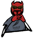
Your discarded concepts are better, because they're better at conveying the meaning of ignoring the cause of something. Yes the ?? as eyes make it clearer, not because it's a good idea, but because the other shapes fail at converying ignorance. All of them.
You need to know a bit about how humans and animals use their bodies to express meaning to be able to portray it in a manner that others can recognize, especially in a small size where a misplaced pixel completely destroys the percieved meaning.
Let's break it down. That act portrayed here
is the shrug. When we do it, those features are usually central: open palms, raised shoulders, pursed lips, raised eyebrows, eyes to one side. There's also an aspect of surprise to this button, which means wide open eyes and open mouth. All this is not obvious to do at a small size, so the arms, eyes and mouth must be just right.
Now let's look at your ghosts. Because of perspective, they don't look like they have their shoulders up or are presenting their palms. Take this one for example,
he looks like he has his hands up front, presenting the two cellphones he's trying to sell. We percieve this as the hands being forward because the hands are bigger than the arm and shoulder, which we read as being a perspective effect. It looks like this:
Compare with the original:
. The original has his arms fully extended, so we know his hands are to the side, not forward, and it's obvious from the drawing that the palms are open towards us.
None of your ghosts displays this, yet it it essential to convey ignorance at this size, since raised shoulders are much harder to show clearly.
I mean seriously how can you
Zizka pretend to make meaning-conveying buttons when you don't even know the expressions you're trying to convey?
It's the same with the eyes and mouth. Look at this guy again:
. Notice how the "tail" is to the left, and the eyes are to the right? That's intentional: the eyes can't just be to any one side, they're opposite his center of gravity. They go where he is less firm in his position. In other words, eyes and mind are in a state of
disequilibrium. And that portrays uncertainty, physically. The eyes on your buttons are whatever, sometimes googly-eyes, sometimes retarded eyes, it just fails at functionally conveying the intended meaning.
It seems to me that knowing how to create pixel art isn't sufficient to be able to make good buttons, because it also requires being able to distill complex human expressions in a very small number of pixels.


