Putting the 'role' back in role-playing games since 2002.
Donate to Codex
Good Old Games
  • Welcome to rpgcodex.net, a site dedicated to discussing computer based role-playing games in a free and open fashion. We're less strict than other forums, but please refer to the rules.

    "This message is awaiting moderator approval": All new users must pass through our moderation queue before they will be able to post normally. Until your account has "passed" your posts will only be visible to yourself (and moderators) until they are approved. Give us a week to get around to approving / deleting / ignoring your mundane opinion on crap before hassling us about it. Once you have passed the moderation period (think of it as a test), you will be able to post normally, just like all the other retards.

Why is Fallout New Vegas considered good?

Gargaune

Arcane
Joined
Mar 12, 2020
Messages
3,636
I'm only judging from the author screenshots from here (user screenshots have a bunch of mods and such) because i do not have Fallout 4 available, but from what i can see 95% of the difference seems to be because of the lighting engine :-P.
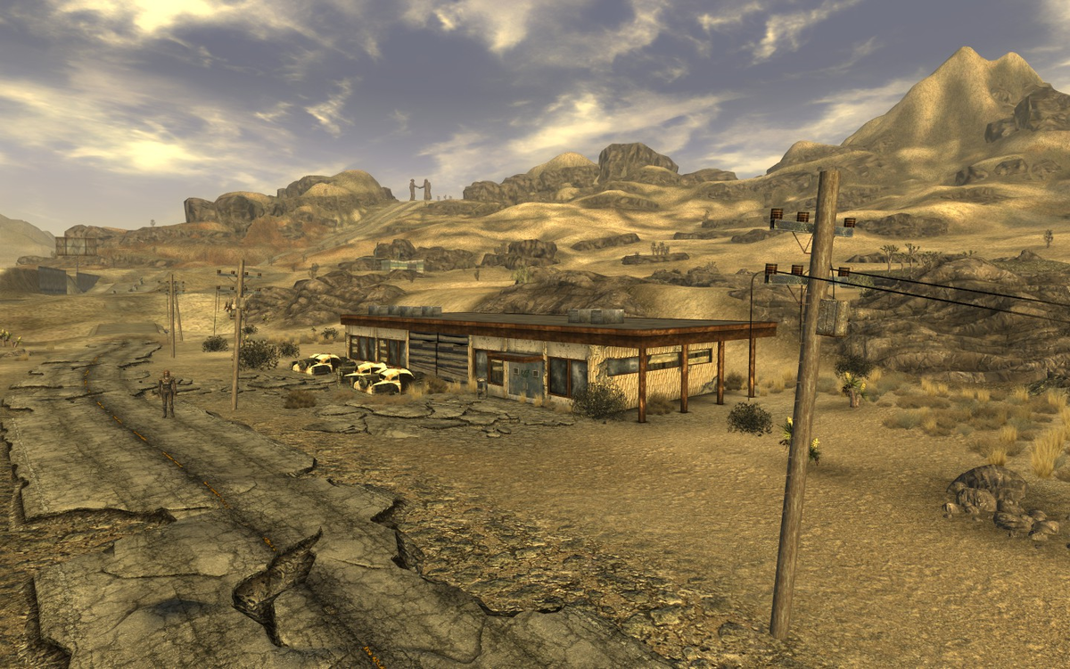
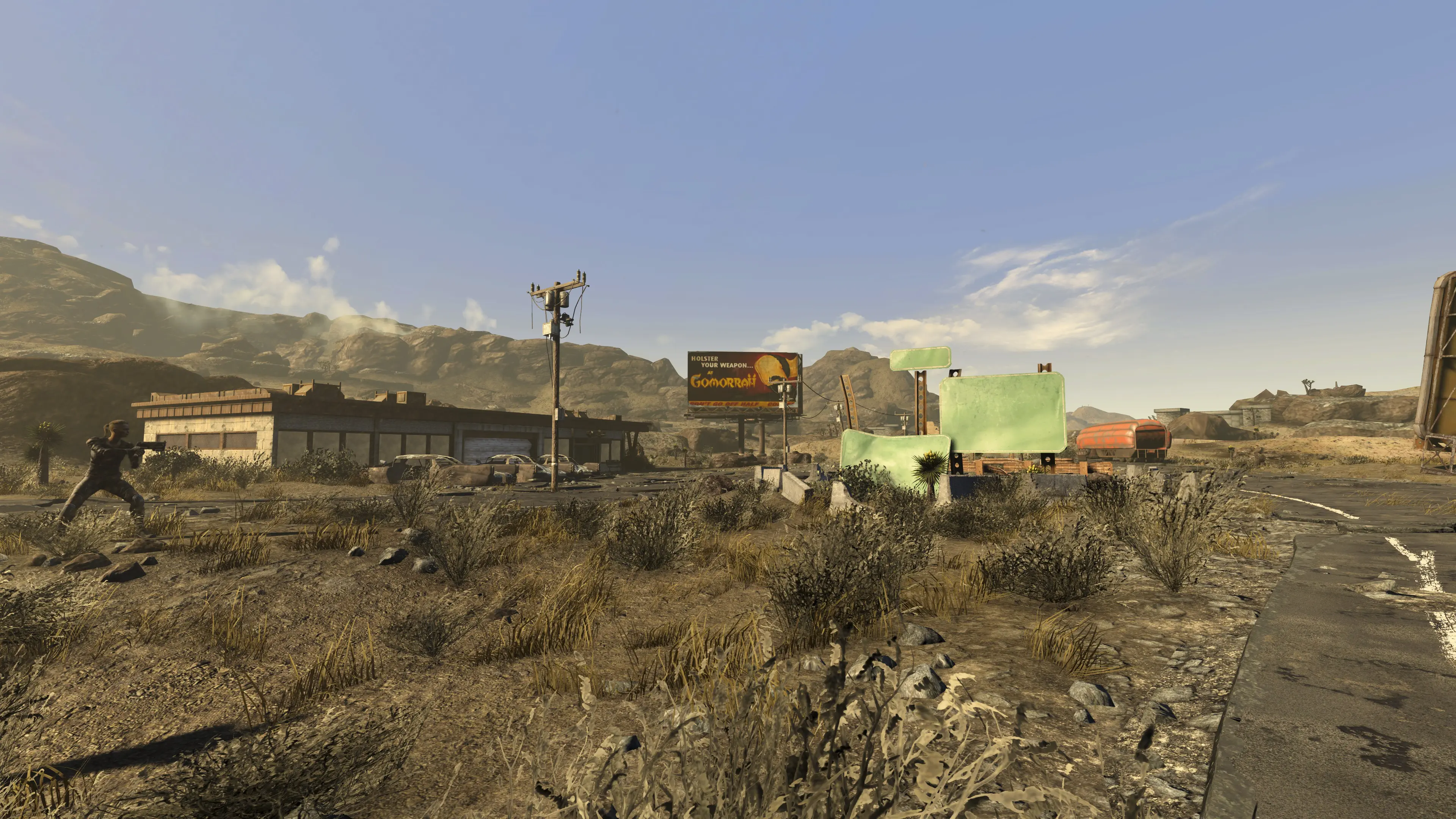
I'd say there's a bit more to the architecture as well. Even staying out of Vegas proper, have a look at these two renditions in NV and F4NV and a vaguely similar sort of thing in Fo3:

1200px-FNV_Location_Nevada_Highway_Patrol_Station.PNG
55215-1635019618-1844857634.jpeg
maxresdefault.jpg


There's more detail to the design and execution in both F4NV and Fo3 (even if you ignore the arch), and it's not like that F4NV variant is something super-high-poly that couldn't be accommodated on the Fo3-gen Gamebryo. Bethesda just did a better job around those same technical constraints even if they then ruined it by drowning everything in green puke.
 

Lemming42

Arcane
Joined
Nov 4, 2012
Messages
6,806
Location
The Satellite Of Love
Fo3 really taps into a lush 30s/40s/50s Americana aesthetic. It looks great, especially areas like the big skyscraper hotel. The vomit filter is a questionable choice for sure, but playing with Fellout installed just looks horribly wrong.

I like the imagination that went into the visual design of some of the settlements too - Megaton and Rivet City look fantastic (even if neither makes much logical sense). It's easy to see why it made such a strong impression on people who weren't familiar with Fo1/Fo2, there's a lot of really striking visuals which often dip into surrealism (which the game deliberately goes for).

NV doesn't look atrocious but I think the problem with its visuals is that a lot of places don't have much visual identity, so it all feels like an endless brown-orange mush. There's some decent ideas to try and make places stand out - the Novac dinosaur, the big ranger statue, the Primm rollercoaster - but it all ends up feeling kinda mundane. The only visual design that really feels iconic is Vegas lit up at night when you see it from a distance, which always looks great.
 

agris

Arcane
Patron
Joined
Apr 16, 2004
Messages
6,927
Isn’t one of reshade’s functions to add AO/SSAO in post? I expect that’s one of the largest differences between the new lighting and old. Maybe PBR too, idk gamebryo well
 

Ol' Willy

Arcane
Zionist Agent Vatnik
Joined
May 3, 2020
Messages
25,903
Location
Reichskommissariat Russland ᛋᛋ
The major problem with FNV graphics is that it has absolutely terrible lighting during the day. I get it that they wanted it to show the "scorching desert sun" but it looks simply awful, Gamebryo simply can't give a good picture with this set-up. Vomit inducing yellow filter only makes it worse

To improve the picture, obviously, first thing is to remove the filter, and secondly, to reduce the overall lighting level in outdoor scenes (not the overall brightness, the lighting intensity in the game's engine)

This will improve the picture a lot
 

Bad Sector

Arcane
Patron
Joined
Mar 25, 2012
Messages
2,334
Insert Title Here RPG Wokedex Codex Year of the Donut Codex+ Now Streaming! Steve gets a Kidney but I don't even get a tag.
I'd say there's a bit more to the architecture as well. Even staying out of Vegas proper, have a look at these two renditions in NV and F4NV and a vaguely similar sort of thing in Fo3:

Ah yeah i see what you mean, there is more detail in FO3/F4NV indeed. I guess either Obsidian didn't have time for extra detail (since they needed to make a bunch of custom props even if they used props by Bethesda) or they couldn't get the engine to run as well as Bethesda did (i remember them mentioning they had to rely on Bethesda to make changes to the engine for the Vegas lights, so i guess they weren't in a position to make many changes/optimizations themselves and/or had access to Bethesda's engineers).
 

Lyric Suite

Converting to Islam
Joined
Mar 23, 2006
Messages
58,293
It all started with Oblivion really.

Morrowind really wasn't that great graphically, but it still looked clean and sharp enough.

The first time i saw Oblivion however i was instantly hit with a wave of revolution and Fallout 3/New Vegas are basically the same, and Skyrim isn't much better either.

It's one of the things that make me hate Bethesda the most, since you'd think graphics would be the EASIEST thing for a big company like that to do. The writing and gameplay being shit i can understand, but terrible visuals are just mind boggling on games with AAA budget. Like, how lazy or cheap can you be that you can't even bother to hire talented programmers or artists.
 
Last edited:

Bad Sector

Arcane
Patron
Joined
Mar 25, 2012
Messages
2,334
Insert Title Here RPG Wokedex Codex Year of the Donut Codex+ Now Streaming! Steve gets a Kidney but I don't even get a tag.
Eh, in 2002 Morrowind looked very dated, its graphics fidelity was like Heretic 2 from 1998 (and in some cases like character models Heretic 2 looked better while Morrowind didn't even have shadows in the environment) during a time where new GPUs and graphics tech made leaps and bounds over previous generations. The main thing Morrowind had visually was the art direction and environment variety, which is also why Oblivion looks bland by comparison despite the much improved graphics engine.
 

Lyric Suite

Converting to Islam
Joined
Mar 23, 2006
Messages
58,293
I think it looked far better than Oblivion.

Other than the goofy character models (shitty character models seemed to be a thing on some games back then, not sure why. Thief for instance, or Jedi Knight), the enviorments looked clean and crispy enough to make looking at the game pleasurable, even if the graphics were very much behind the times. And it wasn't just the art direction, the visuals themselves were respectable enough, and there was nothing offensive about them:


Even the shitty drawing distance didn't bother me, with that strange fog instead of having shit pop up out of nowhere which for me is always jarring. The outside was clean and it was easy to make up everything, and the interiors looked crip and sharp as well. Not the greatest graphics, but not the awful eye sore that was Oblivion.
 

Butter

Arcane
Patron
Joined
Oct 1, 2018
Messages
8,643
I think it looked far better than Oblivion.

Other than the goofy character models (shitty character models seemed to be a thing on some games back then, not sure why. Thief for instance, or Jedi Knight), the enviorments looked clean and crispy enough to make looking at the game pleasurable, even if the graphics were very much behind the times. And it wasn't just the art direction, the visuals themselves were respectable enough, and there was nothing offensive about them:


Even the shitty drawing distance didn't bother me, with that strange fog instead of having shit pop up out of nowhere which for me is always jarring. The outside was clean and it was easy to make up everything, and the interiors looked crip and sharp as well. Not the greatest graphics, but not the awful eye sore that was Oblivion.

Is the intent of this video to show that TES3 looks better than TESO? Because it succeeded.
 

Lyric Suite

Converting to Islam
Joined
Mar 23, 2006
Messages
58,293
I think it looked far better than Oblivion.

Other than the goofy character models (shitty character models seemed to be a thing on some games back then, not sure why. Thief for instance, or Jedi Knight), the enviorments looked clean and crispy enough to make looking at the game pleasurable, even if the graphics were very much behind the times. And it wasn't just the art direction, the visuals themselves were respectable enough, and there was nothing offensive about them:


Even the shitty drawing distance didn't bother me, with that strange fog instead of having shit pop up out of nowhere which for me is always jarring. The outside was clean and it was easy to make up everything, and the interiors looked crip and sharp as well. Not the greatest graphics, but not the awful eye sore that was Oblivion.

Is the intent of this video to show that TES3 looks better than TESO? Because it succeeded.


Nah, i was just having some trouble finding footage of the untouched original. Too many shitty fucking mods or "graphical overhauls" getting in the way, including that one, yes.
 

Sigourn

uooh afficionado
Joined
Feb 6, 2016
Messages
5,739
You walked from that white house at the top to the Prospector saloon down the street. This has to be one of the most tryhard posts I've ever seen here, genuinely impressed
I'm with Lyric Suite on this one, and I say this as someone who has hundreds of hours in New Vegas.
After playing better looking games, I just can't go back. And I don't mean modern games. Duke Nukem 3D (a great looking game on its own, make no mistake) is the fucking Sistine Chapel next to New Vegas.

NV has this inconsistent low quality mesh, low quality textures, janky animations, complete lack of shadows in what is otherwise meant to be a "realistic" looking game. It's so jarring and ugly. I share his sentiment of the game making him sick in his stomach because I sort of felt like it when trying to replay the game recently. Locations are so sparse, but not in a "this is a 90s game so of course 3D environments will be rather empty" sense. Rather, in a "we rushed this bad boy out the door as soon as we could" kind of sparsity. Disgusting.
 

Sigourn

uooh afficionado
Joined
Feb 6, 2016
Messages
5,739
New Vegas could have easily been remade in Morrowind's engine.

I mean, easier than remaking Morrowind in Skyrim's engine at least.
 

Gargaune

Arcane
Joined
Mar 12, 2020
Messages
3,636
After playing better looking games, I just can't go back. And I don't mean modern games. Duke Nukem 3D (a great looking game on its own, make no mistake) is the fucking Sistine Chapel next to New Vegas.
That's kinda been my experience too. I've got absolutely no issue going back to much older 3D games - Thief, Unreal, Deus Ex or, hell, I was waxing poetic about Drakan's visual presentation not too long ago and I don't think I need to go over my NWN fanboy credentials - but there's something about New Vegas that just makes me go bleh!
 

Sigourn

uooh afficionado
Joined
Feb 6, 2016
Messages
5,739
but there's something about New Vegas that just makes me go bleh!
IMO it's a combination of things:
  • The lighting engine, tint and lack of shadows.
  • The low level of abstraction that clashes with the low detail of the environment. It's like Obsidian placed a few tables, chairs, some mild clutter and giant rocks everywhere and called it a day.
  • The janky animations and overall "fake" look of the game. NPCs just stand around, walk in circles, but never really do anything convincing.
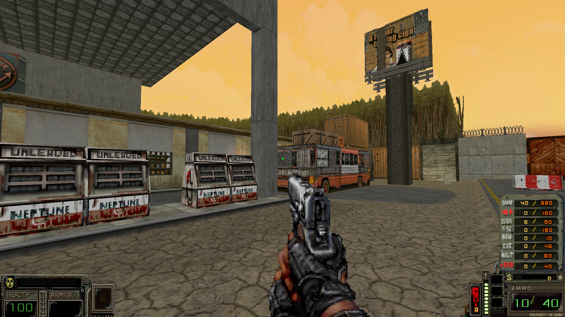
Meanwhile I couldn't believe how beautiful Ashes 2063 looked. The more abstract graphics help mask flaws evident in more detailed but less polished games:

HR2.png
 

Lyric Suite

Converting to Islam
Joined
Mar 23, 2006
Messages
58,293
Lack of detail doesn't mask anything. I've seen pixelated retro games that look like an incoherent mess that made me wish i could gouge my own eyes out.

New Vegas looks like shit because Obvlion/Fallout 3 looked like shit. The engine just became unsalvageable with Oblivion.
 

Ash

Arcane
Joined
Oct 16, 2015
Messages
7,055
F:NV doesn't fix these points.
it does, actually. fnv is way less bullet spongy than fo3 and has improvements like a DT system resulting in more deadly headshots, various ammo types and true iron sights. base FO3 is just bad, TTW improves the game a ton.
Not to mention that in FO3 you get a perk each level and way more skill points per level. New Vegas cutting the skill point and perk gain by half is already a massive improvement as it puts some pressure on your level up choices. To say that New Vegas doesn't improve the mechanics over FO3 is crazy.

The single most important things NV does for gameplay are perhaps:

1. Reducing damage resistance bonus the player receives in VATS from 75% (wtf) to a much more reasonable 20%.
2. Stimpacks heal over time on hardcore so you can't just buy 50 stimpacks and be a god of the wastes.
3. The new weapon mechanics, e.g accuracy penalty, ironsights, alt ammo types, DT, weapon modding etc. Makes the combat a bit more diverse and engaging.
4. No level scaling.
5. Skill point gain rate cut in half. The perk change I am less a fan of, I don't like limiting fun build choices. Would just take a different approach (tougher enemies & encounters, stricter economy, nerf any OP perks etc).
 

MakenBro

Novice
Joined
Apr 30, 2024
Messages
79
1. Reducing damage resistance bonus the player receives in VATS from 75% (wtf) to a much more reasonable 20%.
The actual player DR in VATS was 90% in Fallout 3, not 75%. A ridiculous crutch.
 

Sigourn

uooh afficionado
Joined
Feb 6, 2016
Messages
5,739
Lack of detail doesn't mask anything. I've seen pixelated retro games that look like an incoherent mess that made me wish i could gouge my own eyes out.
Of course I'm just talking about competently made games.
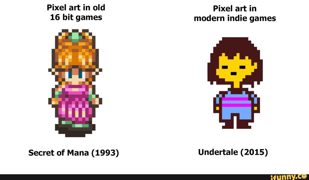
We all know "pixel retro games" look anything but the real deal.

999bb6c1d8fd926fedf95c4137af847faf18bdb385817b093cfb7f6a82ef3106_1.jpg
 

Ash

Arcane
Joined
Oct 16, 2015
Messages
7,055
You walked from that white house at the top to the Prospector saloon down the street. This has to be one of the most tryhard posts I've ever seen here, genuinely impressed
I'm with Lyric Suite on this one, and I say this as someone who has hundreds of hours in New Vegas.
After playing better looking games, I just can't go back. And I don't mean modern games. Duke Nukem 3D (a great looking game on its own, make no mistake) is the fucking Sistine Chapel next to New Vegas.

NV has this inconsistent low quality mesh, low quality textures, janky animations, complete lack of shadows in what is otherwise meant to be a "realistic" looking game. It's so jarring and ugly. I share his sentiment of the game making him sick in his stomach because I sort of felt like it when trying to replay the game recently. Locations are so sparse, but not in a "this is a 90s game so of course 3D environments will be rather empty" sense. Rather, in a "we rushed this bad boy out the door as soon as we could" kind of sparsity. Disgusting.

The only good graphics whore is a dead one!
 

NecroLord

Dumbfuck!
Dumbfuck
Joined
Sep 6, 2022
Messages
14,939
The major problem with FNV graphics is that it has absolutely terrible lighting during the day. I get it that they wanted it to show the "scorching desert sun" but it looks simply awful, Gamebryo simply can't give a good picture with this set-up. Vomit inducing yellow filter only makes it worse

To improve the picture, obviously, first thing is to remove the filter, and secondly, to reduce the overall lighting level in outdoor scenes (not the overall brightness, the lighting intensity in the game's engine)

This will improve the picture a lot
It's ugly as fuck.
Fallout 1 and 2 are straight better.
Proper cRPGs and had way better atmosphere precisely due to the graphics.
Just look at The Glow, New Reno, Necropolis...
Less is More, you just have to know how to use it.
 

Ash

Arcane
Joined
Oct 16, 2015
Messages
7,055
Game looks fine. Certainly it's not enough to render it "unplayable", that I'm afraid is graphics whoring.

There are also mods if it is THAT offensive.
 

Lyric Suite

Converting to Islam
Joined
Mar 23, 2006
Messages
58,293
You walked from that white house at the top to the Prospector saloon down the street. This has to be one of the most tryhard posts I've ever seen here, genuinely impressed
I'm with Lyric Suite on this one, and I say this as someone who has hundreds of hours in New Vegas.
After playing better looking games, I just can't go back. And I don't mean modern games. Duke Nukem 3D (a great looking game on its own, make no mistake) is the fucking Sistine Chapel next to New Vegas.

NV has this inconsistent low quality mesh, low quality textures, janky animations, complete lack of shadows in what is otherwise meant to be a "realistic" looking game. It's so jarring and ugly. I share his sentiment of the game making him sick in his stomach because I sort of felt like it when trying to replay the game recently. Locations are so sparse, but not in a "this is a 90s game so of course 3D environments will be rather empty" sense. Rather, in a "we rushed this bad boy out the door as soon as we could" kind of sparsity. Disgusting.

The only good graphics whore is a dead one!

Visuals are important. Believing otherwise was always a cope.

What DOESN'T matter is tech as such, although that was an aspect of gaming i feel was also important in its own right.

Gamers like Deus Ex or Thief didn't have the best graphics, but it would be false to say they were downright unpleasant. All the Bethesda games starting with Oblivion and including New Vegas of course all the way to Starfield are downright unpleasant.
 

Ash

Arcane
Joined
Oct 16, 2015
Messages
7,055
Graphics (well, art direction more than anything) are important, but NV while janky and ugly in some regards isn't anywhere near enough of a deterrent.

Deus Ex is more unpleasant. The vanilla weapon models and animations are downright disgusting, far more so than NV. But no one in their right mind would give much a shit when there is a fun game, interesting story, pleasant music, exciting exploration, etc etc to experience. Anyone that isn't an afflicted graphics whore.
 

As an Amazon Associate, rpgcodex.net earns from qualifying purchases.
Back
Top Bottom