Putting the 'role' back in role-playing games since 2002.
Donate to Codex
Good Old Games
  • Welcome to rpgcodex.net, a site dedicated to discussing computer based role-playing games in a free and open fashion. We're less strict than other forums, but please refer to the rules.

    "This message is awaiting moderator approval": All new users must pass through our moderation queue before they will be able to post normally. Until your account has "passed" your posts will only be visible to yourself (and moderators) until they are approved. Give us a week to get around to approving / deleting / ignoring your mundane opinion on crap before hassling us about it. Once you have passed the moderation period (think of it as a test), you will be able to post normally, just like all the other retards.

Vapourware Zodiac Legion - X-COM and dungeons

Unwanted

YanBG

Unwanted
Joined
Mar 10, 2016
Messages
175
The engine is GameMaker and it has it's own language but your code scheme should work! I tried the free version of TexturePacker but that's without trimming and i didn't think about the file with coordinates(afaik there is another free program with trimming) until another dev asked me once how i'd use a trimmed spritesheet(there are such open source graphics).

Btw you draw your animations in 2d with GraphicsGale? I render from models in Blender and i use an automated script(python) that creates the spritesheets directly in Blender. After i added more actions/animations the full set of frames for each prop goes over the target's maximum image size(2048x2048 for PC and 1024x1024 for mobile). Currently i fixed that by having different spritesheets for each angle(it's good also in case i go for more than 8) but there might be another increase in future and with the small armor parts there is huge unused space.

Ohwseja.jpg
 

Galdred

Studio Draconis
Patron
Developer
Joined
May 6, 2011
Messages
4,495
Location
Middle Empire
Steve gets a Kidney but I don't even get a tag.
Interesting, being a big fan of x-com, this sounds great.
I'm not sure where you are on your development but you might want to do another interview, except in english (if you plan an english release) and prepare it or cut the blanks / fails (like when you talk about descent and the interviewer clearly don't know what you're talking about.
You should make your promotional video like a movie if you're not very good with live (doesn't look like you are) and restart a scene when it's not good enough.

And you should probably cut / take down this one once you have a better interview, promotion is really important, i feel like your game deserves a far better advertisement.
I would have cut several pieces of this one indeed, but given that it was done by someone else, I had little control over it.
I was thinking about doing an edited Let's play or something like that, as interviewing relies too much on the interviewer knowing what he is talking about.
I am not good at live indeed (nor at recorded, but the latter can be remedied with enough time), so I will definitely focus on other formats.
Should I subtitle this one, or work on a new video instead?
 
Last edited:

Galdred

Studio Draconis
Patron
Developer
Joined
May 6, 2011
Messages
4,495
Location
Middle Empire
Steve gets a Kidney but I don't even get a tag.
Btw you draw your animations in 2d with GraphicsGale? I render from models in Blender and i use an automated script(python) that creates the spritesheets directly in Blender. After i added more actions/animations the full set of frames for each prop goes over the target's maximum image size(2048x2048 for PC and 1024x1024 for mobile). Currently i fixed that by having different spritesheets for each angle(it's good also in case i go for more than 8) but there might be another increase in future and with the small armor parts there is huge unused space.
Yes, the artists that worked on the project used Graphics Gale for the animations.
TP is a great way to save texture space indeed.
But you need a lot of RAM to make it work at an acceptable speed. 12GB is fine but 4GB is definitely not enough, so I cannot use it on my laptop.
 

Galdred

Studio Draconis
Patron
Developer
Joined
May 6, 2011
Messages
4,495
Location
Middle Empire
Steve gets a Kidney but I don't even get a tag.
I am working on the save/load system now (I should not have pushed it back so far in the development timeline...), in order to start working on the not-geoscape and management portions of the game.
The hard part is going through every object and determining whether it should be saved as a separate entity, with its parent, or not at all and regenerated from data files on load.


For the stronghold facilities construction, I am considering having an UI similar to Disciples 2:


yTSMpLG.png

xehhwf0.png

Please ignore the place holder text and the fact that the barracks and alchemy lab should certainly not be on the same tab.


ie, having "tabs" for each functions (crafting facilities, training facilities, research facilities, defenses...), with several building trees:
I won't have the same "base layout" as in XCOM, because the placement of the facilities won't matter compared to the stronghold layout itself.
Actually, I would love to have a customizable defensive layout, like in Lords of the Realm, but it would be tricky to do UI wise, as that would almost come down to making an user friendly version of the level editor.


xlh2WGE.jpg
 
Last edited:

Galdred

Studio Draconis
Patron
Developer
Joined
May 6, 2011
Messages
4,495
Location
Middle Empire
Steve gets a Kidney but I don't even get a tag.
The first spoiler doesn't load for me, a message redirects to old-games.com
Sorry, fixed it.

Btw, I will have the geoscape map work a bit like the one in the game of Thrones board game:

13EW3xD.jpg
ie a background image with actuale gameplay informations as sprites dynamically displayed on top of it (borders, constructions, and resources).
 
Unwanted

YanBG

Unwanted
Joined
Mar 10, 2016
Messages
175
Nice map, for the Disciples 2 UI, i can't say i like it but maybe yours will look better.
 
Joined
Oct 19, 2010
Messages
3,524
Galdred excellent work going on here. The art is great aesthetically but a huge advantage to playability and accessibility as well. I think you'll grab a lot of passerby attention with the screenshots alone.

I haven't heard any of the music yet, do you have some of that to show?
 

Galdred

Studio Draconis
Patron
Developer
Joined
May 6, 2011
Messages
4,495
Location
Middle Empire
Steve gets a Kidney but I don't even get a tag.
Galdred excellent work going on here. The art is great aesthetically but a huge advantage to playability and accessibility as well. I think you'll grab a lot of passerby attention with the screenshots alone.

I haven't heard any of the music yet, do you have some of that to show?
The in game music is a bit hard to showcase, as it is "dynamic" (that is, the relative volume of the tracks depend on game parameters, like characters and enemies remaining). Also, we currently have only 2 tracks.
The game candidate trailer music is here:


Citizen

Guest
Galdred excellent work going on here. The art is great aesthetically but a huge advantage to playability and accessibility as well. I think you'll grab a lot of passerby attention with the screenshots alone.

I haven't heard any of the music yet, do you have some of that to show?
The in game music is a bit hard to showcase, as it is "dynamic" (that is, the relative volume of the tracks depend on game parameters, like characters and enemies remaining). Also, we currently have only 2 tracks.
The game candidate trailer music is here:


I'm having a chaos gate flashback now.
 

Darth Roxor

Rattus Iratus
Staff Member
Joined
May 29, 2008
Messages
1,879,028
Location
Djibouti
Galdred excellent work going on here. The art is great aesthetically but a huge advantage to playability and accessibility as well. I think you'll grab a lot of passerby attention with the screenshots alone.

I haven't heard any of the music yet, do you have some of that to show?
The in game music is a bit hard to showcase, as it is "dynamic" (that is, the relative volume of the tracks depend on game parameters, like characters and enemies remaining). Also, we currently have only 2 tracks.
The game candidate trailer music is here:


I'm having a chaos gate flashback now.


But will it have the same corny death quotes?
 

Galdred

Studio Draconis
Patron
Developer
Joined
May 6, 2011
Messages
4,495
Location
Middle Empire
Steve gets a Kidney but I don't even get a tag.
Galdred excellent work going on here. The art is great aesthetically but a huge advantage to playability and accessibility as well. I think you'll grab a lot of passerby attention with the screenshots alone.

I haven't heard any of the music yet, do you have some of that to show?
The in game music is a bit hard to showcase, as it is "dynamic" (that is, the relative volume of the tracks depend on game parameters, like characters and enemies remaining). Also, we currently have only 2 tracks.
The game candidate trailer music is here:


I'm having a chaos gate flashback now.

It is as high a praise as I could think of. Chaos Gate is definitely the game whose music left me the strongest impression. Thank you!

But will it have the same corny death quotes?
I wish! But finding the line between cool and cringy will require a lot of iterations.
 
Last edited:

Galdred

Studio Draconis
Patron
Developer
Joined
May 6, 2011
Messages
4,495
Location
Middle Empire
Steve gets a Kidney but I don't even get a tag.
I showcased the game at the Intel Buzz Workshop last Saturday, and managed to get a new batch of players confused about the UI.
I think the game needs to make a better job of representing which action will be performed on a click, who the active character is, and who are the opponents.
So I was looking at how newer games use contextual mouse pointer, and found out most actually don't:
53473A6B938FBAFB16878F4C431589377FDD7D2F

upload_2018-10-2_1-46-23.png
Several display the action/spell icon under the arrow pointer.
Which modern tactical game or RPG with party use a contextual mouse pointer (I am mostly interested in seeing whether they are usually animated or not, and how the animation is done)?
I know it is very hard to notice such detaiks, but which convention do you usually prefer?
I guess the icon under the cursor is more flexible, as it can be specific to each spell.
 
Unwanted

YanBG

Unwanted
Joined
Mar 10, 2016
Messages
175
Can't give you any UI feedback but i was thinking are you going to find a publisher?
 
Joined
Jul 4, 2014
Messages
1,563
Bad way to do contextual mouse cursors was what some old adventure games did with their big eye and hand and whatever symbols that obscured the actual location of the cursor. So keep the arrow (or crosshair or whatever) always visible.
Animations are noise.

Color changes for arrow and or symbols under it should be good.
 

ushas

Savant
Joined
Jan 5, 2015
Messages
550
Will try to pay attention when playing. Thinking of it in general, yeah, changing the pointer to indicate action without loosing its pointing function might be effective enough. Depends what type and how nuanced actions are. Eg. if something simple like a sword pointer for melee and an arrow (eventually with a bow) for ranged attacks. For a spell, perhaps normal arrowhead with a mini-icon of said spell underneath? Just keeping it simple.

Have you looked at ToEE? Though my memory is very haze.

Btw. cool updates!
 

Galdred

Studio Draconis
Patron
Developer
Joined
May 6, 2011
Messages
4,495
Location
Middle Empire
Steve gets a Kidney but I don't even get a tag.
Can't give you any UI feedback but i was thinking are you going to find a publisher?
I am thinking about it, but I really want to control the brand and IP+I don't really need that much extra money.
Bad way to do contextual mouse cursors was what some old adventure games did with their big eye and hand and whatever symbols that obscured the actual location of the cursor. So keep the arrow (or crosshair or whatever) always visible.
Animations are noise.

Color changes for arrow and or symbols under it should be good.
That is a good point, but what if I use pointers that are shaped like an arrow (sword, literal arrow, wand)?

Will try to pay attention when playing. Thinking of it in general, yeah, changing the pointer to indicate action without loosing its pointing function might be effective enough. Depends what type and how nuanced actions are. Eg. if something simple like a sword pointer for melee and an arrow (eventually with a bow) for ranged attacks. For a spell, perhaps normal arrowhead with a mini-icon of said spell underneath? Just keeping it simple.

Have you looked at ToEE? Though my memory is very haze.

Btw. cool updates!

I played ToEE a lot (actually, with Knights of the Chalice, it was one of the game that prompted me to work on my own).
 

ushas

Savant
Joined
Jan 5, 2015
Messages
550
That's great! Just that thought there were some changing pointers. Damn, am yet to replay with all the new mods.
 

baud

Arcane
Patron
Joined
Dec 11, 2016
Messages
3,992
Location
Septentrion
RPG Wokedex Strap Yourselves In Steve gets a Kidney but I don't even get a tag. Pathfinder: Wrath I helped put crap in Monomyth
I showcased the game at the Intel Buzz Workshop last Saturday, and managed to get a new batch of players confused about the UI.
I think the game needs to make a better job of representing which action will be performed on a click, who the active character is, and who are the opponents.
So I was looking at how newer games use contextual mouse pointer, and found out most actually don't:
53473A6B938FBAFB16878F4C431589377FDD7D2F
Several display the action/spell icon under the arrow pointer.
Which modern tactical game or RPG with party use a contextual mouse pointer (I am mostly interested in seeing whether they are usually animated or not, and how the animation is done)?
I know it is very hard to notice such detaiks, but which convention do you usually prefer?
I guess the icon under the cursor is more flexible, as it can be specific to each spell.

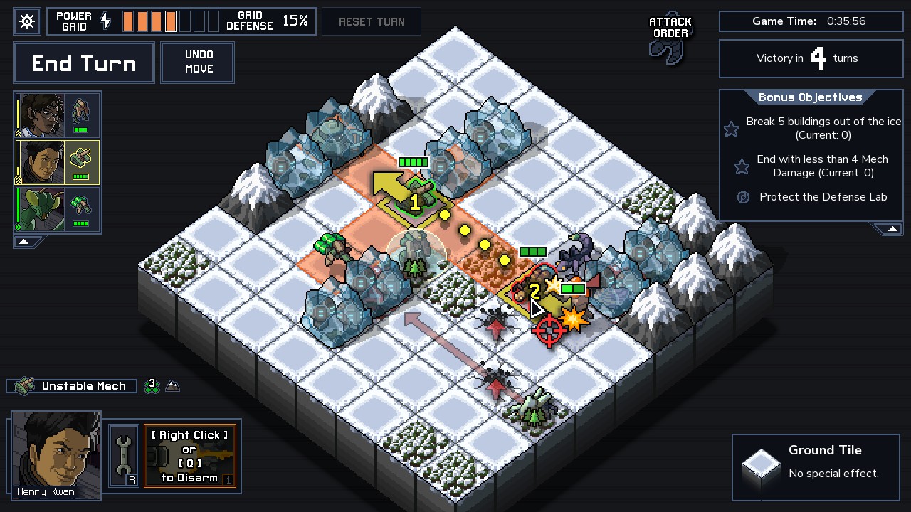
Apparently the problem with the UI is that the player don't understand what a click will do. Perhaps you could like into the breach or NuXCOM, with only one thing possible at each time: only click to move by default, then click on an attack/spell button at the bottom of the screen and then select target, instead of a contextual action. Of course it increase the number of clicks required to do anything, but if it helps the players understand the UI, it might be a fair trade.
 

As an Amazon Associate, rpgcodex.net earns from qualifying purchases.
Back
Top Bottom