luj1
You're all shills

HoMM 5 is probably the worst Heros ever

Well, if you like 4 "quite a lot" then bad art style and general ugliness really shouldn't be an insurmountable obstacle.I see we have a lot of connoisseurs here, so maybe you can help me with my quandary: how can I make myself play HoMM5? I adored 1-3, and I liked 4 quite a lot (excellent overworld map and music, engaging campaigns, not a big fan of combat though). But every time I try to play 5 it just smacks me in the head with ugly UI, ugly fonts, ugly graphics and stupid "full 3D".
How did you manage to overcome this? Genuine question.
Thanks, it seems that I'll have to try again one of these days.Well, if you like 4 "quite a lot" then bad art style and general ugliness really shouldn't be an insurmountable obstacle.I see we have a lot of connoisseurs here, so maybe you can help me with my quandary: how can I make myself play HoMM5? I adored 1-3, and I liked 4 quite a lot (excellent overworld map and music, engaging campaigns, not a big fan of combat though). But every time I try to play 5 it just smacks me in the head with ugly UI, ugly fonts, ugly graphics and stupid "full 3D".
How did you manage to overcome this? Genuine question.
But just focus on mechanics, that's where 5 shines the most. It has thinsg that are not only exceptional in the series (retaining superior 7 tier system, but at the same time having easily the least amount of creatures that are too bad and that no one will ever recruit), but even among strategy games in general (probably the best branching unit upgrades system that I've seen). Factions have most mechanical identity and learning to play them is fun. Not everything is rosy and there are some missed shots (I hate the town level gimmick), but it's a game worth giving a go for sure.
For, me the biggest roadblock was the content. I don't really do campaigns, but the maps felt small, cramped and often not that fun to play. 5 has a very active community, so I'm sure things improved now on this front if you're willing to have a look.
It's also good fun in multi, if you find the people for it and avoid the cheesy stuff (as per revered homm tradition).
Ah, you will be our newest Death Knight, then?Also I'm willing to die on the hill that HoM&M4 art style is perfectly fine.
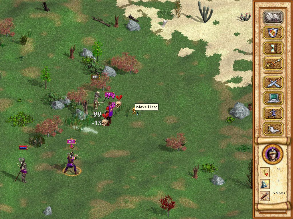
Homm4 has this uncanny vaporwave aesthetics which is not bad at all (I believe those are a pre-rendered 3d models made 2d). But seeing it for the first time was a bit underwhelming.In which retarded universe H4 is equally ugly to 5? Ah yes, in this retarded universe.

I suggest to take out your eyes with a spoon.
HoMM4 has very pleasant interface aesthetics. The map is unfortunately somewhat ugly, which is odd because AoW has a similar perspective but is gorgeous. The cities especially are bad, including the city screens.In which retarded universe H4 is equally ugly to 5? Ah yes, in this retarded universe.

I suggest to take out your eyes with a spoon.
Don't be ridiculous, of course it's not.Yeah H4 is equally ugly with heroes of warcraft


No one said they're "equally" ugly. Mostly because they look very different and other than the poor quality cartoon/comic-book like portraits for units and heroes they both have it's difficult to make a direct comparison. That being said, they are similar in the way they they are both (steep af) decline from some of the best looking games in history in H2 and 3.In which retarded universe H4 is equally ugly to 5? Ah yes, in this retarded universe.

Well, if you like 4 "quite a lot" then bad art style and general ugliness really shouldn't be an insurmountable obstacle.I see we have a lot of connoisseurs here, so maybe you can help me with my quandary: how can I make myself play HoMM5? I adored 1-3, and I liked 4 quite a lot (excellent overworld map and music, engaging campaigns, not a big fan of combat though). But every time I try to play 5 it just smacks me in the head with ugly UI, ugly fonts, ugly graphics and stupid "full 3D".
How did you manage to overcome this? Genuine question.

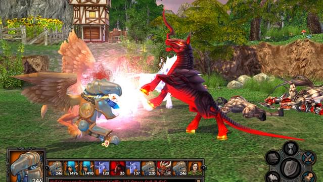
Not sure what's worse - the hell horse or the other... creature (is it a gryphon?!)Well, if you like 4 "quite a lot" then bad art style and general ugliness really shouldn't be an insurmountable obstacle.I see we have a lot of connoisseurs here, so maybe you can help me with my quandary: how can I make myself play HoMM5? I adored 1-3, and I liked 4 quite a lot (excellent overworld map and music, engaging campaigns, not a big fan of combat though). But every time I try to play 5 it just smacks me in the head with ugly UI, ugly fonts, ugly graphics and stupid "full 3D".
How did you manage to overcome this? Genuine question.
Heroes 4 is infinitely better looking than 5

lmao

the hell horse
Yeah, the whole debate on Play-Doh Heroes vs WoW Heroes aestethics is a bit surreal. Each one is ugly in its own very special way.No one said they're "equally" ugly. Mostly because they look very different and other than the poor quality cartoon/comic-book like portraits for units and heroes they both have it's difficult to make a direct comparison. That being said, they are similar in the way they they are both (steep af) decline from some of the best looking games in history in H2 and 3.In which retarded universe H4 is equally ugly to 5? Ah yes, in this retarded universe.


