All artstyle joking aside this is all looking pretty damn good, nice to see things are coming together.
Whalenought_Joe I haven't played the alpha but some quick feedback from this video:
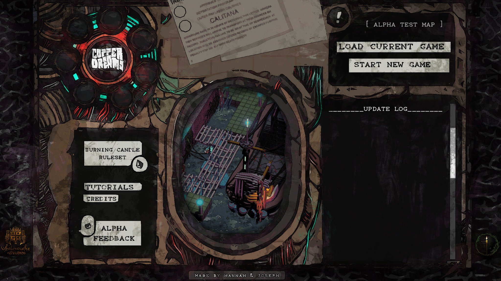
1. I'd revisit the font selection. IMO, most of the font used throughout the game is too skinny. At first glance there is room to thicken the font slightly IMO. I think this is especially the case at the bottom with the greyed out font. You have some gray boxes below, and and a black background. The skinny font tends to kinda recede in the background. Again, just thickening it up or choosing a slightly less skinny font would help IMO. But I like the overall look of it.
2. Speaking of fonts, I feel the title screen font is a bit unfinished. I know you have other higher priorities, but wanted to give my thoughts anyhow. Overall, I feel like I know where you're going with it, but it just is missing some things. To me it almost feels like it wants to be a gritty take on comic book font. It reminds me of a combination of a few different sources. However, I feel like it's a bit too rounded off, and needs some grit textures to match some of the overall UI of the game. I'm posting some fonts that your game reminds me of. I think Cyberpunk font seems to evoke some of the same stylized points ur trying to hit with yours.
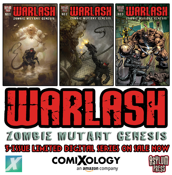
They're very different, but I like the font, and I wanted to post it as a cool example of stylized fonts for the genre. I think the Warlash title font is a good example of what I mean by adding some grimy textures here and there. Obviously, you dno't wan tto over do it, but a bit would help to marry it with the cool textured UI you have going on. You do have a bit, but I think it can be taken a bit further. Also, I think squaring off the font juuuust a bit might help.
Sorry, I know this talking of fonts is super ticky tacky, but it's some of the stuff I'm noticing right off the bat.
3. Something about the graphics is giving me some depth perception problems. In between buildings it's sometimes hard to discern if I'm on a different floor and where structures are at. A good example for me is at 1:08 of the above video. Maybe, it's different in-game, so I might take a look at it tomorrow. But form the clip I'm having a hard time understanding if I'm on the second floor looking down or if I'm on the same level as the enemies, or what. Maybe playing with shadows darkness might help a bit? I'll try to play a bit tomorrow and see if it improves in-game.
EDIT:
4. I also noticed that there seem to be only two forms of feedback when guards notice you. That's auditory and the upper left hand radar screen. I don't think it's enough tbh. Some ppl like to play with other outside game music and might miss the auditory cue. Also, I think just improving the visual cues would help. Maybe since the upper left hand is like a radar screen, make it ping (visually) when a guard notices you? I think that'd be helpful as a further cue to let the player know. There might be other ways, but I just wanted to point out it seems to be a bit lacking.
EDIT2: Oh wait, there's a ! or ? above a guards head? I dunno...it seems to be applied real inconsistently. Also increase the size of the !/?. Should be like 3 times bigger IMO. Depending on how it all works with multiple enemies. My eyesight sucks and right now Im struggling to tell if it's a ! or a ? above his head.


