Putting the 'role' back in role-playing games since 2002.
Donate to Codex
Good Old Games
  • Welcome to rpgcodex.net, a site dedicated to discussing computer based role-playing games in a free and open fashion. We're less strict than other forums, but please refer to the rules.

    "This message is awaiting moderator approval": All new users must pass through our moderation queue before they will be able to post normally. Until your account has "passed" your posts will only be visible to yourself (and moderators) until they are approved. Give us a week to get around to approving / deleting / ignoring your mundane opinion on crap before hassling us about it. Once you have passed the moderation period (think of it as a test), you will be able to post normally, just like all the other retards.

Game News Obsidian's next game is Tyranny, an isometric RPG set in a fantasy world where evil won

MrE

Literate
Joined
Jan 21, 2016
Messages
34

Lady_Error

█▓▒░ ░▒▓█
Patron
Joined
Oct 14, 2012
Messages
1,879,250
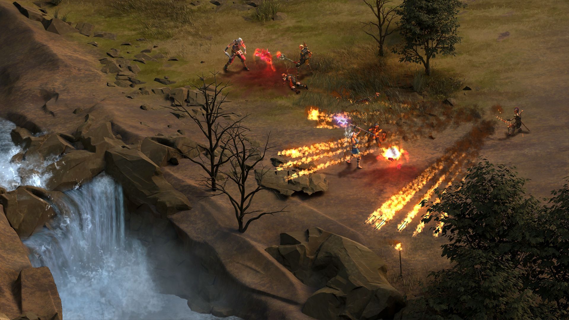
Could it be that terrain will be in 3D this time? I mean it does look ugly enough.

Not sure if trolling.
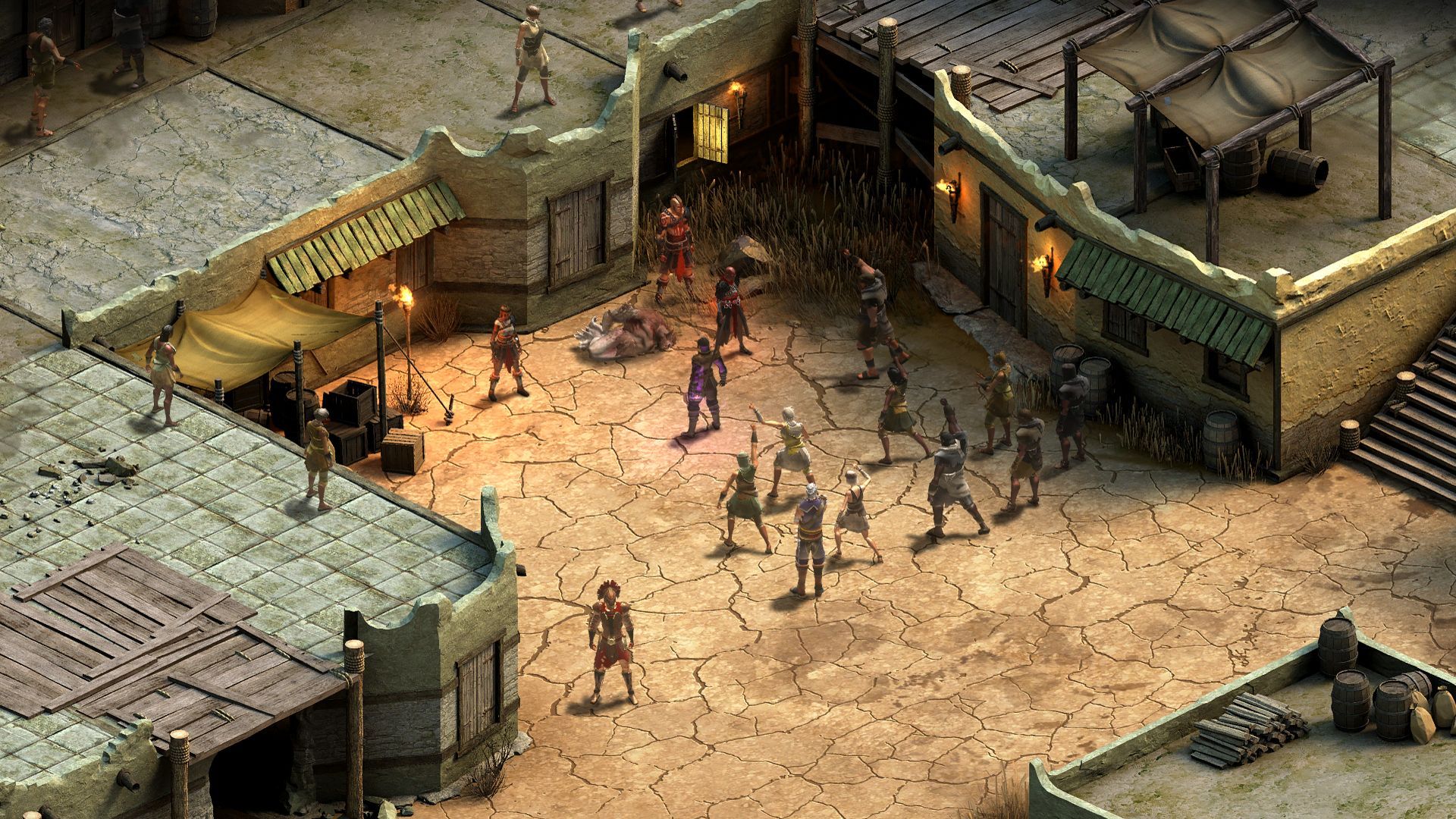
Not sure if blind. Here, refresh your memory: http://polycount.com/discussion/166800/pillars-of-eternity-the-white-march-art-dump

So that's ugly in your book?

14540.jpg
 
Self-Ejected

Excidium II

Self-Ejected
Joined
Jun 21, 2015
Messages
1,866,227
Location
Third World
Yes, considering what their tech allows and what they are capable of. I remember seeing screenshots of PoE maps before the handpaint step that looked better than that.

Though that one isn't really that bad, the biggest offenders are the wilderness areas.
 
Unwanted

Irenaeus III

Unwanted
Shitposter
Joined
Jan 10, 2016
Messages
990
Wow Poe looks so much better. But it's ok, this is a lower budget thing and probably has a lot more areas, so it makes sense each area is less developed.
 

MrE

Literate
Joined
Jan 21, 2016
Messages
34
Could it be that terrain will be in 3D this time? I mean it does look ugly enough.

Not sure if trolling.
Not sure if blind. Here, refresh your memory: http://polycount.com/discussion/166800/pillars-of-eternity-the-white-march-art-dump

So that's ugly in your book?

14540.jpg

Not ugly for an alpha (pre-alpha?), but I was referring to this:

14542.jpg


It's the worst screenshot they've shown (apart from those purple (pink?) crystals people complain about but they're not THIS bad) as opposed to the one you quoted, which is by far the most promising. Gotta admit, the land looks great where flat. But the two screens with the crystals, the rocks look weird there too. I don't know, I'm not a geologist, there are some weird natural structures in the world but I don't think you can explain any of the showcased examples with either wind or water. And I don't think they're going for a magical explanation either. Probably a stylistic choice, which I just don't happen to like very much.
 

Lady_Error

█▓▒░ ░▒▓█
Patron
Joined
Oct 14, 2012
Messages
1,879,250
Sorry, I don't get it. AoD and Underrail both have graphics that are worse than this. I understand that the screenshots are all we have right now, but there are many things that are more important than graphics.

And even that fireball screenshot looks fine to me.
 

Kron

Arcane
Joined
Apr 18, 2009
Messages
642
Location
The dark throne in Algalord
See, this is the problem, those are not rocks.
They are actually gigantic pieces of chocolate. Like the ones they sprinkle on ice cream, but colossal. Cos you know, Tim Cain has been working on this game for a year.


GET IT???


Edit: Seriously though, the artists that did this should actually look at some rocks and rocky topography and see what they really look like.
 
Last edited:
Self-Ejected

Excidium II

Self-Ejected
Joined
Jun 21, 2015
Messages
1,866,227
Location
Third World
Are you really this fucking retarded?

Do you actually have something to say, moron? Or is shitposting all you've got?
I am never sure if I have to respond seriously to this much cretinism. You know the salary of one senior artist at Obsidian could fund the development of both of those games?

When criticizing something you have to look at the circumstances, AoD and Underrail were self-funded and made by amateurs, on largely inferior tech. This is a publisher-funded game made by experienced full-time profissionals, using specialized tech for pre-rendered graphics where there's no technical limitation besides how long it will take to render on their beast computers. They can do better, and they sure did with PoE.
 

Lady_Error

█▓▒░ ░▒▓█
Patron
Joined
Oct 14, 2012
Messages
1,879,250
Are you really this fucking retarded?

Do you actually have something to say, moron? Or is shitposting all you've got?
I am never sure if I have to respond seriously to this much cretinism. You know the salary of one senior artist at Obsidian could fund the development of both of those games?

When criticizing something you have to look at the circumstances, AoD and Underrail where made by amateurs, on largely inferior tech.

That wasn't so difficult was it? The point is that despite those inferior graphics both games are loved here. And this is a lower budget game as well. Your graphics whoring is just tiresome.
 
Self-Ejected

Excidium II

Self-Ejected
Joined
Jun 21, 2015
Messages
1,866,227
Location
Third World
It's irrelevant that those games are loved. I am not discussing whether the game will be good but the quality of the grafics I see before my eyes. For the record both AoD and Underrail have quite good grafics for their circumstances, Underrail looks better in static pictures because it's 2D but AoD has better animations.

And this is a lower budget game as well.
:lol:

Your graphics whoring is just tiresome.
Fuck off, you're dumb as hell.
 

DeepOcean

Arcane
Joined
Nov 8, 2012
Messages
7,404
Sorry, I don't get it. AoD and Underrail both have graphics that are worse than this. I understand that the screenshots are all we have right now, but there are many things that are more important than graphics.

And even that fireball screenshot looks fine to me.
We came from, hey, PoE art is pretty good to "Why Obsidian decided to make sculptures out of shit all of sudden? Maybe they are going for a stylized look but right now the waterfall and stone giant screenshots in particular could easily fit on any shovelware F2P Moba game out there.
 

Tigranes

Arcane
Joined
Jan 8, 2009
Messages
10,350
It seemed like they'd reveal more info next week, so maybe we'll hear something concrete.

Screens definitely look worse than POE, like a mishmash of POE and cartoonshit, and maybe it is because it is lower budget, maybe it's because it's meant to have much larger areas, more areas, or whatever. What's weird is there's a lot of variation - Lady Error's screen looks great to me, Mr E's one looks like Titan Quest or someshit.
 
Self-Ejected

Excidium II

Self-Ejected
Joined
Jun 21, 2015
Messages
1,866,227
Location
Third World
maybe it is because it is lower budget
Did I miss some info? Because people keep repeating this. And people seem to be ignoring the fact this benefits from PoE's CRPG technology/process, it's p. much smooth sailings while PoE was built from zero under much harder constraints due to the nature of crowdfunding.
 

MrE

Literate
Joined
Jan 21, 2016
Messages
34
See, this is the problem, those are not rocks.
They are actually gigantic pieces of chocolate. Like the ones they sprinkle on ice cream, but colossal. Cos you know, Tim Cain has been working on this game for a year.


GET IT???


Edit: Seriously though, the artists that did this should actually look at some rocks and rocky topography and see what they really look like.

Yep, that looks about right.


Nah, I think Kron got it right, chocolate, not concrete (really, not porous enough to be concrete if you take a closer look).

Did I miss some info? Because people keep repeating this. And people seem to be ignoring the fact this benefits from PoE's CRPG technology/process, it's p. much smooth sailings while PoE was built from zero under much harder constraints due to the nature of crowdfunding.

Yeah, I don't know, I've read the whole thread and checked their website too, no idea where the idea is coming from. Which means you can guess where it's coming from.

Ok, in all honesty, we have a few (7) screenshots of various quality and we can get maybe 3 shades of grey from them - shit, meh and ok. Until they show more/better stuff, there's no doubt they began announcing with the wrong stuff or just totally got Eric's proposal concerning quality over quantity backwards. Yes, the discussion is there but probably not favourable enough for Obsidian's liking. I remain hopeful, there's still time to change a lot (like the deadline date for example).
 

Jaesun

Fabulous Ex-Moderator
Patron
Joined
May 14, 2004
Messages
37,430
Location
Seattle, WA USA
MCA Dead State Divinity: Original Sin Project: Eternity Torment: Tides of Numenera Shadorwun: Hong Kong Divinity: Original Sin 2 BattleTech
Thank gawd people are discussing the single most important aspect of a crpg, graphics.
 

As an Amazon Associate, rpgcodex.net earns from qualifying purchases.
Back
Top Bottom