Putting the 'role' back in role-playing games since 2002.
Donate to Codex
Good Old Games
  • Welcome to rpgcodex.net, a site dedicated to discussing computer based role-playing games in a free and open fashion. We're less strict than other forums, but please refer to the rules.

    "This message is awaiting moderator approval": All new users must pass through our moderation queue before they will be able to post normally. Until your account has "passed" your posts will only be visible to yourself (and moderators) until they are approved. Give us a week to get around to approving / deleting / ignoring your mundane opinion on crap before hassling us about it. Once you have passed the moderation period (think of it as a test), you will be able to post normally, just like all the other retards.

Torment Torment: Tides of Numenera Thread

passerby

Arcane
Joined
Nov 16, 2016
Messages
2,788
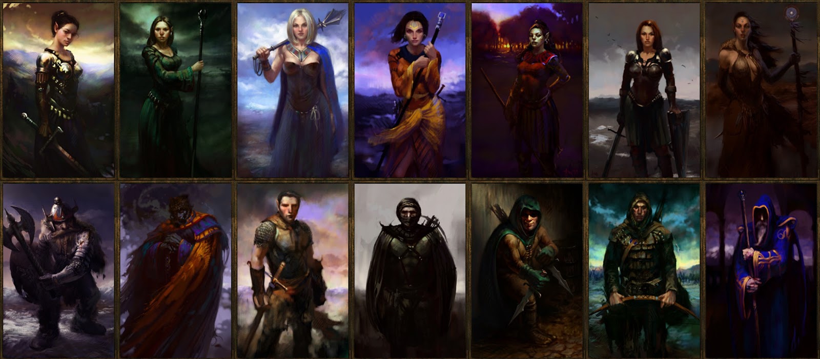
Numerera companions:

torment-companions-630x420.jpg

Perfectly realistic, detailed and sharp faces vs blurry amateurish everything around them.

Low effort paintovers, over photos of real people, by C grade artist detected. Uncanny valley is stron in these ones.

Lol at the bottm left one... This shit in, an according to Fargo, 8M$ game ?
 
Joined
Feb 11, 2007
Messages
2,952
Well I only got trough the tutorial / character creation part of the game so far and the game has already managed to disappoint me somehow. Was it really necessary to spell out the plot like that right at the start? Kind of feels like if you woke up in Mortuary in PS:T and then Morte tells you exactly who you are, who is hunting you and what you need to do. Is there some big plot twist in the future or is that all? Also, character system they went with seems really awkward for a crpg. Unlike this bad boy:


Seriously, this is the first time I've seen this image and it is beautiful, they really tried to faithfully implement gurps in a crpg. Ah, what could have been...
 

hexer

Guest
Latest Positive Steam reviews are simply WTF...

"Torment is one of the greatest interactive books ever."

"One of a kind. Amazing. Will support all future titles blindly. "

"yes sire "

"Am I having fun? For Torment, that answer is absolutely "Yes"."

"I can't believe anyone would not recommend this game."

"This game has a lot of flaws" (yes, that's how the Positive review starts)
 
Self-Ejected

Lurker King

Self-Ejected
The Real Fanboy
Joined
Jan 21, 2015
Messages
1,865,419
Despite the delay caused by WL2, it seems that Fargo wasn't interested in delaying Torment enough to give the production the time it needs. This seems to fit into Fargo's philosophy that you can just do everything in pre-production and pop it into the game on a rushed production schedule (see his comments during WL2's KS). Also worth noting that as soon as Torment started production, resources were being moved to Bard's Tale IV pre-production.

That sounds about right. The problem is not just that they are rushing games, but that the only way to release these games that fast is by checklist design. I posted this about Obsidian in another thread:

taylorism_scientific_management-696x359.png

Taylorism design. Obsidians at work. "Everyone has a function. They are very efficient!"

What allows them to make complex cRPGs really fast is the same checklist design that makes their games suck in the first place. They could be called “Taylorism Entertainment”, because their games are created on assembly lines. The producer, artists, programmers, level designers, writers, which working furiously in their particular roles to ensure a bland and massive disjointed game. That’s why you shouldn’t lose any sleep expecting any progress in the encounter design, because the worker who did this job, just made what he was told, i.e., place a bunch of enemies on this area to fill the map. The real decline is no the absence of cRPGs of yore due to lack of funding, but the belief that a superficial checklist design made by people with such disdain for traditional cRPGs can be a substitute for the real article.

The same thing can be said about InXile. You can't make a series of games taking your time to think about the mechanics, revising it properly, etc. but you can ignore these things in a checklist design approach, because the only thing you need is a shell of a game with some features in it, and the suckers will buy it. People defending these games are deluded and should be ashamed of themselves.
 
Last edited:
Joined
Dec 12, 2013
Messages
4,334
WTF were they thinking?

I know what they were thinking. Companions being too weird would be too much when the world iweird too. Players need some familiar hooks, otherwise they would not connect to the game.
This is not a speculation. In one of the streams in early 2016 with Fargo and Ziets it was stated that they made the game starting areas so that the player at first encounters strange things but then they immediately give him things familiar to him, so the player has an easier time getting into the game. That's why one of the first locations looks like a fantasy market.
 
Last edited:
Joined
Dec 12, 2013
Messages
4,334
Numerera companions:

torment-companions-630x420.jpg

Perfectly realistic, detailed and sharp faces vs blurry amateurish everything around them.

Low effort paintovers, over photos of real people, by C grade artist detected. Uncanny valley is stron in these ones.

Lol at the bottm left one... This shit in, an according to Fargo, 8M$ game ?

For 40 usd on Icy indiegogo campaign I got a paintover portrait in the game. Apart from a fake looking beard the portrait looks a grade better than most of those...
 

Lady_Error

█▓▒░ ░▒▓█
Patron
Joined
Oct 14, 2012
Messages
1,879,250
I think only the red woman (Calli- Carri-whatever) and the blonde guy (Erritis) are badly done, the rest looks okay. But that's just regarding the optics.
 

Malpercio

Arcane
Joined
Dec 8, 2011
Messages
1,534
CNIxSv8.jpg

Can't seem to summon projections in the Labyrinth, game freezes, anyone experience this? Can't find anything online.

I managed alone so far by going stealth, but it will be a pain if there are more serious battle again.
 
Self-Ejected

Lurker King

Self-Ejected
The Real Fanboy
Joined
Jan 21, 2015
Messages
1,865,419
I know what they were thinking. Companions being too weird would be too much when the world iweird too. Players need some familiar hooks, otherwise they would not connect to the game.

The problem is not being weird, the problem is being uninteresting. Let's consider PS:T again. The companions, the setting, the first location are all weird as fuck and nobody complained about then. Being weird has nothing to do with it. If anything, the weird companions in ToN are bland and boring.
 

Prime Junta

Guest
I think only the red woman (Calli- Carri-whatever) and the blonde guy (Erritis) are badly done, the rest looks okay. But that's just regarding the optics.

Telling that one of the game's few fans here can't remember her name.

Dullistege. Sorry, Callistege.

Those are pretty bad portraits. Just not quite as bad as some they used in the beta. All of them except Matkina's and Tybir's look like somebody 'shopped a photo of a face into another photo with weird hair, added colour and some glowy stuff, then pulled down the shadows to mask the seams. Aligern's face isn't even properly aligned with his head, the head is turned a little to his left, bu tthe face looks straight out of the screen. (And Erritis' hair, WTF men?)

I'm not even an artist but I'm pretty sure I could do about as well. Possibly better if I spent max Effort.

Matkina looks painted. Kinda badly painted, but still, painted. I almost like it.

Tybir is the only somewhat competent one of the bunch. Still a likely overpaint, but it doesn't look obviously composited.
 

Chris Avelltwo

Scholar
Joined
Mar 3, 2017
Messages
678
Now compare those portraits to this:

082443.jpg
They are generic people. :M

Agreed. The T:ToN portraits aren't great, but at least you can tell them apart at a glance. These on the other hand, you would have a very hard time remembering their names. They all look like clones of the same person - except the one in the bottom left corner who looks like Mark Wahlberg.

Being an expert at making a bowl of oatmeal doesn't mean much because the end product is still going to be bland and boring no matter what you do. If nothing else, at least the T:ToN portraits are colorful and distinct.
 

Sigourn

uooh afficionado
Joined
Feb 6, 2016
Messages
5,734
The biggest crap about Torment's portraits is that there aren't any, yet the writers thought it was important for us to know in detail about certain NPC's distinctive appearances. Why? For what purpose?
 

Gunnar

Arbiter
Joined
Jul 10, 2016
Messages
819
I just finished the Sagus Cliffs area. So far, I can say that the companions are dull as dishwater with almost no banter or comments, the sprites and portraits look like complete ass and there are some writing moments that are WTF bad (bells if bells could rot, emotions if emotions could smell). I want to know who is responsible for what because whoever wrote that and whatever editor left that in needs a slap upside the head. In fact I demand that be changed in a patch immediately. The writing in general feels like a group of creative people got together and just told a bunch of unrelated stories that were crudely stitched together. Art was fine. Quests and combat were ok. I liked the concept of effort applying to skill checks and sleeping advancing some quests. All in all, I enjoyed it more than the boredom simulator that is PoE, looking forward to the Bloom area.
 

cvv

Arcane
Patron
Joined
Mar 30, 2013
Messages
18,955
Location
Kingdom of Bohemia
Enjoy the Revolution! Another revolution around the sun that is.
Aight, about 10 hours in, time for sitrep.

I like the game. Systems are solid, writing is very good, combat is mostly fun (tho inXile MUST add a "combat speed" option). C&C, reactivity and the various ways you can solve quests is great even for inXile (W2 was excellent in this). So that's all good.

As for bad - my biggest problem is I don't feel as mesmerized as when I played the original Torment for the first time. Maybe because the game is not as brilliant, or my game preferences shifted or I'm simply older and more jaded. Probably all above. Also text is mostly good but sometimes it tries to be lofty and poetic and mysterious but comes across as clumsy, artsy fartsy and pretentious. This is probably the perfect example:

"Then, you feel it: a hole inside you, like something torn away, a truth, an unknown answer to an unknown question, a name, a self.
You crumple with the weakness of hollow things and imagine armoring yourself in a false enigma, obscuring your shame through obscurity, and scrounging through the world's drit for a lone lost grain."

Furthermore I hated the skillcheck system in W2 and I don't like it here either. Such mechanics just urges you to savescum all the time and should be purged from existence. And last but not least it's kindda weird you have combat focused character and loads of combat spells, abilites and skills but combat is actually pretty sparse (so far, no idea if the endgame is different but it'd be a weird distribution indeed if you had 3 fights in the first half and 50 in the second so I don't expect dramatic changes).

I also checked the Steam reviews, against my better judgement, and it's filled with retards and mouthbreathers as expected. People actually trashing the game because of muh graphixx, can't create muh avatar, bad sound etc. A reminder to the optimist the decline is ineradicable. Also loads of RTwP faggots who lost the vote all those years ago over the type of the combat. And ppl complaining about cut content? I'm 10 hours in and it's been smooth sailing. What cut content and why should I care?

TLDR - I'm not enraptured, just sufficiently entertained. TToN could be a better game. W2 certainly is. But so far it's good. For what it is.
 

As an Amazon Associate, rpgcodex.net earns from qualifying purchases.
Back
Top Bottom