Putting the 'role' back in role-playing games since 2002.
Donate to Codex
Good Old Games
  • Welcome to rpgcodex.net, a site dedicated to discussing computer based role-playing games in a free and open fashion. We're less strict than other forums, but please refer to the rules.

    "This message is awaiting moderator approval": All new users must pass through our moderation queue before they will be able to post normally. Until your account has "passed" your posts will only be visible to yourself (and moderators) until they are approved. Give us a week to get around to approving / deleting / ignoring your mundane opinion on crap before hassling us about it. Once you have passed the moderation period (think of it as a test), you will be able to post normally, just like all the other retards.

KickStarter We need more buttons

Kev Inkline

(devious)
Patron
Joined
Nov 17, 2015
Messages
5,479
A Beautifully Desolate Campaign Pillars of Eternity 2: Deadfire Pathfinder: Kingmaker Steve gets a Kidney but I don't even get a tag.
99rmV5M.png
Cringe x 1

Brilliant suggestion, Kev! Somebody please rescale this image to the proper size (max. height 22px, I think) so that DarkUnderlord can add it. xD
I can do that myself, if need be. :shittydog:
 

fork

Guest
And as much as fork is being an asshole, he's got the facts right. Your posts the last 3 pages or so are coming across like your time is too valuable to "waste" on work that doesn't receive instant positive feedback.

I want to respond to that, to you. I say to you because you sound like someone you can talk to (as opposed to others with which I don’t even bother as you’ve seen in the thread). Look me up on Pixelation and Pixeljoint, both are communities about Pixel Art (I have the same username). I rework each thing I do many times over, it’s not a question of wasting my time. I like to do pixel art and art in general, it’s not a chore, it’s fun. Also, if you check my reply, I usually say « I agree, that’s fair feedback » as opposed to getting annoyed when I’m not showered with praise.

As for ‘positive feedback’, if I’m being honest, it’s not the feedback I appreciate the most. Sure, people saying ‘it’s brilliant’ is cool but what I like the most is feedback like Lady Error (and others) has given for example: it doesn’t work because of this, this and that. Then I can I improve on it. If it’s just ‘brilliant’ then I don’t know where to take it from there. Saying it’s bad doesn’t help and I see that as being malicious. Saying it doesn’t work because… is constructive criticism and I’m always open to that.

All of this being said, I’ll finish what I started. I feel like I owe the people who took time to give me feedback that much. It’d be cheap to leave them hanging.

(And also to annoy Zed something)

The attention whouring continues, nonstop:
Look me up there and there, great communities. I practice hard...

Fuck man, noones cares. Post a good button that might get taken, or fuck off.
I'd probably punch you in the face irl, you insufferable cunt.
 
Last edited by a moderator:

Lady Error

█▓▒░ ░▒▓█
Patron
Vatnik
Joined
Jan 21, 2021
Messages
9,215
Strap Yourselves In

This one is indeed brilliant.

Next set:
P. Removed the teeth, made the horns shorter. Moved the jaw instead of the full face.
SbU7gyo.gif


Q. More frames, different timing.
zIAgIIN.gif


R. Back to two frames, shorter horns, tongue, bigger eyes.
xQfpokV.gif


S. Longer chin to make it more like the original reference of the troll. Change the shape of the horns as well to better represent the troll. Also changed the eye shape for that reason.
4LTGCLF.gif


T. Non-frowning, different head shape, different horns.
iupiTEO.gif

Here the eyes of R are pretty good, but it needs to be the top of the mouth that moves up and down - not the bottom. Take a look at the yellow laughing smileys:

rating_lulz.gif
:lol:

I took your R and changed it a bit to show what I mean:

troll-gif.gif


It can be fine-tuned (eyes, transparent background, maybe head shape and horns)
 
Self-Ejected

Zizka

Self-Ejected
Joined
Jan 15, 2020
Messages
429
Nice edit! I actually tried moving the face up and down at first (instead of the jaw):
tFX2Xnv.gif
your edit looks more convincing however:
troll-gif.gif
.
I think the only issue left (if we'd go with your edit) is that the likeness tothe troll reference is not quite there yet.
 
Self-Ejected

Zizka

Self-Ejected
Joined
Jan 15, 2020
Messages
429
In other news, this was previously requested by Zombra regarding the 'thanks' button. I used the same head shape as 'prestigious' but made the horns slightly longer.

First shot
I.

Different sign, face and smile.
II.

Different sign and smile.
III.

I don't like this one as it's greatly simplified but I know some prefer when it's more simple. Also, capital letters this time around.
IV.

Bad spelling:


Button A:


Or Button B:
 

Zombra

An iron rock in the river of blood and evil
Patron
Joined
Jan 12, 2004
Messages
11,842
Location
Black Goat Woods !@#*%&^
Make the Codex Great Again! RPG Wokedex Strap Yourselves In Codex Year of the Donut Codex+ Now Streaming! Enjoy the Revolution! Another revolution around the sun that is. Serpent in the Staglands Shadorwun: Hong Kong Divinity: Original Sin 2 BattleTech Pillars of Eternity 2: Deadfire Pathfinder: Kingmaker Steve gets a Kidney but I don't even get a tag. I'm very into cock and ball torture I helped put crap in Monomyth
"Button" is perfect as is, don't need a new one.

The new Thanks-s I like OK, I-III all nice except you changed the color of the sign. Ruins the joke if the sign is different at all imo
 
Self-Ejected

Zizka

Self-Ejected
Joined
Jan 15, 2020
Messages
429
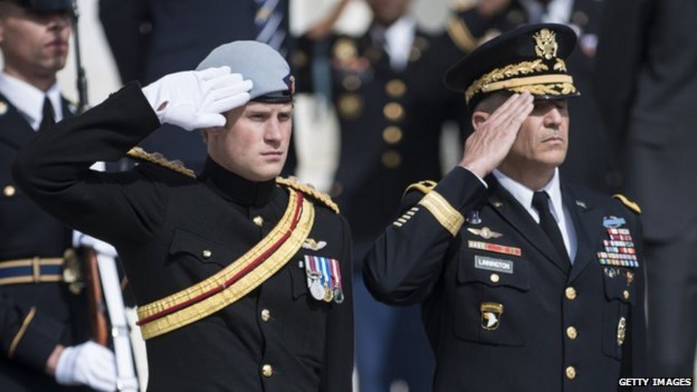
Quick question for the military inclined. I'm looking at reference pictures for the military salute:

_80060794_harrysalute_get.jpg

Which one would be more appropriate? Open palm like on the left or the right? I take it it's a cultural thing where different countries do things differently?
 

Skinwalker

*meows in an empty room*
Patron
Village Idiot
Joined
Aug 20, 2021
Messages
12,689
Location
Yessex
Which one would be more appropriate? Open palm like on the left or the right?
Three fingers (thumb, pointer, middle) together to symbolize the Holy Trinity, the other two fingers folded (to symbolize Christ's divinity and humanity), touch forehead (in the name of the Father), navel (and of the Son), left shoulder (and of the Holy), right shoulder (Spirit), middle of the chest (one God, amen).
 

Peachcurl

Arcane
Joined
Jan 3, 2020
Messages
10,676
Location
(╯°□°)╯︵ ┻━┻
Quick question for the military inclined. I'm looking at reference pictures for the military salute:
Which one would be more appropriate? Open palm like on the left or the right? I take it it's a cultural thing where different countries do things differently?

This discusses the two salutes:
https://tvtropes.org/pmwiki/pmwiki.php/Main/MilitarySalute

In the English speaking world, which here means the US and the commonwealth there are two types of salutes. The first, with palm facing outwards, is the "British military salute." This is used by the armies and air forces of most Commonwealth countries. Its origins are with the British Army. The other which is palm downwards, originating with the Royal Navy, is the British "Naval" salute (this was originally introduced because sailors' and officers' hands were often stained with tar through life aboard ship, and showing a dirty palm was considered to reduce the dignity of the gesture). This is used by the Naval forces of the Commonwealth and the US Armed Forces. This is often in popular parlance seen as an American salute, even in the commonwealth. There has been examples of nitpickers and scolds attacking works (or real life) where British or Australians are depicted as saluting palm downwards as an example of Eagleland Osmosis.
 
Self-Ejected

Zizka

Self-Ejected
Joined
Jan 15, 2020
Messages
429
Thanks, I'll go for the one on the right then. Seems to be the most common one.

2cyZv18.gif

As far as I know, a salute doesn't involve throwing your hand upwards after though.
 

Ismaul

Thought Criminal #3333
Patron
Joined
Apr 18, 2005
Messages
1,871,810
Location
On Patroll
Codex 2014 PC RPG Website of the Year, 2015 Codex 2016 - The Age of Grimoire Make the Codex Great Again! Grab the Codex by the pussy Insert Title Here RPG Wokedex Strap Yourselves In Codex Year of the Donut Divinity: Original Sin Project: Eternity Torment: Tides of Numenera Shadorwun: Hong Kong Divinity: Original Sin 2 BattleTech A Beautifully Desolate Campaign My team has the sexiest and deadliest waifus you can recruit.
In other news, this was previously requested by Zombra regarding the 'thanks' button. I used the same head shape as 'prestigious' but made the horns slightly longer.

First shot
I.

Different sign, face and smile.
II.

Different sign and smile.
III.

I don't like this one as it's greatly simplified but I know some prefer when it's more simple. Also, capital letters this time around.
IV.
IV is the only one that's minimally acceptable, and is keeping with the style of existing trolls. The other three are basically prosper faces.

Still, IV is not simplified enough. It's like you're trying to make a big icon with details, but that just makes the icon hard to read at its real size.

Compare the eyes and the contouring:
Thanks2.png
vs
rating_rage.gif


Angry dude has thicker and clearer contour lines, well-defined eyes, and is very readable. Yours is muddy as fuck. And what's that white spot on his chin, cum?
 
Self-Ejected

Zizka

Self-Ejected
Joined
Jan 15, 2020
Messages
429
I quite like the 'thanks' button I've made. I think the faces look great. I doubt I'll modify them further except maybe for the palette. Or maybe add in an animation. We'll see.

First shot at 'salute':
ji4mZCv.gif
 
Last edited:

Kev Inkline

(devious)
Patron
Joined
Nov 17, 2015
Messages
5,479
A Beautifully Desolate Campaign Pillars of Eternity 2: Deadfire Pathfinder: Kingmaker Steve gets a Kidney but I don't even get a tag.
I quite like the 'thanks' button I've made. I think the faces look great. I doubt I'll modify them further except maybe for the palette. Or maybe add in an animation. We'll see.

First shot at 'salute':
ji4mZCv.gif
Dude, I think you should make and suggest new ratings instead of trying to replace the old ones. Otherwise this soon'll look like an anime forum.
 

As an Amazon Associate, rpgcodex.net earns from qualifying purchases.
Back
Top Bottom