Alright, I had to come back to comment on this.
Proving Grounds is one of my favorite games ever, seriously. I wrote a tiny review of it here a few years ago, where I examined Wizardry from the perspective of a zoomer in 2020. It turns out that it is a wonderful game, even in our current year. There are a lot of surface-level opinions of Proving Grounds, and many people like
smaug simply don't understand the core principles of the game. If you're grinding Murphy's Ghost and skipping levels 5-9, then you wouldn't want to bothered with playing a remake anyways.
(Not to sound pompous, but really... if you play the game "correctly", there is zero grinding at all.)
All of this to say that I really enjoy the game, and so I think I'm allowed to criticize it from a good-conscious perspective.
I've been day-dreaming of what a potential Wizardry remake could look like for a few years now, and there are a lot of cool things that I think this remake is presenting. I love that it is trying to stay faithful to the base mechanics, and that you can play with the Apple II game overlaid on top. Neat!
Kind of stepping beyond all of that, there is only one thing I want to say:
Regardless of whether you like the art-style or not (I don't prefer it, but whatever), there is a concerning lack of vision and unity in it's usage here.
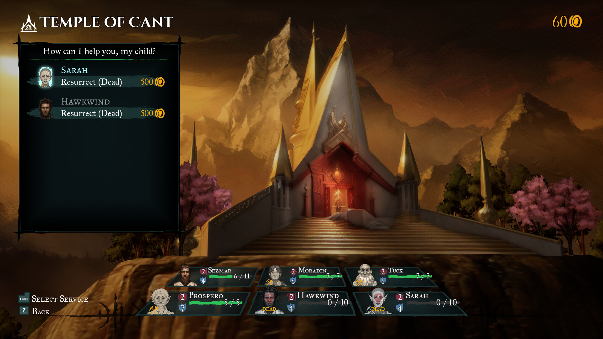
The first thing that kind of raised suspicions in my mind was the Tempe of Cant screenshot:
Notice the strange bulging of the stairs and how they creep up on the right tower, and the kind of blurry pixelization of the entire thing. I hate to be one of those people constantly throwing around accusations of AI art, but this really isn't a pretty image, and it hard for me to imagine that anyone really put much thought into it.
And that is the main issue I have with the art:
It seems like whoever did it doesn't actually care about Wizardry. It just sets off a tiny red-flag in my brain. It is a shame, because the Japanese Wizardry's got Jun Suemi to do the art, and he actually has a coherent art-style that he brings to the game. It gives it atmosphere. With this remake, I feel like the art is spreading the tone in multiple scattered directions.
And the character portraits...
Again, this is less about the style, and more about the tone and quality. The last portrait on the right here looks clearly mirrored, and so it just kind of throws me off, because whoever did it just doesn't care that much. And why the heck are the female portraits biting their lips?
Anyways, I hope this is good and successful, but it just has a few weird touches here and there that kind of put me off, as someone who really likes this game.
The art tells of a general lack of care, but I hope that is just a consequence of an Early-Access release.