- Joined
- Oct 1, 2018
- Messages
- 8,814
2024 hot take: Tim Cain ruined RPGs by introducing perks. Now all our RPGs are just basic bitch action games with +damage perks slapped on.Avowed bethesda-esque skill trees:

2024 hot take: Tim Cain ruined RPGs by introducing perks. Now all our RPGs are just basic bitch action games with +damage perks slapped on.Avowed bethesda-esque skill trees:

Not great, BUT 40% is very substantial and will be felt in gameplay. Not like the usual 2% increase that numbers go up gives you.oh god no. Not the "damage goes up X%" skill tree.
They said later that the reason why the sword sound like a mace at the beginning is it's under leveled(maybe not sharp enough to cut through the enemy). After they upgrade it the sound goes back to normal.The weird thing for me here is how everything clashes. The player strikes with a sword, but the sound effects and enemy feedback make it seem they're bludgeoning with a mace, or at least punching with the sword's guard. The mushrooms and protrusions give me the impression the game takes place underwater, but that's clearly not the case. The colors fail to complement each other in every instance. It's as if two very different people designed the game completely oblivious from one another and then a third one mashed everything together. It's disconcerting.


Not great, BUT 40% is very substantial and will be felt in gameplay. Not like the usual 2% increase that numbers go up gives you.oh god no. Not the "damage goes up X%" skill tree.

Oh I know you're gonna like it. Just like you like Inquisition.Haha horny baiting and that FUCKING consoleshit UI. You know exactly who the target audience is.
Retards.
GUYS WOW I JUST LEVELED UP
DO I GET THE 25% FART DAMAGE BONUS OR THE 2% CHANCE TO CRIT ON A MOONLESS NIGHT AT SEA? IM SO EXCITED!!
I can't believe I'm saying this, but this game is uglier than Dragon Age 4.
How is that possible? This is a crime against my eyeballs.

I really have no idea what the hell happened in the industry to where the art design sucks this hard. Everything looks like sickening cartoonish shit.I can't believe I'm saying this, but this game is uglier than Dragon Age 4.
How is that possible? This is a crime against my eyeballs.
Whoever wins, we lose...
At least we are getting Tainted Grail: The Fall of Avalon, even with lower graphics, it has much more style than these two fuckups...
I remember they spent time and effort to make a medieval bathroom right/realistic through iterations in deadfire, an isometric gaym, both games' looks were realistic af but now just cos it is said something along the lines of "the living lands is wacky" in the lore they went crazy on everything and they don't need a second invite to paint the game eye melting purple & pink(again after TOW)the garish, hyper-cartoony look of Avowed.
Talented people left for jobs where they aren't being slaved away and where they get paid their worth. There's no creative freedom in the AAA space anymore, so there's no reason to stomach shitty pay and working conditions. This goes for programmers too.I really have no idea what the hell happened in the industry to where the art design sucks this hard. Everything looks like sickening cartoonish shit.I can't believe I'm saying this, but this game is uglier than Dragon Age 4.
How is that possible? This is a crime against my eyeballs.
Whoever wins, we lose...
At least we are getting Tainted Grail: The Fall of Avalon, even with lower graphics, it has much more style than these two fuckups...
Did all these 30-something art directors go to the same school or something?


You think like that because all you see in Deadfire and 1 are the miniature of the world/building/people, and even then the character design looks cartoonish-ish, despite semi-realistic environment.both games' looks were realistic
I remember they spent time and effort to make a medieval bathroom right/realistic through iterations in deadfire, an isometric gaym, both games' looks were realistic af but now just cos it is said something along the lines of "the living lands is wacky" in the lore they went crazy on everything and they don't need a second invite to paint the game eye melting purple & pink(again after TOW)the garish, hyper-cartoony look of Avowed.
What I meant with purple and pink is mostly the spell fx blown to our faces or on the objects in the environment from the gameplay videos you can see, very simlar with TOW, which is separate from unrealistic artstyle of the game which it was in pillows 1&2.I remember they spent time and effort to make a medieval bathroom right/realistic through iterations in deadfire, an isometric gaym, both games' looks were realistic af but now just cos it is said something along the lines of "the living lands is wacky" in the lore they went crazy on everything and they don't need a second invite to paint the game eye melting purple & pink(again after TOW)the garish, hyper-cartoony look of Avowed.
Things being grey and brown does not make them realistic. If anything a lot of medieval fantasy lacks color. I personally like what they did with armor and weapon designs especially.
What I meant with purple and pink is mostly the spell fx blown to our faces or on the objects in the environment from the gameplay videos you can see, very simlar with TOW, which is separate from unrealistic artstyle of the game which it was in pillows 1&2.
This looks more fable-y than that Fable gaym lol, apart from the character that game looks great.

The latest trailer actually did start off with a couple of pseudo-iso shots, allowing one to make the comparison.You think like that because all you see in Deadfire and 1 are the miniature of the world/building/people, and even then the character design looks cartoonish-ish, despite semi-realistic environment.both games' looks were realistic
This game is no different.
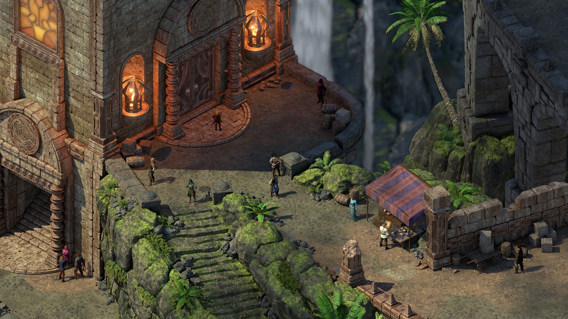
All I hear is that you people have mental dissonance over the much bigger, first person world design. If this game was an Isometric RPG, it still going to look the same compared to Deadfire and Pillars 1.


Yes, unfortunately very too much to ask.Just give us something interesting ffs. I don't care what colour it is just give us good dungeons, some good progression, some good exploration and don't shove the damn agenda in my face every goddamn second. Is it too much to ask for someone to just make a game as good as Ultima Underworld, Arx Fatalis, Dark Messiah or even just something with some depth like Morrowind?! What is the malfunction with these people.

It's Deadfire HD+ 4K.The latest trailer actually did start off with a couple of pseudo-iso shots, allowing one to make the comparison.You think like that because all you see in Deadfire and 1 are the miniature of the world/building/people, and even then the character design looks cartoonish-ish, despite semi-realistic environment.both games' looks were realistic
This game is no different.
All I hear is that you people have mental dissonance over the much bigger, first person world design. If this game was an Isometric RPG, it still going to look the same compared to Deadfire and Pillars 1.


And here's Deadfire.


