-
Welcome to rpgcodex.net, a site dedicated to discussing computer based role-playing games in a free and open fashion. We're less strict than other forums, but please refer to the rules.
"This message is awaiting moderator approval": All new users must pass through our moderation queue before they will be able to post normally. Until your account has "passed" your posts will only be visible to yourself (and moderators) until they are approved. Give us a week to get around to approving / deleting / ignoring your mundane opinion on crap before hassling us about it. Once you have passed the moderation period (think of it as a test), you will be able to post normally, just like all the other retards.
You are using an out of date browser. It may not display this or other websites correctly.
You should upgrade or use an alternative browser.
You should upgrade or use an alternative browser.
KickStarter Mechajammer (formerly Copper Dreams) - cyberpunk RPG from Whalenought Studios
- Thread starter Infinitron
- Start date
- Joined
- Sep 25, 2012
- Messages
- 30,518


We always hyped for the looks bro. All of them.the looks it had
grimace
Arcane
- Joined
- Jan 17, 2015
- Messages
- 2,119

I see replies to this image saying there is not enough contrast between the text and the background.


These "fisters" are the insist-ers of a a contrast rebellion.
Low-contrast font color and unreadable texts?
To hell with them!
Because sometimes we only think about aesthetics
Clearly, aesthetics are important but aren't the ultimate goal of design. And often poor readability doesn't get noticed during the design process, as we are not like our users. We don't read the texts as a visitor does.
When making
the contrast of
the text lower
and lower...
designers need
to think of
elderly users
with bad vision
low quality
monitors
bad lighting
and glare
reading on
tiny screens
The text in game is stylized and part of the experience, the text cannot by copy and pasted (like a website text often can be), and because people need to read the text to play the game ...
Please continue to complain about design decisions in a reply below.
CryptRat
Arcane

- Joined
- Sep 10, 2014
- Messages
- 3,626
Actu #29
Build update
Build update
There's a new deathmatch available for testers with the usual game mods, and swarm mode now has combatants with guns. Later this week will be the first tutorial area of the game, before you skip off to your base in the city proper. We'll announce that on twitter when it's available for download.

We were planning on shooting a short video showcasing the simultaneous step-by-step stealth a little more in this area. However from some feedback and ongoing play testing, we are focusing on updating a few gameplay and map elements prior to showing this off to make it more clear what tile your character is popping to next, and making it more clear on tile boundaries while simultaneously keeping our double coat of grunge. We're going to be updating beta builds with that as well in the build this week.
The starting area is a good place to show this off because you can sneak through it entirely if you want, so there's some clear visuals for sight, hearing radius, reactions if caught (patience meter or hostility) in an area that doesn't have a ton of enemies.
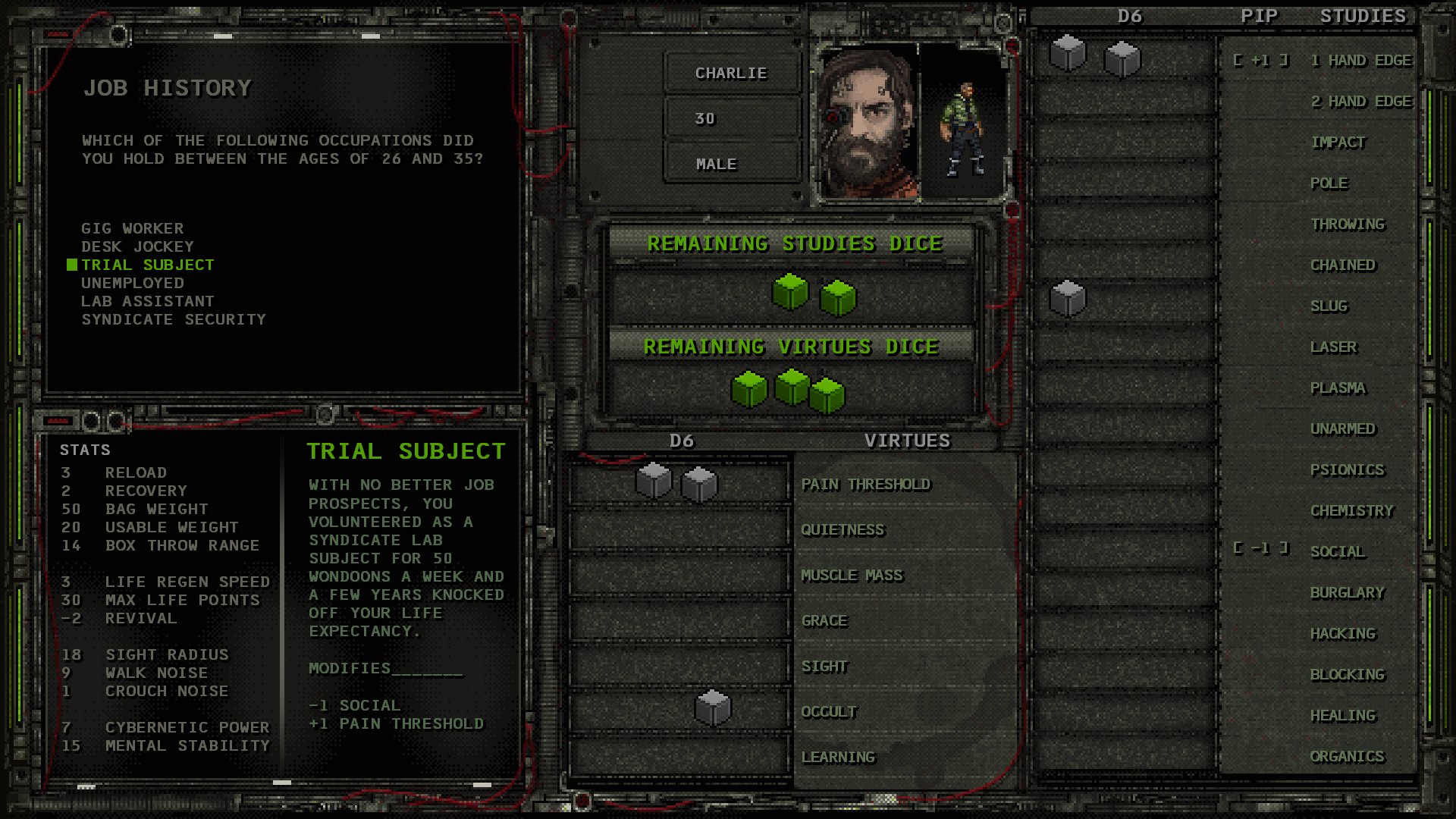
The rolls have also changed from D8 to D6 for aiming and actions. However you can pool them together now, starting with the character sheet where you can drag&drop them into Virtues and Studies after a harrowing job background.


Cheers
Hannah & Joe
Some of this looks really good.
grimace
Arcane
- Joined
- Jan 17, 2015
- Messages
- 2,119
Whalenought Studios
@whalenought
·
16h
A new coat for another rainy day in the cyberpunk jungle colony. Junglepunk? Mechajammer! #screenshotsaturday #cyberpunk #turnbased #rpg #indiegame
Better than a dried out arid desert Wasteland. And more dangerous too.
Better than a dried out arid desert Wasteland? And more dangerous too?
The Fallout from this comment might
AdolfSatan
Arcane
- Joined
- Dec 27, 2017
- Messages
- 2,109
Of all the artstyles they had they're sticking with the worst? It's an unreadable mess 

grimace
Arcane
- Joined
- Jan 17, 2015
- Messages
- 2,119
That's a re-upload from the Jul 24, 2020 official upload.
https://youtu.be/MKyhVPXtVYY
Don't read the comments. Or do.
That's a decision I leave up to you.
Please, for the love of ARR PEE GEEs, do not ignore the "WORK IN PROGRESS" text.
Michael Hübner 1 week ago
I like the redesign. It also looks like a real time game now, which is good, because I am tired of turn-based shovelware.
Napoleonic S 2 weeks ago
It's said to be a turn based game, so why does it look like an action game here? What's with the odd combat?
StingingV 4 weeks ago
Wow this looks awesome. I never even heard of the first version despite surfing CRPG sites all the time. Hopefully this gets more attention!
uuves 1 month ago
its kind of heartbreaking to see this, though i imagine it must be for you also because of how long you've worked on the project and how much you've sacrificed to get it this far: the twists and turns in the game's art direction finally leading to .. low-rent sprites that don't seem to fit well into the existing environments. it does feel a bit like, for reasons i can't begin to imagine, a sledgehammer had been taken to what was otherwise a very promising game.
uuves 1 month ago
@Anil Demir if your definition of 'soul' and 'originality' is sprites straight out of a late 90s title. this was clearly a move of necessity rather than an aesthetic choice. i mean, look at all the updates with detailed and quality character art that is now a pixel blob
Anil Demir 4 weeks ago
@uuves If your definition of 'visuals' is only character sprites. Also please show me late 90s titles with this look. Closest could be maybe fallout 1-2. I meant the overall look and visuals. I might agree or not with sprites vs 3d models but that wasn't a part of my comment above, or the original comment. When I look at previous iterations and this one side by side, this looks more like something I haven't seen before (original) and therefore more interesting. I also really feel that post-apo atmosphere in my bones. That said, I might agree that the 3D characters fit better than the sprite ones. Though I think everything else look ace. It feels so gritty, colors are not all washed out and accent color use with occasional saturated yellows, reds and greens is great.
uuves 4 weeks ago (edited)
@Anil Demir the direct example of using sprites with 3d backgrounds would be syndicate wars, which is a tonal inspiration for this game as well from what I can tell. The sprites are fine in and of themselves, but the combination with other assets that were developed under a different aesthetic causes decoherence. I mean, maybe some people quantify something like 'soul' by how janky something looks.. in which case we're entering a particularly soulful period in this game's development. Which is a shame because there had previously been inspired moments.. even that moebius/quantic dream-reminiscent cell-shaded period.
Malice Gerbil 1 month ago
Hmm... This isn't what I backed. The low poly 3D characters were one of the main appealing things. But now they've been replaced with pixel art, which is overdone at this point.
wait, the game is 2D now? we went from metal gear solid 1 esque, to lucy and the sky with diamonds, to basically sci-fi serpents in the staglands. maybe the real treasure is the artstyle we got along the way
sprites looks amazing tho so i am not complaining too much
mercyRPG
Cipher
I think this game looks amazing. Best of the best I think are the - very amazing GANTZ-style!! - weapons, which all should have their own slot, just like in XCOM: UFO DEFENSE.How in the name of bloody hell is this game that looks more like a fucking abortion, still generating posts in this thread ? Have Codexians turned into complete fucking retards ?
Also talky heads are nice. The environment animation GIFs here look beautiful, I think.
mercyRPG
Cipher
This UI could use he following improvements:
1. Fonts should be brighter everywhere.
2. Drop that noisy crap in the slots
3. TRIAL SUBJECT text should have its own frame, but fully preserving current font size!!
4. STATS should also receive a visual upgrade, keep the font size!
5. STUDIES should be brighter, while their background darker..
grimace
Arcane
- Joined
- Jan 17, 2015
- Messages
- 2,119
This UI could use he following improvements:
1. Fonts should be brighter everywhere.
2. Drop that noisy crap in the slots
3. TRIAL SUBJECT text should have its own frame, but fully preserving current font size!!
4. STATS should also receive a visual upgrade, keep the font size!
5. STUDIES should be brighter, while their background darker..
Are you in agreement with this:

I see replies to this image saying there is not enough contrast between the text and the background.


buffalo bill
Arcane
- Joined
- Dec 8, 2016
- Messages
- 1,075
I hope its not vaporware.
It's always when you're alive that you die
wew, looks nice
toro
Arcane

- Joined
- Apr 14, 2009
- Messages
- 15,160
I hope its not vaporware.
I wish this forum had a remindme feature.
buffalo bill
Arcane
- Joined
- Dec 8, 2016
- Messages
- 1,075
Just downloaded the updated "beta" and all of a sudden it is completely unplayable. Now the game opens full-screen instead of windowed, but when I try to click on the map to move my character, they go in a random direction or don't move at all.

Whalenought_Joe please implement keyboard-based movement! I'm begging you! The current control setup SUCKS even when it is properly working!

Whalenought_Joe please implement keyboard-based movement! I'm begging you! The current control setup SUCKS even when it is properly working!


![The Year of Incline [2014] Codex 2014](/forums/smiles/campaign_tags/campaign_incline2014.png)


