Putting the 'role' back in role-playing games since 2002.
Donate to Codex
Good Old Games
  • Welcome to rpgcodex.net, a site dedicated to discussing computer based role-playing games in a free and open fashion. We're less strict than other forums, but please refer to the rules.

    "This message is awaiting moderator approval": All new users must pass through our moderation queue before they will be able to post normally. Until your account has "passed" your posts will only be visible to yourself (and moderators) until they are approved. Give us a week to get around to approving / deleting / ignoring your mundane opinion on crap before hassling us about it. Once you have passed the moderation period (think of it as a test), you will be able to post normally, just like all the other retards.

KickStarter Peripeteia - Deus Ex-inspired FPS/RPG set in anime cyberpunk Poland

Shodanon

Ninth Exodus
Developer
Joined
Jun 13, 2020
Messages
53
Don't like the skill icons much. They seem uneven and don't mesh well with the UI. I guess they're going for the pip-boy aesthetic, but it needs more work.
When I move to polishing such details, I am planning to experiment with a scanline effect to make them blend into the wheel. Otherwise they'll stay as they are.

I'm willing to bet this game is one "guys I came out as trans to my parents and now I'm homeless" away from meeting the Void of Vaporwareness.
At very unfavorable odds.

Is she staring at my crotch and taking snapshots?
No, that's her looking from behind the journal. The photos go to the cringe compilation.
 
Last edited:

Maxie

Wholesome Chungus
Patron
Glory to Ukraine
Joined
Nov 13, 2021
Messages
8,113
Location
Warszawa, PL
will you buy ads on bus stops like pixellated milk and go under to the point that you will have to collaborate with IPN to produce a propaganda piece
 

Shodanon

Ninth Exodus
Developer
Joined
Jun 13, 2020
Messages
53
will you buy ads on bus stops like pixellated milk and go under to the point that you will have to collaborate with IPN to produce a propaganda piece
No, we will rent an exorbitantly expensive office in downtown Warsaw to prove to ourselves we're "real" developers, a much more effective way of squandering all the profits.

So, just like the original GitS manga, this game will be full of random lesbian orgies, right?
That's not Catholic!
Side note, though: in Poland the manga was published uncensored, so I was surprised seeing the english release years later.
 

rubinstein

Educated
Joined
Sep 12, 2022
Messages
230
Hirotonfa's UI cartoons were always a Filutek/Vault Boy/Jucika-inspired thing, so weren't ever THAT weeb


gotta be honest, i dont really think the icons fit that well. i agree with ghostdog. but on the other hand they are, god forgive me for using this term, because i dont expect users to do so, adorkable and i wouldnt mind them that much in finished product.

Is she staring at my crotch and taking snapshots?
most likely, this would explain the caption
 

Lagole Gon

Arcane
Patron
Joined
Nov 4, 2011
Messages
7,560
Location
Australia
Insert Title Here RPG Wokedex Codex Year of the Donut Pathfinder: Wrath
It just needs a little something to work better with the background. No idea what though. Some oscilloscope effects maybe, some kind of outline... Fuck do I know.
 

KeighnMcDeath

RPG Codex Boomer
Joined
Nov 23, 2016
Messages
15,410
I still think it’d make a good wall clock. Hell, you could sell stickers, mugs, T-shirts, etc. I’d probably buy a sticker book or art book.
 

Kabas

Arcane
Patron
Joined
Feb 10, 2018
Messages
1,719
They seem fitting precisely because of how somewhat unfitting they're, as weird as it sounds.
Or maybe i am just biased they remind me of those cute Jucika comics.
 

agris

Arcane
Patron
Joined
Apr 16, 2004
Messages
6,927
Don't like the skill icons much. They seem uneven and don't mesh well with the UI. I guess they're going for the pip-boy aesthetic, but it needs more work.
When I move to polishing such details, I am planning to experiment with a scanline effect to make them blend into the wheel. Otherwise they'll stay as they are.
not to pick on you, but this seems to be a classic example of cargo cult design.

in fallout 1 & 2, the pip boy made sense. there was a campy 50s aesthetic, and he was obviously an icon used by vault-tek to illustrate and make palatable concepts. setting aside the use of the pip boy in the manuals and even in-game videos, the part of the UI that incorporated it also made sense. the character screen had info panels, and the pip-boy conveyed a simple monopoly-man like image next to text. it was rendered in the UI in an approximation of a display unit (TV screen). it was all cohesive, and made sense.

so, why are you using these pip girl images in your game? presumably because fallout's use of the pip boy was fun and effective. your images, while cute, do not fit into the form or function of an o-scope. further, they don't look coherent with the rest of the your aesthetics.

that's cargo cult design, in a nutshell.
 

Maxie

Wholesome Chungus
Patron
Glory to Ukraine
Joined
Nov 13, 2021
Messages
8,113
Location
Warszawa, PL
Don't like the skill icons much. They seem uneven and don't mesh well with the UI. I guess they're going for the pip-boy aesthetic, but it needs more work.
When I move to polishing such details, I am planning to experiment with a scanline effect to make them blend into the wheel. Otherwise they'll stay as they are.
not to pick on you, but this seems to be a classic example of cargo cult design.

in fallout 1 & 2, the pip boy made sense. there was a campy 50s aesthetic, and he was obviously an icon used by vault-tek to illustrate and make palatable concepts. setting aside the use of the pip boy in the manuals and even in-game videos, the part of the UI that incorporated it also made sense. the character screen had info panels, and the pip-boy conveyed a simple monopoly-man like image next to text. it was rendered in the UI in an approximation of a display unit (TV screen). it was all cohesive, and made sense.

so, why are you using these pip girl images in your game? presumably because fallout's use of the pip boy was fun and effective. your images, while cute, do not fit into the form or function of an o-scope. further, they don't look coherent with the rest of the your aesthetics.

that's cargo cult design, in a nutshell.
you've almost matured to the point of discovering the real energies ruling the world. the cute girl is in the game, because cute girls are cute. there is no other more objective measure of quality design.
 

Shodanon

Ninth Exodus
Developer
Joined
Jun 13, 2020
Messages
53
not to pick on you, but this seems to be a classic example of cargo cult design.
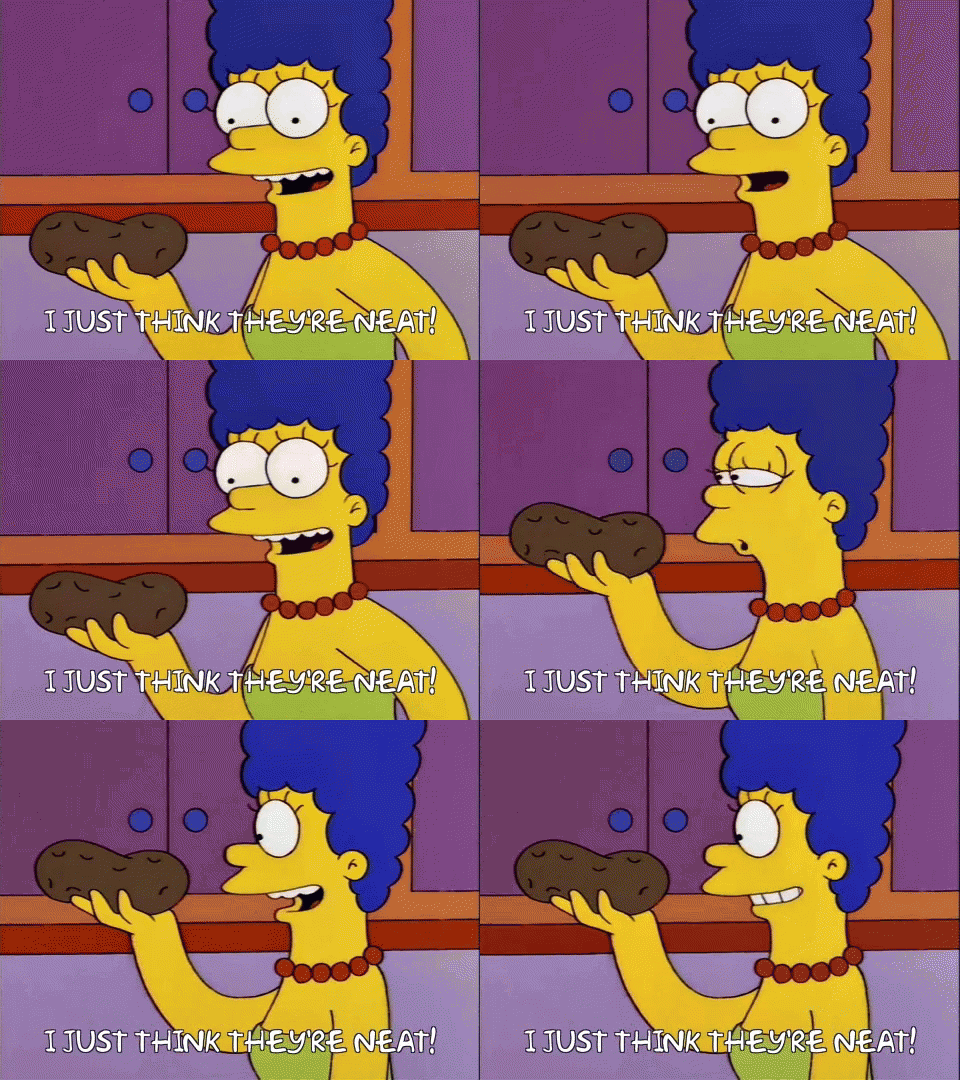
No offense taken my dude, just seems to be a fancy synonym for our
marge-i-just-think-theyre-neat.gif
approach

I would posit that in game design generally, most things are iterations on existing things. If a dev likes cute cartoon UI icons because that's what Fallout does, the dev will implement it because it's fun and effective. Probably most design is "cargo cult" design.
Some will give an explanation for that but sometimes it will be just an afterthought (for example, does Avernum ever do this? does it need to?) or worse, give a hand-waving explanation. Yes, in our case, the moment we put these things in the game we do ask ourselves the questions "if someone asks, how do we explain this?" and "do we hint at this in the lore somehow or do we state it outright?"
But first came "hey we love this one artist's work, let's reach out to him for cute icons, ask him to make our character a Jucika or things from Szczutek" and "what cool device can we kitbash so it fits the UI aesthetic by having a round display for the skill wheel?". And, of course, as Maxie put it:
cute girls are cute.

so, why are you using these pip girl images in your game? presumably because fallout's use of the pip boy was fun and effective. your images, while cute, do not fit into the form or function of an o-scope.
The reason she looks like that is often explained publicly by snakku
1694336218097.png

This explicit explanation I'd rather leave out of the game however.
further, they don't look coherent with the rest of the your aesthetics.
Aesthetics are influenced by soviet/warsaw pact countries and Polish interwar period. Plenty of newspaper cartoons in that time, some of which I named.


This is how the thing looks in motion. We'll have a bit of exposition during the "how to use implants" tutorial. Activating an retrofitted implant requires Marie to emit a signal of specific frequency range, dependent on where it's interfaced. Original idea was using actual sound tone:
1694336737850.png

but the current explanation makes more sense.

I hope that suffices.
 

agris

Arcane
Patron
Joined
Apr 16, 2004
Messages
6,927
that’s interesting, and glad your team has given it more thought than just cute pics are cute

I know it’s a silly nitpick in a lot of ways, but it’s born out of a tiredness of the derivative designs seen in a vast majority of games made today. games that seem to be made by people with little understanding of history, science or art.

one of the reasons i read this thread is because your team has shown a spark of creativity, the Warsaw pact angle is fairly unique. points to inspiration beyond gaymer “culture”. that’s why i posted what i did. if you were just going for bg4 or deus ex: butt cheeks divided, i wouldn’t care.
 
Last edited:

udm

Arcane
Patron
Joined
Aug 14, 2008
Messages
2,901
Make the Codex Great Again!
I actually think this is looking better. The feel is more consistent now, not just a one-off "Hey check out my cute loli icon" shtick.
 

El Presidente

Arcane
Joined
Nov 3, 2018
Messages
1,569
Location
Oval Office
they are, god forgive me for using this term,
Relax my man, bring it on

adorkable
I don't think God will forgive you for that.


As for the game, I see the devs are in this thread so I will refrain from saying what I truly think of the bigass anime girl head on the protagonist, but I will say this: while I respect you folks going for your integral artistic vision for your creation, without giving in on any aspect of it, I'd say you should also not lose focus on the fact you're making a game for an audience to enjoy, an audience that will comprise of mostly 2000's Deus Ex fans, and I can't see this audience's #1 dream being to play "Deus Ex but JC has a waifu bobblehead". I'd fear alienating my playerbase, but then again, I'm not into that style at all. In fact I had this game on my wishlist and removed it when I saw the animu bits. I think quite a lot of people will give the game a try despite the character design, meaning, the rest of the stuff here will have to fight with and ultimately outweight this character design in order to successfully attract the players, so I'd imagine this will always be a big "yeah it was a good game, BUT..." for Peripeteia.

I think what I want to say is that, to me this seems like an unnecessarily self-inflicted con for the game. As a matter of fact I just checked the Steam forums and, as expected, there are a couple threads complaining about this aspect. Now imagine if the character design was more normal, like 99.9% of the people would expect and anticipate from this game when they discover it. None of this "this looks very promising, BUT..." would exist, people would just be into it and hyped with no caveats.
 

Lyre Mors

Arcane
Joined
Nov 8, 2007
Messages
5,428
The anime head clashes terribly with the rest of the aesthetic and presentation, and that's its problem more than the fact it's an anime head. El Presidente is absolutely spot on with his above concerns. I know it has something to do with the character background, but it still seems like it'd be worth revising that aspect.
 

antimeridian

Learned
Patron
Joined
May 18, 2021
Messages
282
Codex Year of the Donut
The anime head has been :deadhorse: here and elsewhere and I doubt the devs will change such major part of the game's identity at this point. I wasn't sold on it originally but I've come around after referencing some of the developers' influences. I respect them sticking by their guns with this.

Now hurry up and drop the full game so I can P E R I P E T E all over it!!

Unrelated but I joined the Discord recently and it's been a good source not only for this game's development, but also for finding other indie immersive sims that aren't on my radar. Quite a few other devs in there and people posting updates to other games.
 

El Presidente

Arcane
Joined
Nov 3, 2018
Messages
1,569
Location
Oval Office
It's like they're selling hot dogs with raisins as the main topping (believe it or not, this is a thing in a few places). Sure, if the hot dog is delicious enough some people might be willing to shove it aside, and a few might even be into it, but all the trouble and controversy this decision will inevitably stir could be avoided if there was no fucking raisins on the hot dog in the first place, you know what I mean?
 

antimeridian

Learned
Patron
Joined
May 18, 2021
Messages
282
Codex Year of the Donut
after referencing some of the developers' influences.
Please share.


but also for finding other indie immersive sims that aren't on my radar.
Also please share.
Serial Experiments Lain seems like the big one. It's not something I've watched and it's not the same exact artstyle, but seems like an obvious homage. Ghost in the Shell is an obvious one too.

I guess I am sympathetic to those who don't like it, maybe the devs could provide alternative head designs for people to toggle between. Maybe it'll be easily moddable anyway bc Unity but I'm not sure

Off the top of my head some neat looking games that the Discord put on my radar are Full Fathom, Corpus Edax, Retrospace, and B.C. Piezophile.
 

Lyre Mors

Arcane
Joined
Nov 8, 2007
Messages
5,428
B.C. Piezophile
Nice! Just put this on my wishlist yesterday, actually. Haven't heard of Full Fathom or Corpus Edax yet. Retrospace looks cool, but I can only allow myself to be cautiously optimistic about it.

As for the influences, I had definitely already identified those two. I thought maybe you were referring to something that very intentionally clashes in style or something. Those are great influences to have, but they are anime in their entirety, which actually works, as opposed to Maria's stupid head being completely out of place in this.
 
Self-Ejected

Dadd

Self-Ejected
Joined
Aug 20, 2022
Messages
2,727
Let us take off the animu head. Make it a mascot head.
 

As an Amazon Associate, rpgcodex.net earns from qualifying purchases.
Back
Top Bottom