You missed the point completely.
I personally have zero problems with Space Wreck's look. I was responding to commenters who were having problems with Space Wreck looks and suggested that making it "like Fallout" would somehow be an improvement.
I already agree with you that Space Wreck don't have to use Fallout's looks like some suggested, but I guess I kinda didn't make it quite clear.
I still think you're a filthy graphic whore for thinking Fallout's looks ugly as sin, though.
It takes place in a post-apocalyptic desert (well, parts of it), so close enough.
No, not even close, baby. Just as wishbone mentioned above, you ought to take into consideration the actual setting between the two games. Fallout takes place in an alternate reality of an actual real world geography and topography, so you ought to take into consideration what they would've looked like in a setting as the people in the 50s envisioned the World of the Future™ looks like, all their buildings and infrastructures ,and all that shit and jazz. And then, apply the Nuke Filter upon it.
Besides, if we're talking about a post-apocalyptic desert, which kind of desert are we talking about, here? The Desert of California? The Desert of Sahara? Arabia? Mongolia? Australia? If you think they all look the same, I mean they are at a glance, then I can kinda see why you think Fallout looks monotone in all of its art style and palette.
And yes, it has better art style too, because it avoids the monotony that plagues FO tileset a lot more than color palette per se.
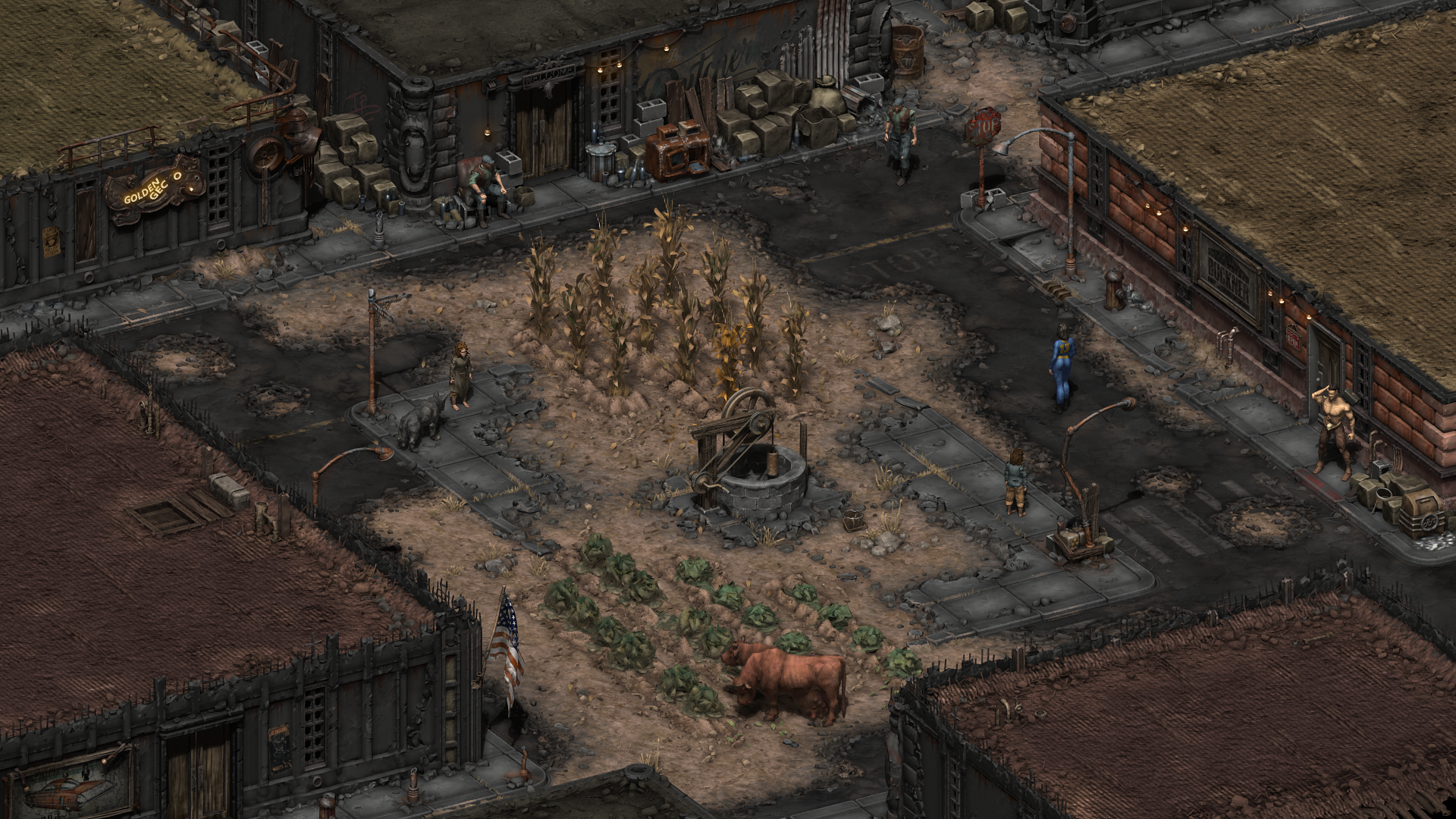
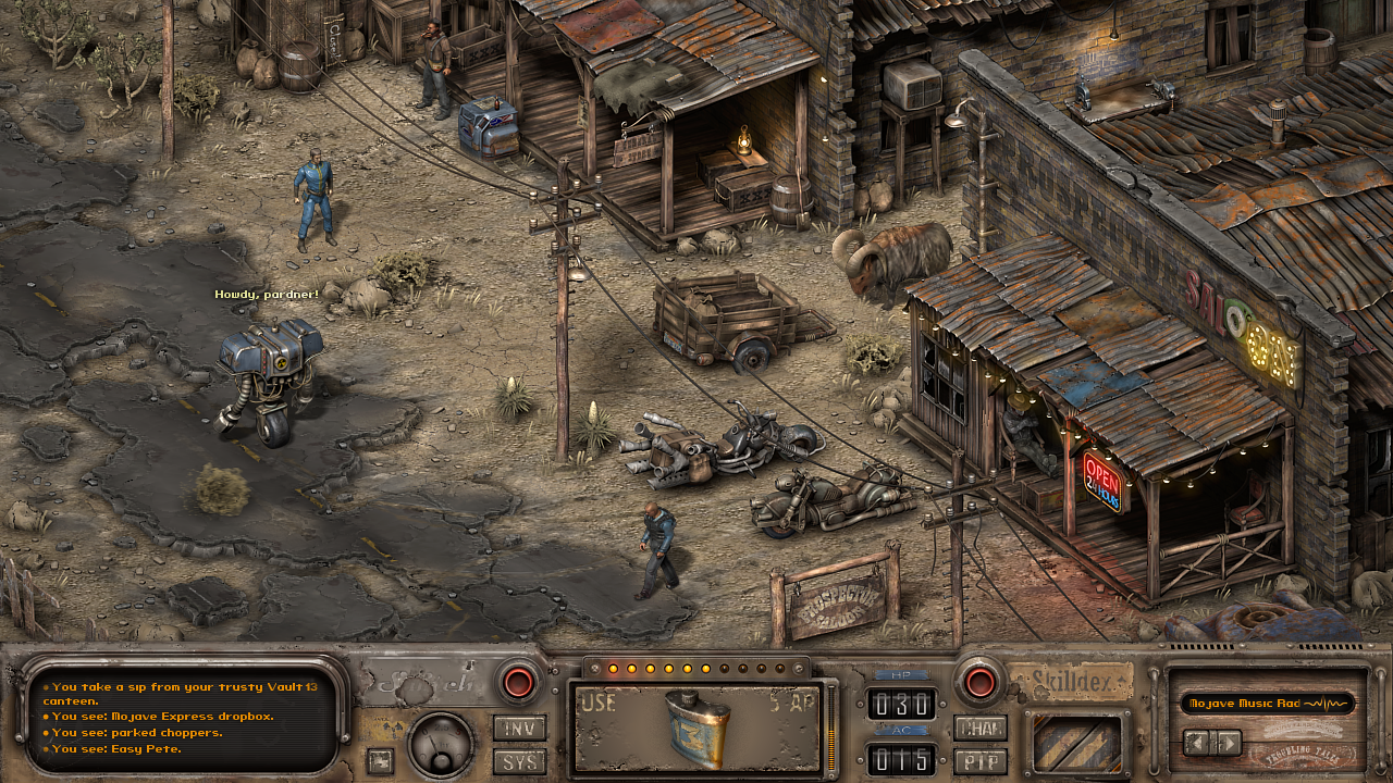
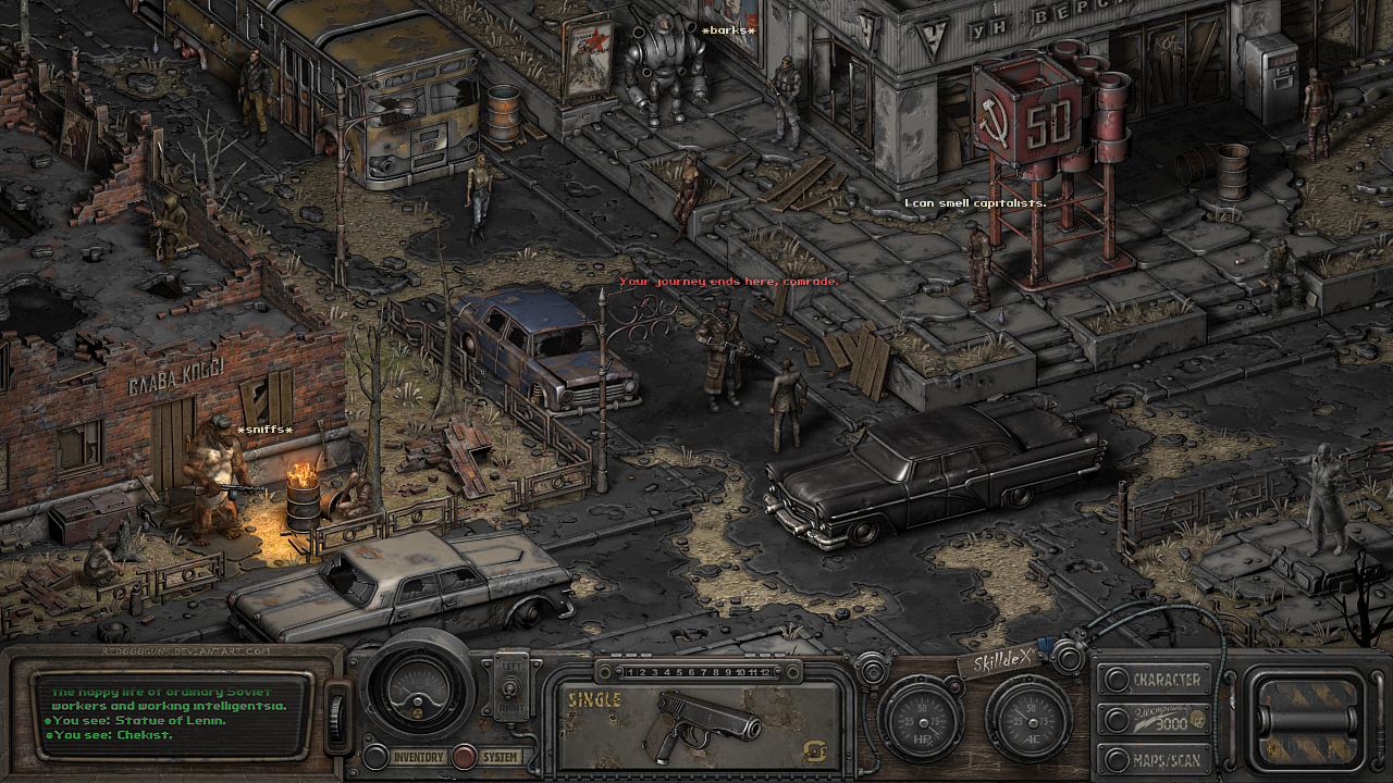
We all know "better" here is subjective. What I see are two different art style, utilizing different techs. I have nothing to say about Beautiful Desolation in particular, but having close-to-realistic looks does not automatically make things better. And personally, I think Fallout's looks fine as hell, and will age like a damn fine wine well into even the far future. Would love to be proven wrong, though, I think someone has mentioned a mockup of New Vegas in isometric (cavalier oblique?) top down style, with a style not exactly the original Fallouts but close to it. But a mockup's a mockup, gotta see how it plays in action to judge how it looks and feels.
Are you for real? Comparing the financial situation of a two-brothers joint in South Africa with the 90s Interplay and implying the former could be somehow better?
Except I'm not comparing *only* the financial situation, though? There's the management stuff, and in case you didn't really know how it went with Fallout 1, Tim Cain started all alone for the first 6 months of the development, and I actually forgot if he was still in the pre-production at the time or not. In the time period where real-time, first-person action shooter like Doom was all the rage, there he is, a damn nerd trying to develop a tabletop-based computer role-playing game, with a top-down, cavalier oblique, turn-based combat gameplay. Initially he wanted to use the GURPS system, but had to scrap it, and establish a makeshift GURPS-like known today as the S.P.E.C.I.A.L. And yet, despite all the praises and the critical acclaims, it didn't perform up to expectation financially. And then we have those stories about Black Isle/Interplay immediately developing Fallout 2, but Tim had some disagreement with the management, and yadda yadda.
What I'm saying here is that Fallout's development weren't getting the attention and investment it deserved when it first started, and with all the issues that followed, it's the factors of what I said to be the "technical limitation" argument, which to some extent, can be used in relation to how it came to look like. It might seem strange for people like me, who have literally zero problems with how the game looked like, to say that it looked the way it is because of "technical limitation". Because I personally have the know-how to play the game using modern-day rig, with the help of widescreen mod, the game looked close to how it's supposed to look like when played using the resolution that monitors has when it was first released, but upscaled properly to the resolution of modern-day monitors.
Bless the PC gaming.


