$30 buy-in, huh? We'll see.
-
Welcome to rpgcodex.net, a site dedicated to discussing computer based role-playing games in a free and open fashion. We're less strict than other forums, but please refer to the rules.
"This message is awaiting moderator approval": All new users must pass through our moderation queue before they will be able to post normally. Until your account has "passed" your posts will only be visible to yourself (and moderators) until they are approved. Give us a week to get around to approving / deleting / ignoring your mundane opinion on crap before hassling us about it. Once you have passed the moderation period (think of it as a test), you will be able to post normally, just like all the other retards.
You are using an out of date browser. It may not display this or other websites correctly.
You should upgrade or use an alternative browser.
You should upgrade or use an alternative browser.
KickStarter System Shock 1 Remake by Nightdive Studios
- Thread starter LESS T_T
- Start date
Throw your savings into better projects!
Don't support this shit!
Don't support this shit!
oh ye of little faithAlso, special voiced audiologs placed in the game as a backer reward for those who have nothing better to do with their money. Getting PoE flashbacks yet?
I hope this gets funded, but that it doesn't reach its stretch goals. I fear all the new shit they are promising and throwing in will disrupt the levels and gameplay balance.
At $750 a pop I don't think that will be as much of an issue as in PoE.

- Joined
- Mar 14, 2012
- Messages
- 1,494


Hopefully, he will add it!
- Joined
- Feb 19, 2005
- Messages
- 4,663


Uh, so the Demo is available from GOG. Anyone playing this?
- Joined
- Mar 14, 2012
- Messages
- 1,494


AFAIU it is supposed to be remix of this
It's like musical analogue of this (remix on the right)

Well...


Well...

m_s0
Arcane
- Joined
- Jun 18, 2009
- Messages
- 1,292
Played the demo and it's... alright, I guess? Kudos for the effort, but it didn't do much for me
I still dislike the colour scheme - the original has more variety, this is a bit on the monotone side. The sound design - or its overall direction - is neat, the music might work, but it also might put the game much closer to Bioshock than I'd like, personally. The gameplay I'm not sold on, elements like interacting with keypads, doors etc. clearly need rethinking because as they currently are, they will get old FAST. Combat is reworked for a bit more modern fps feel, which doesn't sit all that well with me since I'm one of the weirdos who like SS1's interface and feel - combat included. It runs relatively fine for an early alpha/prototype made in Unity (not saying much, I know), and overall isn't too bad. Except for the fucking animations, that is. I really hope they're just there to showcase the models for the demo, and will get axed or at least significantly toned down somewhere down the line. Incredibly irritating, and, ironically, they pulled me right out of the game. Make them optional, or something.
All said, I really don't see much point to this. If they're planning to get a studio going with this project - godspeed, truly. Sales fodder/a curiosity is what this is for me so far. I can see myself playing it, just not for this kind of price.
Excidium II
Self-Ejected
lol what the hell men.musix
- Joined
- Jun 4, 2010
- Messages
- 3,528


Uh, so the Demo is available from GOG. Anyone playing this?
Feels pretty comptetent for what little I played. A bit of tension and claustrophobia, all fine. The "modernisation" of controls, though, makes it feel a bit too much like a regular horror shooter to me (couldn't help getting a Doom 3 feeling from time to time) which kinda lowered the effectivness. But I'm biased on that since I've not been "into" FPS games in a long time.
toro
Arcane

- Joined
- Apr 14, 2009
- Messages
- 15,176
Uh, so the Demo is available from GOG. Anyone playing this?
Yep. It's like 15 minutes. Good minutes. This remake/reboot has potential.
Perkel
Arcane
- Joined
- Mar 28, 2014
- Messages
- 16,528
What will be Avellone role? He will just write an audiolog full of metaphizical and philozophical thoughts?
That will depend only on things they can cut from the game.

sparq_beam
Guest
Combat is reworked for a bit more modern fps feel, which doesn't sit all that well with me since I'm one of the weirdos who like SS1's interface and feel - combat included. It runs relatively fine for an early alpha/prototype made in Unity (not saying much, I know), and overall isn't too bad. Except for the fucking animations, that is. I really hope they're just there to showcase the models for the demo, and will get axed or at least significantly toned down somewhere down the line. Incredibly irritating, and, ironically, they pulled me right out of the game. Make them optional, or something.
All said, I really don't see much point to this. If they're planning to get a studio going with this project - godspeed, truly. Sales fodder/a curiosity is what this is for me so far. I can see myself playing it, just not for this kind of price.
Same here, for instance I liked having a free cursor in SS1. Who knows, maybe they'll add that. I also like the integrated inventory ui from the original, instead of the huge inventory screen in this one. As for the combat, it can probably be tweaked a lot, but movement felt slower and the pipe seemed to have a very small range. The demo did not give me the same satisfying feeling as piping the medbots in regular ss1 did.
Some details irked me, like the sparq beam having a two-state switch instead of an analog slider. Not that having that kind of fine grained control mattered that much in terms of resource management in the original, but it was a nice thing to frob.
Nice effort I suppose, and these details can probably be ironed out, but I also don't see the point in this, or mostly any remake. SS1 is perfectly playable as is. I'd rather more developers in learn from LGS games and incorporate some of their design philosophies instead of updating something which doesn't need an update.
The tier-5000$ laptop is pretty cool:

By the time this actually gets released it will be obsolete.
I'm surprised that their pitch didn't really include anything voiced by Terri Brosius as SHODAN. SHODAN is such an iconic voice for a villain yet she is strangely absent in much of the marketing videos and descriptions.
Last edited:
Average Manatee
Arcane
- Joined
- Jan 7, 2012
- Messages
- 15,755
- Inventory pretty bad, almost certainly placeholder.
- Really dislike the lack of a SS1/2-like hud. Consoles are going to hold us back here. I'm sure it will be improved but it won't be as great as the original.
- Too much bloom and blur, still looks quite nice and I bet it will look amazing once the artifacts are removed.
- Movement is too slow now. System Shock 1 pretty much had you move at the speed of DOOM once you had the boost augment and before then it was still pretty dang fast but with a stamina limit. Hopefully they'll have the boost augment and it will make it more SS1-y.
- Also removed prone position. So I guess the whole "rocket-powered lugeing laser rapier death mobile" thing isn't going to happen. Pity.
- Enemy positions appear somewhat randomized, which is good. Hopefully they can make a SS2-like repopulation mechanism. Would suck if the "respawns suck too hard i'm bad at video games ree" crowd got their way and dumbed it down.
Leechmonger
Cipher
Wow, the demo feels really clumsy compared to the original.
The Good:
- Right clicking on items automatically places them in your inventory. You no longer need to drag them there.
- The level layout is almost exactly like the original's, with a bit more detail (a reception desk next to the first keypad, for example)
- The hotkey slot system sounds like it would be very useful
The Neutral:
- Graphics circa 2007
- First door code is written next to the keypad, rather than being found in a log. Could just be because logs haven't been implemented yet
The Bad:
- Enemies are tankier (compared to original @ level 2 combat). Medbot takes 3 pipe hits when they used to take 2, mutant takes several SPARQ shots when they used to take just 2. Bullet sponges = no purchase from me
- Mediocre graphics don't prevent game from running poorly (70 fps on a 2600k + 780)
- Movement and especially meleeing feel worse than the original. The pipe swing animation appears to have been done by someone who has never swung a stick let alone a pipe
- The energy weapon setup has been changed. It's now both less granular and less easy to use. Quite the accomplishment.
- Batteries are not useable in the demo even though you can pick them up (hell of an oversight)
- When I ran out of energy I was unable to switch weapons, had to manually move weapons around in the inventory
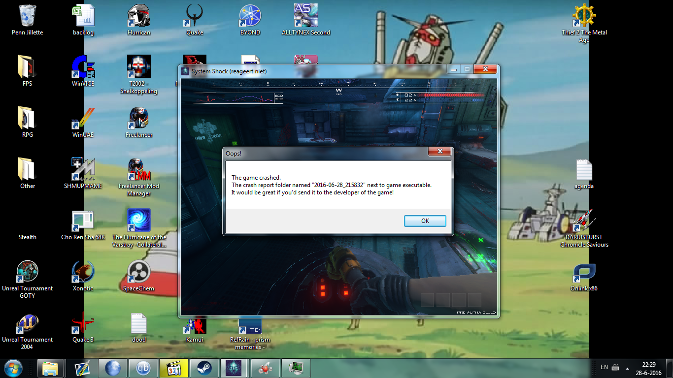
- Crashed on my second playthrough
- Still need to drag items from container to inventory, hopefully temporary
- Climbing stairs now triggers an animation
DeepOcean
Arcane
- Joined
- Nov 8, 2012
- Messages
- 7,405
Well, I gonna buy this anyway just for the curiosity of seeing the Citadel Station on new authentic graphix but I still prefer the original. Man, I have a huge hard on for pixels, while the scenario is fine, the enemy models and their animation are kinda silly on 3D and not as threatening as on the original. The mutant guy in particular didn't look like some scary mutant freak just some pitiful misunderstood lone mutant that wanted a hug.
Ivan
Arcane
i do like the pixelated look when zoned in
Astral Rag
Arcane
- Joined
- Feb 1, 2012
- Messages
- 7,771
durendal's demo impressions:

FOV slider only goes up to 90, crashed after my first time of getting into combat, no graphics options other than resolution changes and borderless/windowed/fullscreen, runs like hot dogshit even on lower resolutions
the franchise is raped
Dude, it's only a demo, what did you expect? Do you even know what Demo means? Performance and stuff will be totally optimerized later down the line.
Astral Rag
Arcane
- Joined
- Feb 1, 2012
- Messages
- 7,771
Wow, the demo feels really clumsy compared to the original.
Graphics circa 2007
runs like hot dogshit even on lower resolutions

- Joined
- Jan 28, 2011
- Messages
- 100,857


Somebody's been triggered
flyingjohn
Arcane
- Joined
- May 14, 2012
- Messages
- 3,319
I wonder why they don't make their own engine?


![Glory to Codexia! [2012] Codex 2012](/forums/smiles/campaign_tags/campaign_slushfund2012.png)


