Putting the 'role' back in role-playing games since 2002.
Donate to Codex
Good Old Games
  • Welcome to rpgcodex.net, a site dedicated to discussing computer based role-playing games in a free and open fashion. We're less strict than other forums, but please refer to the rules.

    "This message is awaiting moderator approval": All new users must pass through our moderation queue before they will be able to post normally. Until your account has "passed" your posts will only be visible to yourself (and moderators) until they are approved. Give us a week to get around to approving / deleting / ignoring your mundane opinion on crap before hassling us about it. Once you have passed the moderation period (think of it as a test), you will be able to post normally, just like all the other retards.

Preview Torment Kickstarter Update #42: New Gameplay Video - "A World Unlike Any Other"

Robert Jarzebina

Guest
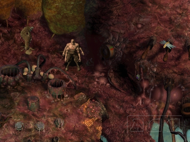
I feel strong Sanitarium vibe :incline:

216_5.jpg


216_5.jpg
 

TwinkieGorilla

does a good job.
Patron
Joined
Oct 19, 2007
Messages
5,480
Serpent in the Staglands Divinity: Original Sin Torment: Tides of Numenera Wasteland 2 Shadorwun: Hong Kong Divinity: Original Sin 2 BattleTech Pathfinder: Wrath
Looks mind-bogglingly good. Hard to believe it's the same company who brought us WL2. Cautiously optimistic.

EDIT: I thought the same thing, re: Sanitarium.
 

Brother None

inXile Entertainment
Developer
Joined
Jul 11, 2004
Messages
5,673
I don't know how often our artists reference Sanitarium but I do know I've often recommended it and bring up specific examples from that game when we're iterating on scenes. It ranks very highly for me in this 2D isometric genre of games (hence the LP, see sig!), alongside Planescape: Torment. I don't really know Septerra Core so...
 

Zeriel

Arcane
Joined
Jun 17, 2012
Messages
13,963
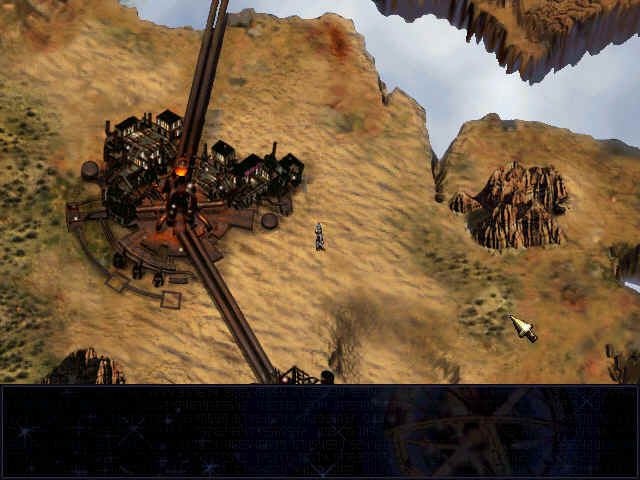
Looks like Inxile's take on Septera Core using PoE "engine". Not bad, but not great either.

Yeah, that's what I was thinking. It's weird how all these years later and Torment art still looks miles better. Character art especially. I guess there's something to be said for getting back to the peak of an artform, but it's still disappointing.

Lest I be too negative, however, yada yada pre-polish build and this video was an incredibly mixed bag, some scenes look way better than others.
 

Shadenuat

Arcane
Joined
Dec 9, 2011
Messages
11,977
Location
Russia
Compared to PST characters are very small and hard to distinguish from background or NPCs
Combat looks like... ToEE?? :o
 
Joined
Dec 12, 2013
Messages
4,334
We will get a big BT trailer when the 4th kickstarter will be about to launch
:troll:
Trailer is amazing!
 

Sothpaw

Learned
Joined
Mar 2, 2015
Messages
227
So we should wait for the GOTY Uber Console Improved version right?
 

Infinitron

I post news
Patron
Staff Member
Joined
Jan 28, 2011
Messages
99,592
Codex Year of the Donut Serpent in the Staglands Dead State Divinity: Original Sin Project: Eternity Torment: Tides of Numenera Wasteland 2 Shadorwun: Hong Kong Divinity: Original Sin 2 A Beautifully Desolate Campaign Pillars of Eternity 2: Deadfire Pathfinder: Kingmaker Pathfinder: Wrath I'm very into cock and ball torture I helped put crap in Monomyth
Jertberg speaks! https://forums.inxile-entertainment.com/viewtopic.php?f=32&t=9879&start=40#p151190

Hi everyone,

Now that the video is out I feel like I should assure you that much of what is in the video is work in progress.
The underlying technology for the animation system has undergone a lot of overhaul past few months and I am still working on bringing it all together.

Now, for all my animation fans lets break the vid down a bit.
For the purpose of pacing in the video, editing occurred that if your watching the animation it affected speed and cut off or sped up transitions.
Cloaks physics are not working in the video.
The swimming is actually very cool in game when moving your guys around, you barely saw anything here.
The next shot of the PC stopping, Im not sure what happened here looks like a bug.
The generic walk animation is not playing smoothly on the npcs, that will improve.
The shot of the guy transitioning into the water, transition into the water looks good right?, however in here you also see some old mostly broken movement of the companions. I am currently working on a follow system for the companions.

OK now the combat...
This is very early stuff and was highly affected by editing.
Im not sure how well the video demonstrates this but Im trying to do something a bit different with the animations.
Combat is very similar in many respects to wasteland in terms of flow from my perspective.
What I have done to try and give this a different look is basically give everything a facing direction
For example:
When executing an attack the attack animation has the rotation of facing your target built in so you turn to face your target and attack all in one motion. This allows me to add some variety to the attacks as an attack to the left is different than to the right or behind. Damages also follow this rule as well as deaths, so if your attacked from behind or killed the reaction is directional. Damages or hit reactions also have the victim turn to face the attacker.
Its a technique that admittedly adds a ton of complexity and increases the difficulty of mechanical construction of the animations.
The timing and use of connecting transitions is something that is missing in combat which makes it feel abrupt visually too, but we still have to balance for gameplay I dont want anyone being annoyed by the animation timing.

Thanks for all the support people,

Josh
 

Hobo Elf

Arcane
Joined
Feb 17, 2009
Messages
14,153
Location
Platypus Planet
It looks really good. More or less exactly how I had hoped it would. Now I just hope that they do a faithful adaptation of the rule system with all the cool character skills and "spells".
 

Maculo

Arcane
Patron
Joined
Jul 30, 2013
Messages
2,589
Strap Yourselves In Pathfinder: Wrath
Some of the landscape style looked very similar to Planescape. I expected that it would look similar to PoE landscapes in the end, but the artists did a great job. It made me feel nostalgic for PST.

Please don't suck.
 

Black

Arcane
Joined
May 8, 2007
Messages
1,873,126
lmao @smudboy is pissed that the game is tb and whines in the video's comments hard.
 

VioletShadow

Sensate
Patron
Joined
Sep 7, 2013
Messages
995
Location
Tumblr
Codex 2013 Codex 2014 PC RPG Website of the Year, 2015 Shadorwun: Hong Kong
I wonder :philosoraptor:
will the least combat focused game out of all KS cRPGs... end up having the best combat and encounter design?
 

Brother None

inXile Entertainment
Developer
Joined
Jul 11, 2004
Messages
5,673
Well, the gameplay was somewhat meh, but 2D art was pretty good in that game, worth checking out
Does look pretty cool. I don't think I've heard it mentioned as something we're taking cues from, but I can see the natural comparison, both top-down 2D games that mix the technological and wondrous.
 

Crescent Hawk

Cipher
Joined
Jul 10, 2014
Messages
664
Damn that combat is looking good ( it just has to be turn based to look good to me). I hope they also go crazy with weapons and armor\cloak designs.
 

As an Amazon Associate, rpgcodex.net earns from qualifying purchases.
Back
Top Bottom