Putting the 'role' back in role-playing games since 2002.
Donate to Codex
Good Old Games
  • Welcome to rpgcodex.net, a site dedicated to discussing computer based role-playing games in a free and open fashion. We're less strict than other forums, but please refer to the rules.

    "This message is awaiting moderator approval": All new users must pass through our moderation queue before they will be able to post normally. Until your account has "passed" your posts will only be visible to yourself (and moderators) until they are approved. Give us a week to get around to approving / deleting / ignoring your mundane opinion on crap before hassling us about it. Once you have passed the moderation period (think of it as a test), you will be able to post normally, just like all the other retards.

KickStarter Vampire Syndicate: Gangs of MoonFall

santino27

Arcane
Patron
Joined
Oct 1, 2008
Messages
2,786
My team has the sexiest and deadliest waifus you can recruit.
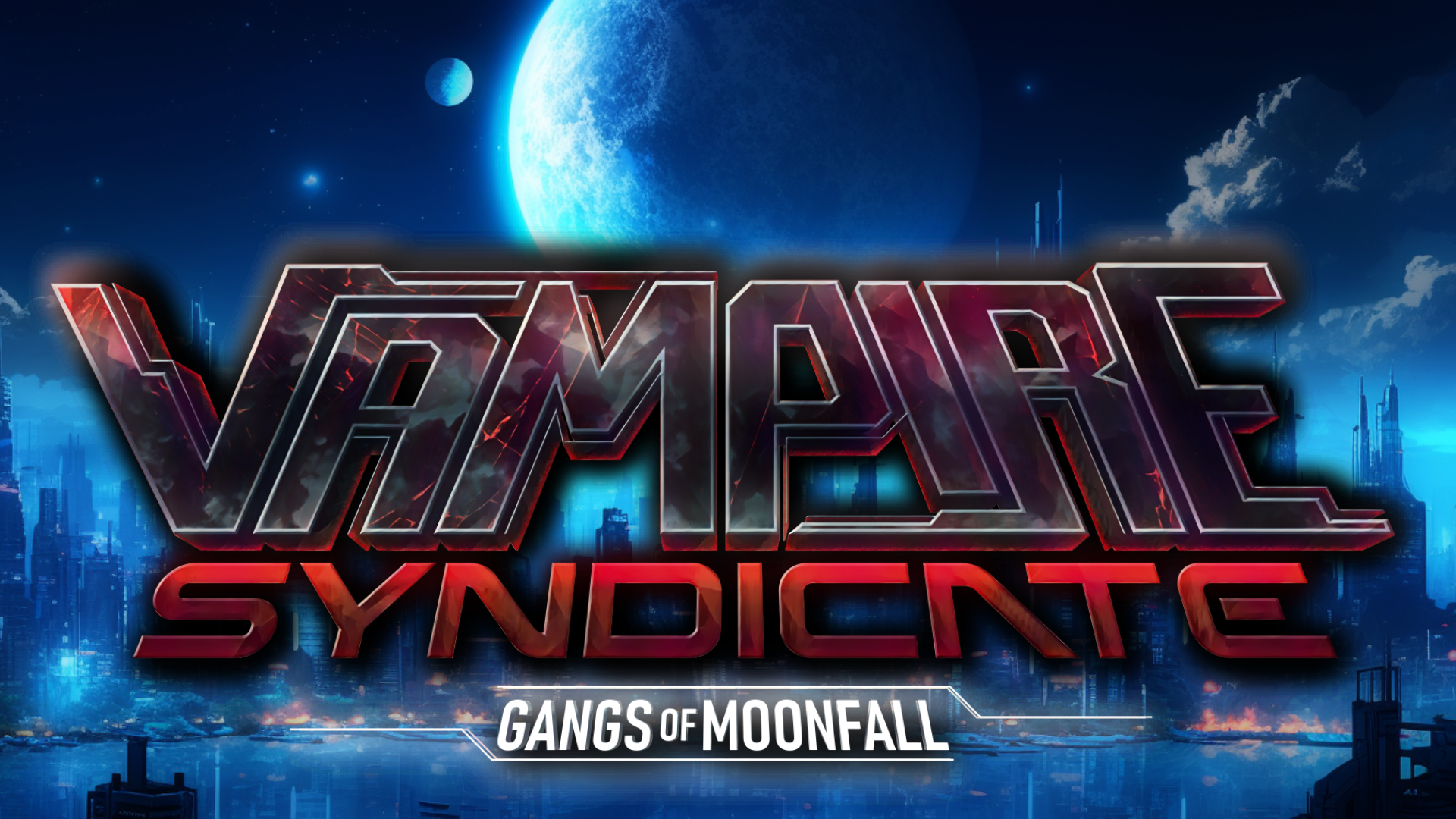
I like the old one better as well, honestly... the new one feels a bit transformers/marvel/too-future-clean vibe (even in the version where it gets paired with the artwork of the previous version), whereas the older version has a lot more atmosphere to it and I actually prefer the font.

Feels like if you just added a bevel or something to the old text to give it more depth/dimension, it would be on point.
 

Ismaul

Thought Criminal #3333
Patron
Joined
Apr 18, 2005
Messages
1,871,810
Location
On Patroll
Codex 2014 PC RPG Website of the Year, 2015 Codex 2016 - The Age of Grimoire Make the Codex Great Again! Grab the Codex by the pussy Insert Title Here RPG Wokedex Strap Yourselves In Codex Year of the Donut Divinity: Original Sin Project: Eternity Torment: Tides of Numenera Shadorwun: Hong Kong Divinity: Original Sin 2 BattleTech A Beautifully Desolate Campaign My team has the sexiest and deadliest waifus you can recruit.
Agreed with what everyone has said about the new logo.

The red vampiric font / text is quite liked, while the new logo is much more cyber/tech oriented. So here's an idea: mix them. "Vampire" could be a bloody font, and "Syndicate" could be a cyber font. You can even have the blood fall from Vampire onto the metallic/cyber Syndicate. Literally dripping with theme, fuck yeah.
 

Tyranicon

A Memory of Eternity
Developer
Joined
Oct 7, 2019
Messages
7,840
My main problem is the bad readability. It's hard to make out, especially at a smaller size, which is the usual size it'll be seen at.

I dunno, I'll keeping working on it or commission another one.
 

Readher

Savant
Joined
Nov 11, 2018
Messages
705
Location
Poland
My main problem is the bad readability. It's hard to make out, especially at a smaller size, which is the usual size it'll be seen at.

I dunno, I'll keeping working on it or commission another one.
Well, the new one is literally just the title of the game, which everyone will see next to the logo on Steam and other storefronts. Meanwhile, the old one has a fairly unique looking, cute girl which will draw attention. I sometimes scroll through games on Steam with just a few filters enabled, hoping to stumble upon something interesting, and there are dozens of games with logos that are just the title with fairly generic backgrounds. It'd take forever to check all of them out, so they get skipped in favor of something more unique. YMMV with other people, but just a thought.

Previous version with new logo is fine as well imo. Daz is pretty much fully associated with porn, so using that would heavily imply that your title is porn first, game second, which isn't what you're going for I believe. Weeb is more flexible, but will push everyone who doesn't like anime aesthetics away immediately. That's why I think the old logo is the best, either with the old or new text.
 

Zombra

An iron rock in the river of blood and evil
Patron
Joined
Jan 12, 2004
Messages
11,843
Location
Black Goat Woods !@#*%&^
Make the Codex Great Again! RPG Wokedex Strap Yourselves In Codex Year of the Donut Codex+ Now Streaming! Enjoy the Revolution! Another revolution around the sun that is. Serpent in the Staglands Shadorwun: Hong Kong Divinity: Original Sin 2 BattleTech Pillars of Eternity 2: Deadfire Pathfinder: Kingmaker Steve gets a Kidney but I don't even get a tag. I'm very into cock and ball torture I helped put crap in Monomyth
Well, the new one is literally just the title of the game, which everyone will see next to the logo on Steam and other storefronts. Meanwhile, the old one has a fairly unique looking, cute girl which will draw attention. I sometimes scroll through games on Steam with just a few filters enabled, hoping to stumble upon something interesting, and there are dozens of games with logos that are just the title with fairly generic backgrounds. It'd take forever to check all of them out, so they get skipped in favor of something more unique. YMMV with other people, but just a thought.
Yeah, this is really worth thinking about. There's no reason the "tiny" Steam splash has to cram in a long title at the expense of everything else. I'd be more intrigued by "VGM" next to a big pair of spooky eyes or something. I am weird of course so yeah.
 

Harthwain

Magister
Joined
Dec 13, 2019
Messages
5,428
Oddly enough when I see that logo picture it makes me think of sci-fi and Imperium Galactica. Not sure why...

fhfhbnbn_1.png
Imperium_Galactica_Coverart.png
 

Tyranicon

A Memory of Eternity
Developer
Joined
Oct 7, 2019
Messages
7,840
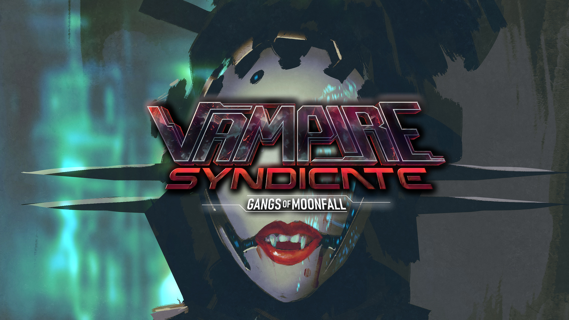
Still working on the logo, but here's another background:
Put her on the right, then have a different logo. Don't put logo over character.

I'll have to use AI to extend the artwork then, because the original is a vertical slice without much horizontal space.

Sometimes I don't get why artists do certain things the way they do. ¯\_(ツ)_/¯
 

Saark

Arcane
Patron
Joined
Jun 16, 2010
Messages
2,343
A Beautifully Desolate Campaign
But it suggests that maybe a lot more people lurk here and avoid posting bc it is controversial but it’s more organic than Reddit, Twitter etc. is my guess
For what it's worth, I lurked for about ~5 years before creating an account to make my first post. Just like Reddit or Twitch chat or twitter etc... There's a fairly significant number of people who aren't interested and/or willing to be active participants, but are more than happy to watch/enjoy/learn. Just like porn.

As far as the logo is concerned, there's some legibility issues with the font I think. The spacing between the letters is too small, so the letters blend together too much, especially with the darkness/shadow~y overlay on the middle and bottom half of the font. It seems like the goal was to have legibility improved through the white outline of the letters, but then the cloudy and shadow effects wash that out to the point where legibility is affected. Just one man's opinion, of course, but it takes a few seconds to actually read what this word is.

85eb529db3.jpg


Biggest offender imo is the smaller size A, the P and the R.
Note how you can basically not even see that the R extends far further to the left, even underneath the P. It looks good in the higher resolutions, but for a thumbnail, I think it has some issues. But again, just one man's opinion.
 
Last edited:

Tyranicon

A Memory of Eternity
Developer
Joined
Oct 7, 2019
Messages
7,840
Threw together a kickstarter video, not sure what to think about it. Probably should've hired a professional lol.

Oh well, got to save money somewhere. ¯\_(ツ)_/¯


Lord_Potato

Arcane
Glory to Ukraine
Joined
Nov 24, 2017
Messages
10,919
Location
Free City of Warsaw
Threw together a kickstarter video, not sure what to think about it. Probably should've hired a professional lol.

Oh well, got to save money somewhere. ¯\_(ツ)_/¯


After completing Memoirs of a Battle Brothel, I'm curious - if the new game is a direct sequel, will Moonfall start as a dependency of the Empire? And if so, will there be an option to try to regain its independence?
 

As an Amazon Associate, rpgcodex.net earns from qualifying purchases.
Back
Top Bottom