Putting the 'role' back in role-playing games since 2002.
Donate to Codex
Good Old Games
  • Welcome to rpgcodex.net, a site dedicated to discussing computer based role-playing games in a free and open fashion. We're less strict than other forums, but please refer to the rules.

    "This message is awaiting moderator approval": All new users must pass through our moderation queue before they will be able to post normally. Until your account has "passed" your posts will only be visible to yourself (and moderators) until they are approved. Give us a week to get around to approving / deleting / ignoring your mundane opinion on crap before hassling us about it. Once you have passed the moderation period (think of it as a test), you will be able to post normally, just like all the other retards.

What would Grimoire's flaws be? Genuinely curious

Valky

Arcane
Manlet
Joined
Aug 22, 2016
Messages
2,418
Location
Trapped in a bioform
My party is Raghilda's Fanclub, don't diss my girl.
 

Yosharian

Arcane
Joined
May 28, 2018
Messages
10,446
Location
Grand Chien
And for the popamole graphics whore above: the graphics do exactly what they are supposed to, namely create a good atmosphere and let you use your imagination to fill in the blanks. Which in turn creates a kind of immersion you probably never experienced.
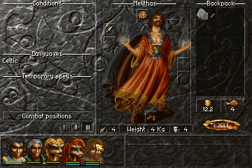
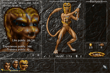
Calling me a 'graphics whore' misses my point entirely. I'm not asking for modern graphics, I'm asking for graphics that aren't shit. Here's some screens from an older game that has graphics that blow Grimoire away:

albion_24.png


albion_10.png


albion_3.gif


albion_26.png


It's from a game called Albion, one of my favourite old school PC RPGs. This is the kind of art style that impresses me. The design is just beautiful.

I'm also not averse to games that have limited graphics, that expect you to imagine your own world, as you say. Nethack, for example, is a fantastic game even without good graphics.

Here's a video of Albion in action where you can see some similarities between the combat & city exploration engine and Grimoire's blobber-style engine.


Lady_Error

█▓▒░ ░▒▓█
Patron
Joined
Oct 14, 2012
Messages
1,879,250
The Albion graphics may have better quality overall, but the style is worse than Grimoire. Just look at the avatars or the world graphics - Grimoire blows it away in every respect there. The inventory screen and the "dress puppet" are certainly nicer in Albion, though that is only a minor thing.
 

Valky

Arcane
Manlet
Joined
Aug 22, 2016
Messages
2,418
Location
Trapped in a bioform
There's some misunderstanding in here like him having the wiki on hand all the time and not playing with some things that were useful, but there's a fair amount of criticism that I can agree with so far, relating to abilities/spells that aren't really useful for anything in the game.
 

Cleveland Mark Blakemore

Golden Era Games
Übermensch Developer
Joined
Apr 22, 2008
Messages
11,713
Location
LAND OF THE FREE & HOME OF THE BRAVE
And for the popamole graphics whore above: the graphics do exactly what they are supposed to, namely create a good atmosphere and let you use your imagination to fill in the blanks. Which in turn creates a kind of immersion you probably never experienced.
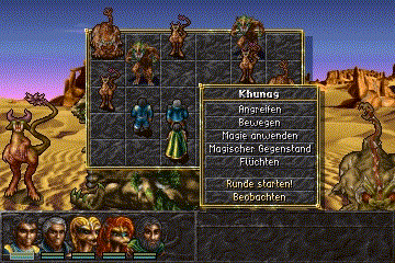
Calling me a 'graphics whore' misses my point entirely. I'm not asking for modern graphics, I'm asking for graphics that aren't shit. Here's some screens from an older game that has graphics that blow Grimoire away:

albion_24.png


albion_10.png


albion_3.gif


albion_26.png


It's from a game called Albion, one of my favourite old school PC RPGs. This is the kind of art style that impresses me. The design is just beautiful.

I'm also not averse to games that have limited graphics, that expect you to imagine your own world, as you say. Nethack, for example, is a fantastic game even without good graphics.

Here's a video of Albion in action where you can see some similarities between the combat & city exploration engine and Grimoire's blobber-style engine.


Albion was truly a beautiful game graphically. I was very enamored with it when it first came out.

Before we switched to Sham's Kingstep engine, I was using a raycaster engine that I built from scratch (using a game design book I still have) identical to Albion's consisting of straight walls and sprites that always faced the player. Shams had a look at it for a while. I experimented with something using layered raycasting ... I had transparent areas in a wall with another texture behind it. I had some samples running with a chest in an alcove or an altar with columns on either side. It was a pretty cool effect and it took the engine up a notch.

After using it for at least 8 months (I believe I still have a demo around somewhere of it, with 16x16 items and 32x32 portraits) I decided it was too newfag looking and I yearned for an eye of the Beholder engine with smooth steps in between cells. This is when I pulled Shams in on it. I remember his first few experiments and I immediately liked them better for this style of game.

The artwork in Grimoire varies wildly. Some of it is true Bitmap Brothers old skool, mostly the stuff done by Ray Beez. The rest of it is pieced together from whatever I could afford, sometimes on no budget or art I personally put together. If I had more money and a full time artist working with me it would be as good or far better than Albion - but ultimately I had to release the game instead of working on it forever. Since every single piece of art was vetted by me, it is the best I could do on the budget and time I had to work at it.

The reason it is not always consistent is that it was worked on by many private contractors over time in fragmented deliveries, each of them done with whatever I could afford to pay.

I encourage everyone to try to produce a game like Grimoire while supporting a family and working at one or more jobs, including a 4 hour commute each day. Everybody is a critic but if you attempted this yourself, you'd see that the world of your imagination and the real world have a big gap between them. It takes an incredible amount of work to bridge that gap when you are a hobbyist developer part-time.

I would say that of all the Wizardry games, none was ever better looking than Grimoire overall. It is better looking than Bane of the Cosmic Forge and Crusaders of the Dark Savant, games which were produced by a company with nothing but time, an unlimited budget and dozens of full time staff. If you look at the list of artists for Crusaders you will see it almost fills a page top to bottom.

In any event, Grimoire is a very beautiful roleplaying game. The fact that games that looked even better have come out from actual game producers with full time staff only underscores how amazing an achievement it is for one person working on their laptop while commuting.

Weaboos like yourself have opinions on a lot of stuff. They have never kissed a girl, still live with their parents and are saving up for transition surgery, meanwhile they are the greatest at all human endeavors and beyond. If only they would do something with the lives instead of just critique. In between long bouts of chronic masturbation they log onto the internet and tell how "they would have done this and that perfectly if only they had worked on it" and pretty much solve the problems of the world from their folks basement - where they will live to the end of their days, surrounded by Pez dispensers and Star Wars model kits they never got around to assembling.
 

Cleveland Mark Blakemore

Golden Era Games
Übermensch Developer
Joined
Apr 22, 2008
Messages
11,713
Location
LAND OF THE FREE & HOME OF THE BRAVE
(using a game design book I still have)

Could you please name the book? Thanks.

Gardens of Imagination
Chris Lampton
Waite Group 1994, ISBN 1-878739-59-X

https://www.amazon.com/Gardens-Imagination-Programming-Maze-Games/dp/187873959X

The amazing thing about this book was clever examples of offsetting textures from existing walls with an extra step in assembly. Once you saw how he did this you could do tricks like I did and layer the textures with transparency for all kinds of cool effects. Remember this was when DOOM was already out so it was still impressively fast and detailed 3D for machines running a couple Mhz.

It would have never been a good look for Grimoire, however. I stuck to my goal of LANDS OF LORE style because it looked handpainted and very atmospheric.
 

zwanzig_zwoelf

Graverobber Foundation
Developer
Joined
Nov 21, 2015
Messages
3,178
Location
デゼニランド
I skimmed through it a few months ago and it seems pretty good.
Been planning to buy it along with the accompanying disk for, uh, recreational programming purposes.
 

Cryomancer

Arcane
Glory to Ukraine
Joined
Jul 11, 2019
Messages
17,058
Location
Frostfell
No information. Some puzzles requires foretelling. For eg, to pick a random item A, then in the dungeon B find the item C, use it on the floor nª 666 of the dungeon D to make a item E who combined with the item F and item G on the city, gives me a item that i need to talk to a guy to open a indestructible wooden door. This guide saved me ( https://steamcommunity.com/sharedfiles/filedetails/?id=1107532654 )

But there are a problem. On combat, if my giant swinging a club failed to pierce a rat's armor, i wanna know why it failed. And if someones succeed against my necro OHK spell, i wanna know why. The game hides this informations
 

Valky

Arcane
Manlet
Joined
Aug 22, 2016
Messages
2,418
Location
Trapped in a bioform
Honestly the puzzles seem a bit too easy. Once you get a new key item, all you have to do is keep exploring and it becomes fairly obvious once you find an obstacle that you use that key item to do so. The sphinx riddle was a good puzzle though.
Key items that aren't strictly necessary that remain key items once you pass the obstacle they were optionally useful for is a problem though, since it clutters up the inventory and you don't know for sure if they are truly useless anymore or not.
 

Doctor Sbaitso

SO, TELL ME ABOUT YOUR PROBLEMS.
Patron
Joined
Oct 22, 2013
Messages
3,351
Codex 2013 Codex 2014 PC RPG Website of the Year, 2015 Grab the Codex by the pussy Serpent in the Staglands
And for the popamole graphics whore above: the graphics do exactly what they are supposed to, namely create a good atmosphere and let you use your imagination to fill in the blanks. Which in turn creates a kind of immersion you probably never experienced.
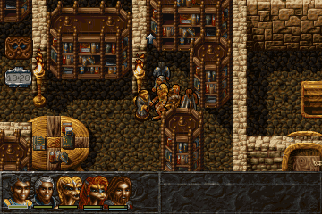
Calling me a 'graphics whore' misses my point entirely. I'm not asking for modern graphics, I'm asking for graphics that aren't shit. Here's some screens from an older game that has graphics that blow Grimoire away:

albion_24.png


albion_10.png


albion_3.gif


albion_26.png


It's from a game called Albion, one of my favourite old school PC RPGs. This is the kind of art style that impresses me. The design is just beautiful.

I'm also not averse to games that have limited graphics, that expect you to imagine your own world, as you say. Nethack, for example, is a fantastic game even without good graphics.

Here's a video of Albion in action where you can see some similarities between the combat & city exploration engine and Grimoire's blobber-style engine.


Albion was truly a beautiful game graphically. I was very enamored with it when it first came out.

Before we switched to Sham's Kingstep engine, I was using a raycaster engine that I built from scratch (using a game design book I still have) identical to Albion's consisting of straight walls and sprites that always faced the player. Shams had a look at it for a while. I experimented with something using layered raycasting ... I had transparent areas in a wall with another texture behind it. I had some samples running with a chest in an alcove or an altar with columns on either side. It was a pretty cool effect and it took the engine up a notch.

After using it for at least 8 months (I believe I still have a demo around somewhere of it, with 16x16 items and 32x32 portraits) I decided it was too newfag looking and I yearned for an eye of the Beholder engine with smooth steps in between cells. This is when I pulled Shams in on it. I remember his first few experiments and I immediately liked them better for this style of game.

The artwork in Grimoire varies wildly. Some of it is true Bitmap Brothers old skool, mostly the stuff done by Ray Beez. The rest of it is pieced together from whatever I could afford, sometimes on no budget or art I personally put together. If I had more money and a full time artist working with me it would be as good or far better than Albion - but ultimately I had to release the game instead of working on it forever. Since every single piece of art was vetted by me, it is the best I could do on the budget and time I had to work at it.

The reason it is not always consistent is that it was worked on by many private contractors over time in fragmented deliveries, each of them done with whatever I could afford to pay.

I encourage everyone to try to produce a game like Grimoire while supporting a family and working at one or more jobs, including a 4 hour commute each day. Everybody is a critic but if you attempted this yourself, you'd see that the world of your imagination and the real world have a big gap between them. It takes an incredible amount of work to bridge that gap when you are a hobbyist developer part-time.

I would say that of all the Wizardry games, none was ever better looking than Grimoire overall. It is better looking than Bane of the Cosmic Forge and Crusaders of the Dark Savant, games which were produced by a company with nothing but time, an unlimited budget and dozens of full time staff. If you look at the list of artists for Crusaders you will see it almost fills a page top to bottom.

In any event, Grimoire is a very beautiful roleplaying game. The fact that games that looked even better have come out from actual game producers with full time staff only underscores how amazing an achievement it is for one person working on their laptop while commuting.

Weaboos like yourself have opinions on a lot of stuff. They have never kissed a girl, still live with their parents and are saving up for transition surgery, meanwhile they are the greatest at all human endeavors and beyond. If only they would do something with the lives instead of just critique. In between long bouts of chronic masturbation they log onto the internet and tell how "they would have done this and that perfectly if only they had worked on it" and pretty much solve the problems of the world from their folks basement - where they will live to the end of their days, surrounded by Pez dispensers and Star Wars model kits they never got around to assembling.


"Between our dreams and actions lies this world" - The Boss
 

Darth Canoli

Arcane
Joined
Jun 8, 2018
Messages
5,737
Location
Perched on a tree
Yosharian
I don't know if that comparison with albion is really judicious.
Sure, Albion has a distinctive art direction but i find the UI worse than Grimoire's and Albion is filled with trash loot and useless NPC.

It's obvious that a Albion, Battle Brothers, Banner Saga or Darkest Dungeon Art direction would have lured all the graphic whores into playing it but would they have enjoyed it ?


Also, there's probably a limit to what one guy alone and with a limited budget can do, even in 20 years ...
 

anvi

Prophet
Village Idiot
Joined
Oct 12, 2016
Messages
8,404
Location
Kelethin
I've only been playing it a while, took me some time to figure stuff out. I didn't want to just watch videos or read manuals... But I am kicking some ass now and really enjoying it. It seems very good. Low tech, but very good.
 

coldcrow

Prophet
Patron
Joined
Mar 6, 2009
Messages
1,717
What I do mind is an UI which proactively fights me. Not counting pre-windows games and rare outliers, I have yet to encounter an UI so fucking bad, that it actively puts you off the game. Seriously Cleve, for all your bluster, you can't design something at least a bit better than this? Sure, you designa fuckton of beautiful content, but the UI is the one thing the player has to deal with at each step. If you fuck this up, it is no surprise that the game gets lackluster reviews. Imagine a responsive tooltip UI, LARGER fonts, and different dress dolls instead of like 25% of the content. Not to mention widescreen support.
Idk man, the game would be better.
 

Cleveland Mark Blakemore

Golden Era Games
Übermensch Developer
Joined
Apr 22, 2008
Messages
11,713
Location
LAND OF THE FREE & HOME OF THE BRAVE
What I do mind is an UI which proactively fights me. Not counting pre-windows games and rare outliers, I have yet to encounter an UI so fucking bad, that it actively puts you off the game. Seriously Cleve, for all your bluster, you can't design something at least a bit better than this? Sure, you designa fuckton of beautiful content, but the UI is the one thing the player has to deal with at each step. If you fuck this up, it is no surprise that the game gets lackluster reviews. Imagine a responsive tooltip UI, LARGER fonts, and different dress dolls instead of like 25% of the content. Not to mention widescreen support.
Idk man, the game would be better.

Grimoire is rated "Mostly Positive" on Steam now and has very good reviews on GOG and Steam.

The UI is much easier to use than most of the classic blobbers ever were. You have to read the manual in order to get the most out of it right away.

Before the millennials, most UIs in game had a lot of buttons and sometimes it took time to figure out what they did. Mobile games placed the new emphasis on instant play because reading is teh hard.
 

KeighnMcDeath

RPG Codex Boomer
Joined
Nov 23, 2016
Messages
15,459
Omg! Instaplay would be that latest league of angels game or w/e its called. I watched a partial playthrough.. terrible.
 

Darth Canoli

Arcane
Joined
Jun 8, 2018
Messages
5,737
Location
Perched on a tree
Grimoire is rated "Mostly Positive" on Steam now and has very good reviews on GOG and Steam.

The UI is much easier to use than most of the classic blobbers ever were. You have to read the manual in order to get the most out of it right away.

Before the millennials, most UIs in game had a lot of buttons and sometimes it took time to figure out what they did. Mobile games placed the new emphasis on instant play because reading is teh hard.

Grimoire's UI isn't exactly terrible but it's not user friendly either, when the UI is fighting back harder than the monsters, it's a sign.

Mobile crap's UI are worse, of course but we had games with good UI as soon as the early 90s and great ones in the late 90s early 2000.

I didn't play the latest version so maybe it improved over time but the combat UI should have been influenced by Wizardry 8 rather than Wiz VII.
With a Wiz 8 combat UI and inventory, you would certainly have achieved a "mostly positive" rating earlier and most certainly scored way higher and i'm not even talking about the glory and the shekels that comes along.
 

Lady_Error

█▓▒░ ░▒▓█
Patron
Joined
Oct 14, 2012
Messages
1,879,250
the combat UI should have been influenced by Wizardry 8 rather than Wiz VII.

Wizardry 8 didn't even exist when Grimoire development started. And neither is there anything wrong with an improved Wizardry 7 combat UI where you don't even have to put in the same commands at every round.
 

Darth Canoli

Arcane
Joined
Jun 8, 2018
Messages
5,737
Location
Perched on a tree
where you don't even have to put in the same commands at every round.

The "thrust / slash / ..." attack mode didn't work quite right last time i played though, every other turn, it was preventing me from attacking.


Wizardry 8 didn't even exist when Grimoire development started.

My bad, it was only released 19 years ago, i get why it was impossible to improve the UI in such a short time.
 

As an Amazon Associate, rpgcodex.net earns from qualifying purchases.
Back
Top Bottom