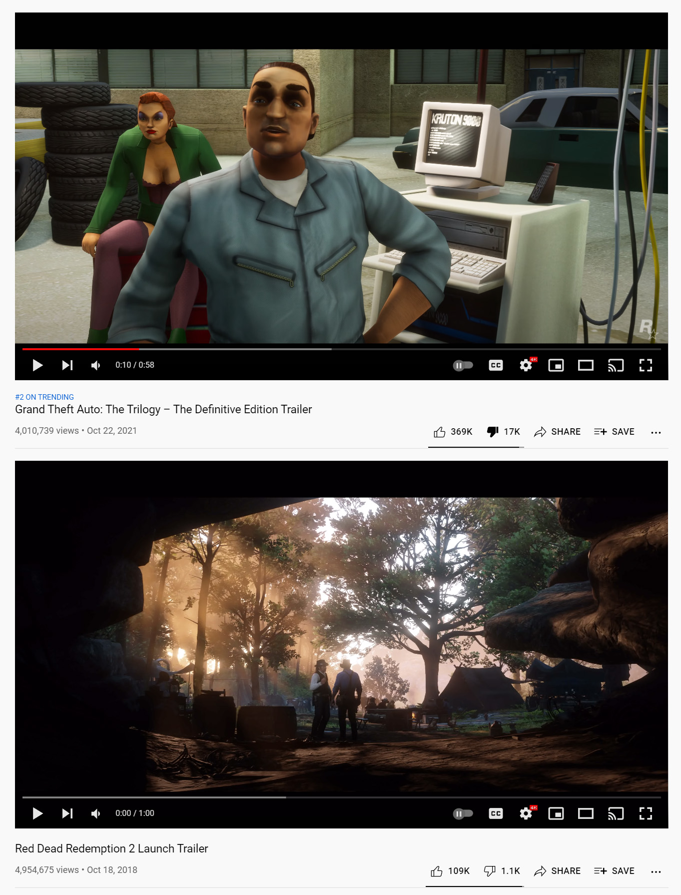
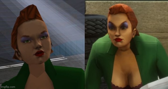
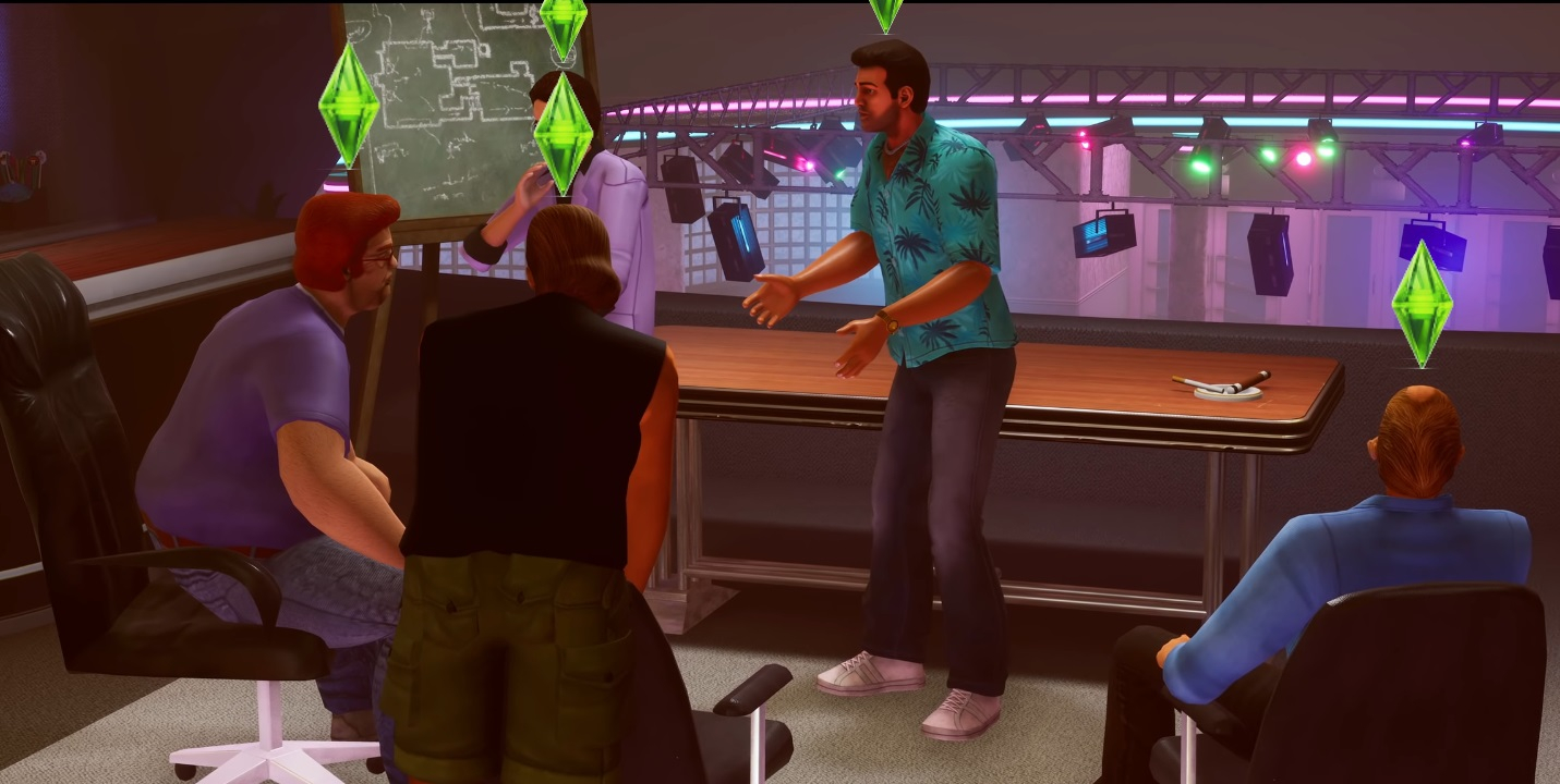
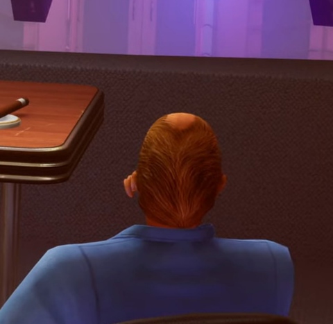
This shit looks weird. The OG games weren't supposed to look cartoony, so this attempt of modernizing material surfaces, lighting, effects just make the un-updated elements pop out more. I have watched this trailer 4 times, VC and SA look increasingly more disgusting through each watch because their visual is seemingly having an internal clash.
The original GTA games were all meant to look cartoony. They weren't like Jet Set Raido cartoony, but the character models were always stylized looking as opposed to going for realism. Even when they toned it down in the official art after GTA3, they were still pretty fucking cartoony looking.
GTA doesn't drop the character models looking cartoony until GTA5. Like even the GTA4 character models have these exaggerated facial features along the same lines as like Def Jam Fight for NY. From the original GTA up to 4 the series was always pretty cartoony.
The character models were slightly exaggerated to compensate for the low polycount, and as polycount increased they were less and less exaggerated. It's just that sticking to accurate proportions at low poly means the picture looks less realistic than emphasizing the bits where detail is needed (head, hands, feet).
You wanna know how you know this isn't true? The characters are exaggerated in GTA and GTA2. It wasn't a stylist choice because of the 3D polycounts, it was just a stylistic choice. If they wanted the drawings they put in GTA, or those little talking heads in GTA2 to look realistic they could've done that, but they didn't, instead they made the characters look like this:
Now they may have stayed with that stylistic choice because of the PS2, not that there weren't games on the PS2 that same year that looked better and had characters with more realistic proportions, but these were stylistic choices they made for GTA before 3D models ever figured into the equation.
Also GTA4 and GTA5 came out on the exact same generation of hardware and GTA4 is still using exaggerated character models but GTA5 isn't really anymore. You put a character's face from GTA4 next to a character's face from GTA5 and they almost look like two different series.
GTA 2 had a lot of stylistic choices that didn't persist into the later games. My point is that 3D GTA games still aimed for relative realism within their (fairly limited) polygon budget and as that polygon budget increased exaggerations became smaller. Would you call Quake and Half-Life cartoony?
My point was that even before going 3D, DMA/Rockstar North were not aiming for realism. You can say it's just cartoony because of the limitations of the hardware of the time, but that's overlooking what they were doing pre GTA3 when characters were just drawings and the thing you're talking about wasn't an issue. Most GTA games didn't aim for relative realism...not until the most recent game in the series anyways. You know that art that's on the front cover of the Grand Theft Auto 3 case? That is what the in-game graphics were aiming for, not realism, but cartoons. Some of the characters in GTA3 are like one step away from being a Dick Tracy character. San Andreas does flirt with more realistic style than the previous two before it, but then 4 is back to having characters with more exaggerated looking.
I wouldn't call Half-Life, the original one, realistic, or even say the aims of it were realism. Half-Life is however not as cartoony looking as it original was when they first showed it off and Freeman looked like a lumberjack, and everyone had big round eyes. The HD Pack for Blue Shift that changes the character models does also change the whole style of the characters from cartoonish to some thing aiming for realism.
I look at the characters in Quake and I'd guess they probably had something like Simon Bisley more in mind than reality.


